Brand architecture
A framework for the Redcare brand architecture that works for current brands but also builds
the framework for future brands.

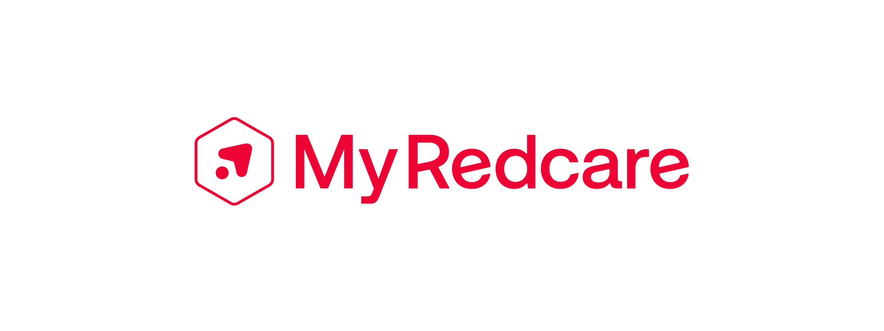
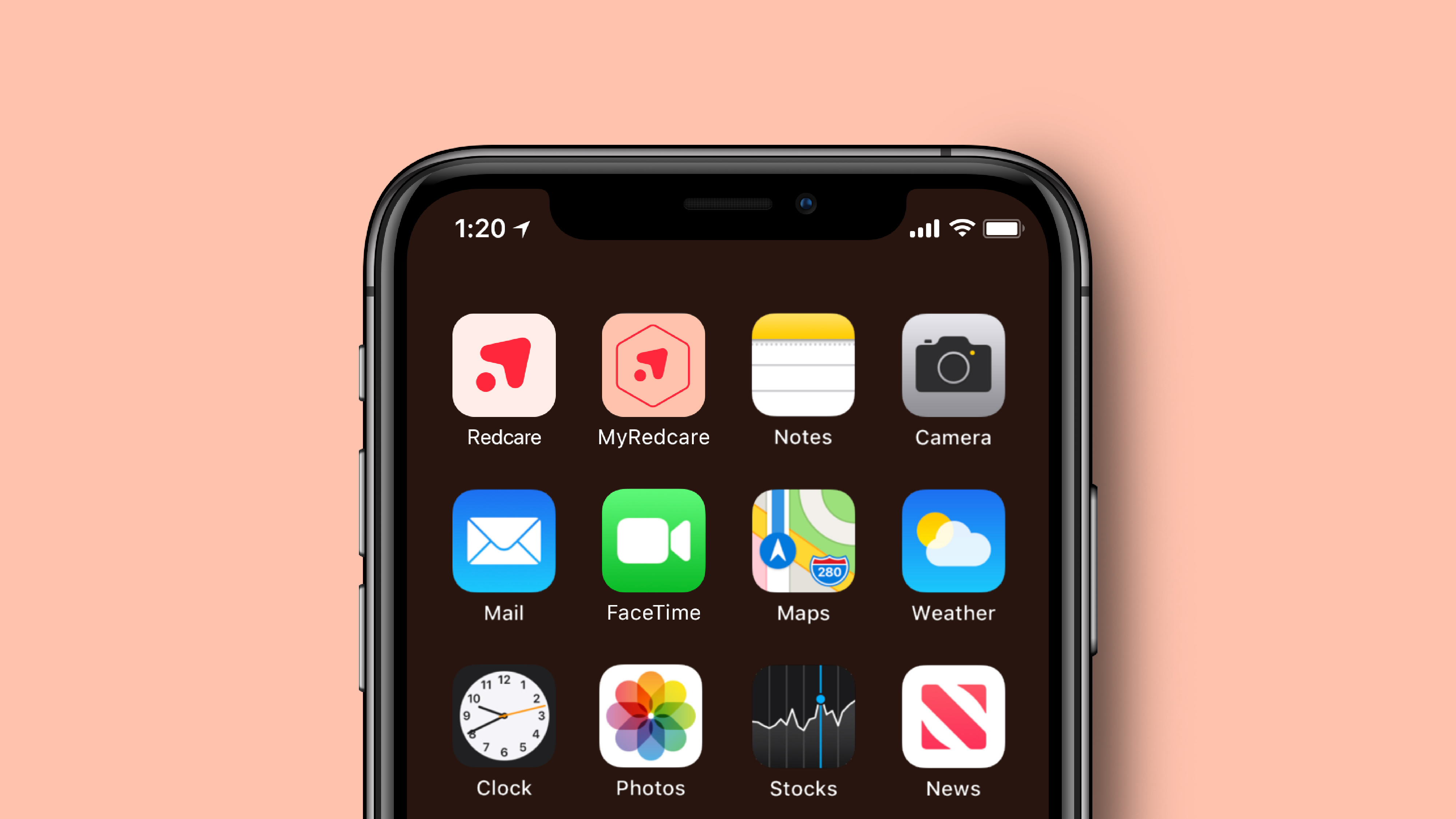
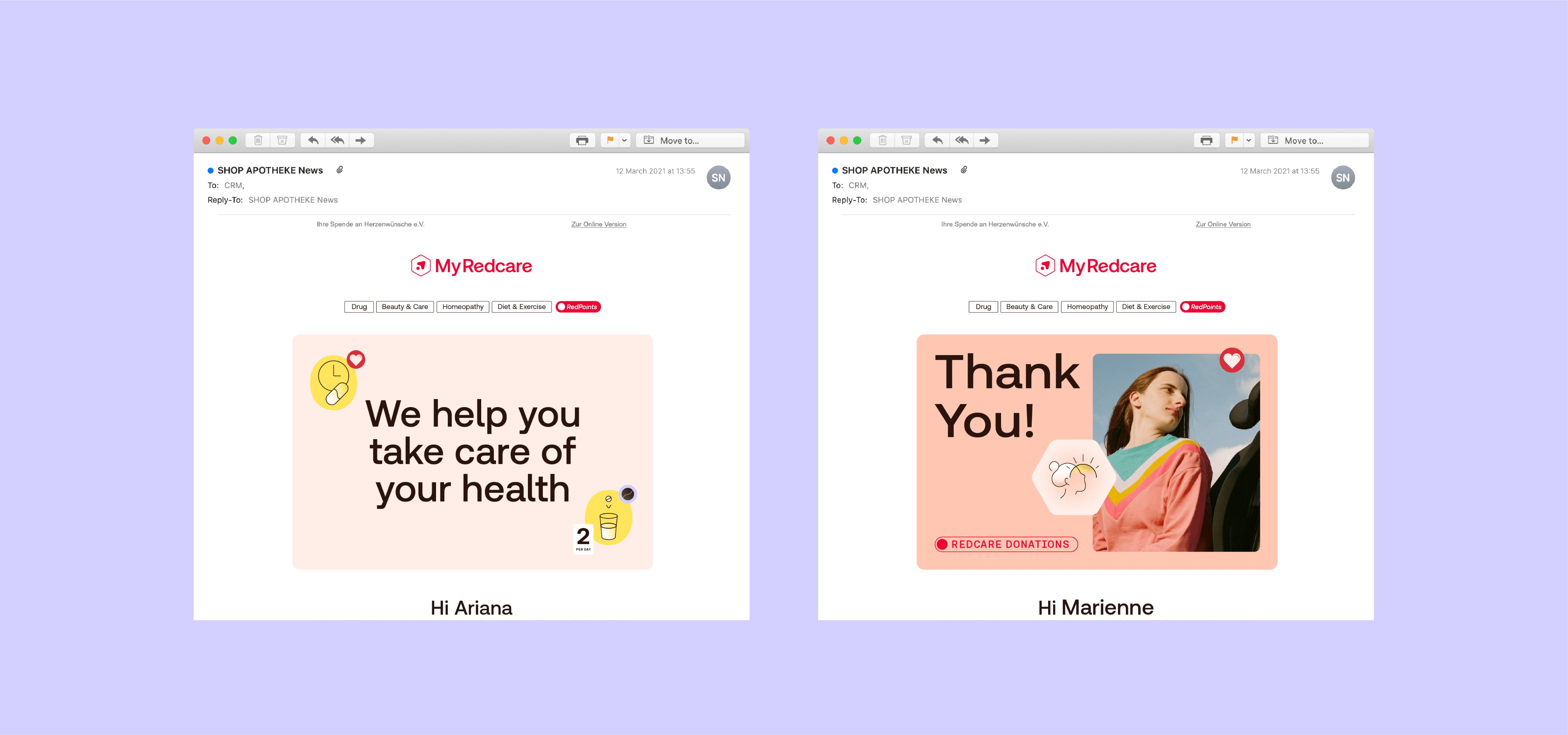
Core brand dominant
examples
A very logical path to brand extensions, as the core brand is always present. MyRedcare is easily linked to the core brand to leverage the brand equity.
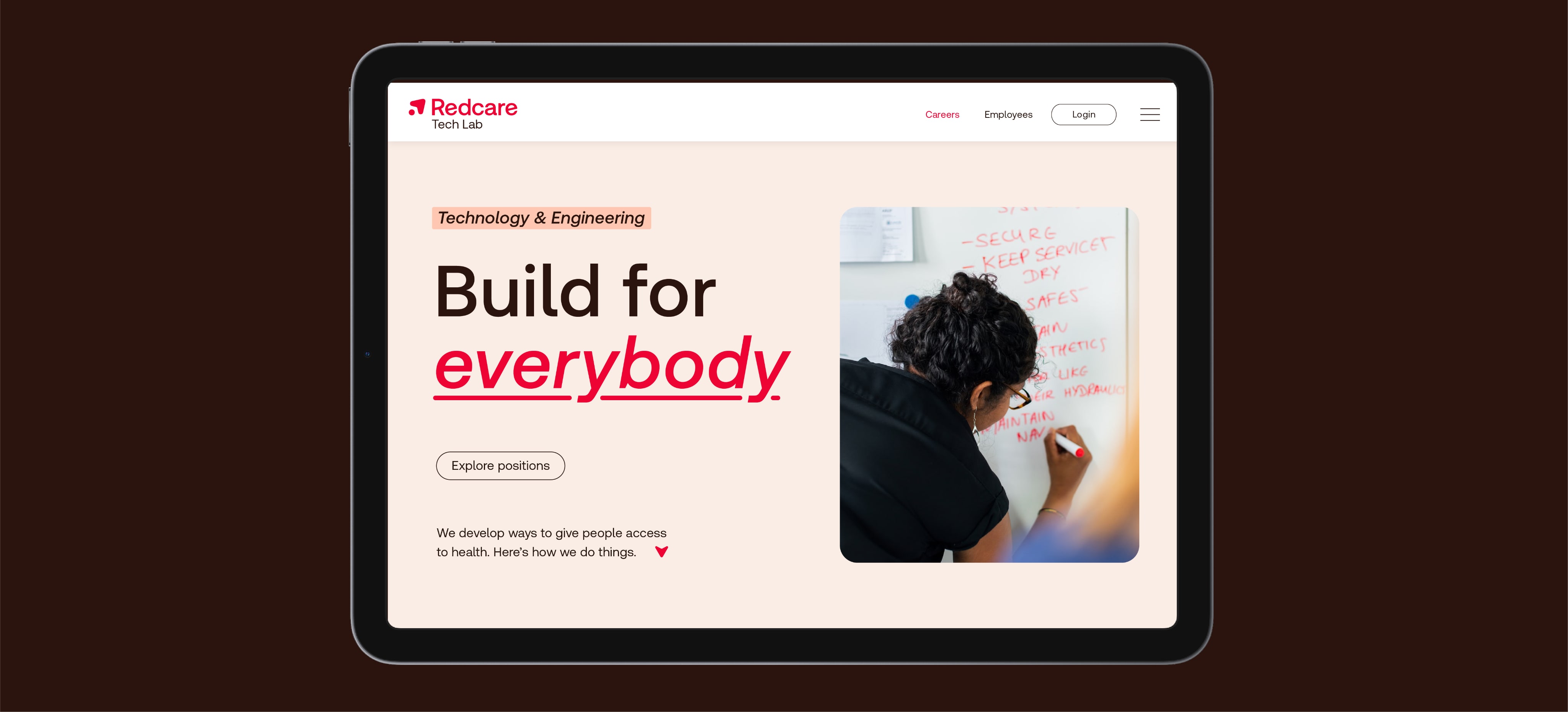
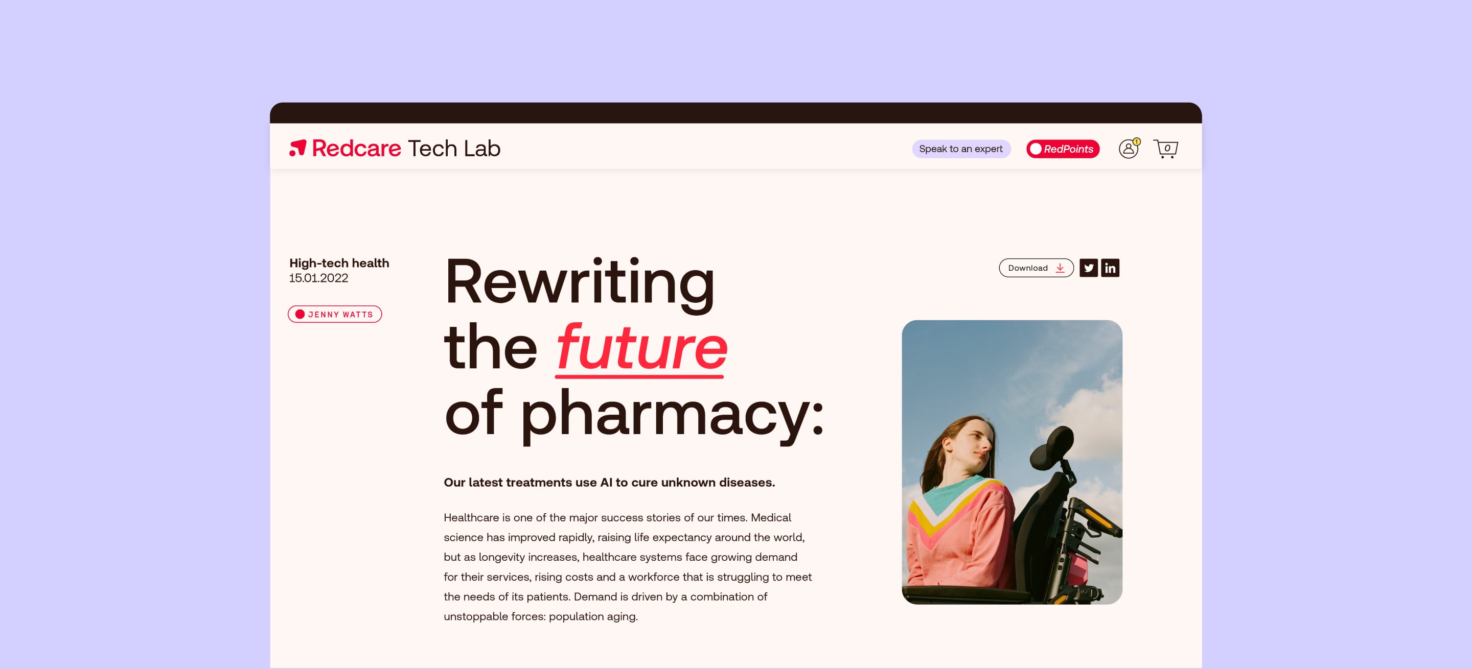
Core brand dominant
examples
Brand units or extensions such as the Redcare Tech Lab can be linked to the core brand to leverage the brand equity. Use the following examples for guidance on how to incorporate brand extensions with the core brand.

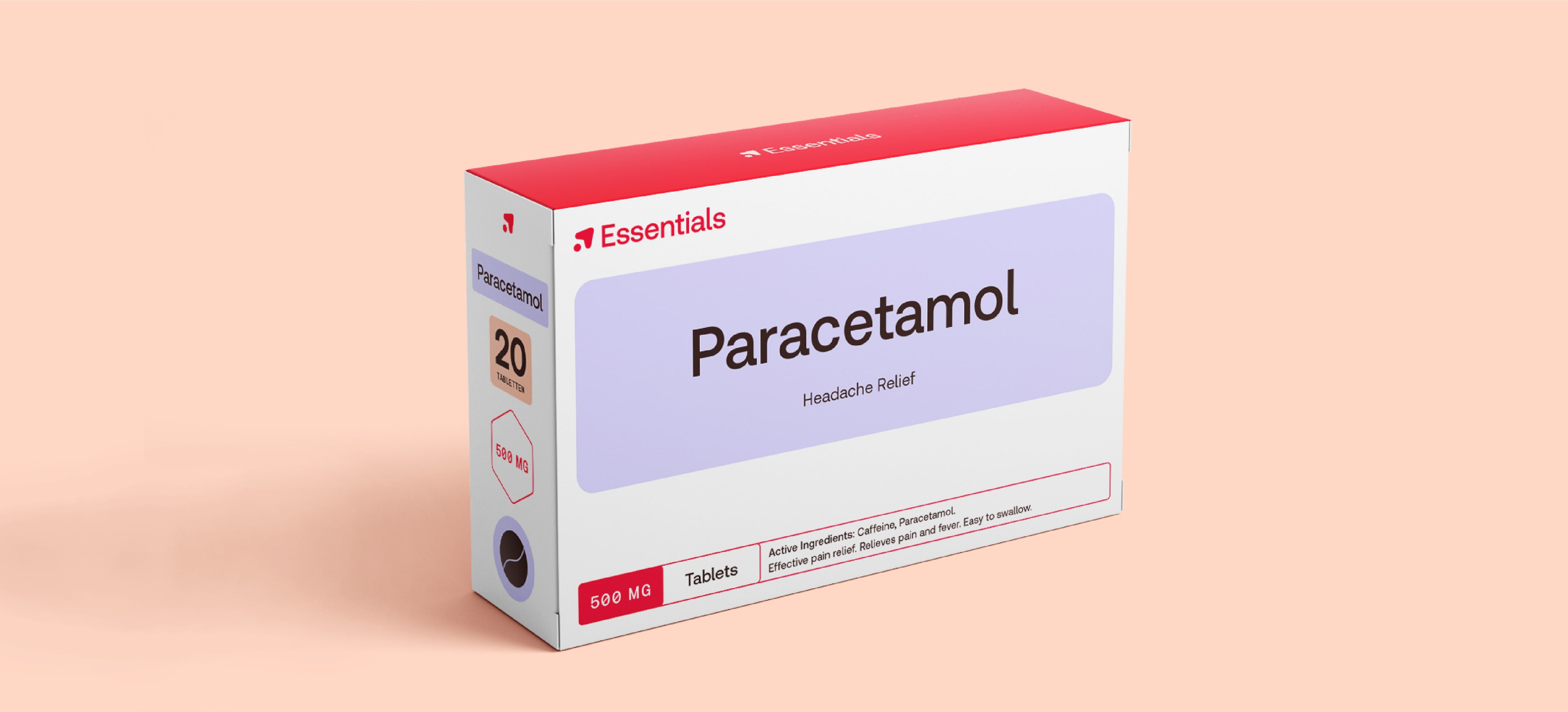
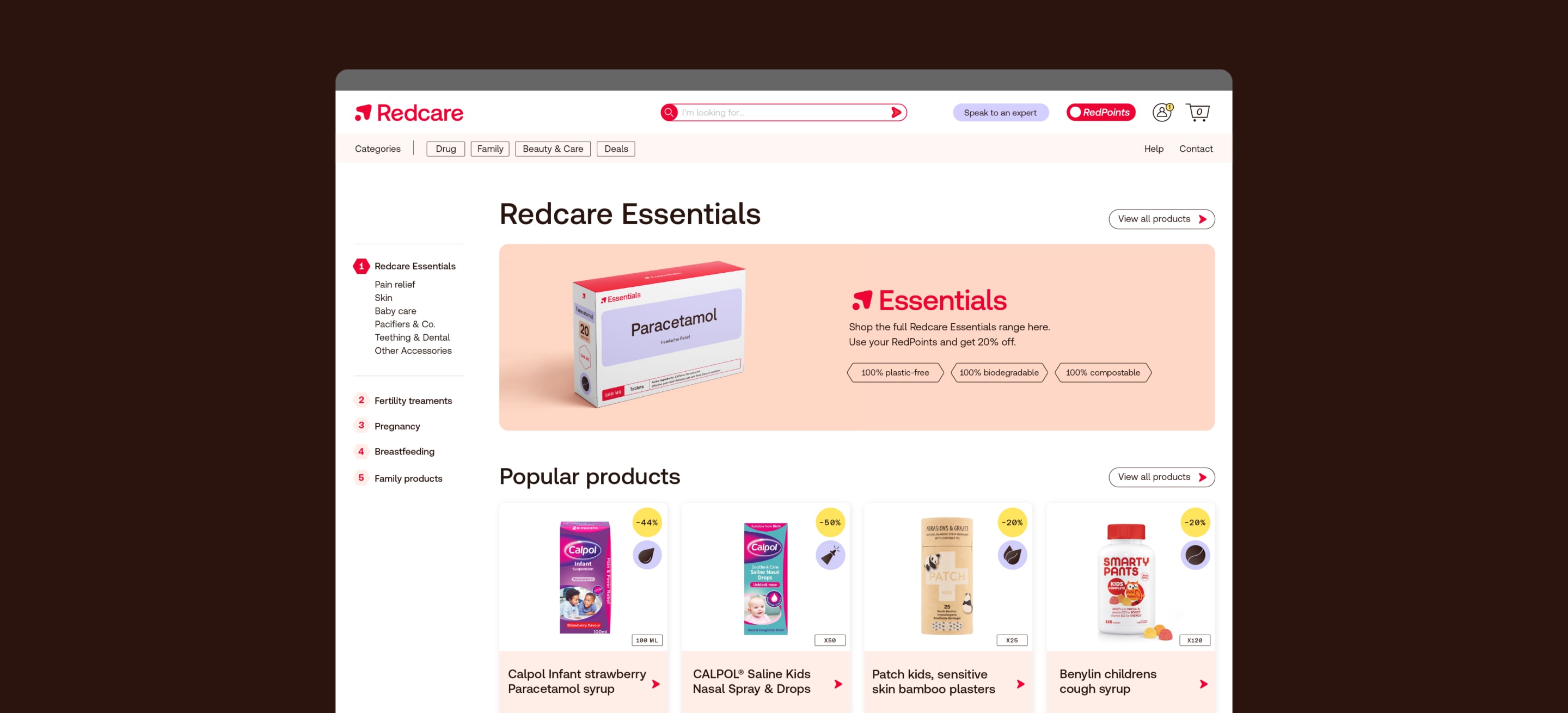
Core brand dominant
examples
The Redcare wordmark can be replaced with a new title for our own brand product line, e.g. Essentials, empowering consumers and building brand loyalty.


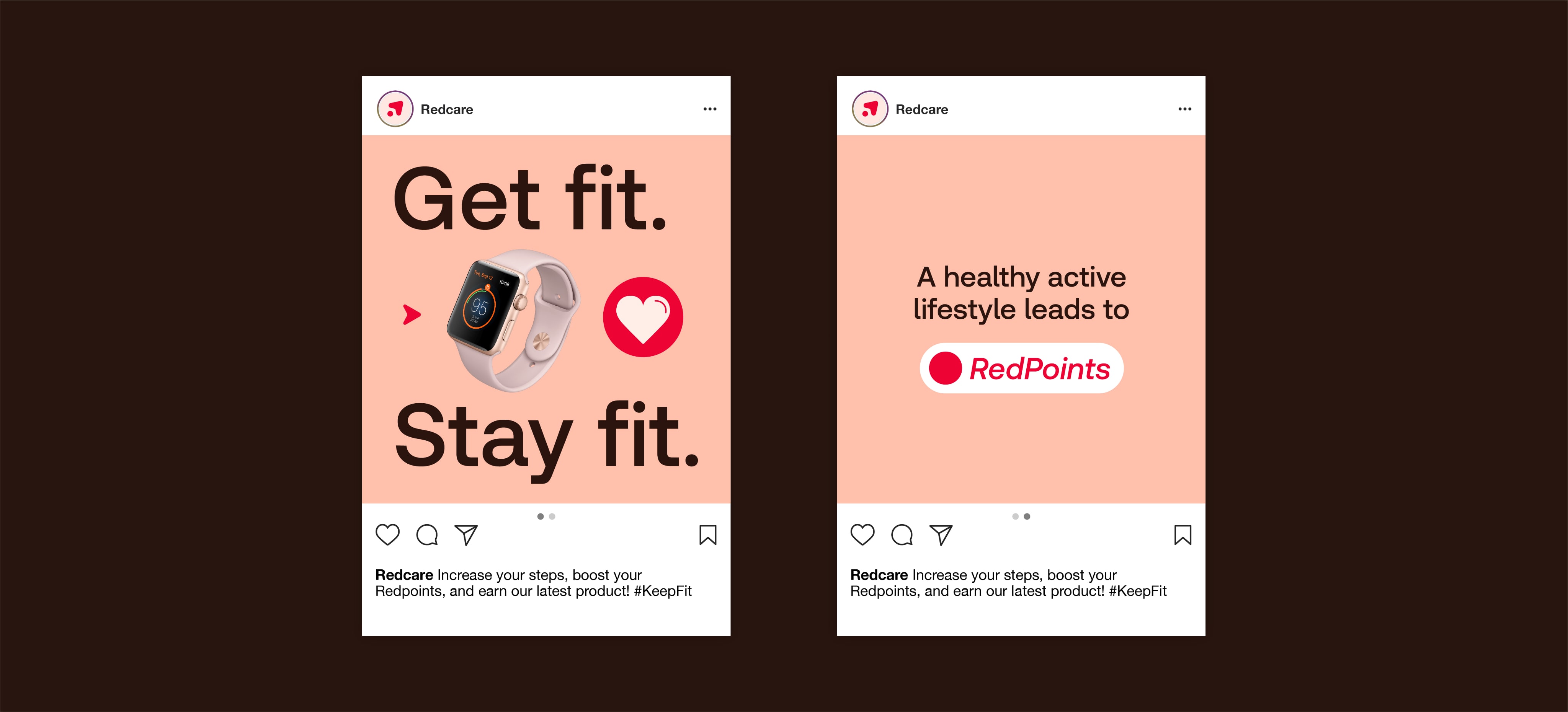
Sub brand dominant
examples
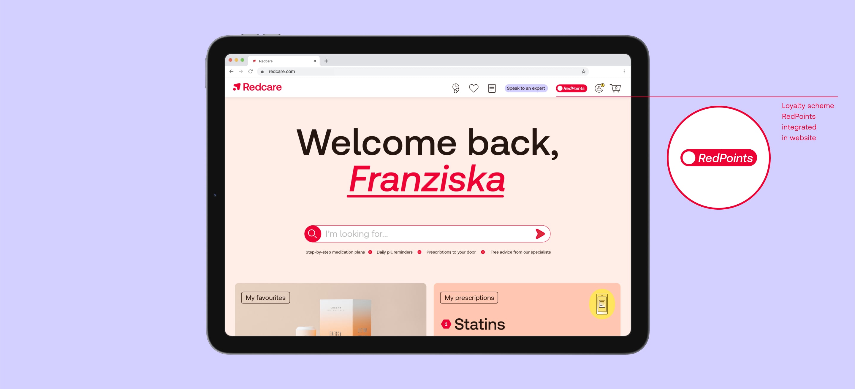
Our loyalty scheme, RedPoints, ties back to the parent brand’s qualities, values, and message. But it also has its unique qualities while shown within a Redcare branded environment.

Sub brand dominant
examples
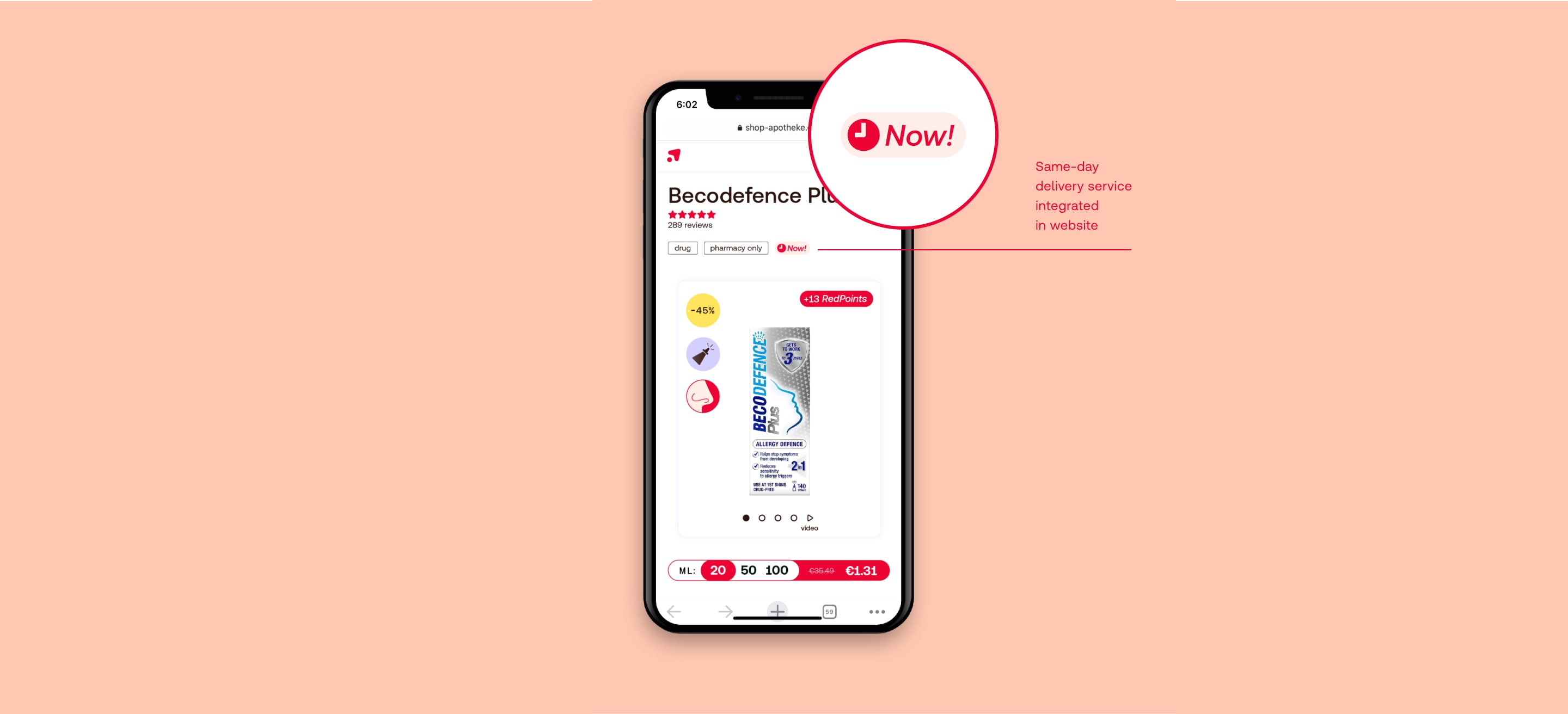
Our same-day delivery service Now!, ties back to the core brand’s qualities, values, and message. But it also has its unique qualities while shown within a Redcare branded environment.

Sub brand dominant
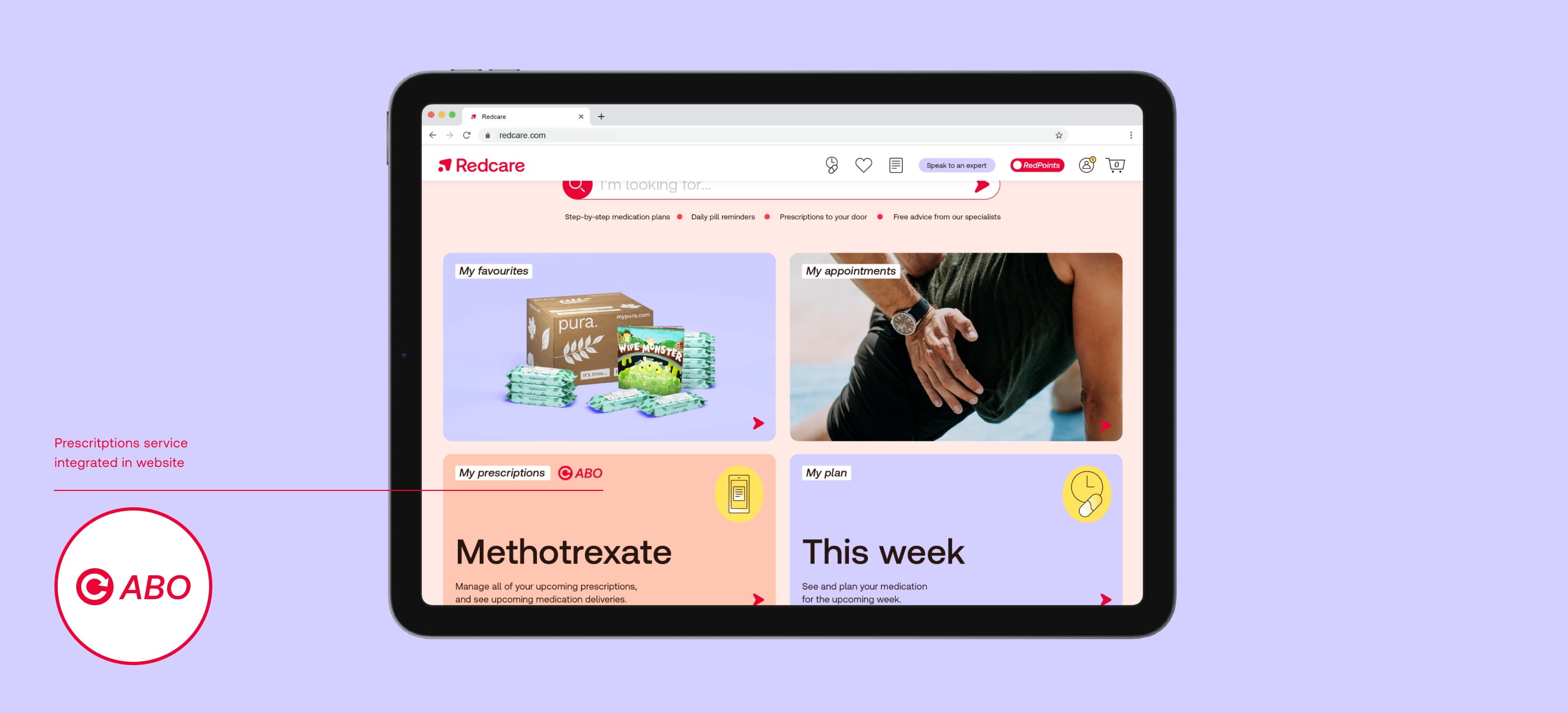
examples
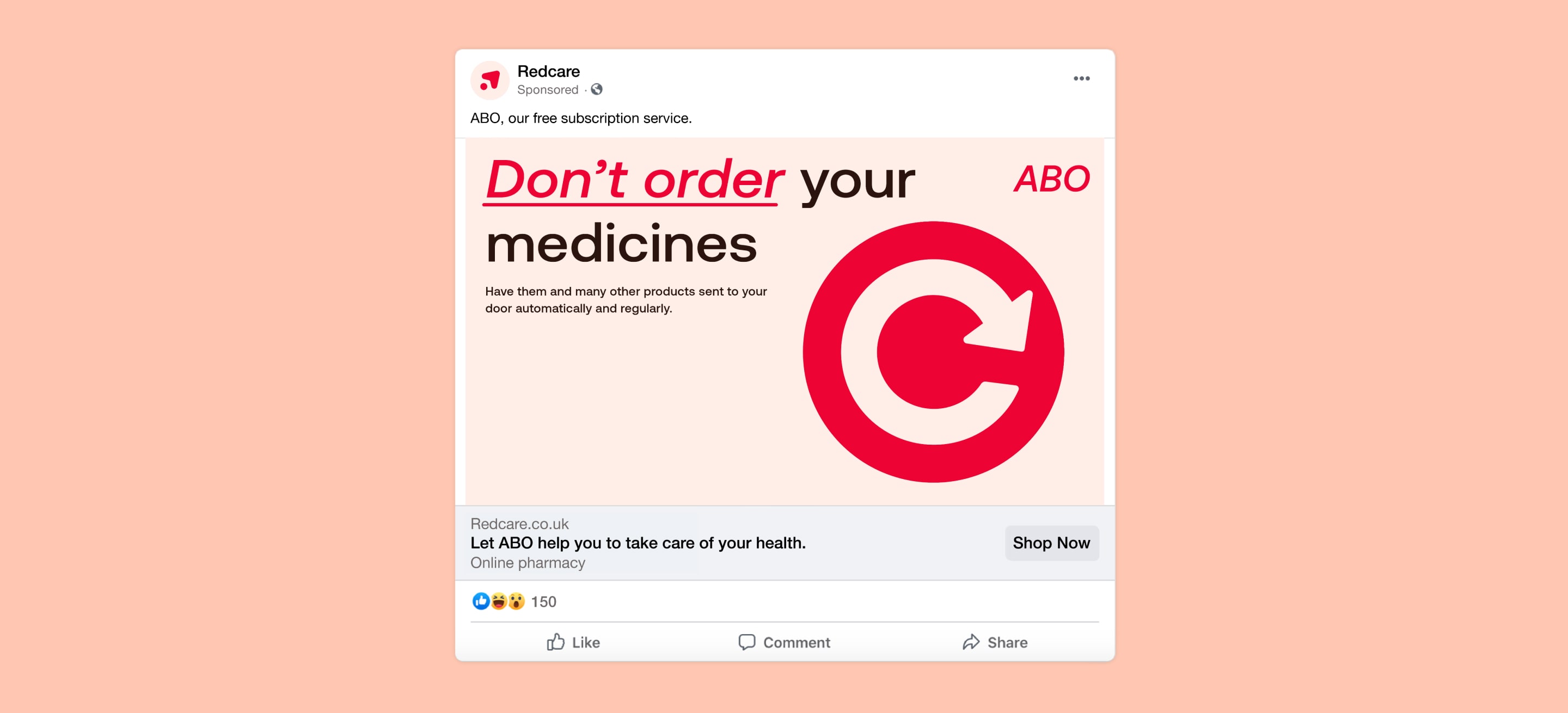
Our prescriptions service ABO, ties back to the core brand’s qualities, values, and message. But it also has its unique qualities while shown within a Redcare branded environment.


Endorsed brand
examples
This framework gives you the freedom to have independent strategies for your brand extensions or products, but to also use the equity of the core brand when it’s convenient.

Endorsed brand
examples
The new brand or product is linked to the positive equity from the parent brand. Use the following examples for visual guidance on how to incorporate the Redcare logo with the new brand.

Endorsed brand
examples
The new brand or product is linked to the positive equity from the parent brand. Use the following examples for visual guidance on how to incorporate the Redcare logo with the new brand.

Brand architecture misuse
Things to avoid

Don’t change the proportions

Don’t change the layout of the logo lockups

Don’t reverse the colour hierarchy when they appear in our logos

Don’t change the colour of our logos that aren’t specified in the guidelines

Don’t use in any colourways that aren’t specified in the guidelines

Don’t change the arrangement of the logos

Don’t crop the symbols

Don’t outline any part of the logo