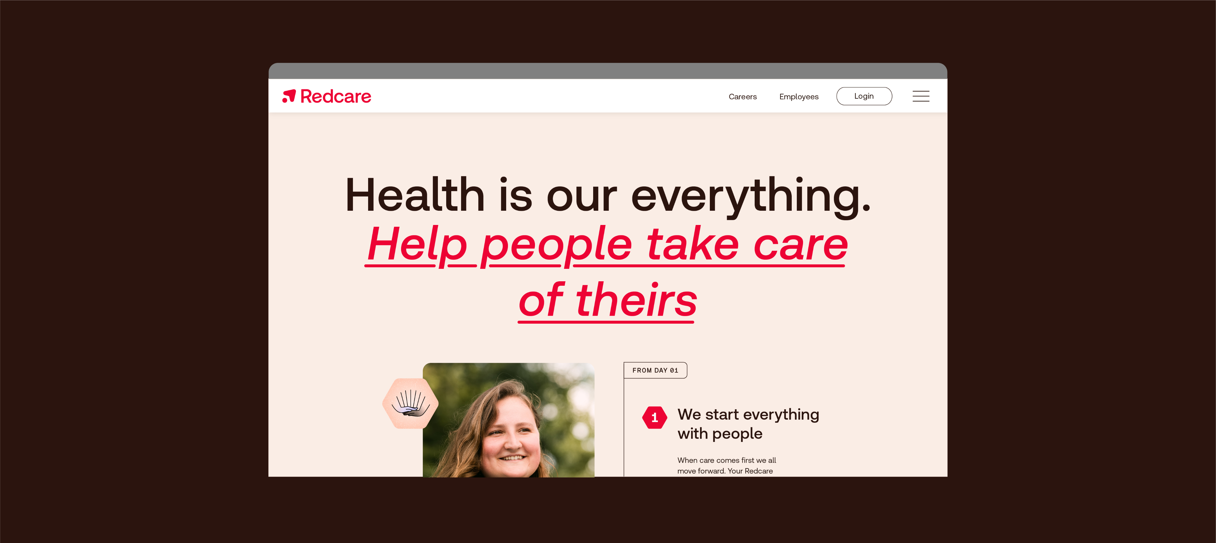
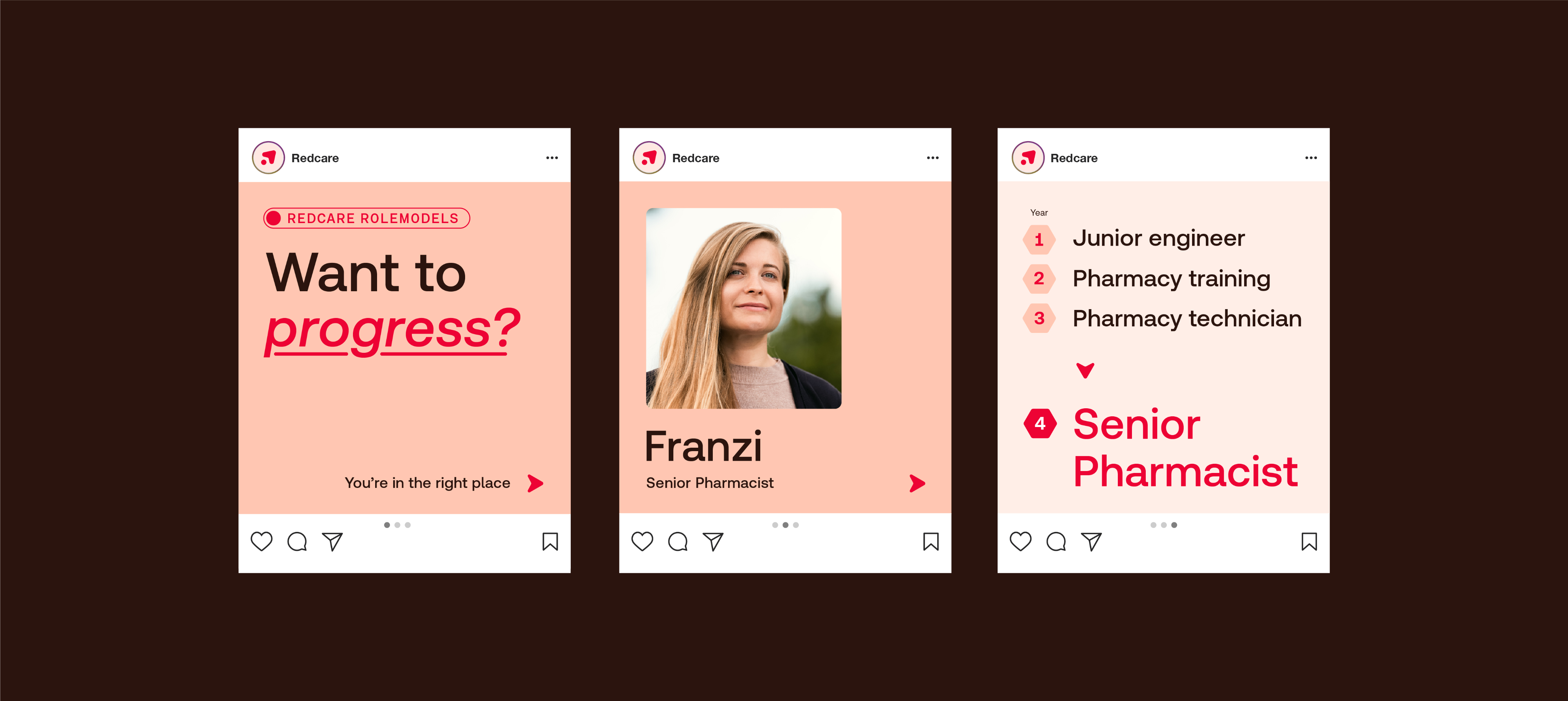
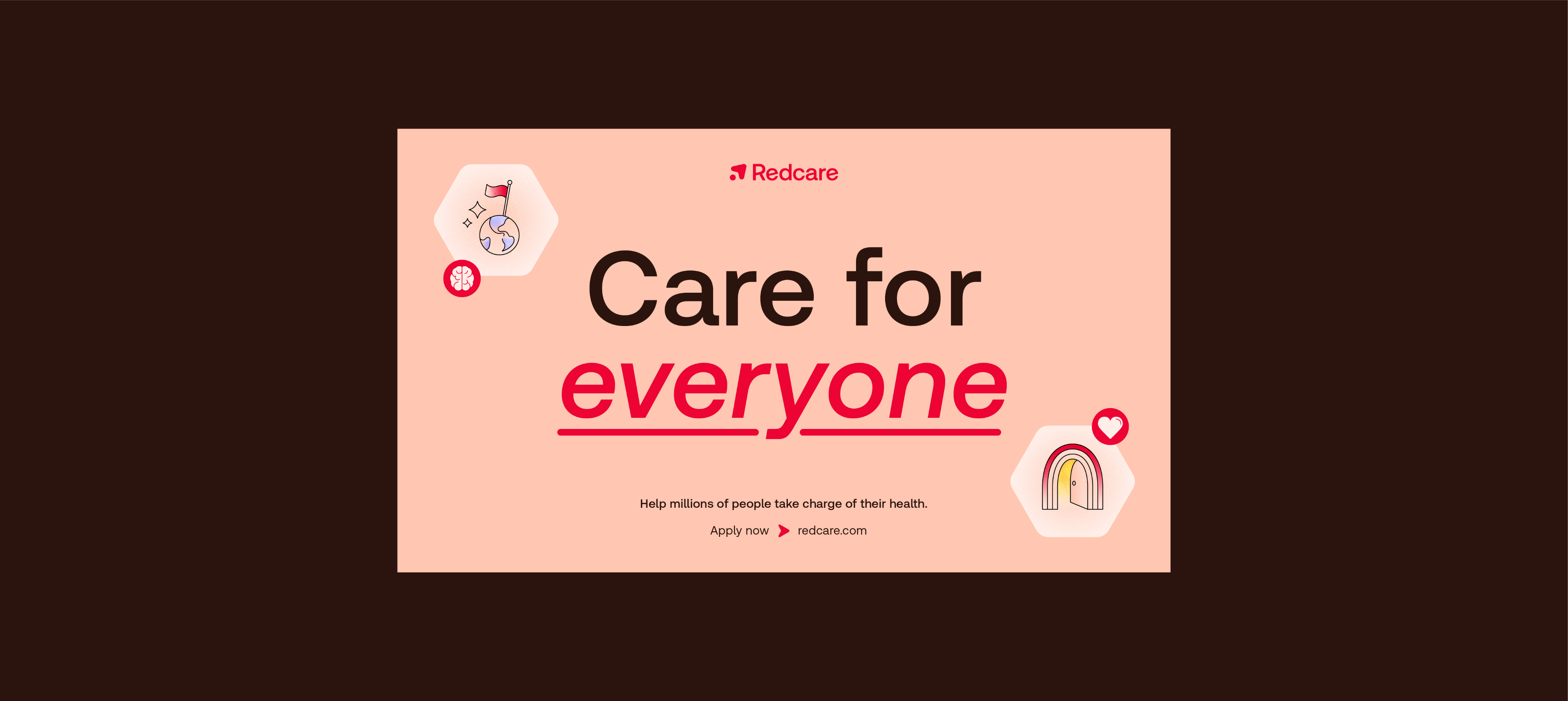
For Employees
We use the same palette for our Employer Brand, but to differentiate from the Customer Brand we change the emphasis, dialing up the Red tones to create a warm and approachable Redcare home.
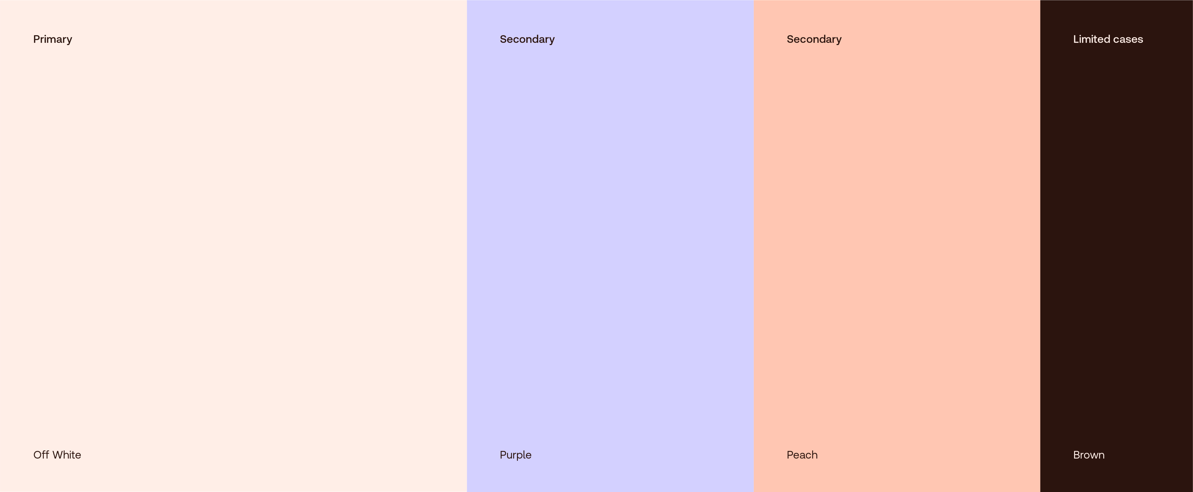
A palette for the pharmacy of the future. Optimistic, warm and human with bright accents that differentiate from the crowd.

These colours can be used for backgrounds. Primarily, use Off White for top-level brand comms, or Purple and Peach to dial up the warmth.
Use Brown backgrounds in limited cases (e.g. internal presentations).
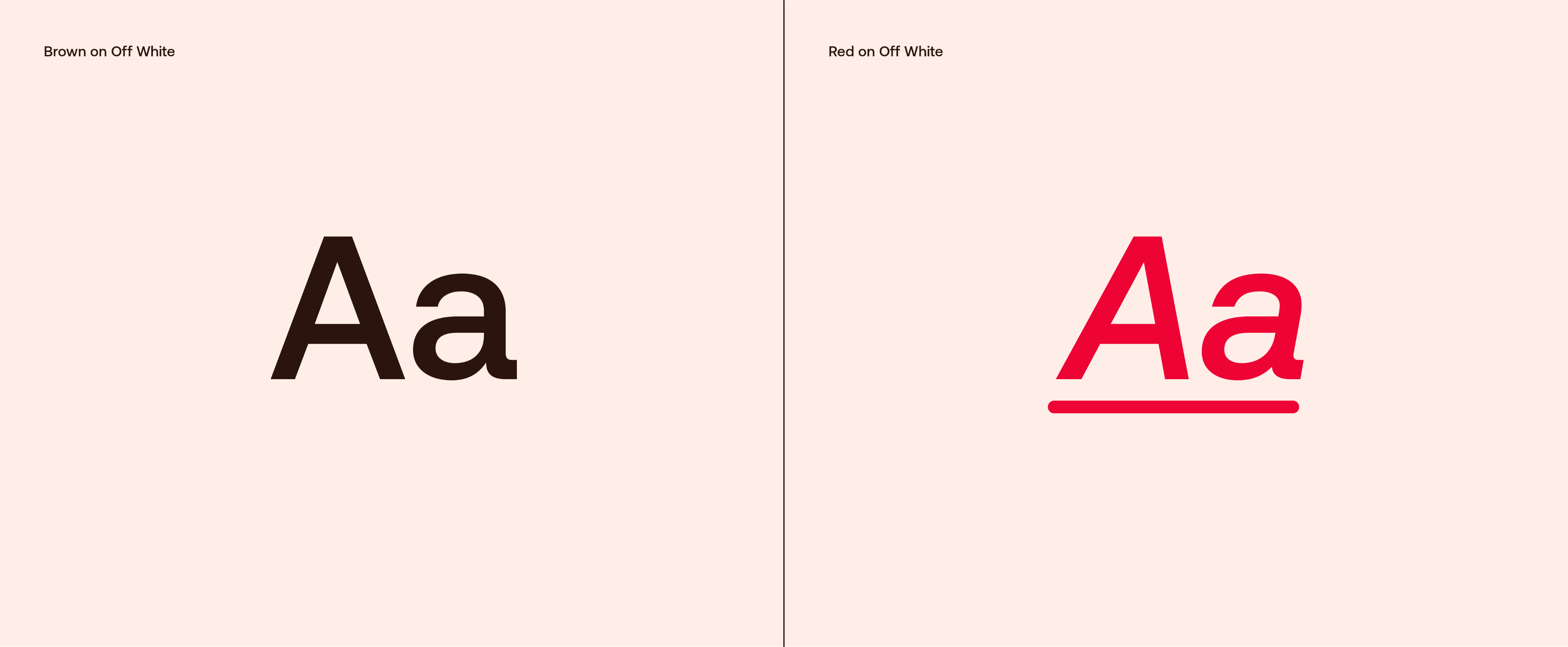
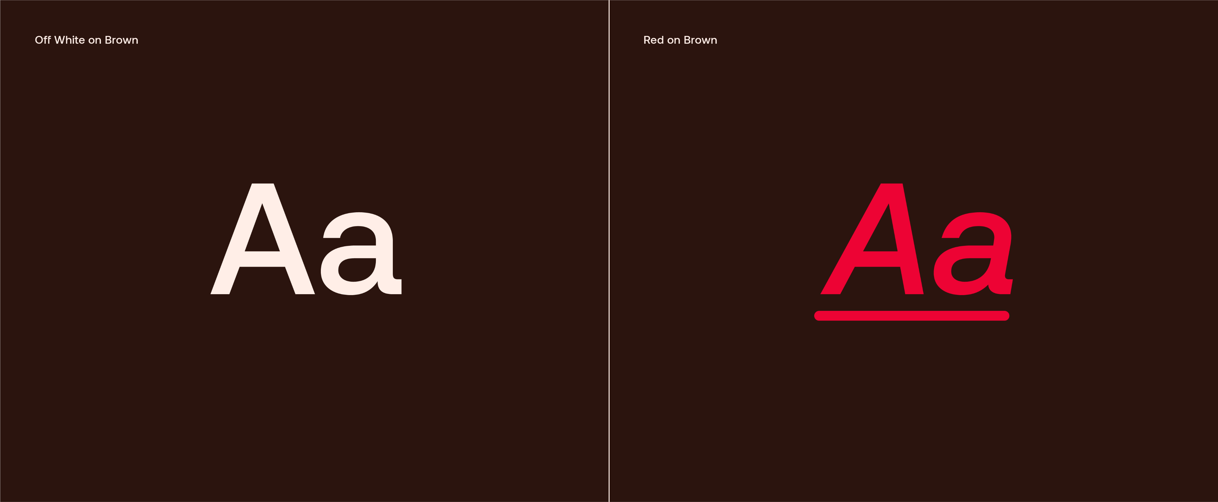
Type is primarily used in Brown, or red for highlights. Use the following colour combinations for typography.
Note: Remember to always use Brown rather than default black as this adds a touch of warmth to our type.
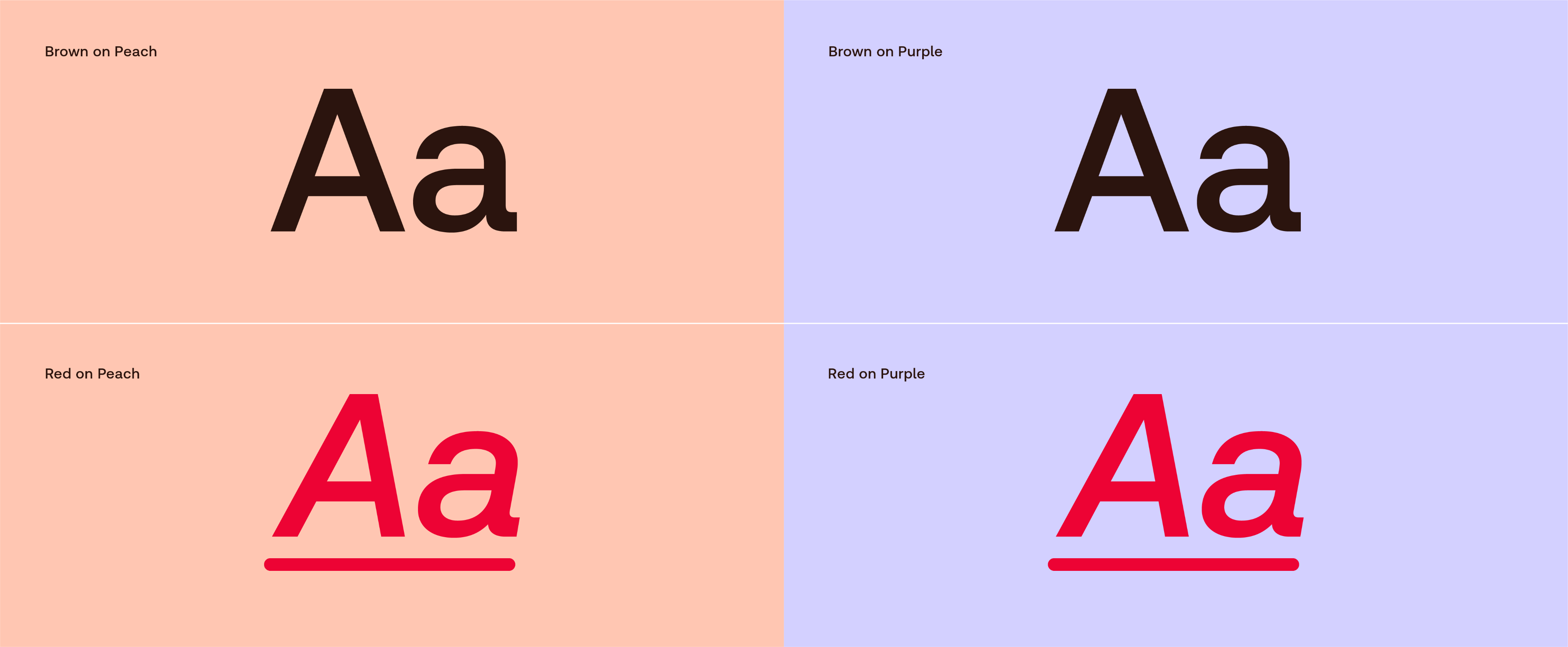
Type is primarily used in Brown, or red for highlights. Use the following colour combinations for typography.
Note: Remember to always use Brown rather than default black as this adds a touch of warmth to our type.
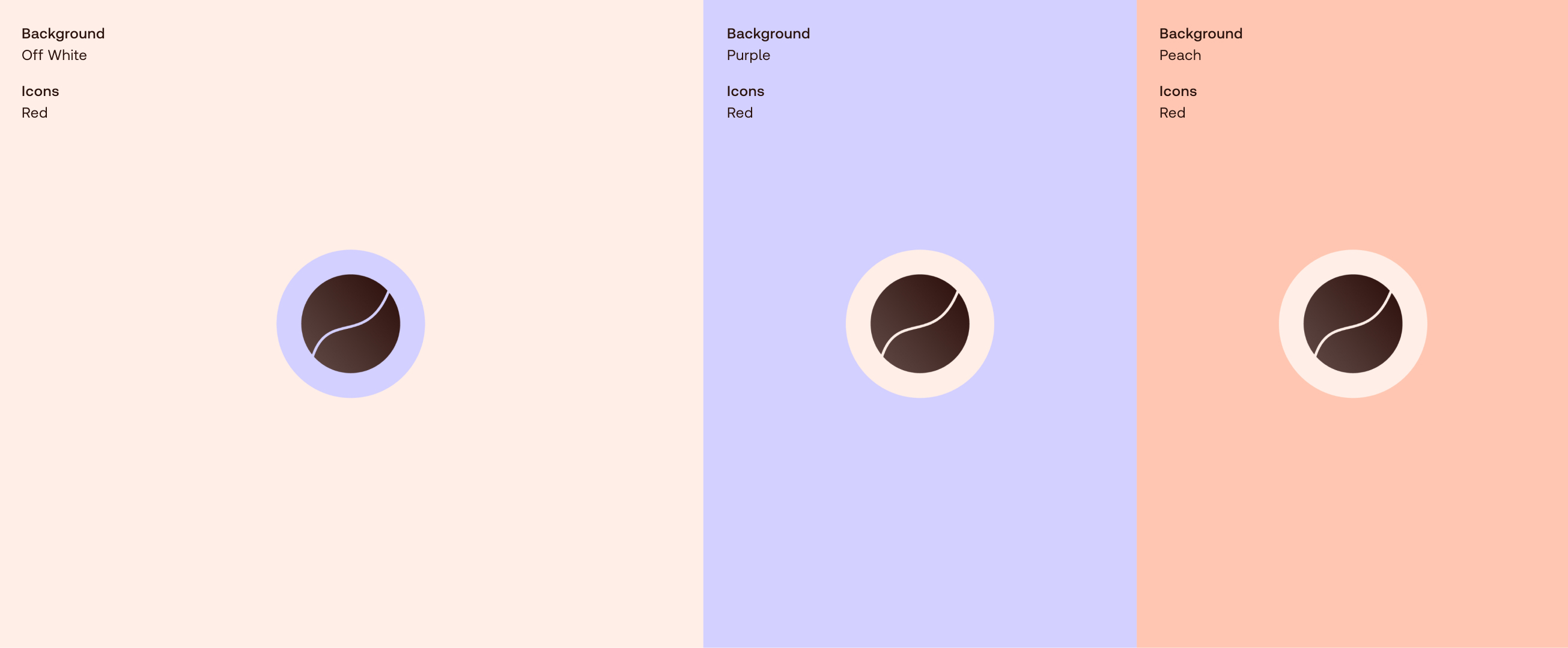
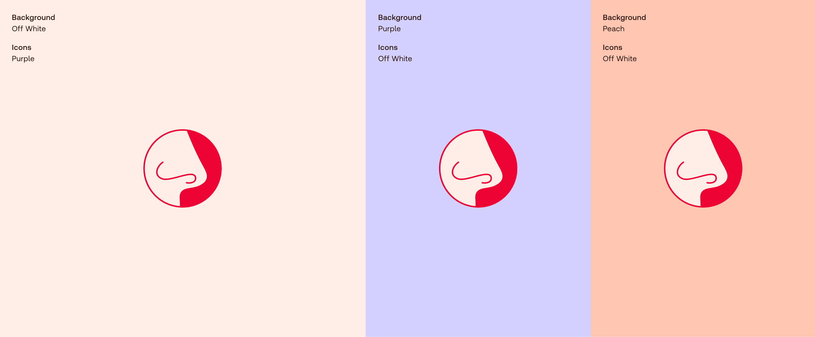
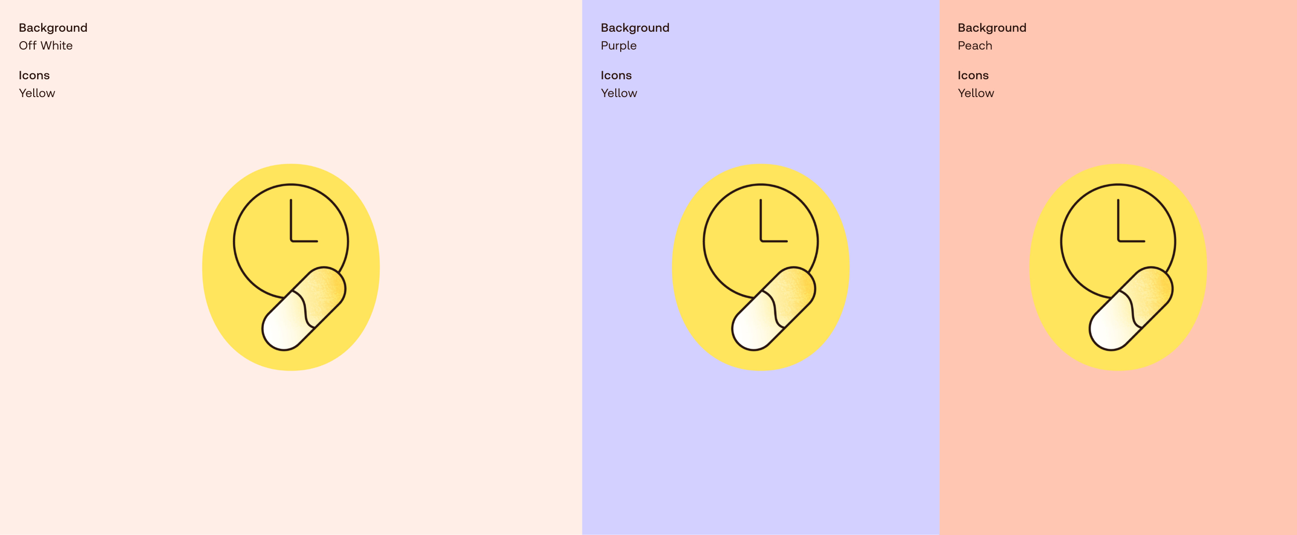
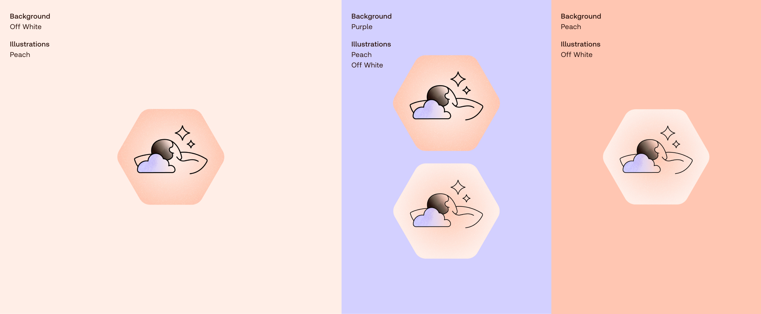
Use these colour combinations for icons and illustrations. The following flexibility ensures they always stand out against our different background colours.
Use these colour combinations for icons and illustrations. The following flexibility ensures they always stand out against our different background colours.
Use the following colour combinations for our numeric tabs. They often appear alongside our action icons, so in order to differentiate we never use them in yellow.
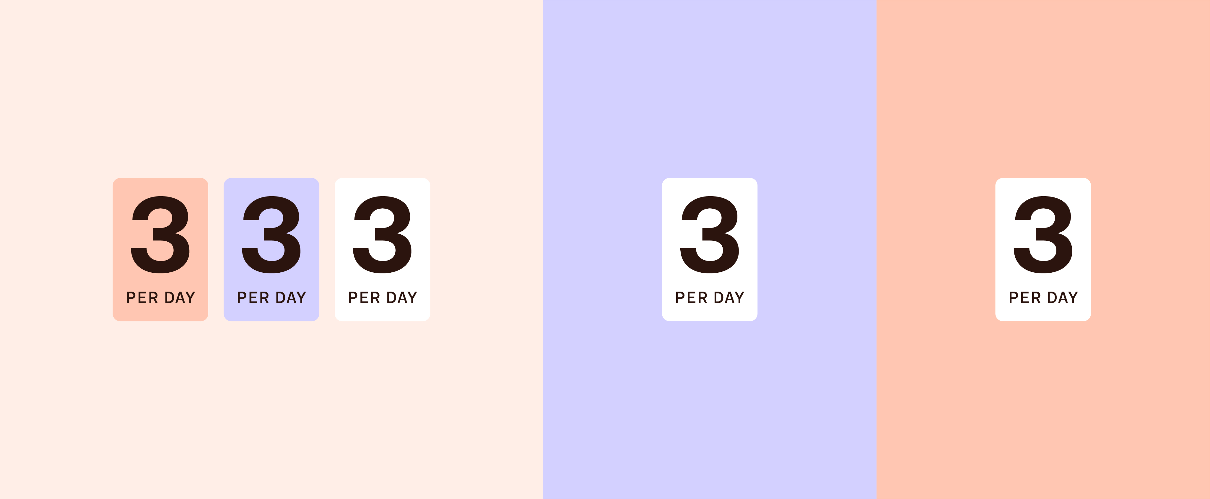
Use the following colour combinations for our numeric tabs. They often appear alongside our action icons, so in order to differentiate we never use them in yellow.
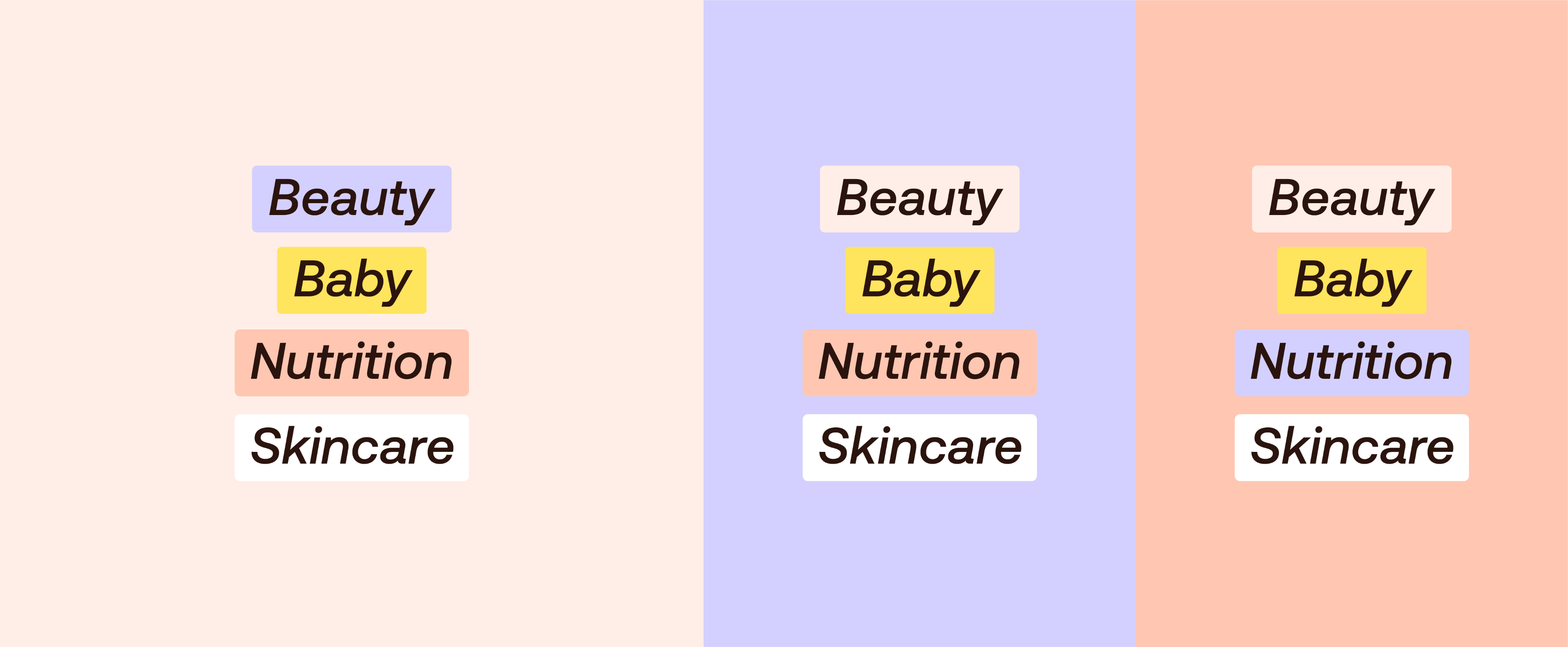
Use these colour combinations for labels. Colours can be used for multiple categories and can flex per application; just ensure no colours are repeated on the same layout.
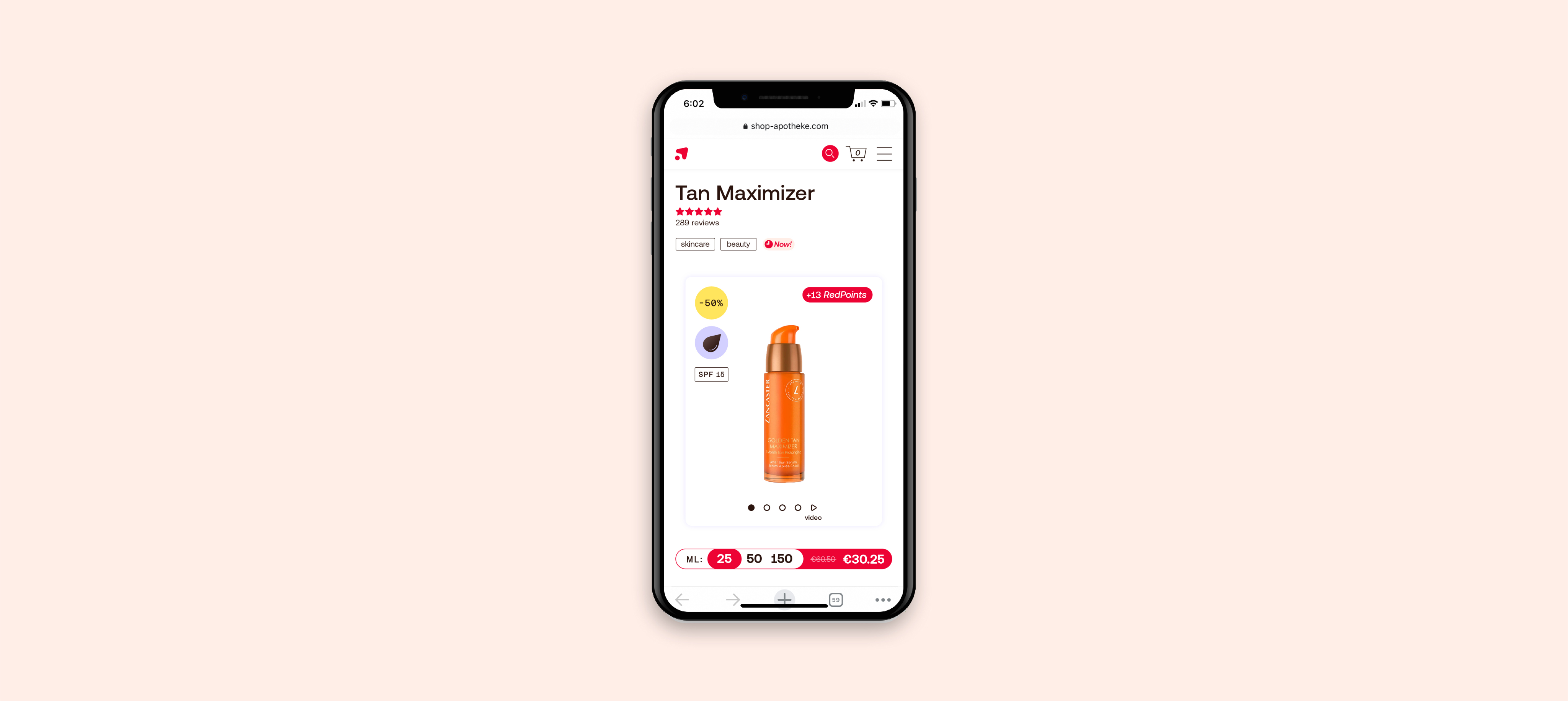
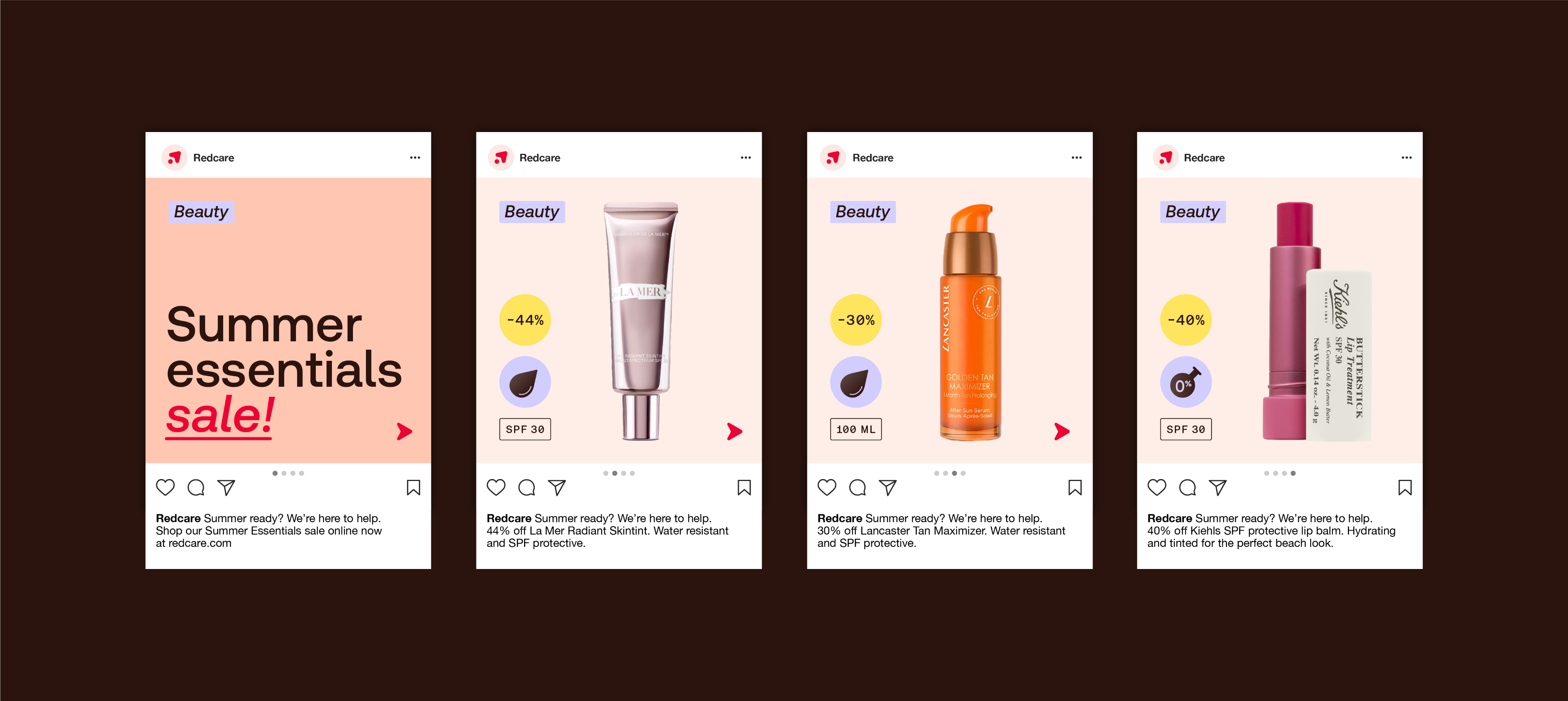
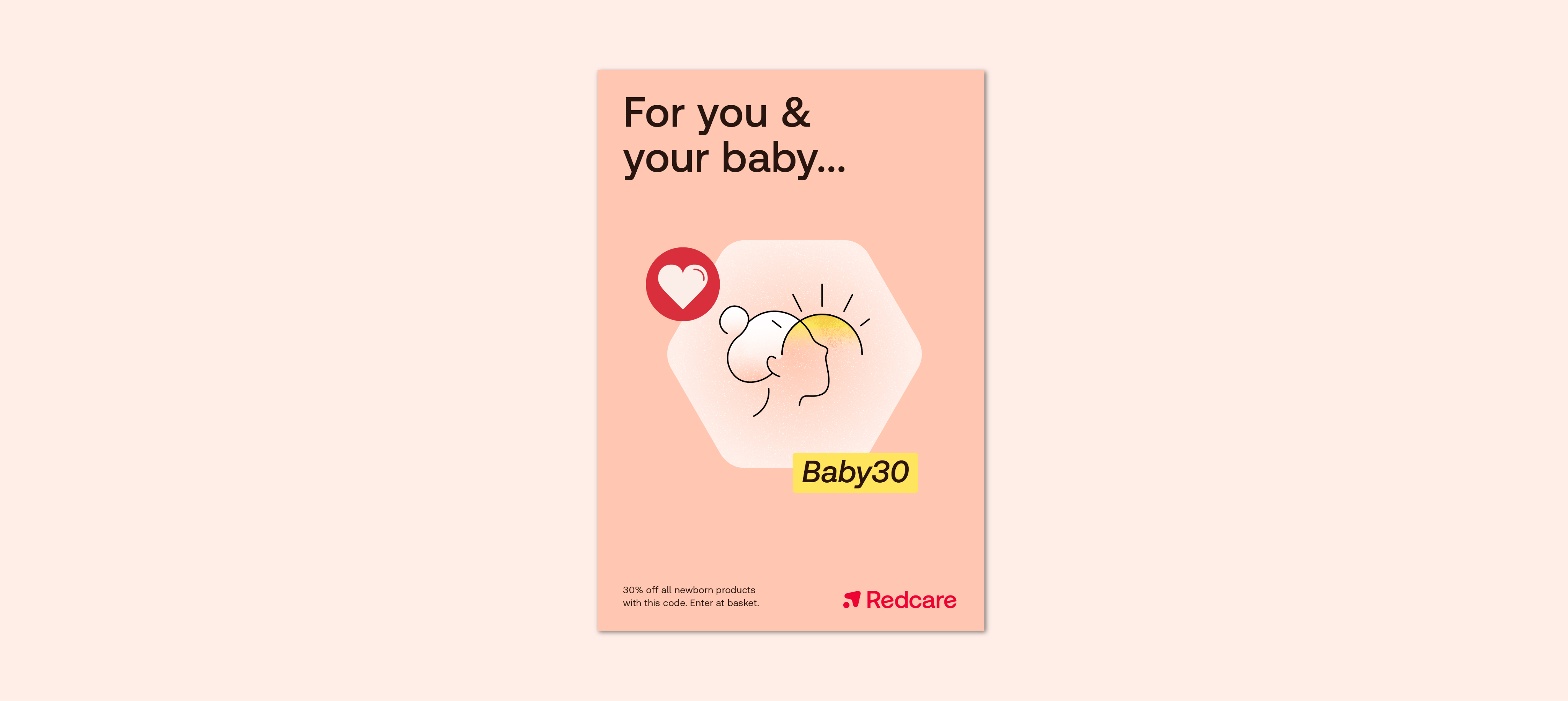
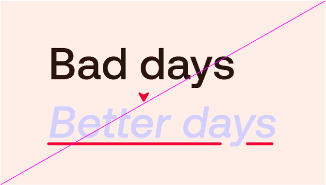
Our colours can be both functional and emotive. Here are examples of how our colour usage can flex.

Things to avoid

Don’t use colour combinations that aren’t indicated in the guidelines

Don’t use Yellow as a background colour

Don’t use Red as a background colour

Don’t use colours outside our brand palette.

Don’t use Red for all the headline, only as a highlight

To ensure legibility, don’t use dark text over dark imagery
Don’t apply multiple colours to typography and headlines

Do not use black and white in layouts
We use the same palette for our Employer Brand, but to differentiate from the Customer Brand we change the emphasis, dialing up the Red tones to create a warm and approachable Redcare home.

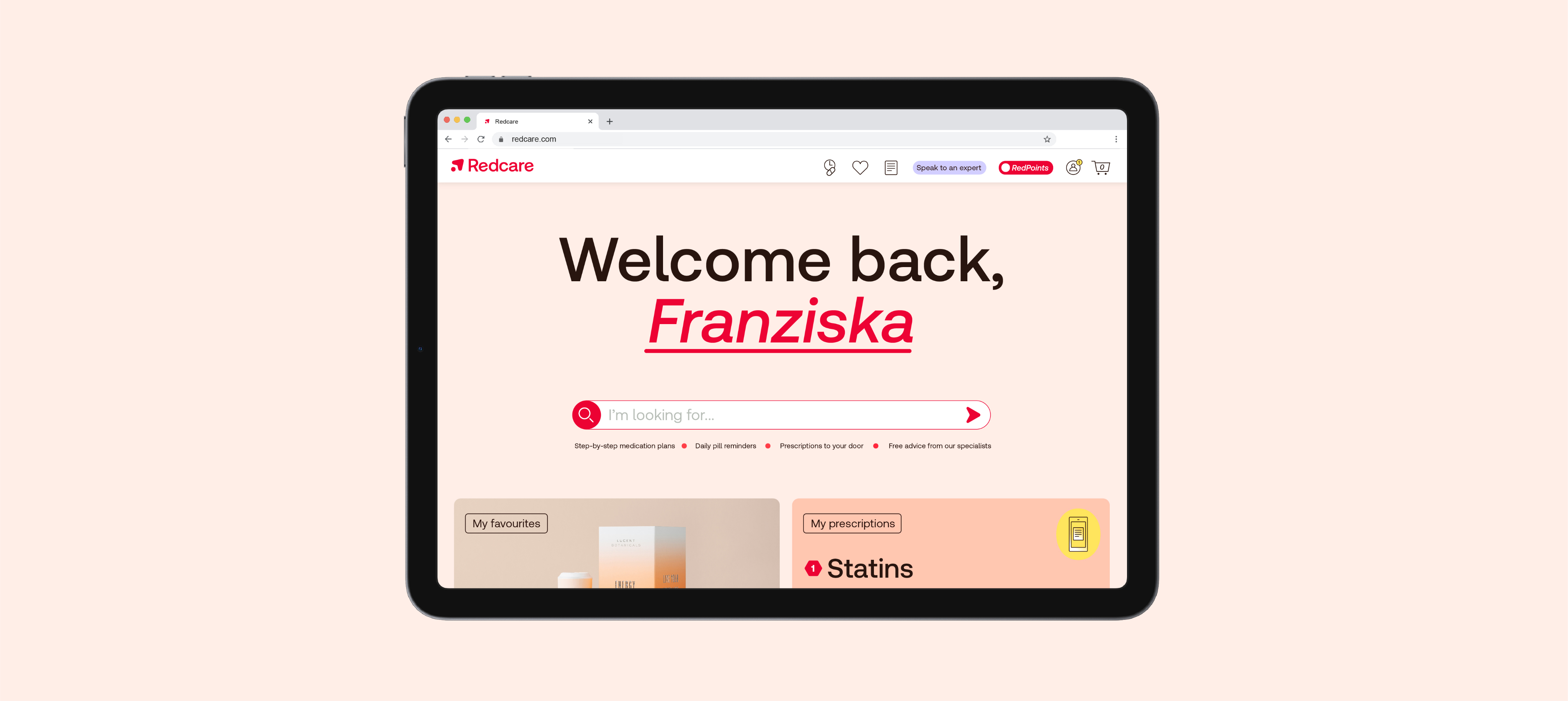
Our colours can be both functional and emotive. Here are some examples of how our colour can play both these roles within our Employee Brand.