How to use icons
Each of our icon sets has a distinct role to play. Use the following guidance to see what each icon is for, and how they can be applied.
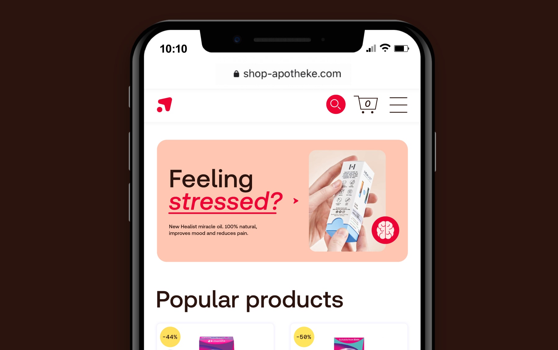
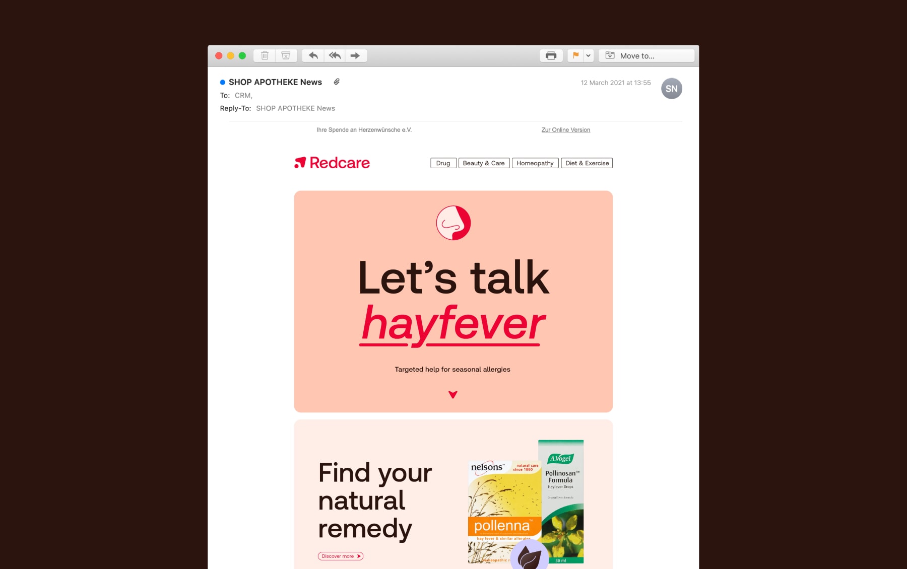
A new universal language for the pharmacy of the future. Our icons are functional and helpful graphic elements that pull out important information across the user journey with Redcare.
Each of our icon sets has a distinct role to play. Use the following guidance to see what each icon is for, and how they can be applied.
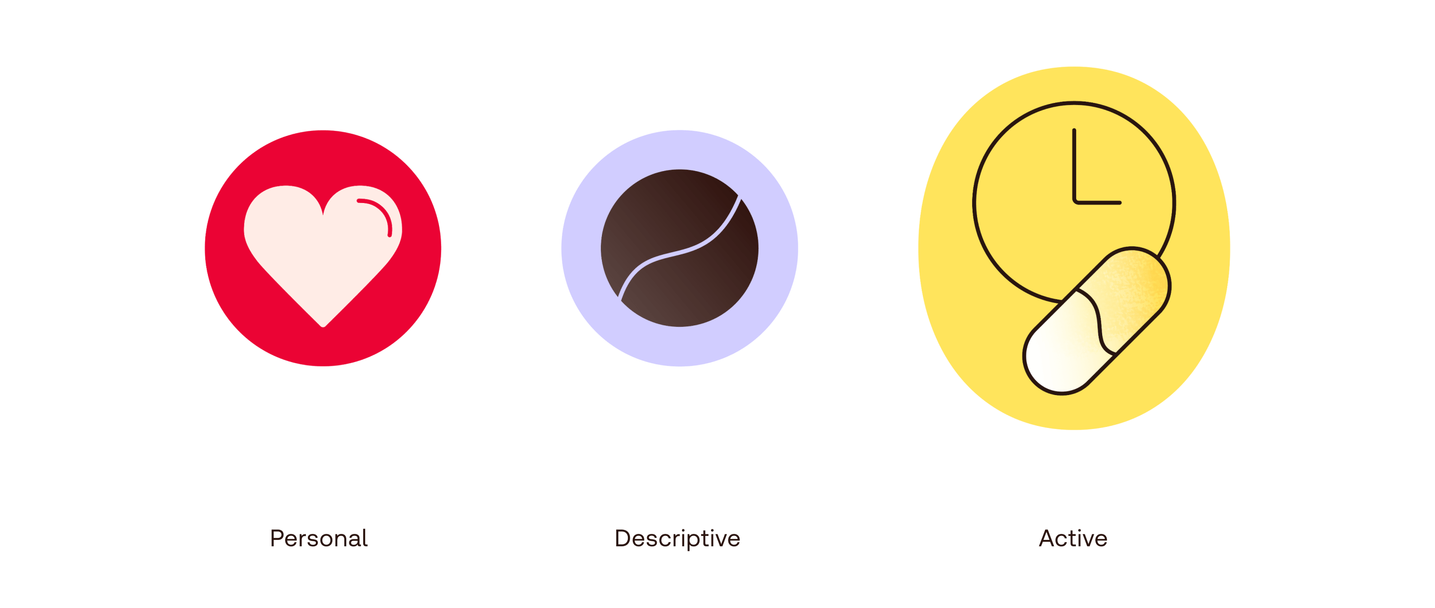
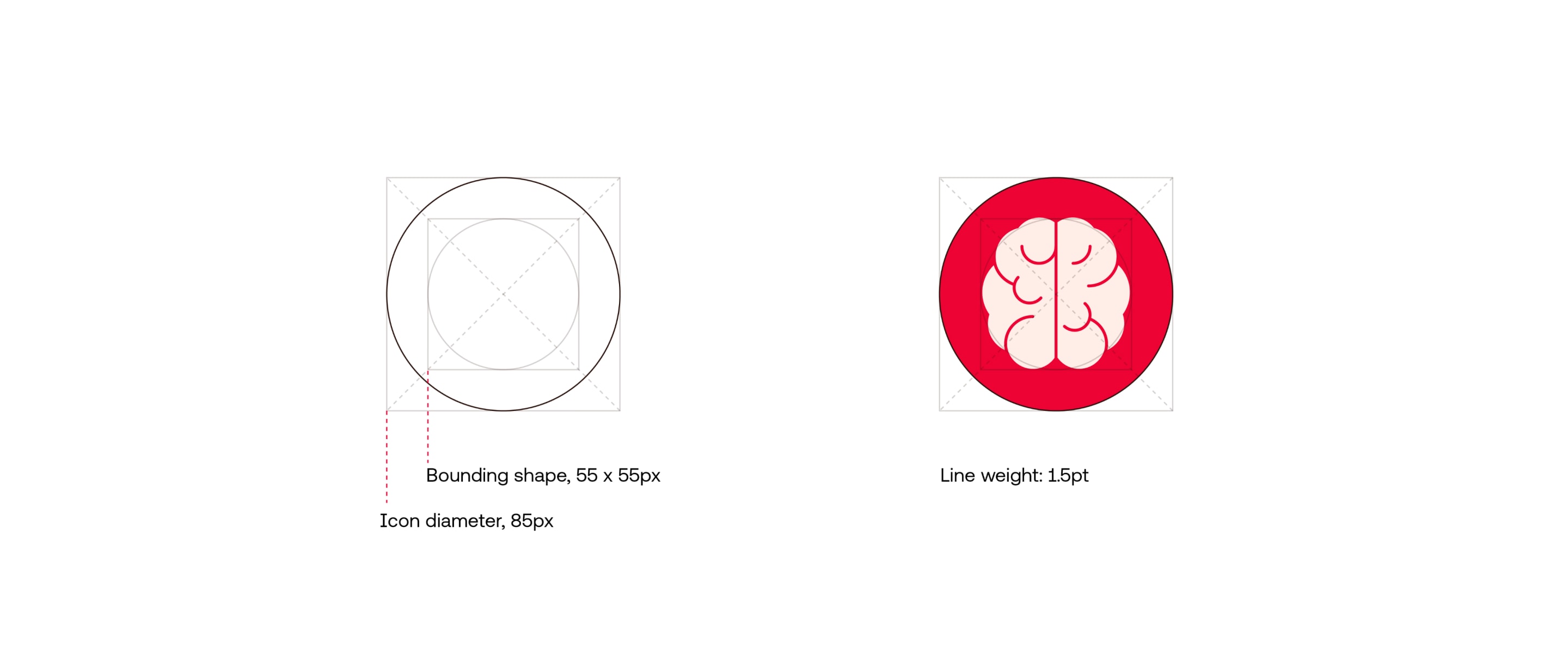
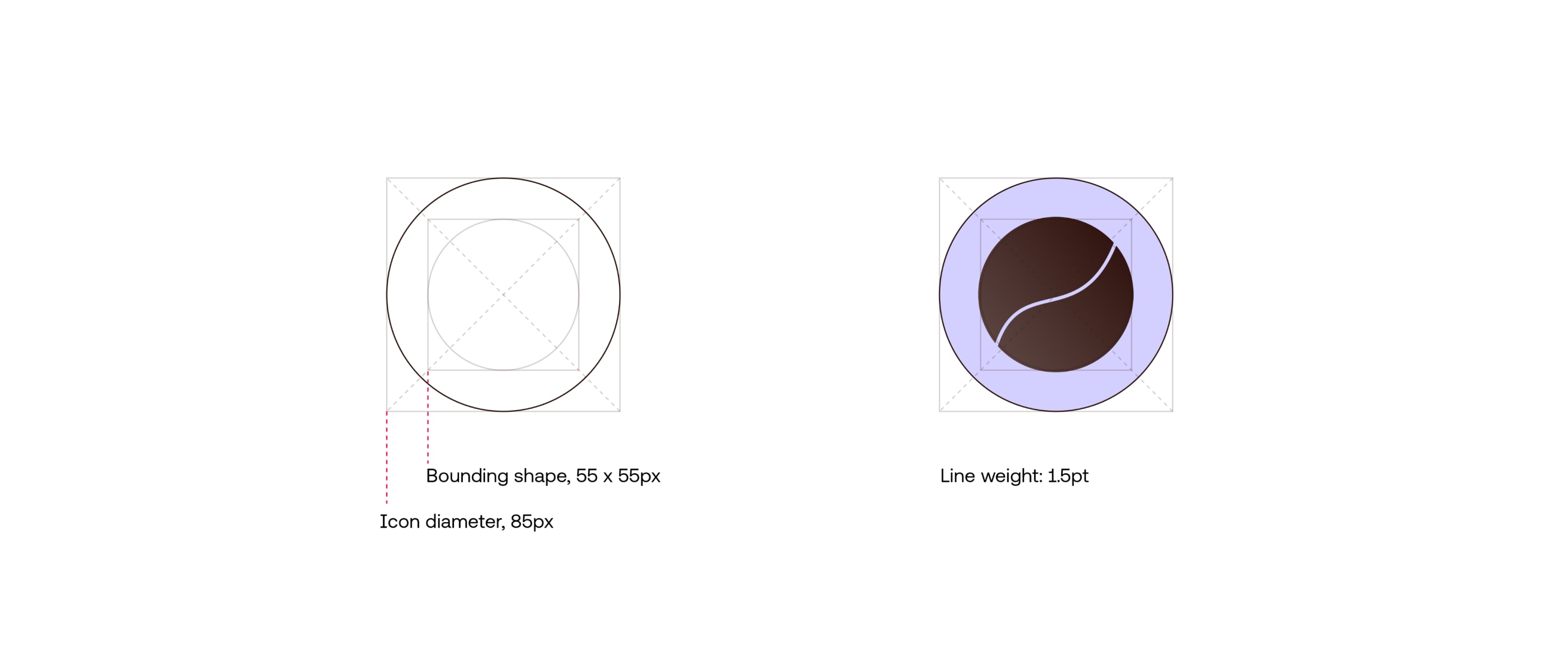
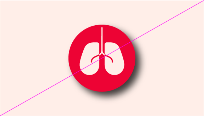
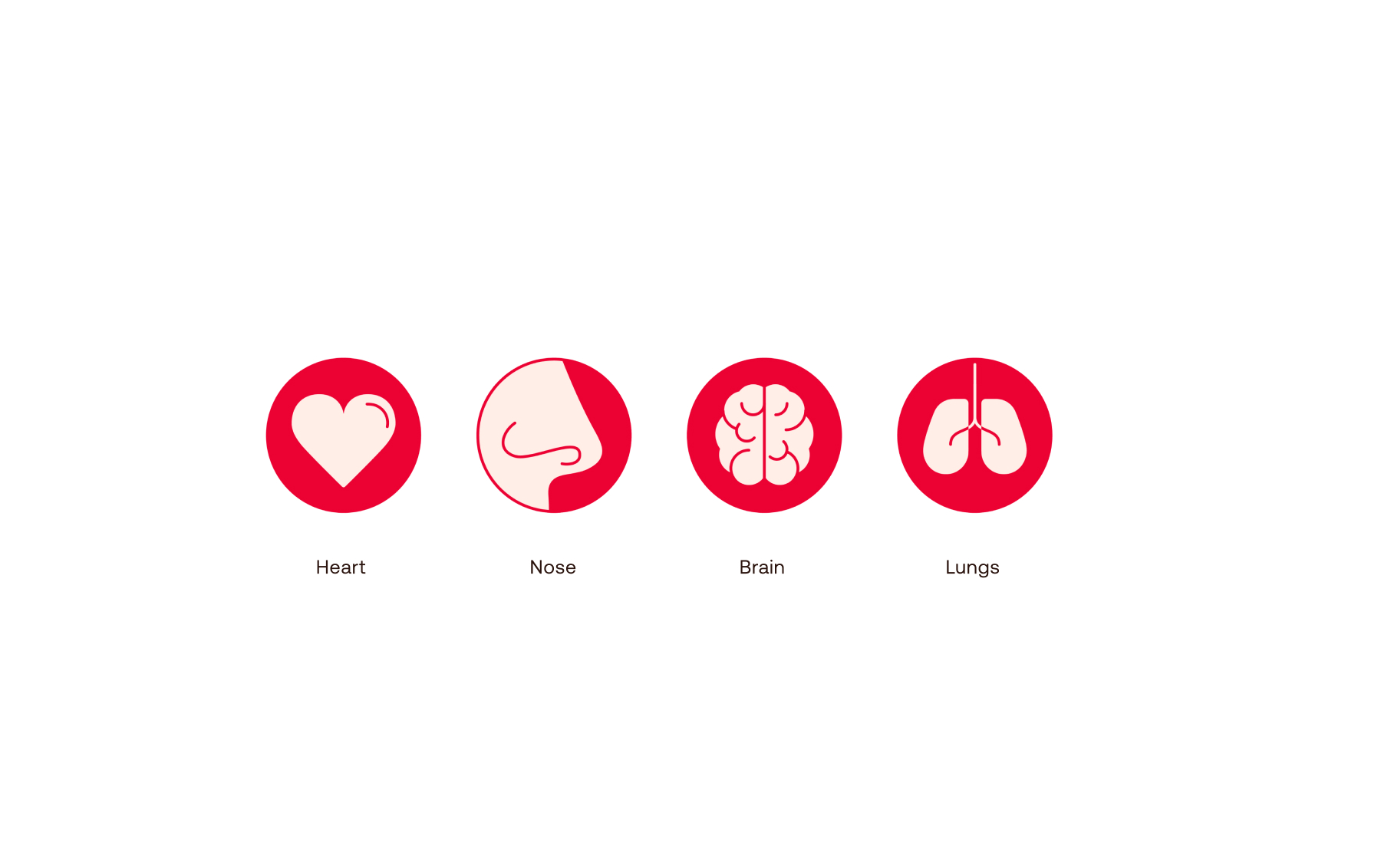
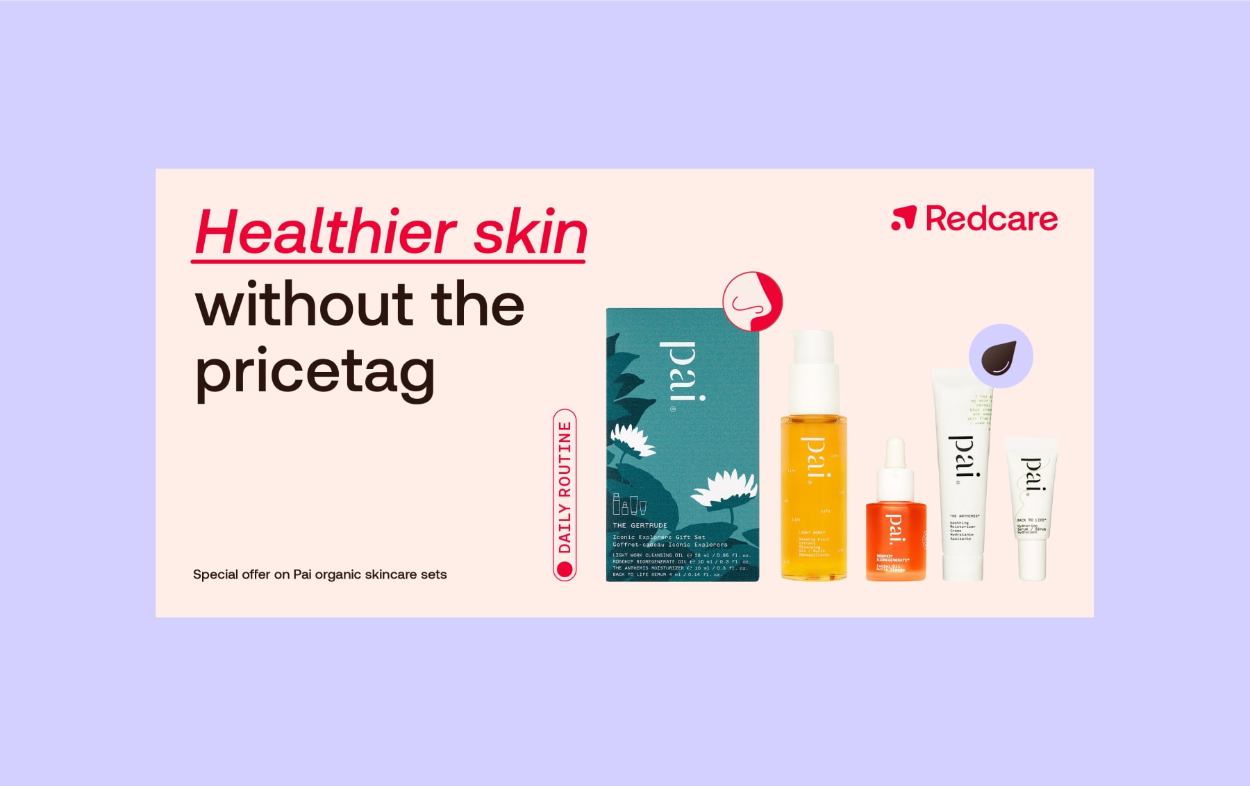
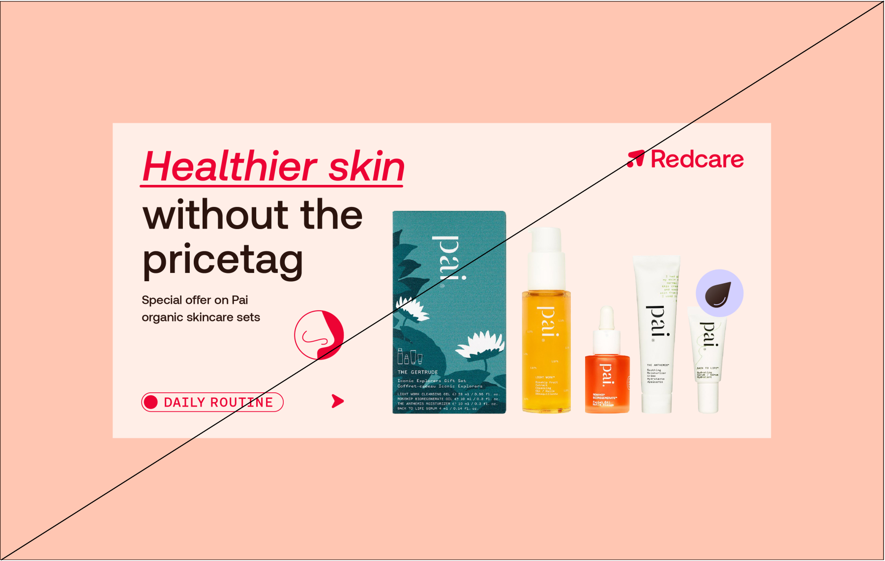
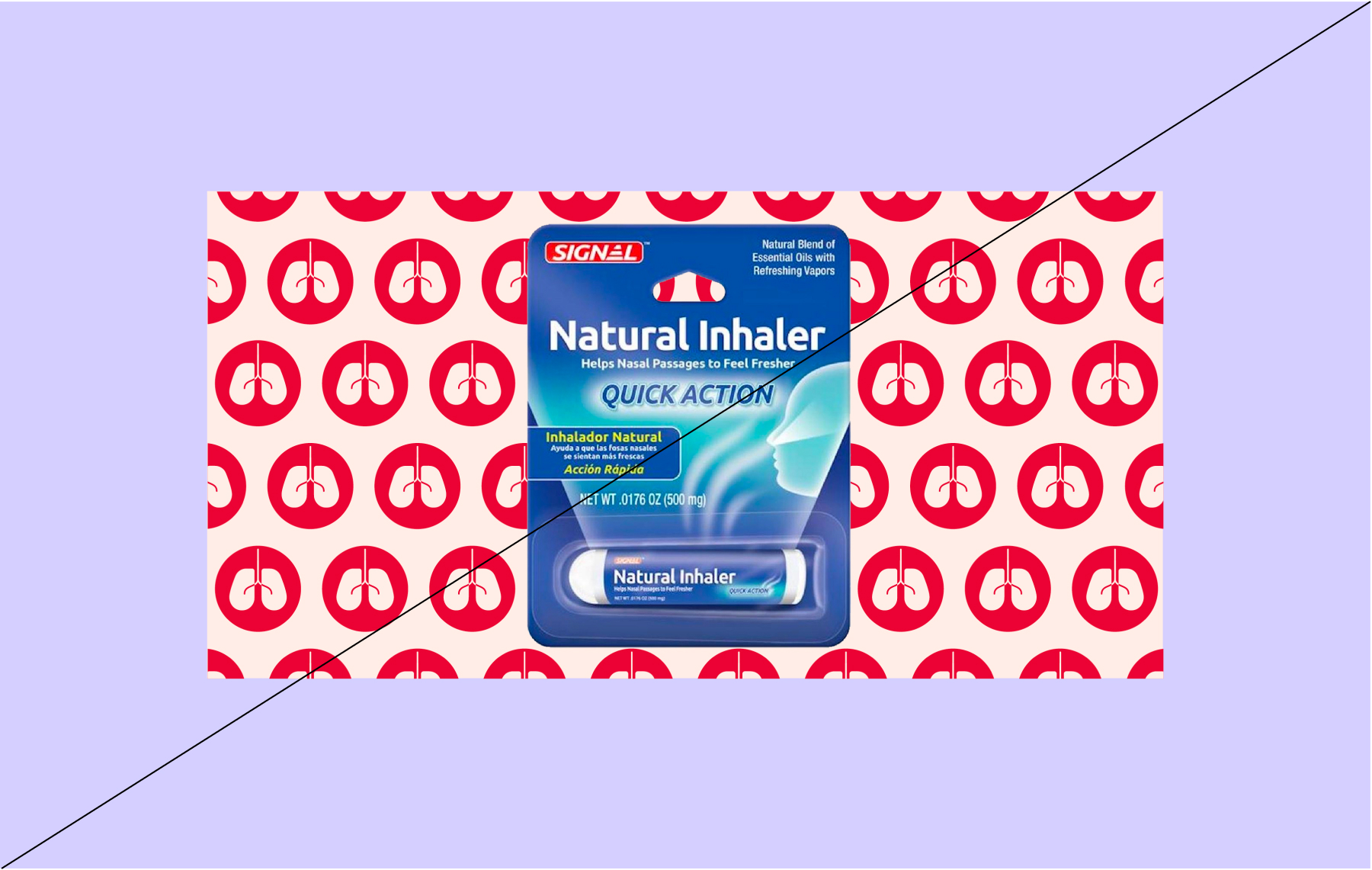
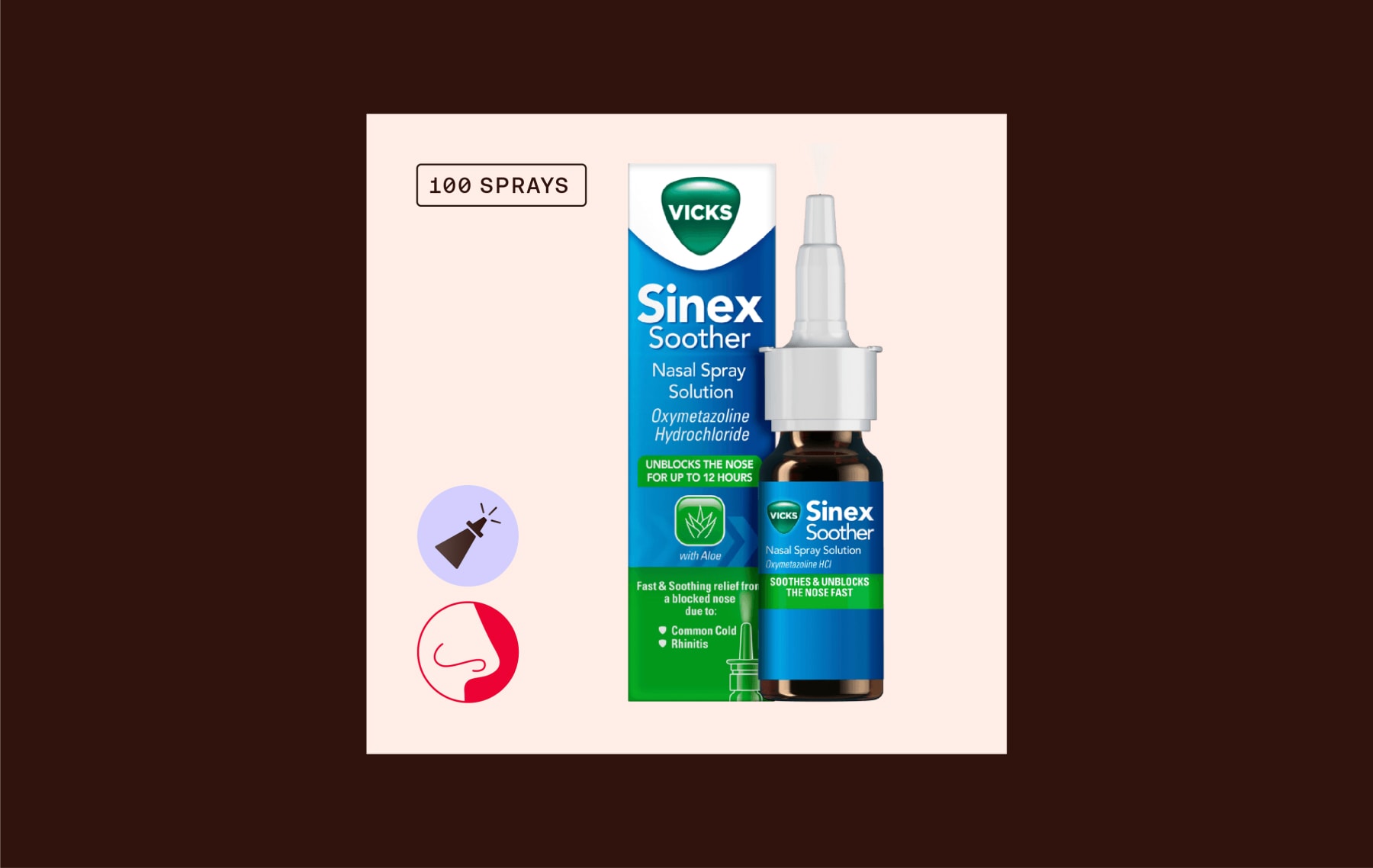
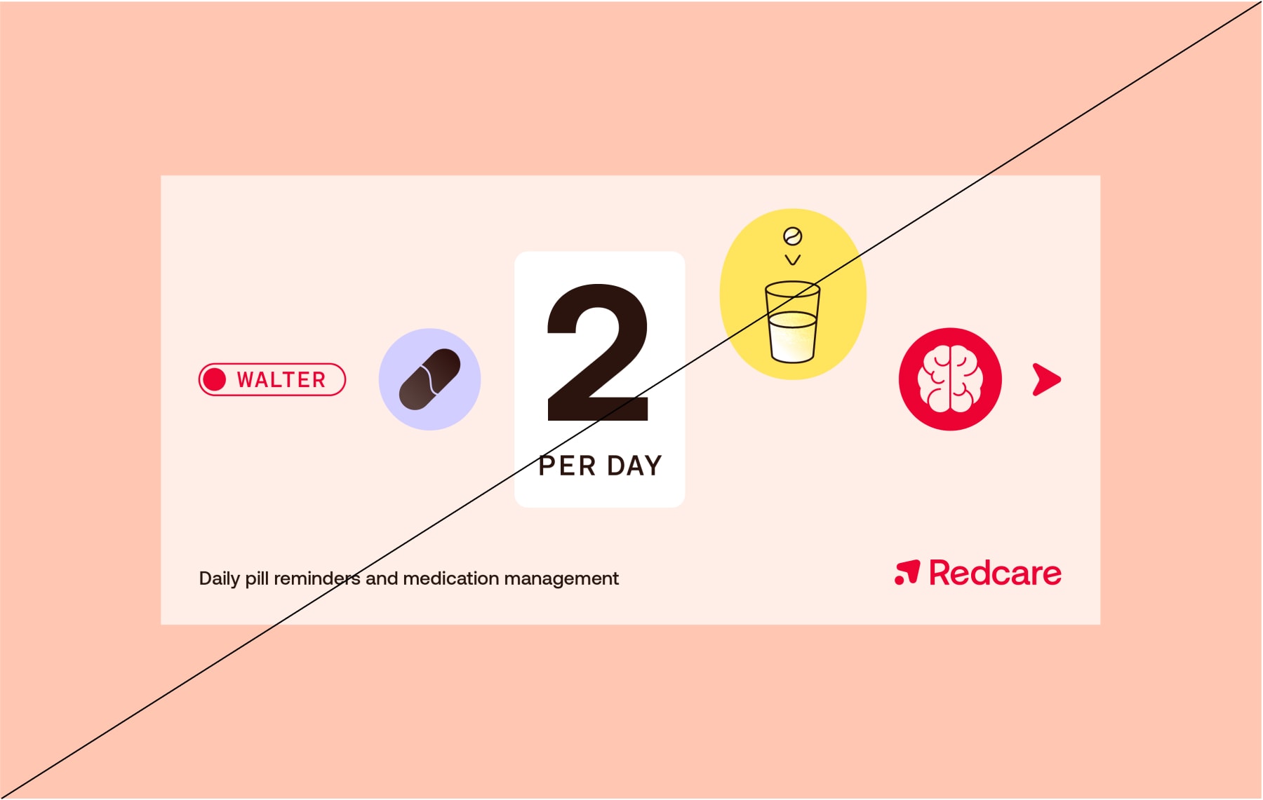
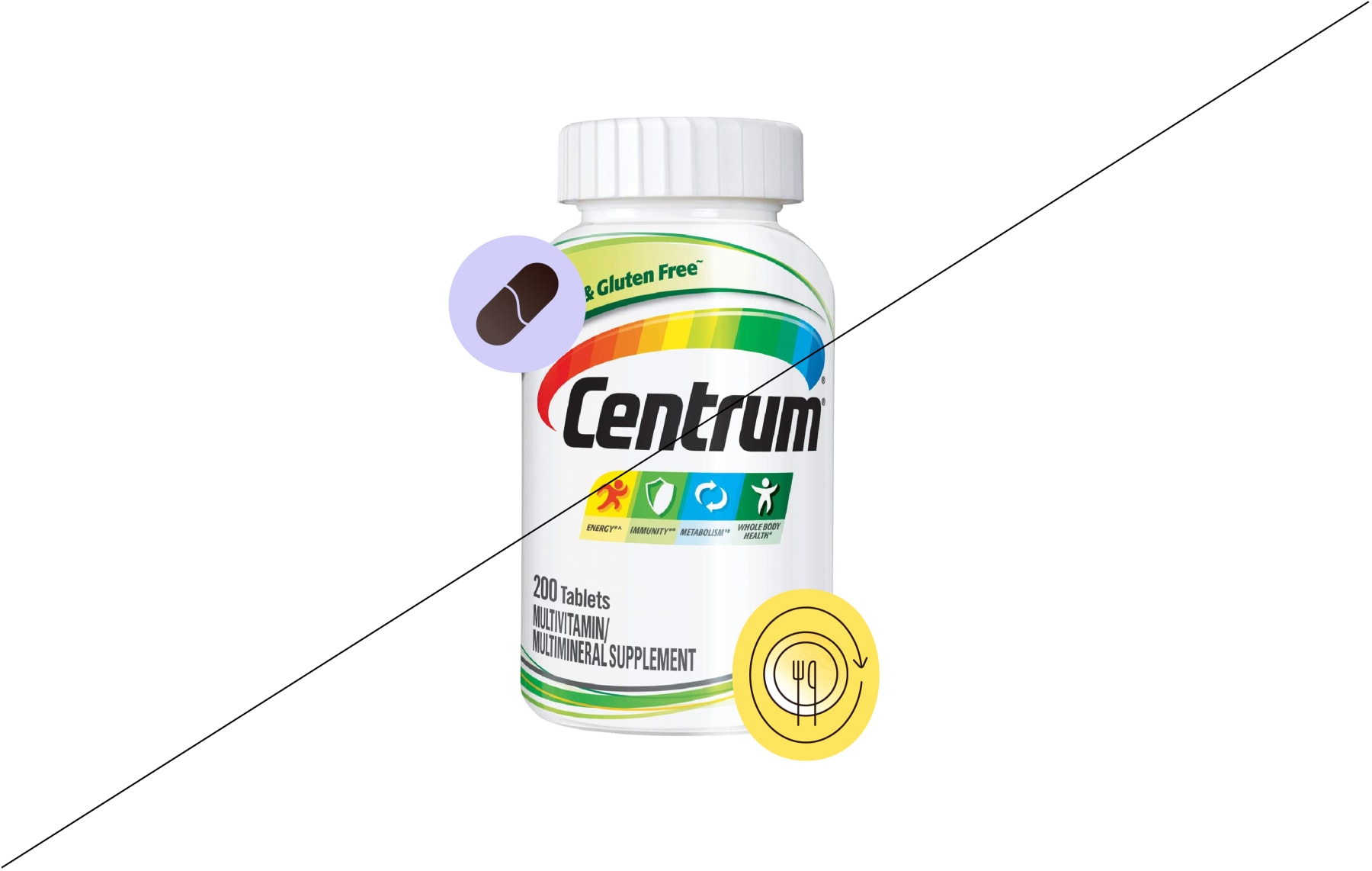
Personal icons represent parts of the body. These can be used when talking about medication or condition that concerns a certain part of the body.
Personal icons represent parts of the body. These can be used when talking about medication or condition that concerns a certain part of the body.
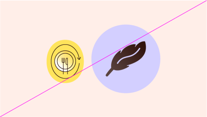
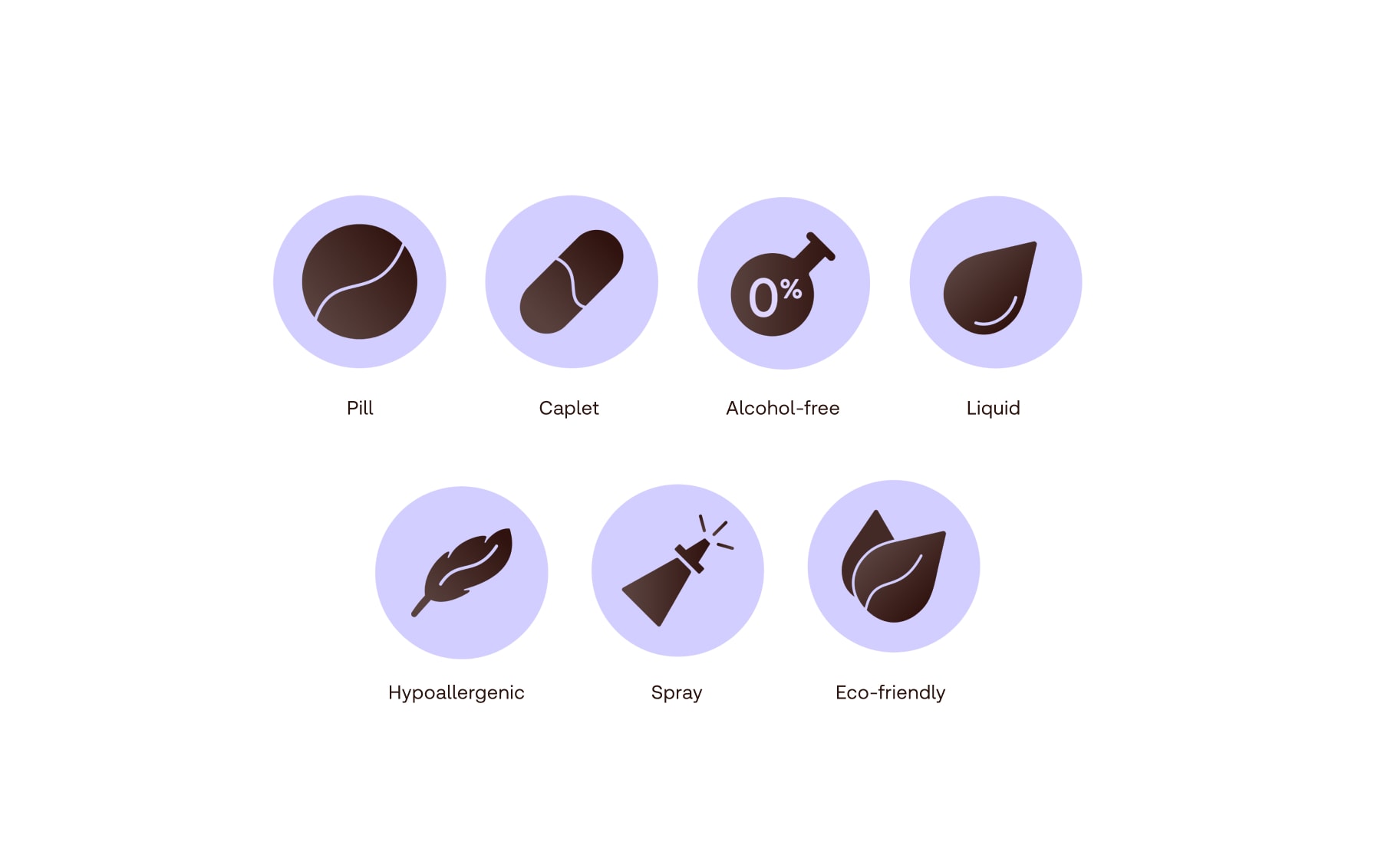
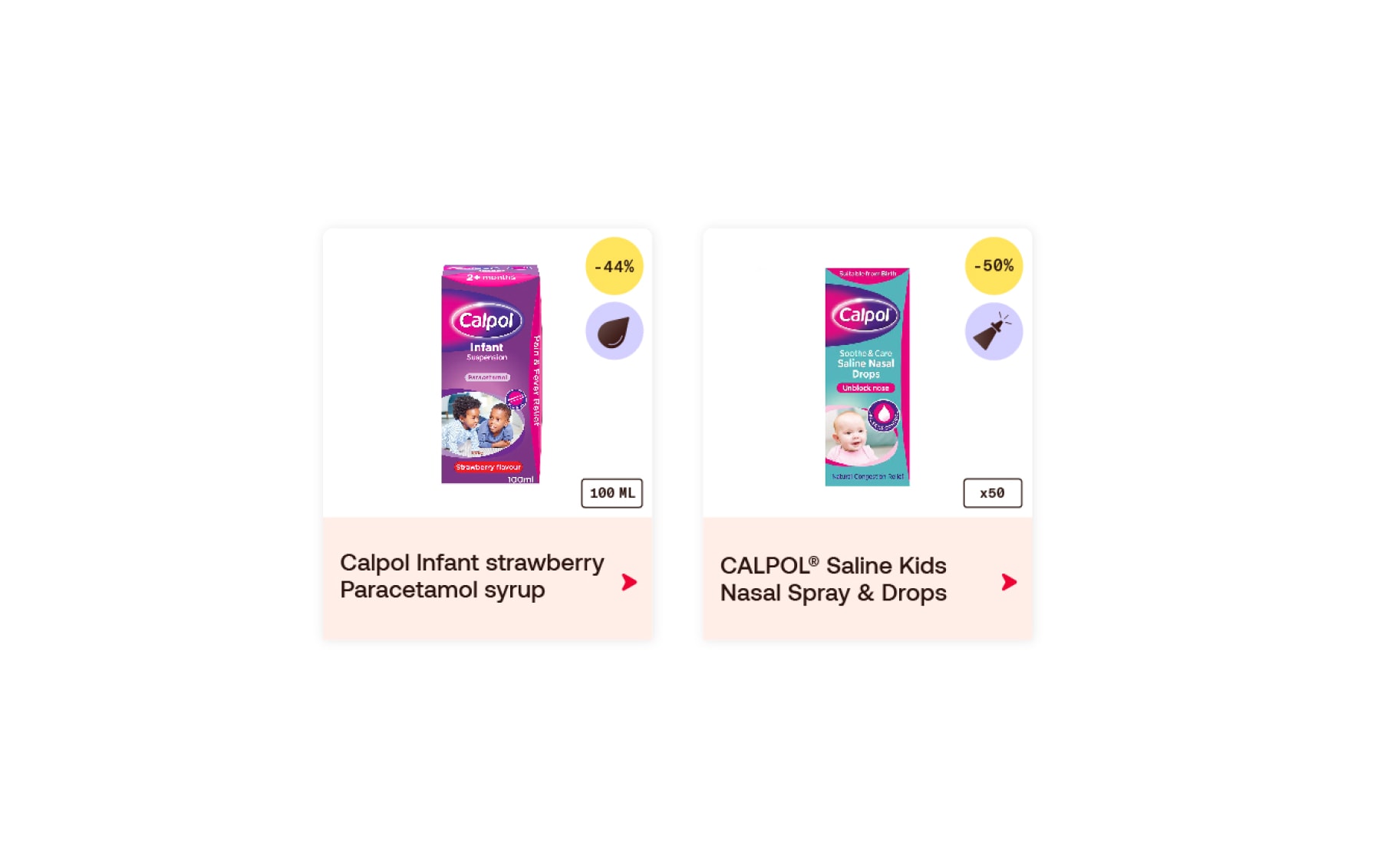
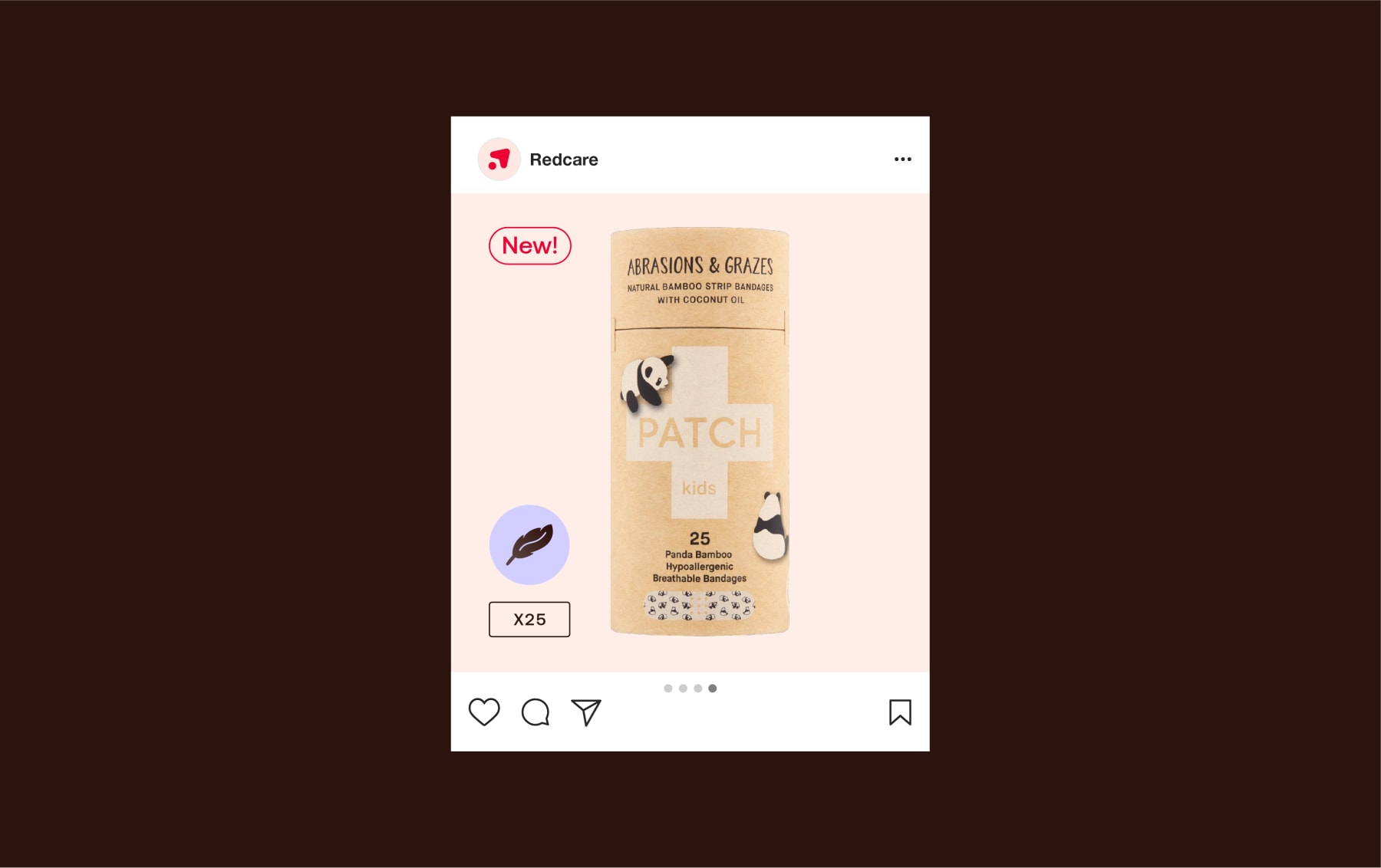
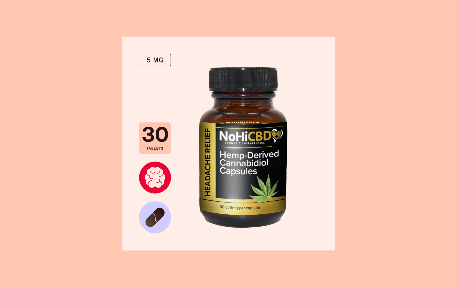
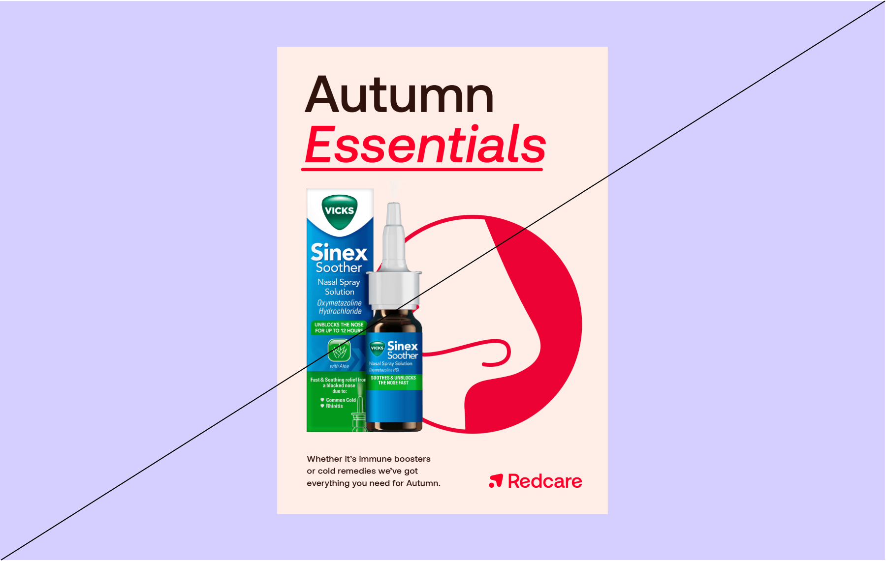
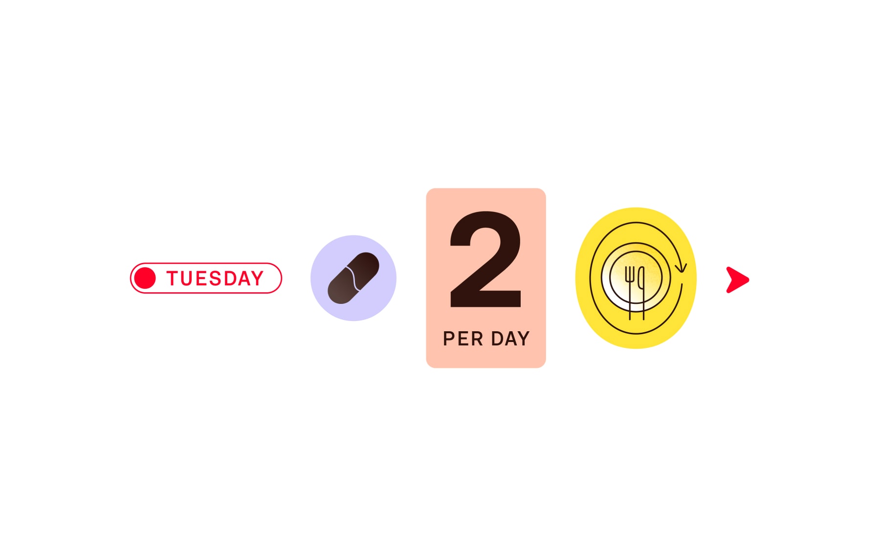
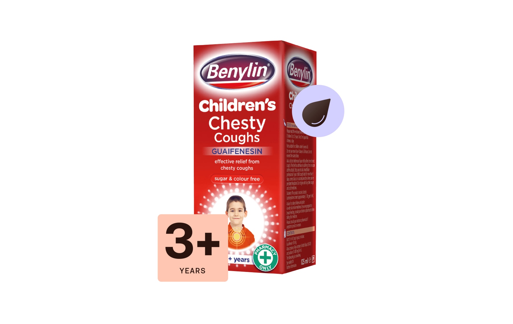
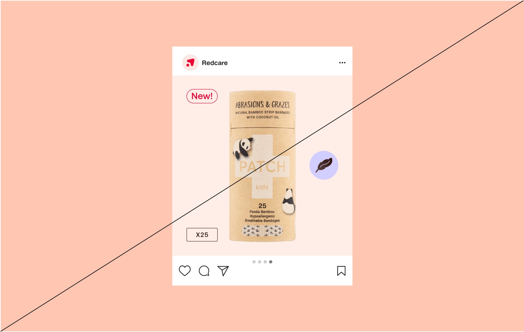
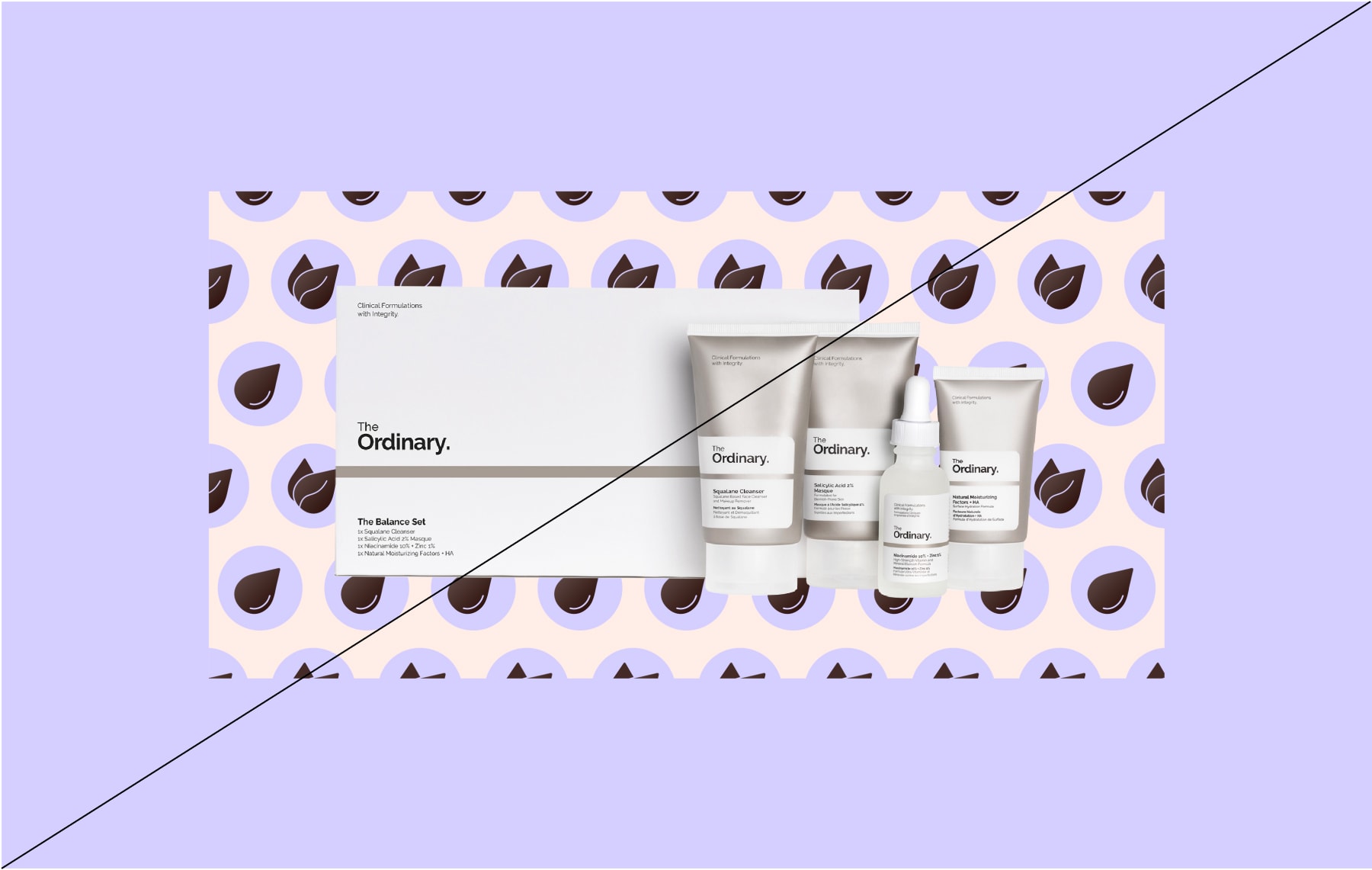
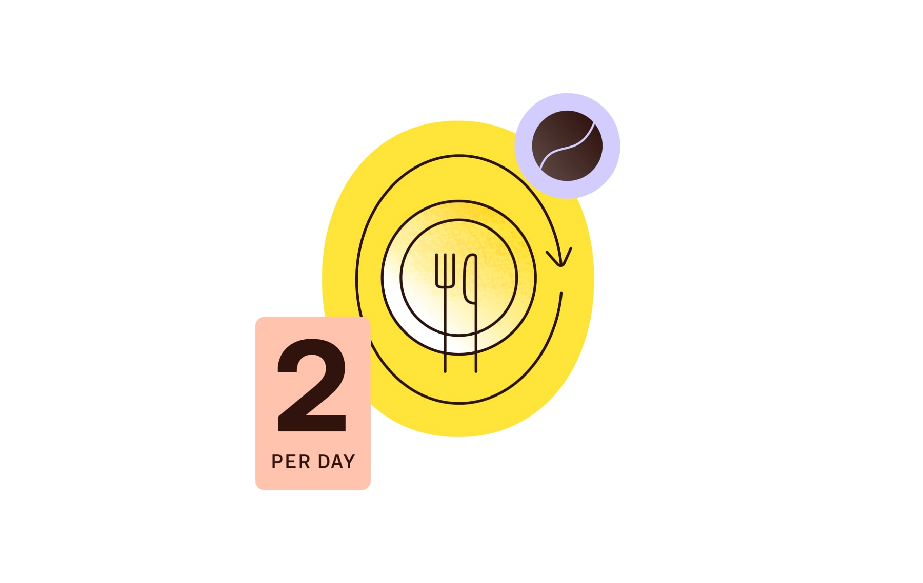
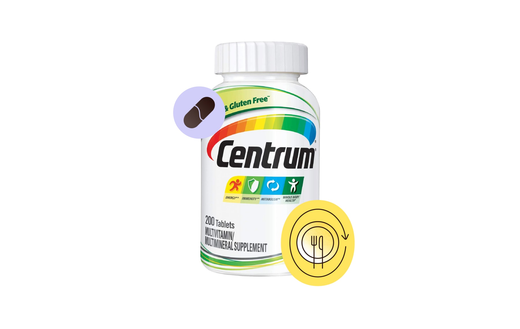
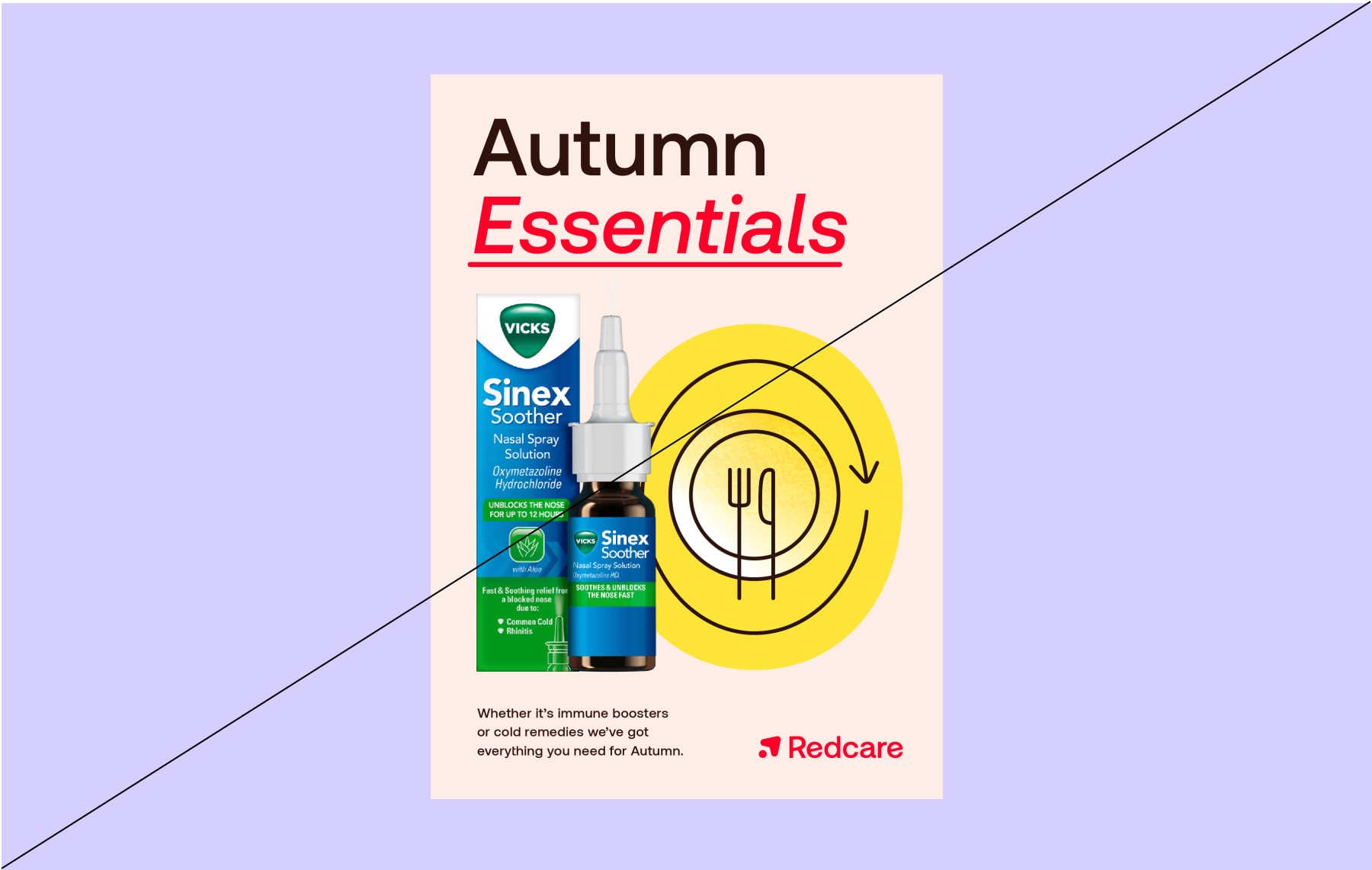
Descriptive icons highlight core features of our products. These can help quickly identify types of medication, or certain features customers might be looking for.
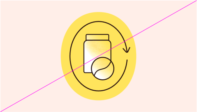
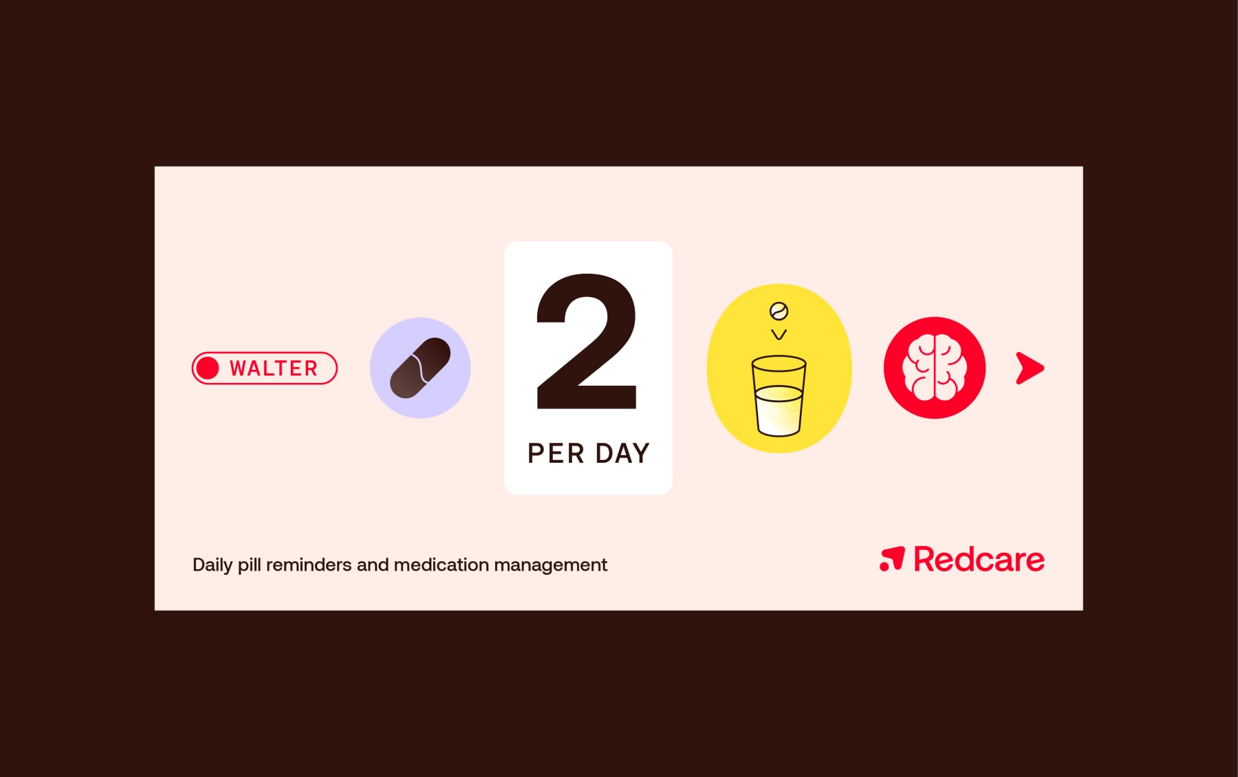
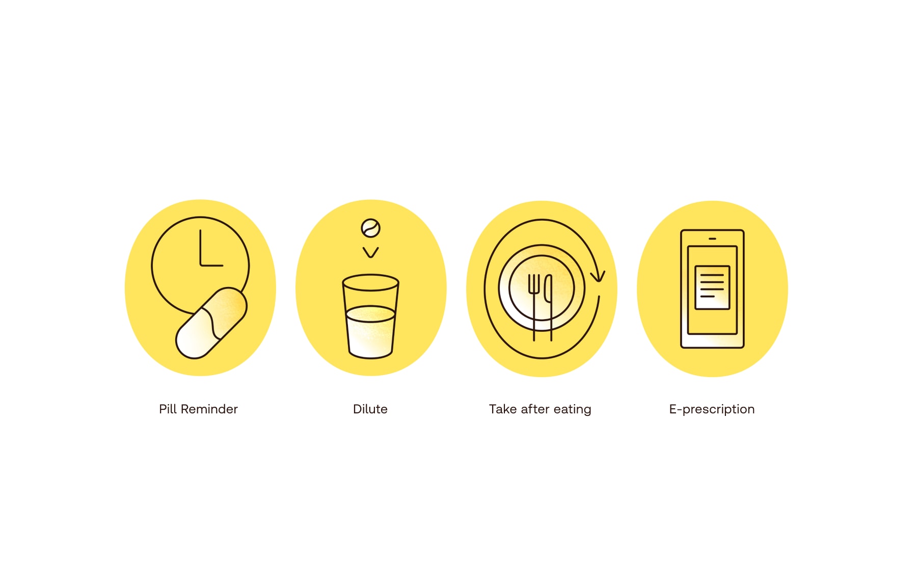
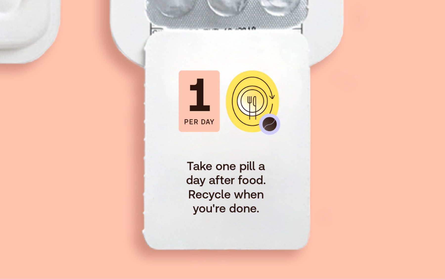
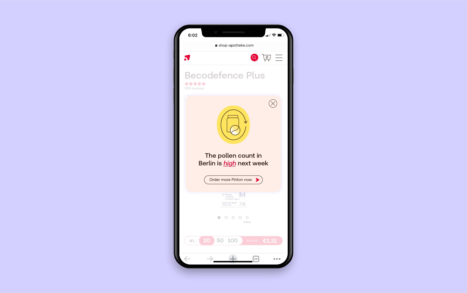
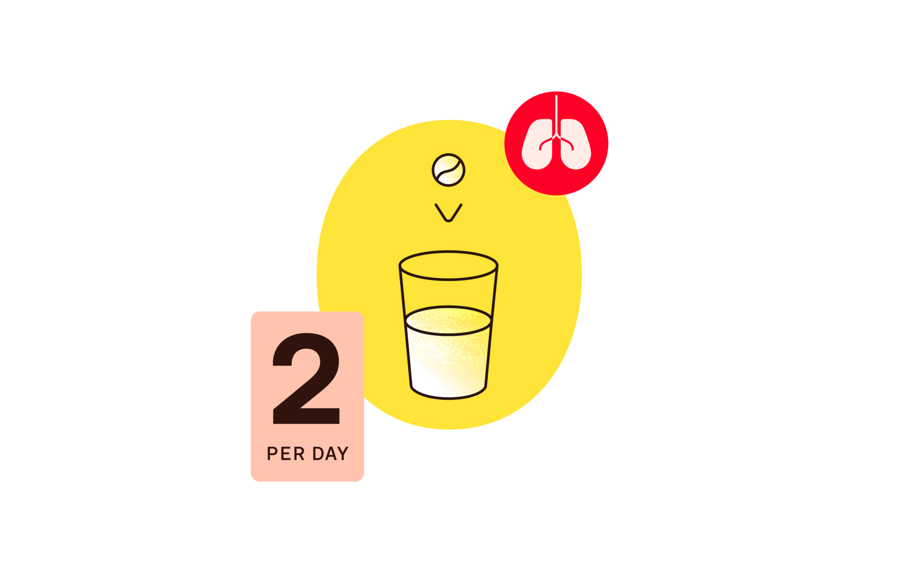
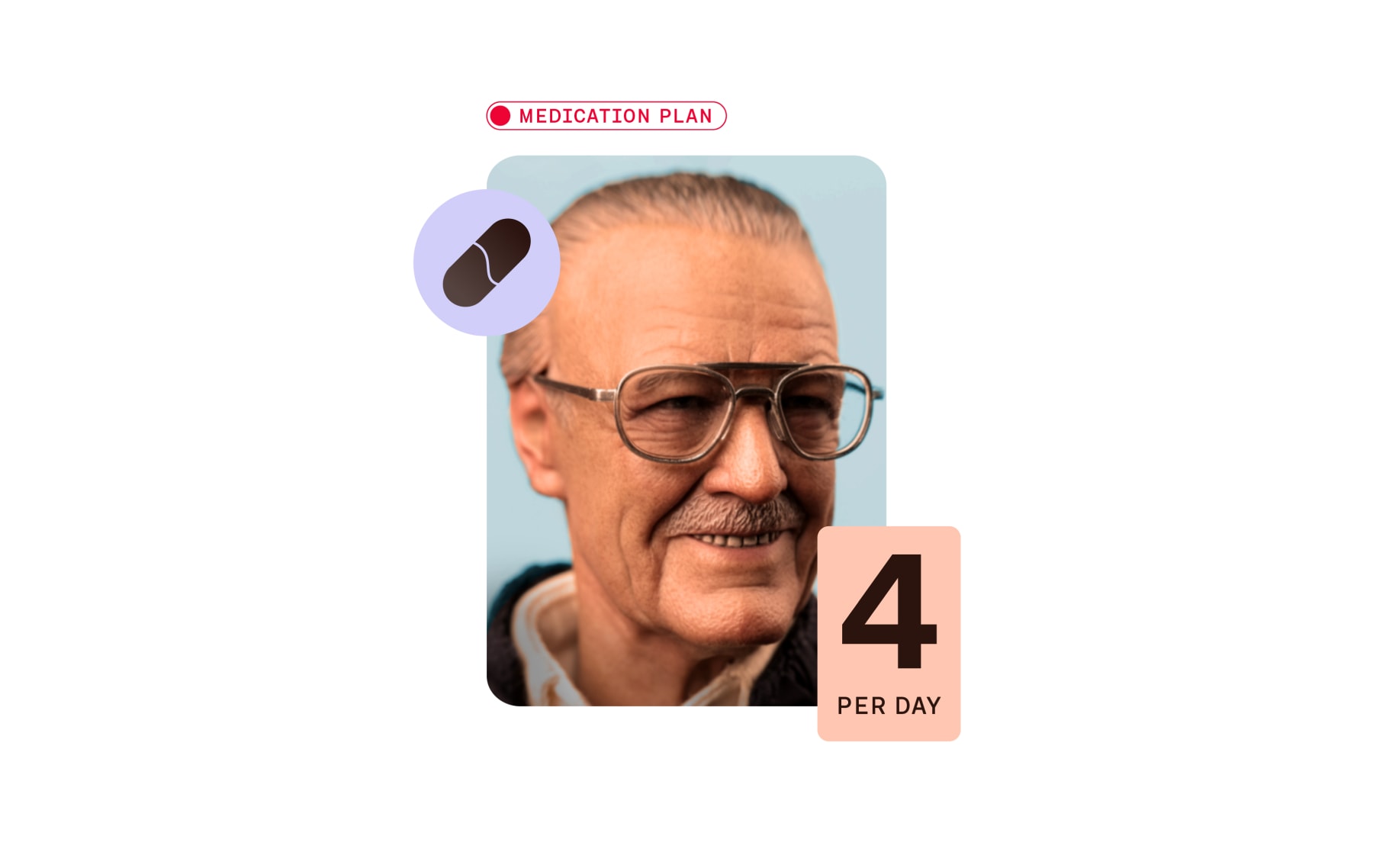
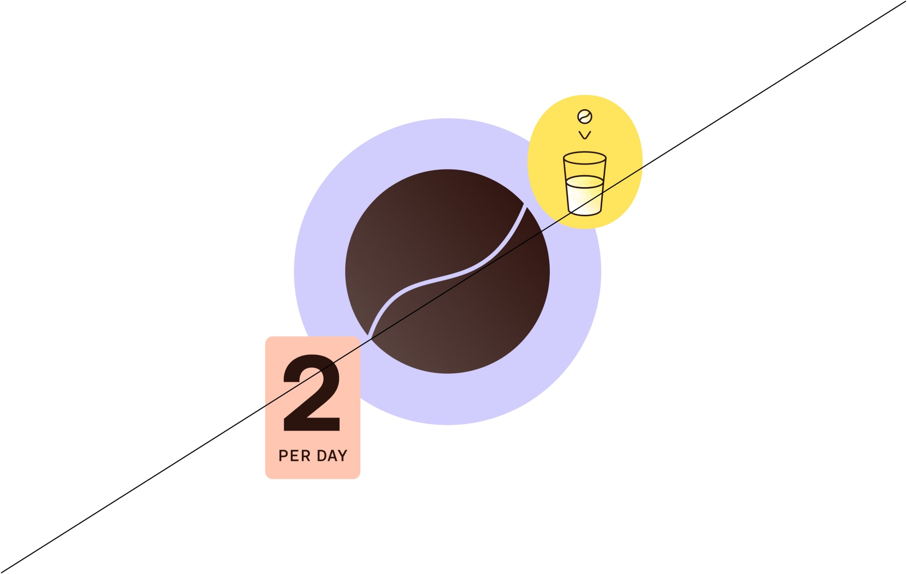
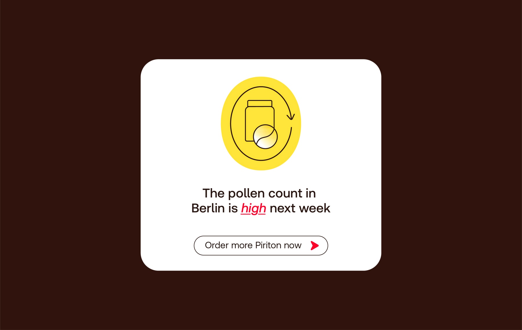
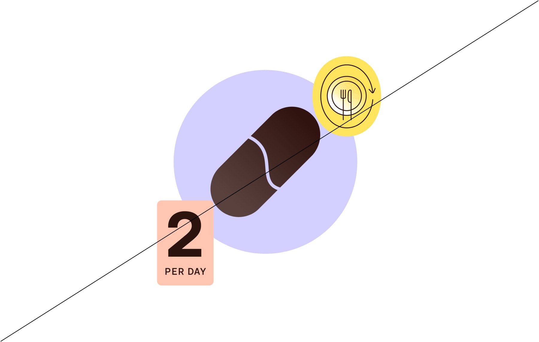
Active icons highlight key interactions, alerting people to something important. EG. pill reminders, medication methods or side effects warnings.
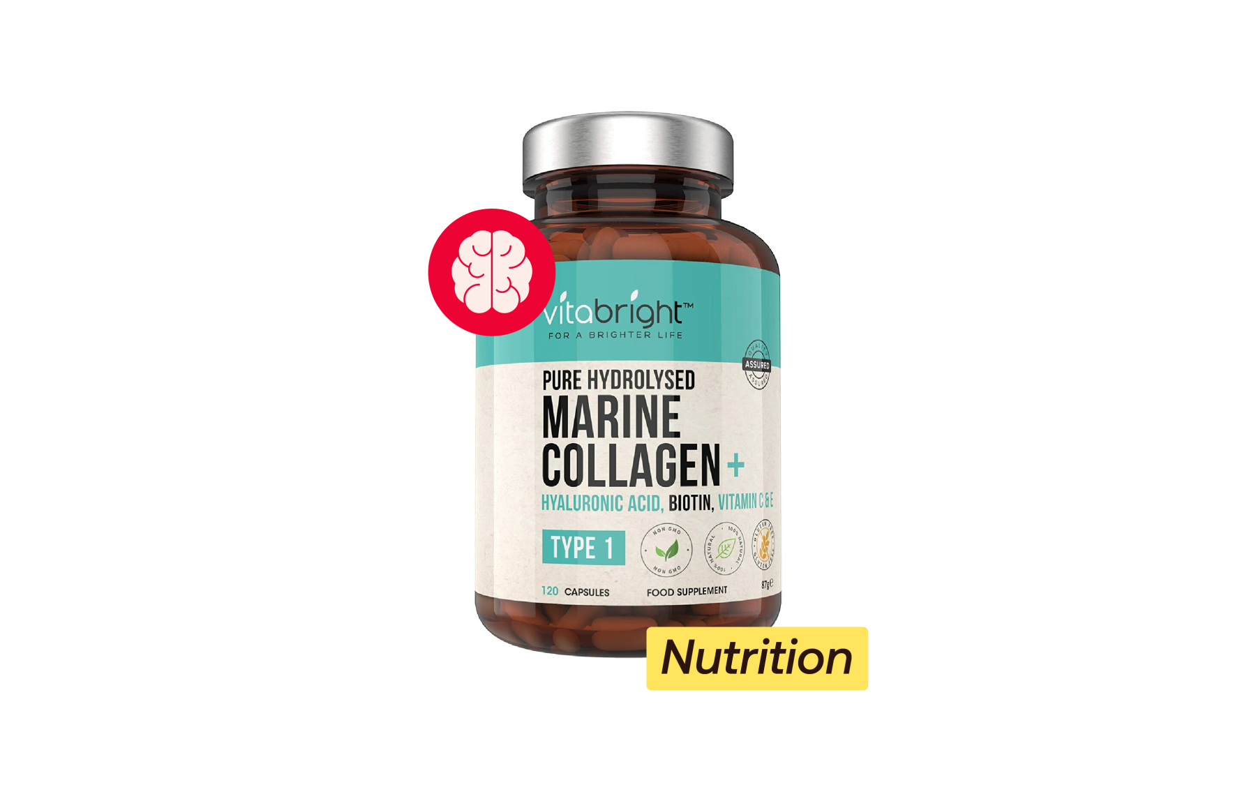
Personal icons should be used small in support of other content, to give more detail on the subject.
Personal icons should be used small in support of other content, to give more detail on the subject.
Descriptive icons should be used small in support of other content, to give more detail on the subject.
Active icons are the largest of our icons, but should still be used small in support of content, to give more detail on the subject.
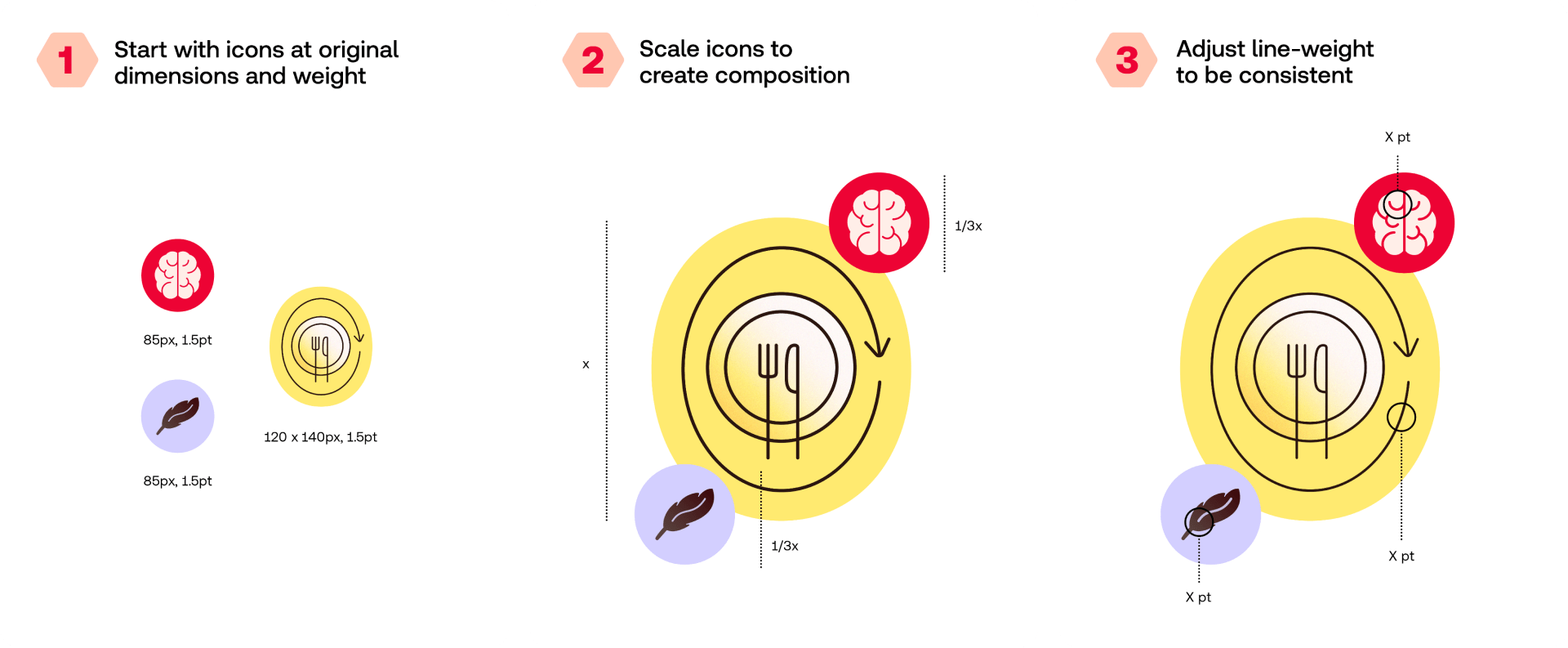
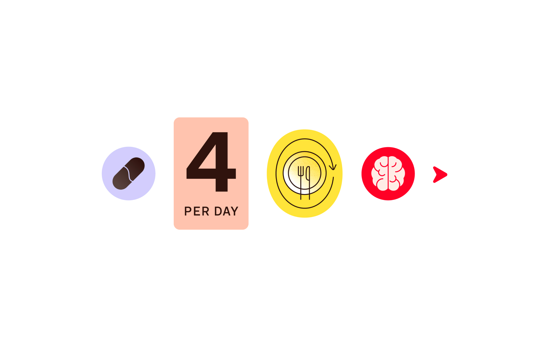
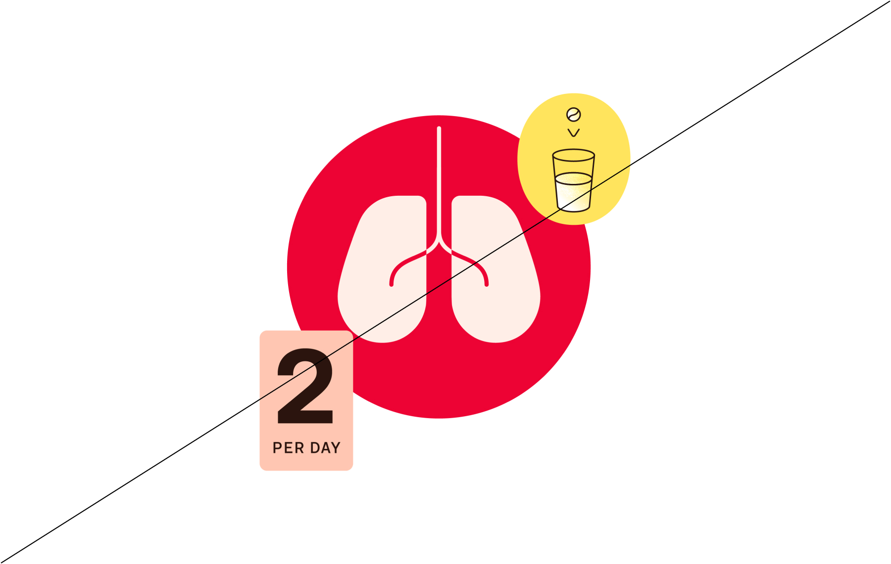
When using icons together, use the following guidance to make sure proportions and line weight are kept consistent across applications.
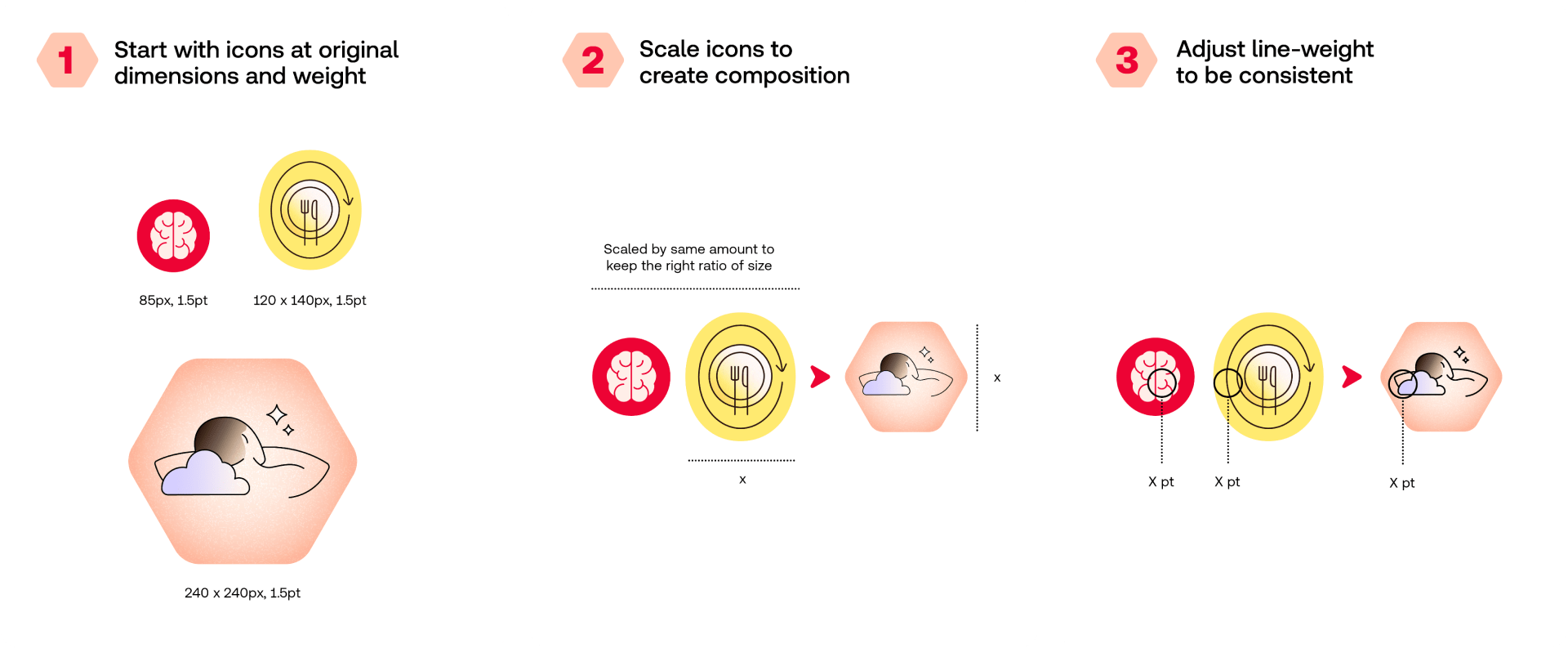
When using icons together, use the following guidance to make sure proportions and line weight are kept consistent across applications.
When combining illustrations and icons, use the following guidance to make sure proportions and line weight are kept consistent across applications.
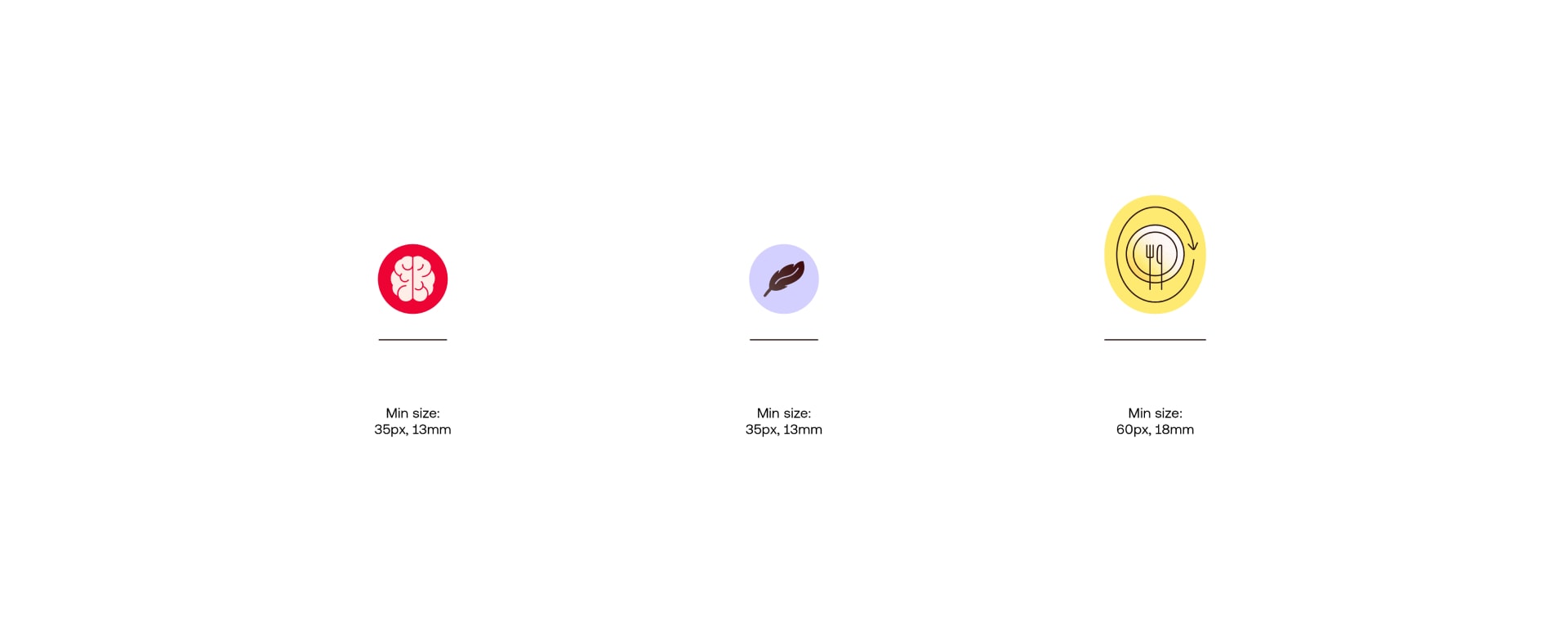
In order to maintain legibility, never scale icons smaller than the these minimum sizes.
Our icons are brought to life with subtle motion. The motion should breathe a sense of life into the icons, without becoming distracting.
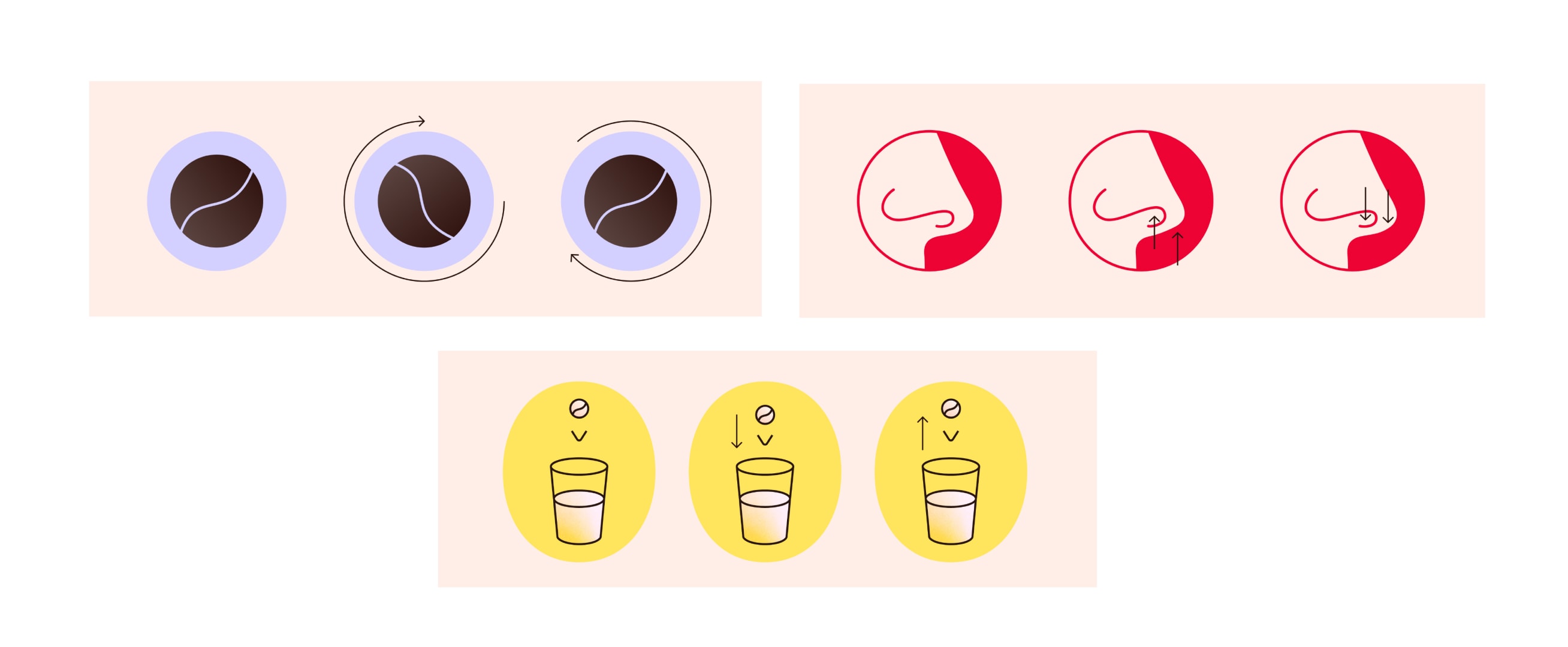
There might be moments when we need more detailed iconography to illustrate new features or more detailed “how to”s. Use the following guidance to create them.

There might be moments when we need more detailed iconography to illustrate new features or more detailed “how to”s. Use the following guidance to create them.
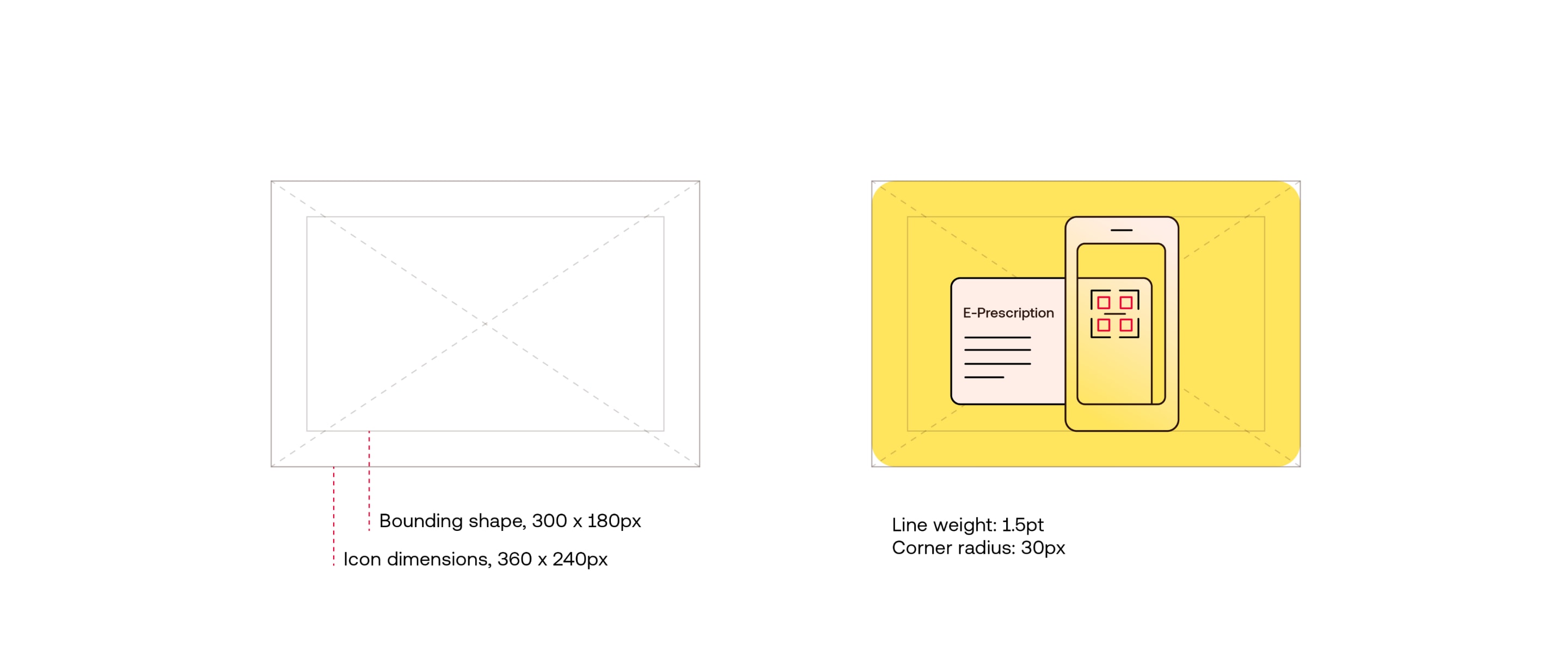
Use this grid and line weight to create more detailed pictograms. Make sure to depict the subject as simply and clearly as possible, removing any unecesary detail. We use the same colour rules as our Active icons, but can introduce red to highlight key elements.

To help explain processes or actions in an accessible and clear way, we can use animation to tell a more detailed story. Keep the motion simple, and use red to highlight key interactions.
We can create more icons for our brand using the following guidance. When creating icons, always start by asking; “Is this icon needed?” in order to avoid duplication or a crowded suite of icons.
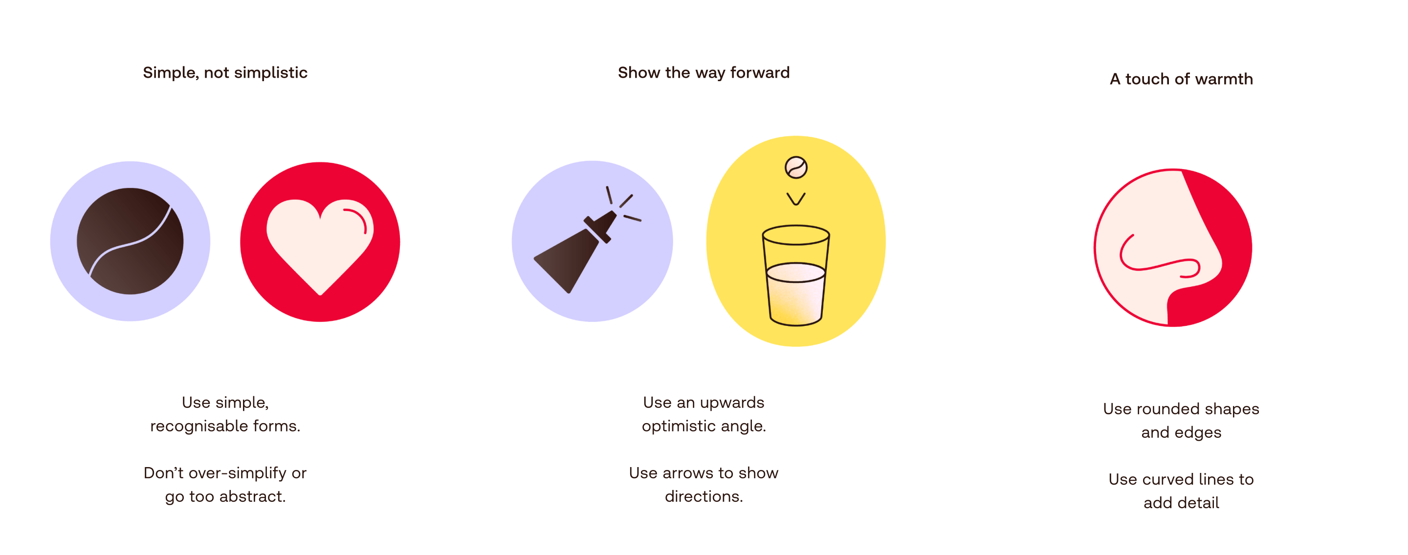
Our icons are simple, helpful and have a touch of warmth. We want to show our subject in an accessible, clear way, without becoming too reductive.
Use this grid and line weight to create new Personal Icons.
Use simple shapes with rounded corners, avoiding any harsh angles. Use a 1.5pt stroke to add detail with
curved lines. These details should play a role in depicting the form, and should never feel like unnecessary detail.
Special case:
For icons that bleed over the edge of the background shape, use a 1.5pt stroke for lines.
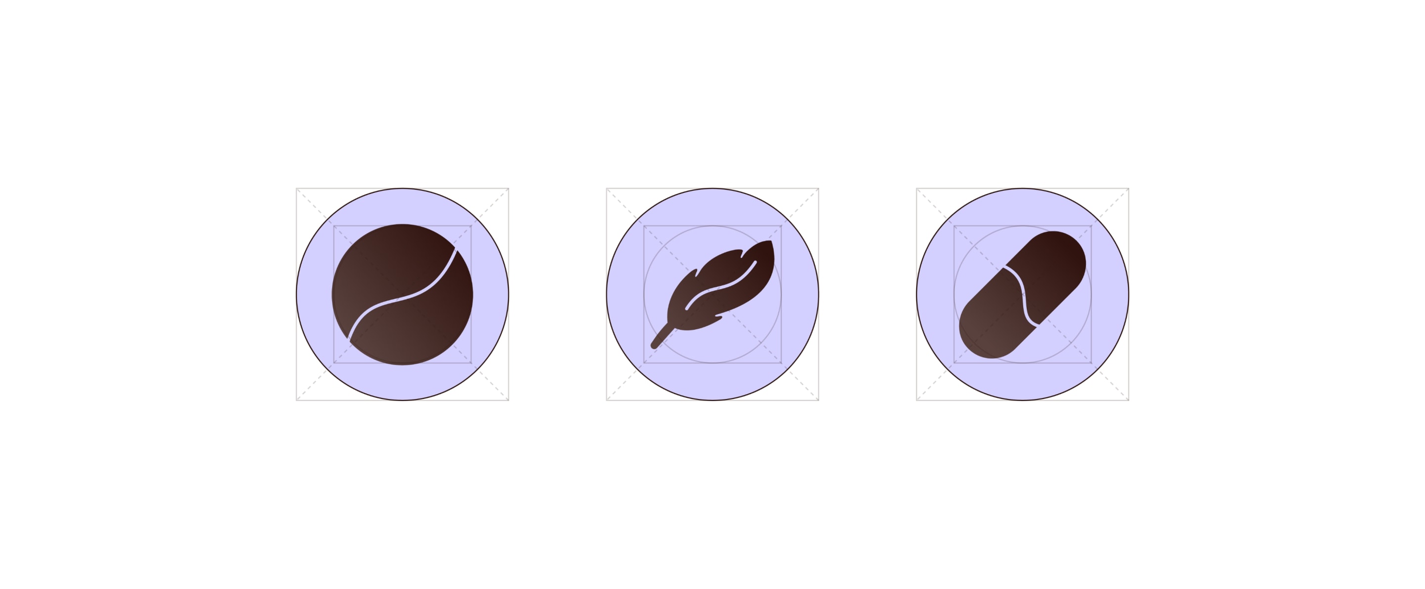
Use this grid and line weight to create Descriptive Icons.
Use simple shapes with rounded corners, avoiding any harsh angles. Angle icons at 45º where possible to create an optimistic feeling. Use a 1.5pt stroke to add detail with curved lines.
These details should play a role in depicting the form, and should never feel like unnecessary detail. When the icon form itself is not going at 45º (e.g. circular pill) we can use the line to give it this direction.
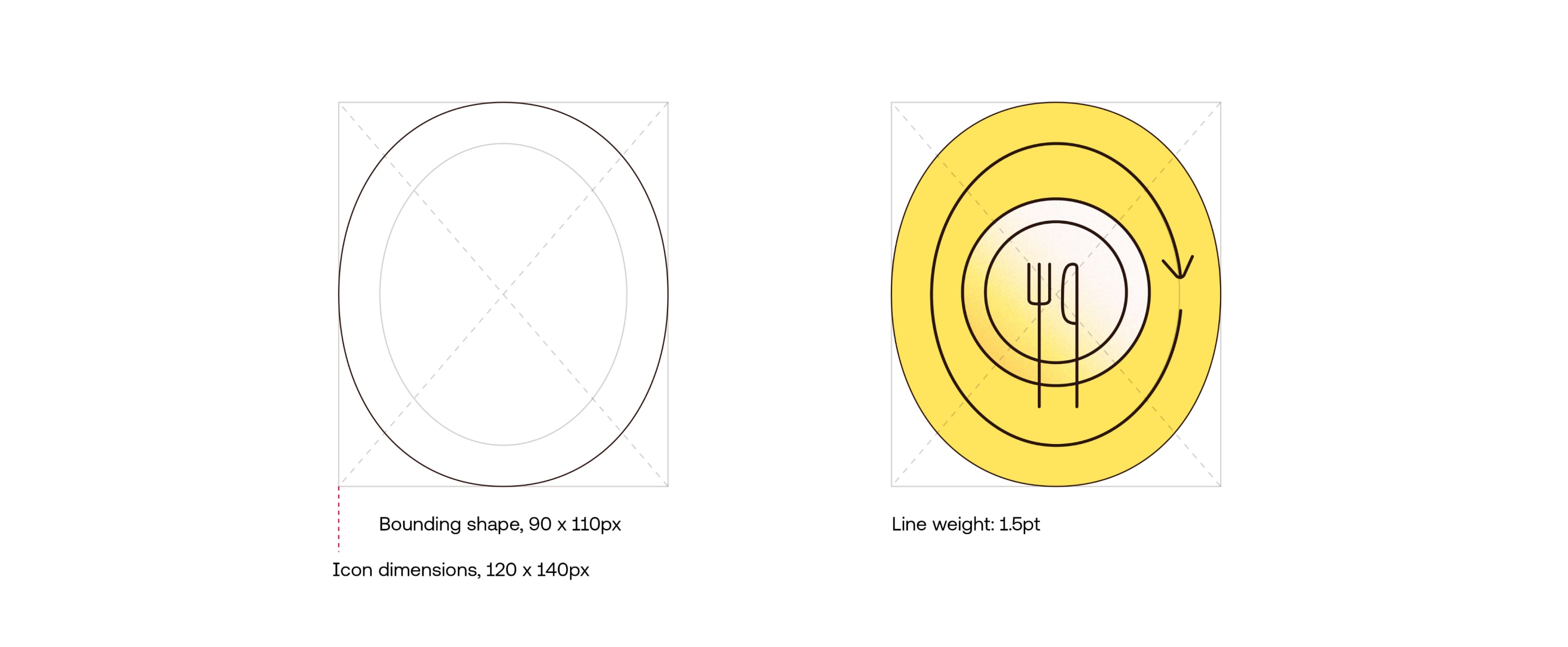
Use this grid and line weight to create new Active Icons.
Use simple shapes with rounded corners, avoiding harsh angles. Angle elements at 45º where possible. Keep consistency by using elements from other icons (e.g. pill)
Add helpful elements such as arrows to show direction.
Use simple shapes with rounded corners, avoiding harsh angles. Angle elements at 45º where possible. Keep consistency by using elements from other icons (e.g. pill)
Add helpful elements such as arrows to show direction.
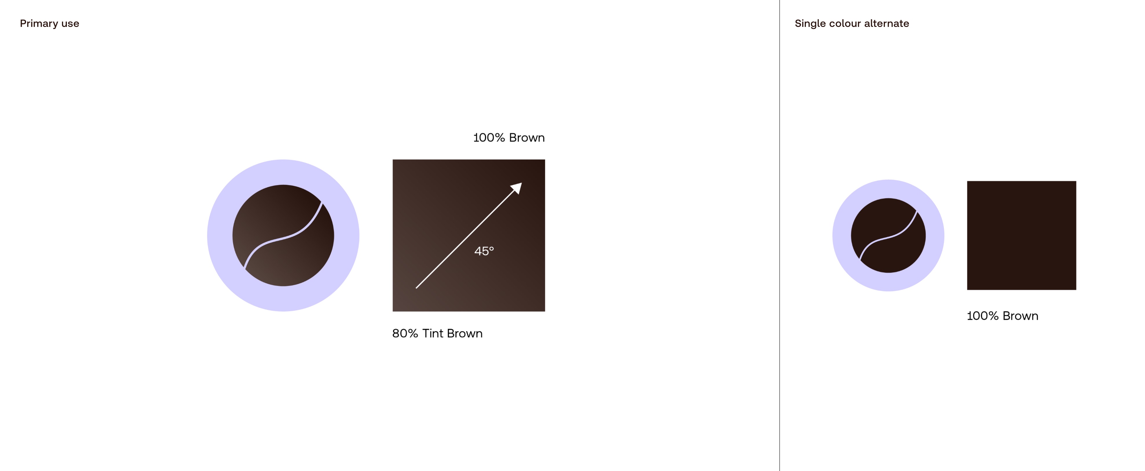
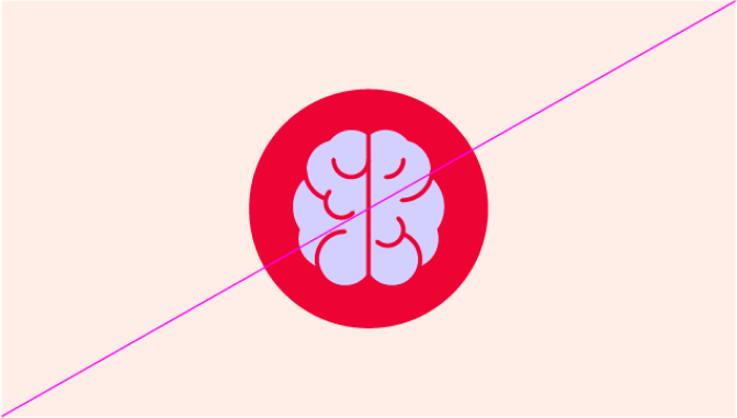
Descriptive icons use a gradient to add warmth and depth.
In cases where we cannot use gradients, use the alternate single colour option shown here.
Descriptive icons use a gradient to add warmth and depth.
In cases where we cannot use gradients, use the alternate single colour option shown here.
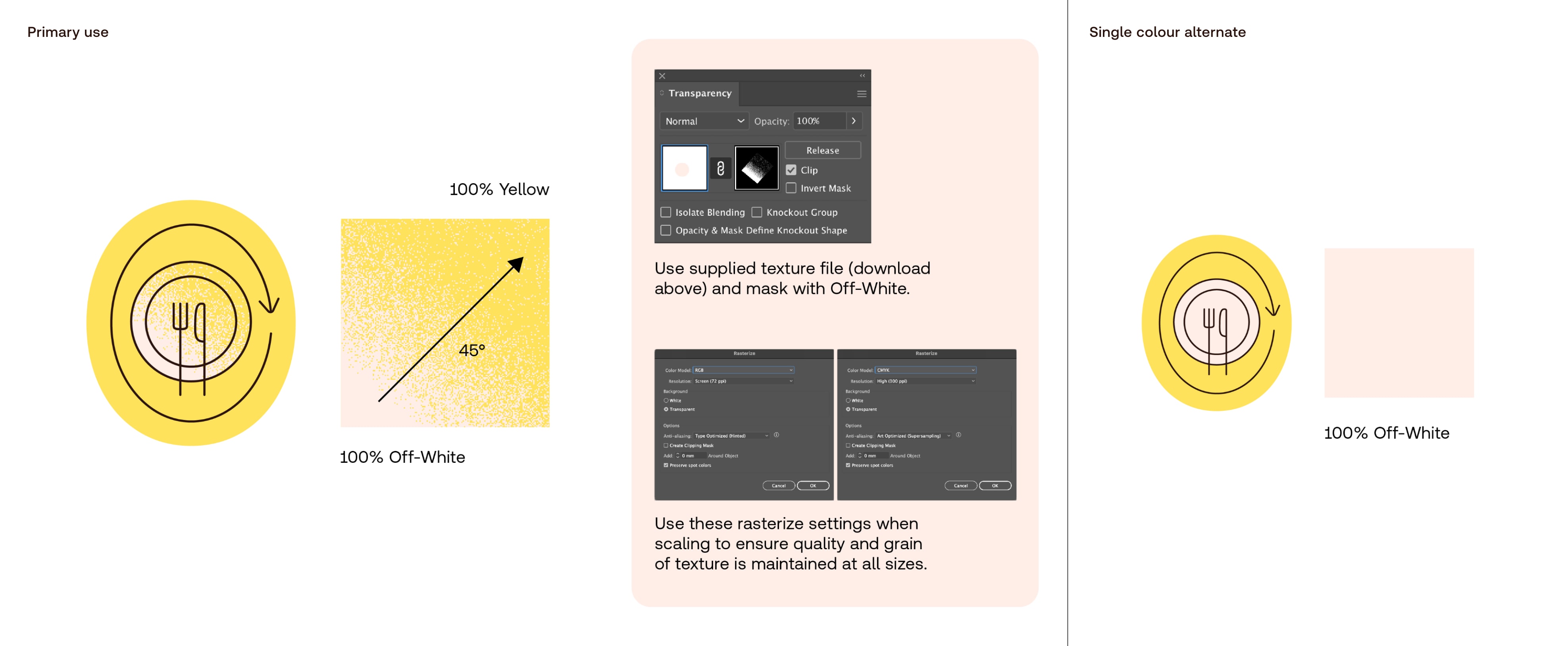
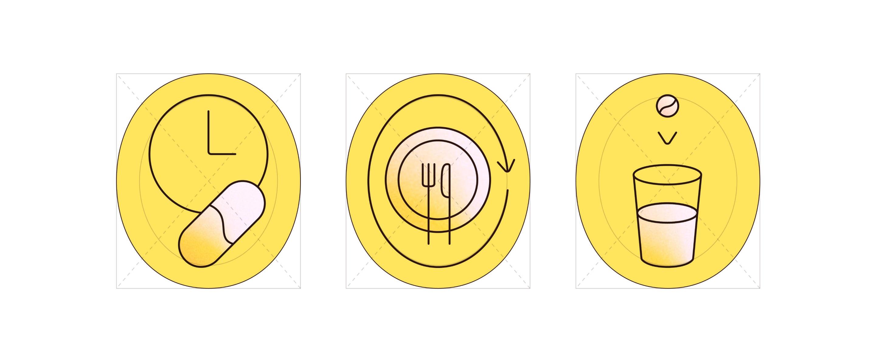
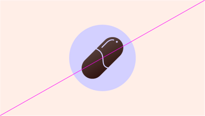
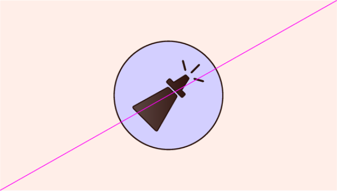
Active icons use our texture to add warmth and depth.
In cases where we cannot use our texture, use the alternate single colour option shown here.
Things to avoid
Don’t make icons too detailed, or add unnecessary styling

Don’t use multiple line weights when making icons
Don’t use colour combinations that aren’t specified in the guidelines
Don’t add outline strokes to the icons
Don’t switch the hierarchy of icon categories
Don’t add any extra effects or drop shadows to the icons
In active icons, don’t use gradient texture in the whole icon. Rather, use it to highlight a specific part

Don’t use generic stock icons that aren’t consistent with our style


