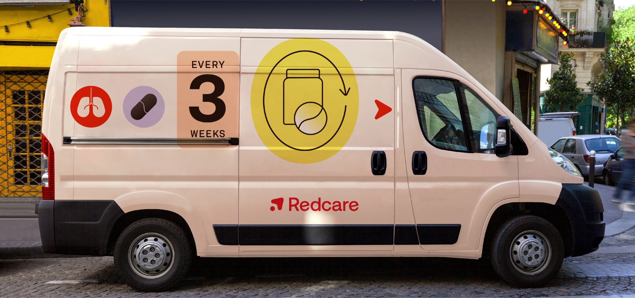
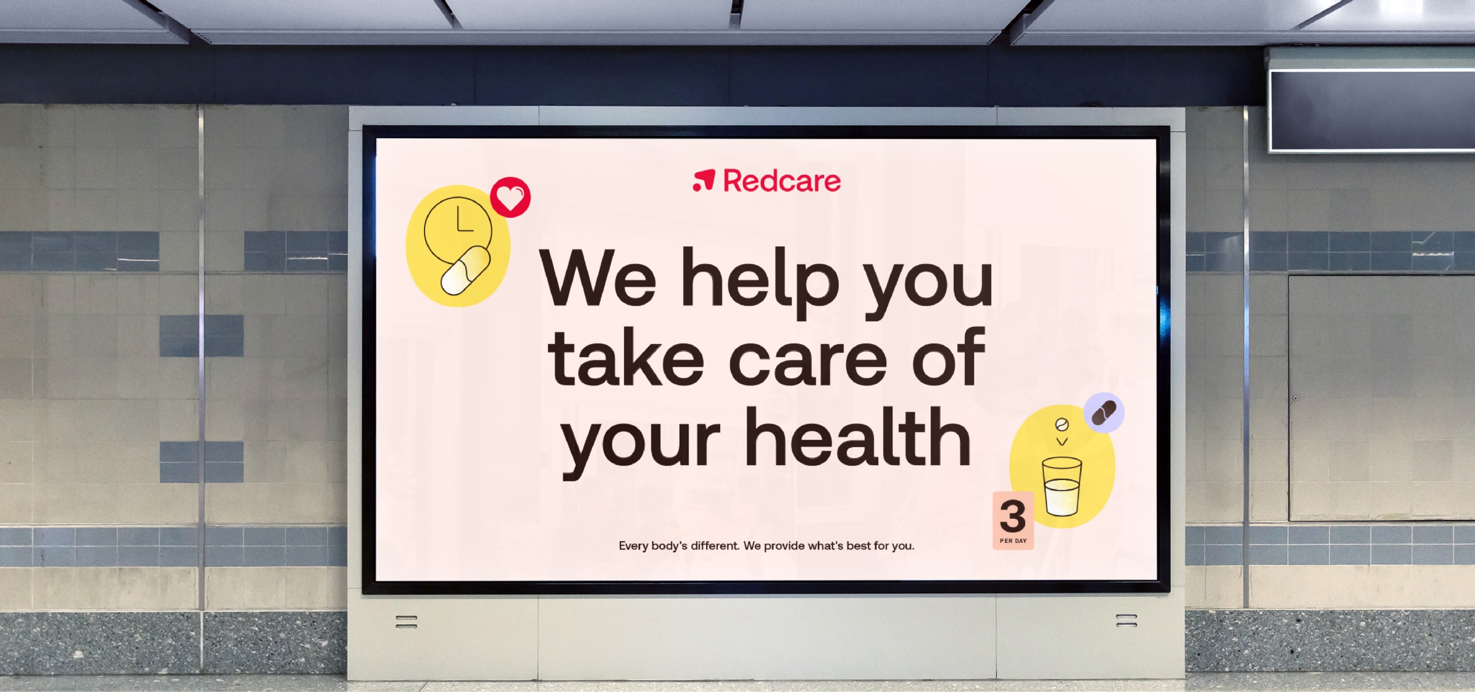
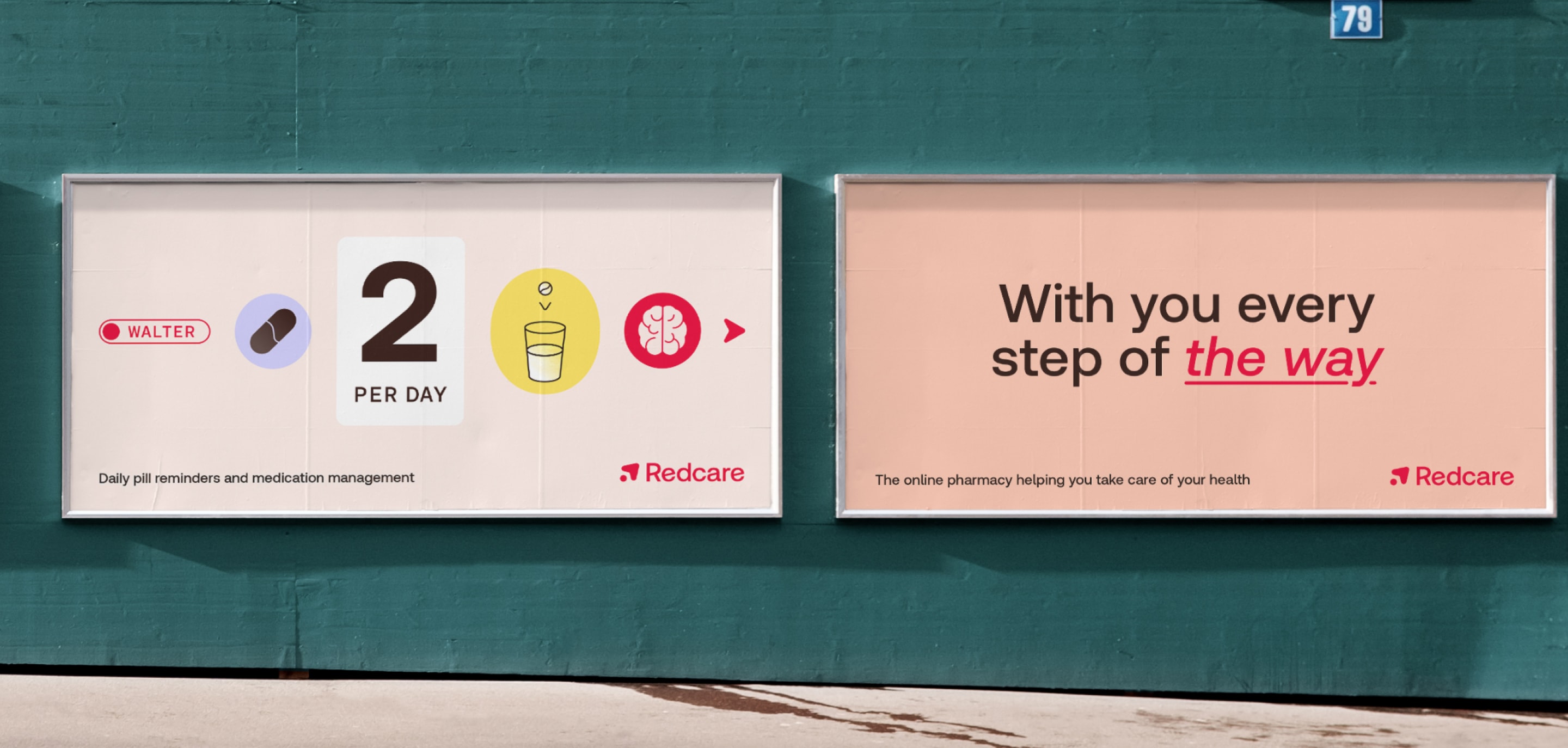
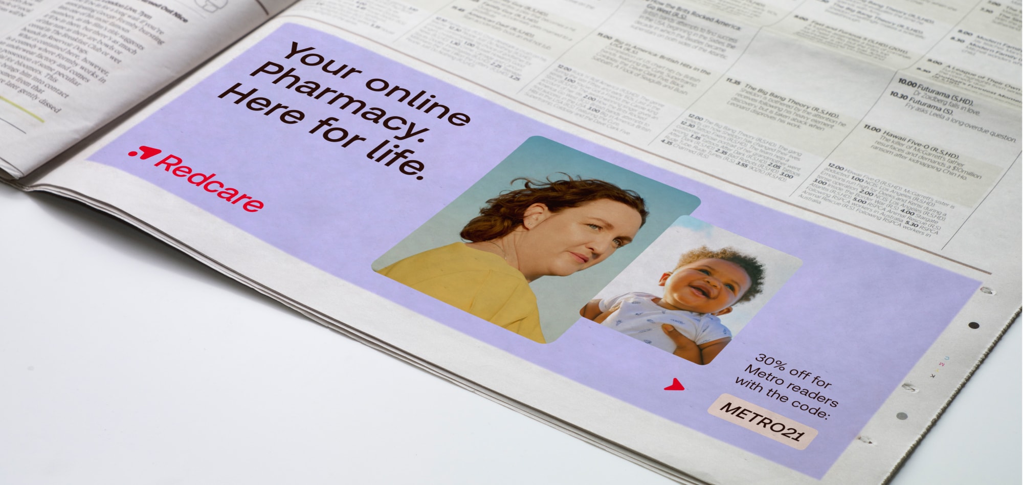
Out of home
For big brand communications and campaigns, we can use visuals and words that stand out.
It’s an opportunity to really hero our brand assets, and use our warm and welcoming tone of voice
Here are lots of example visuals showing
the Redcare brand coming to life.
Use this as inspiration when creating new communications.
For big brand communications and campaigns, we can use visuals and words that stand out.
It’s an opportunity to really hero our brand assets, and use our warm and welcoming tone of voice
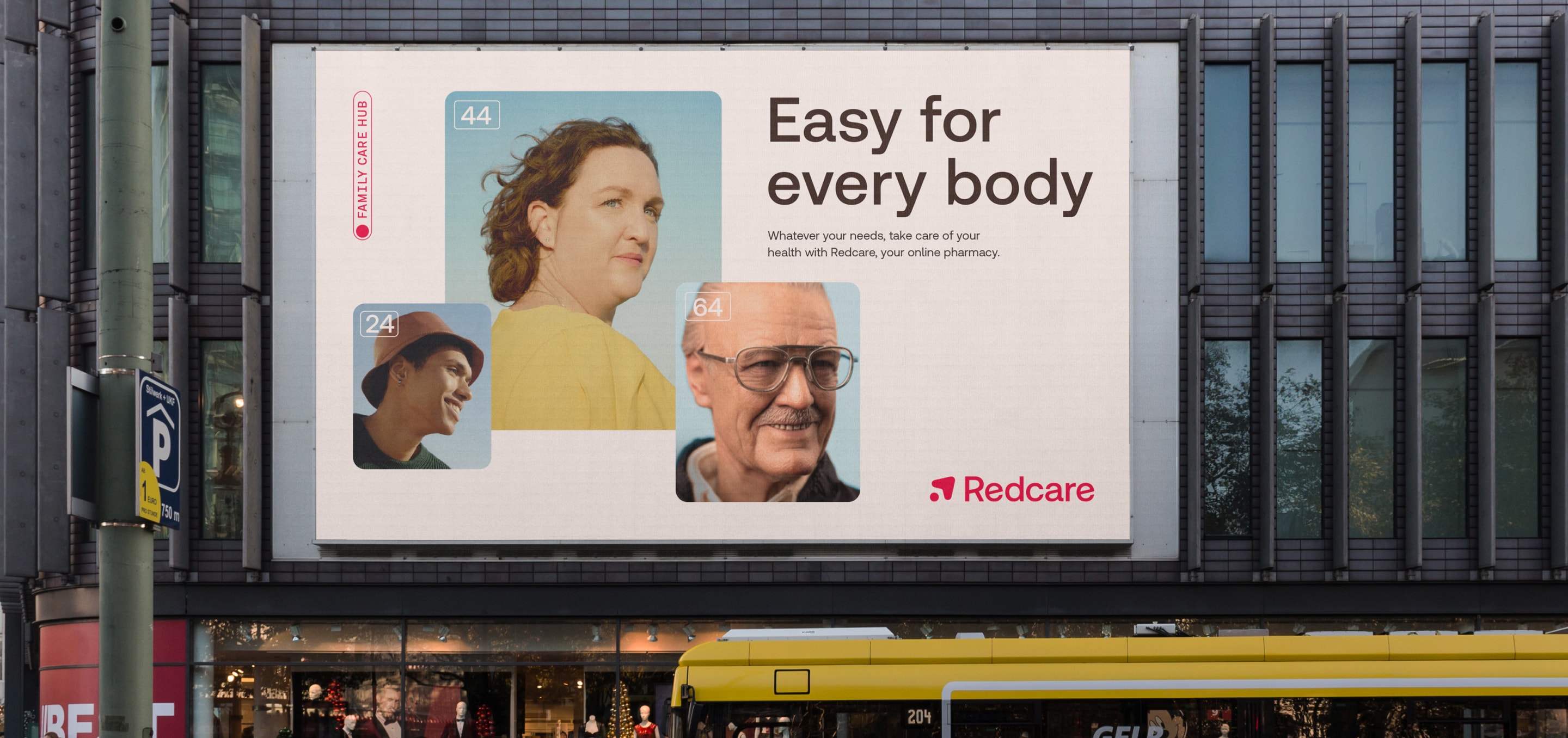
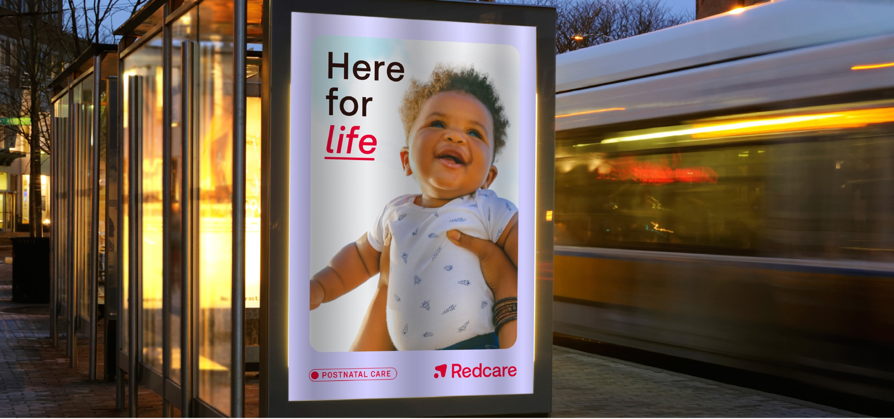
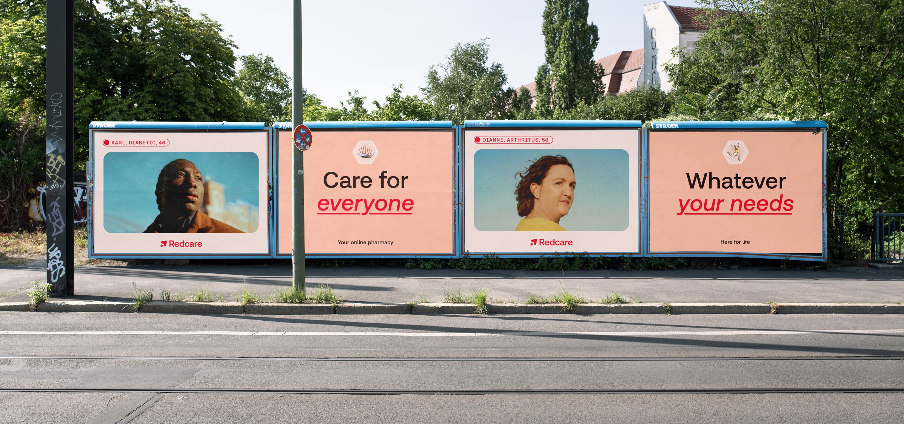
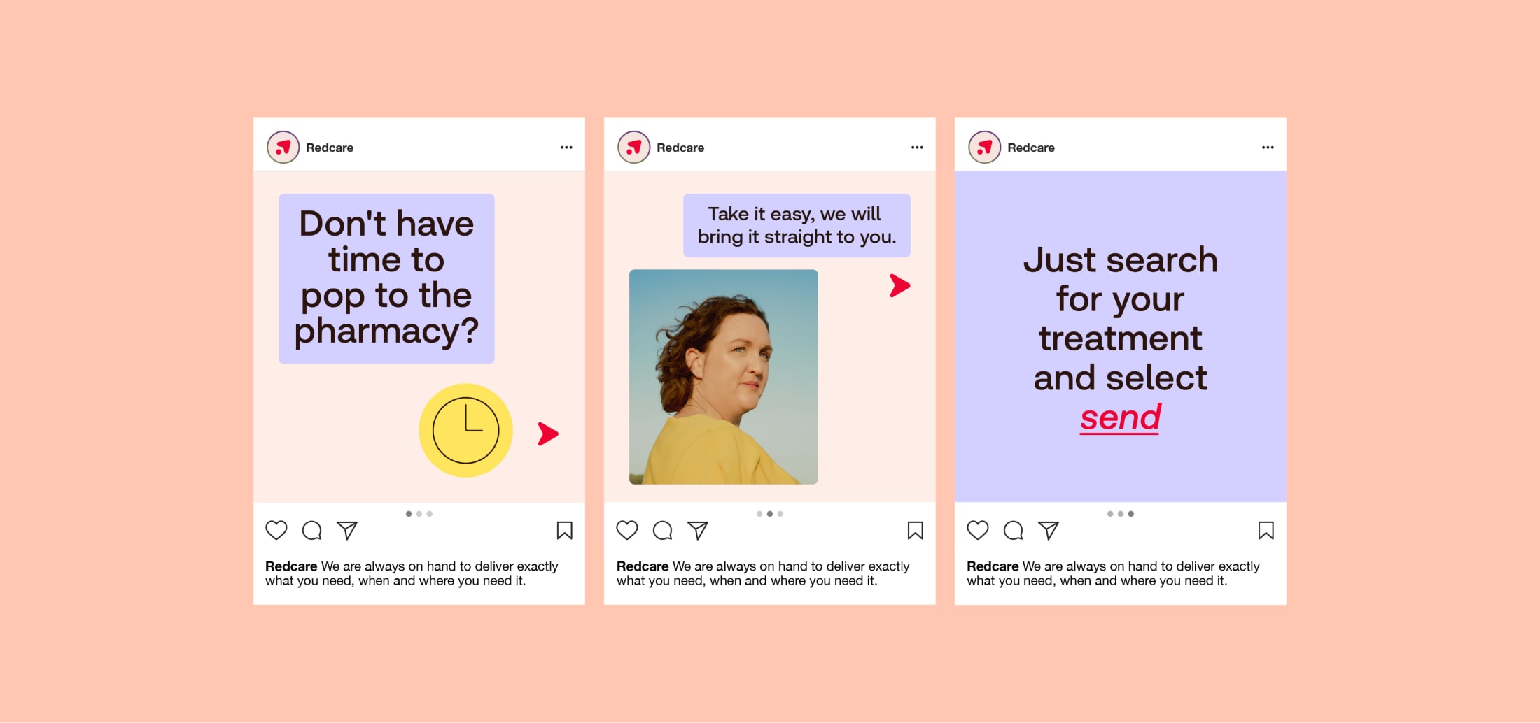
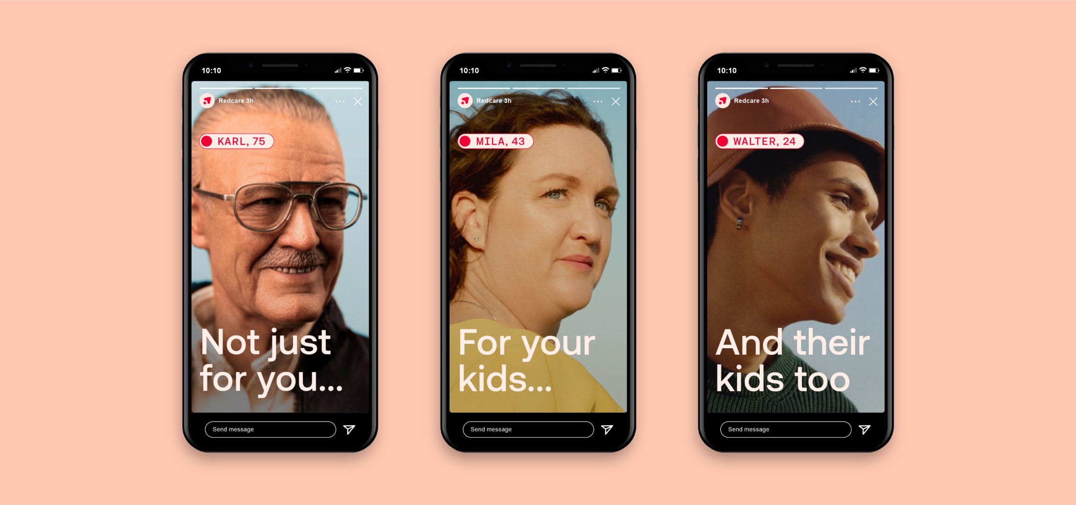
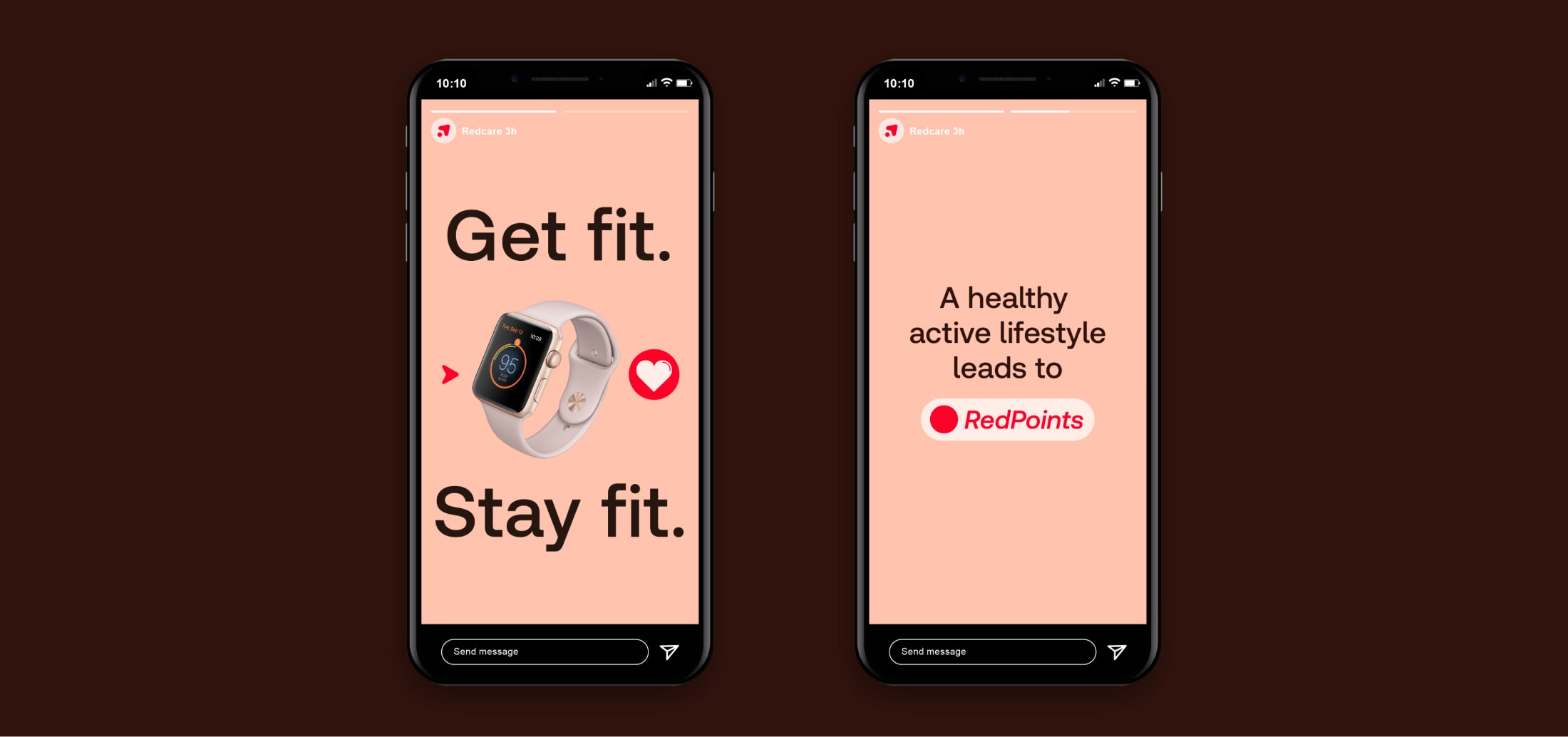
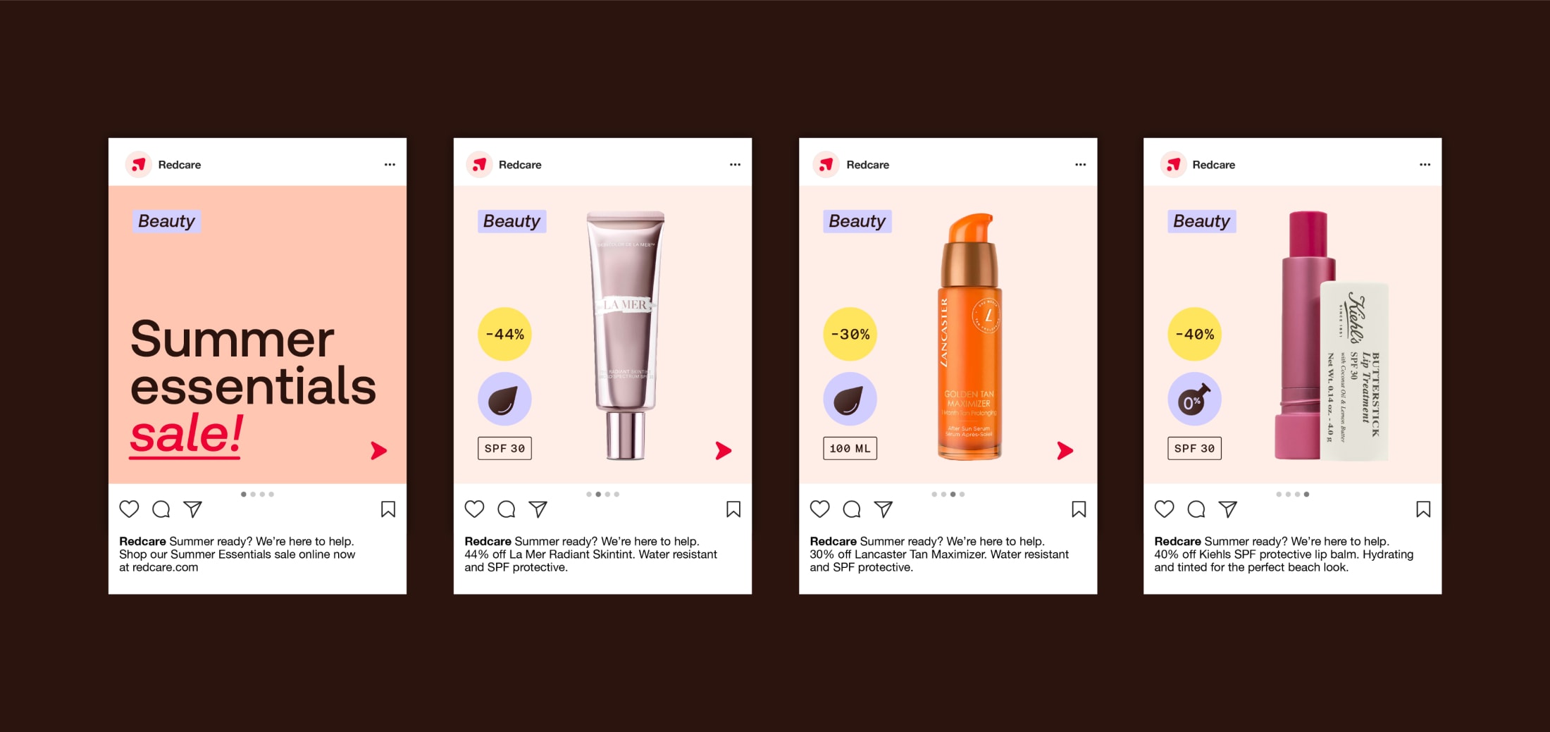
We can be more targeted with our marketing comms, especially when it comes to what we choose to hero. We want our future customers to be in no doubt as to what we have to offer them.
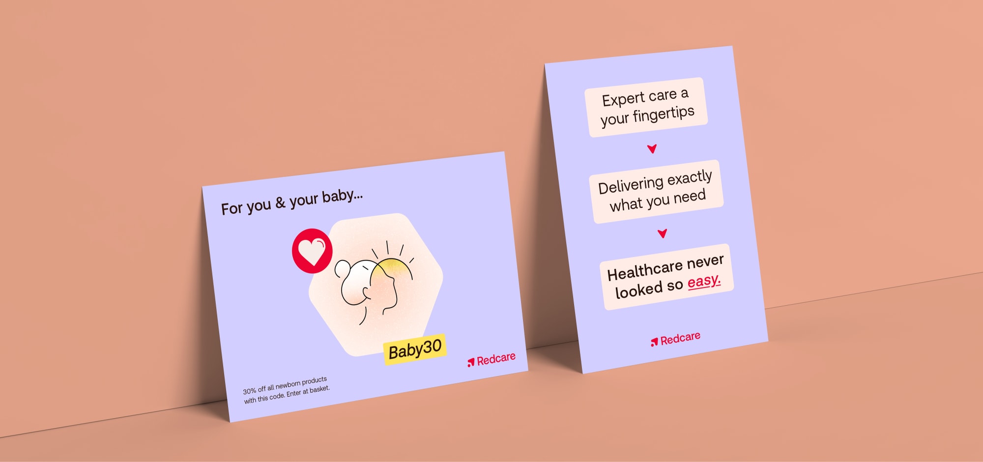
We can get very specific here to fit the scale of the comms. Make sure to hero something that can be quickly understood: a punchy headline, a product, or a portrait.
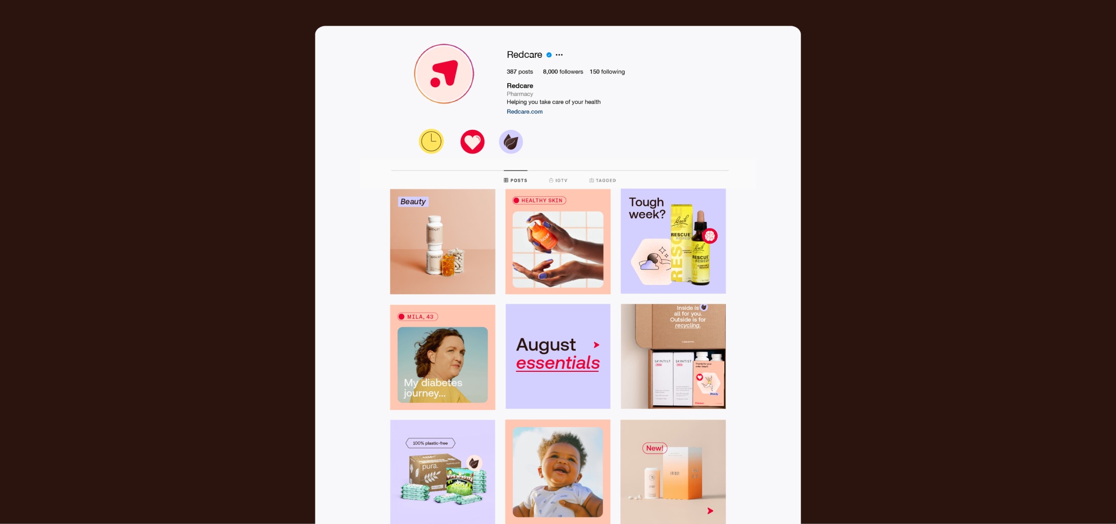
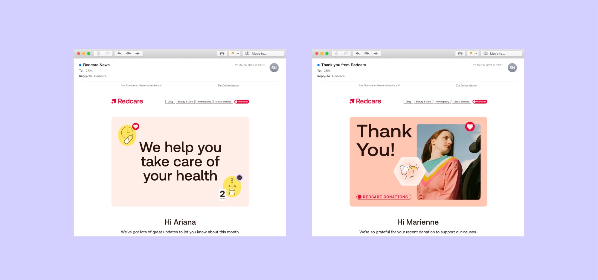
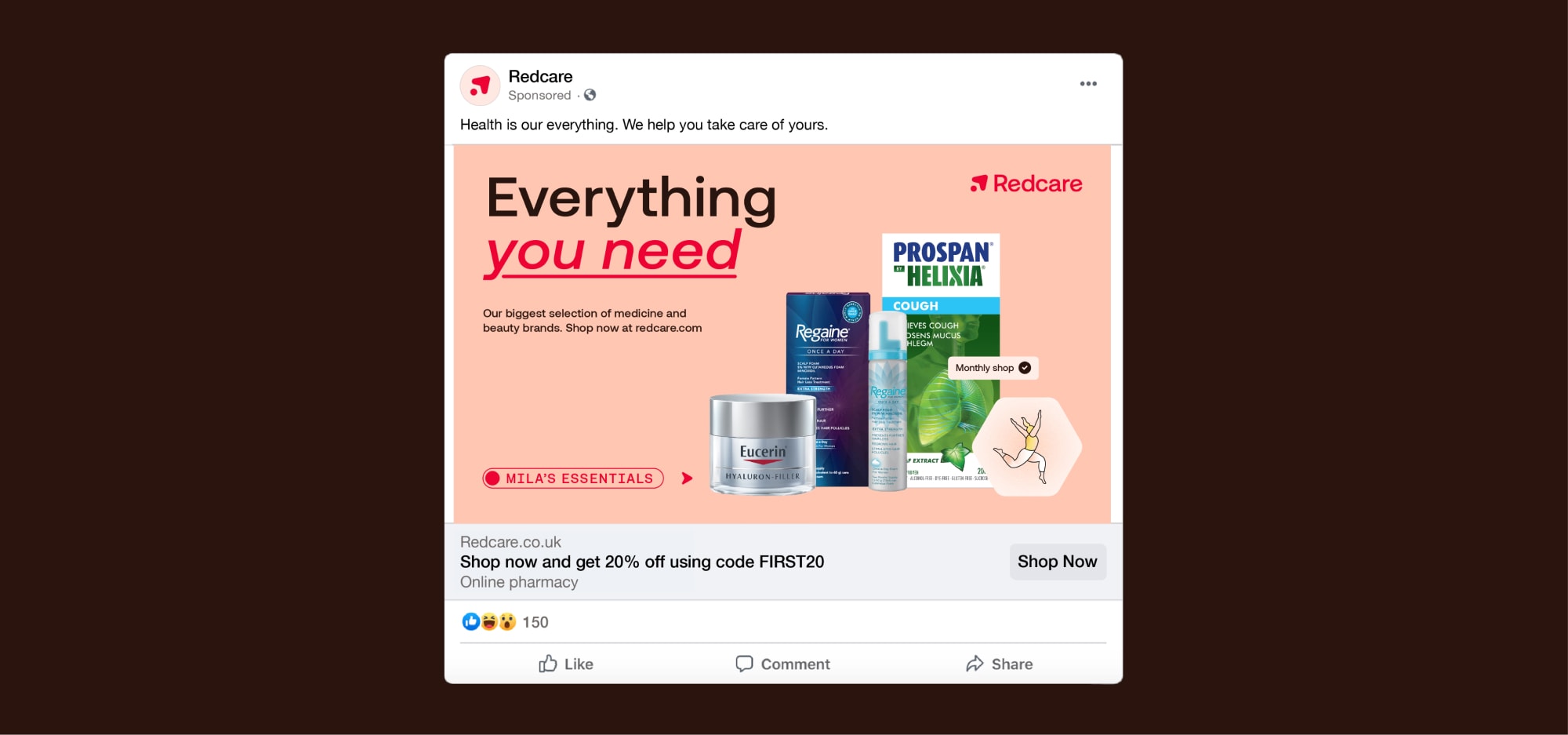
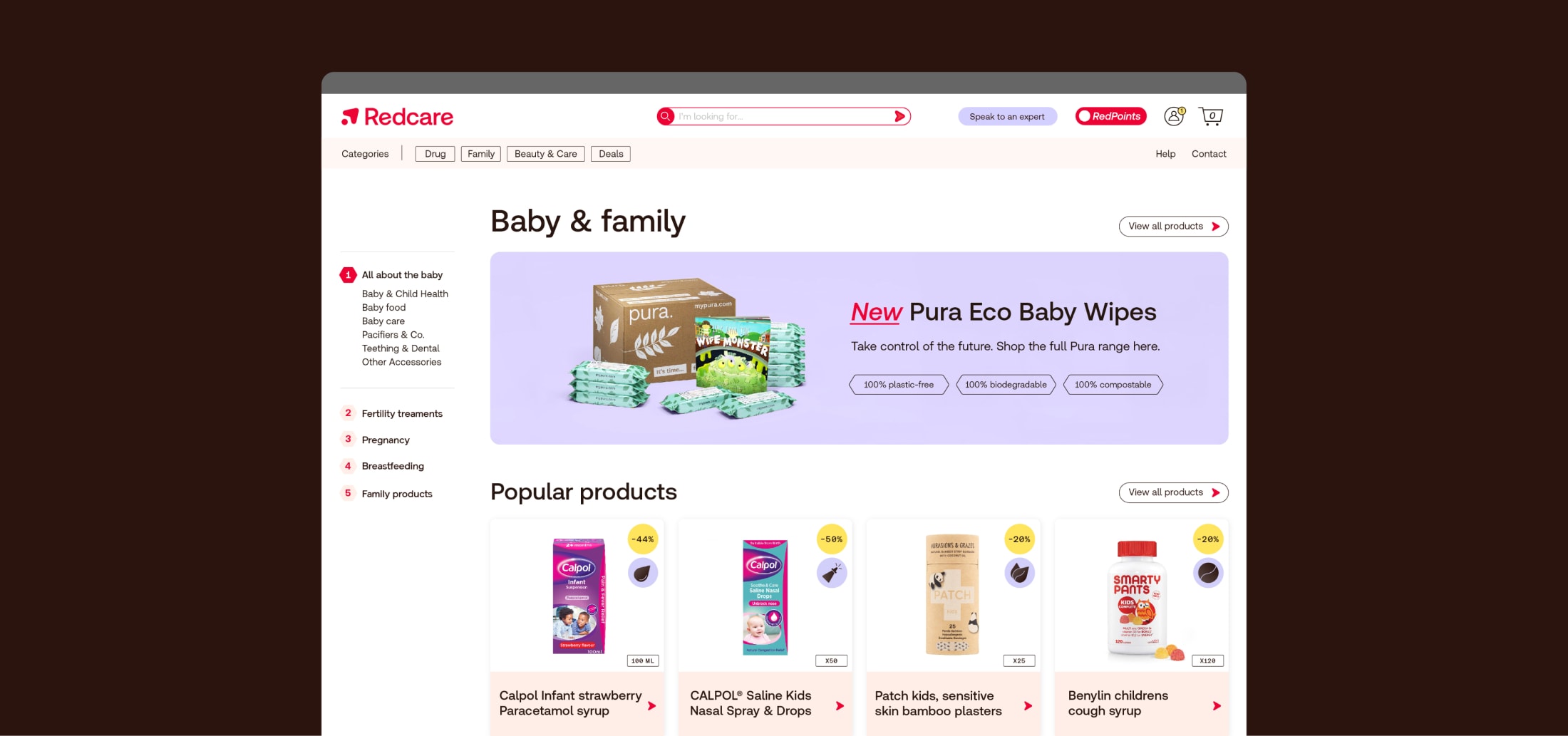
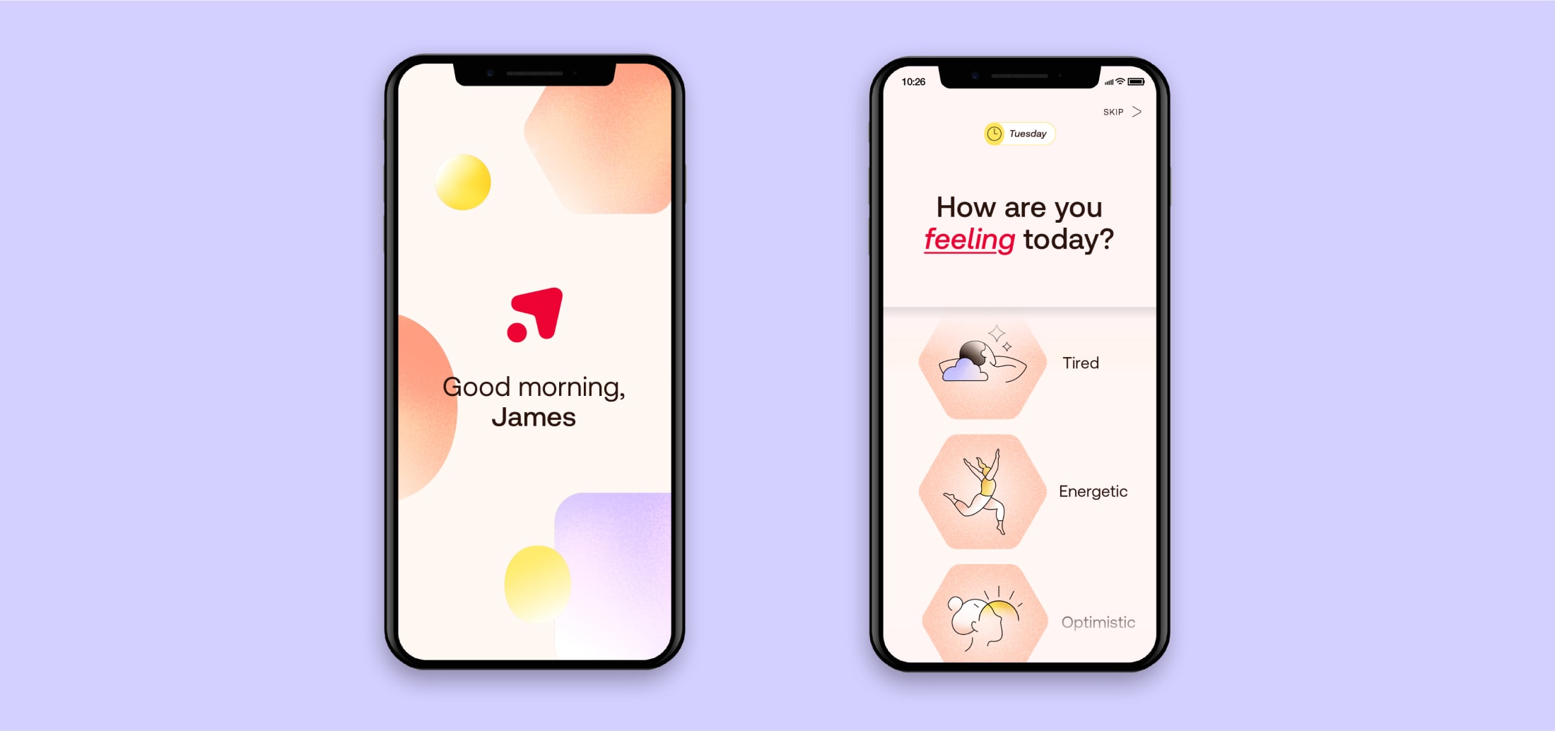
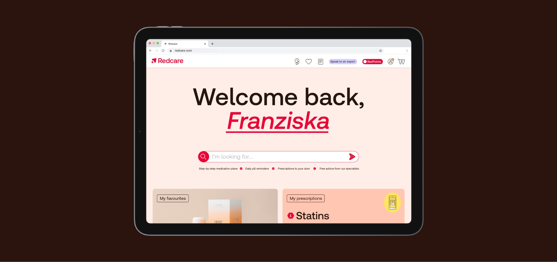
For digital comms, clarity is key. It’s important we use our arrow and design system to make digital experiences accessible and easy to use.
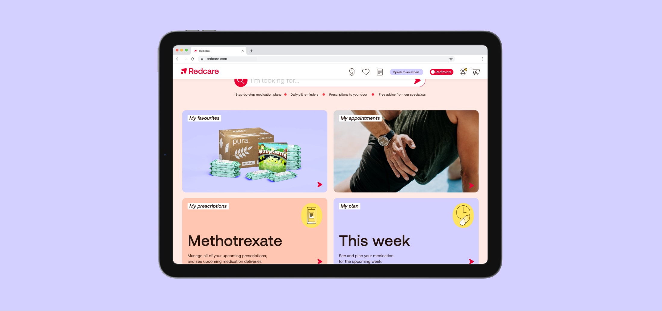
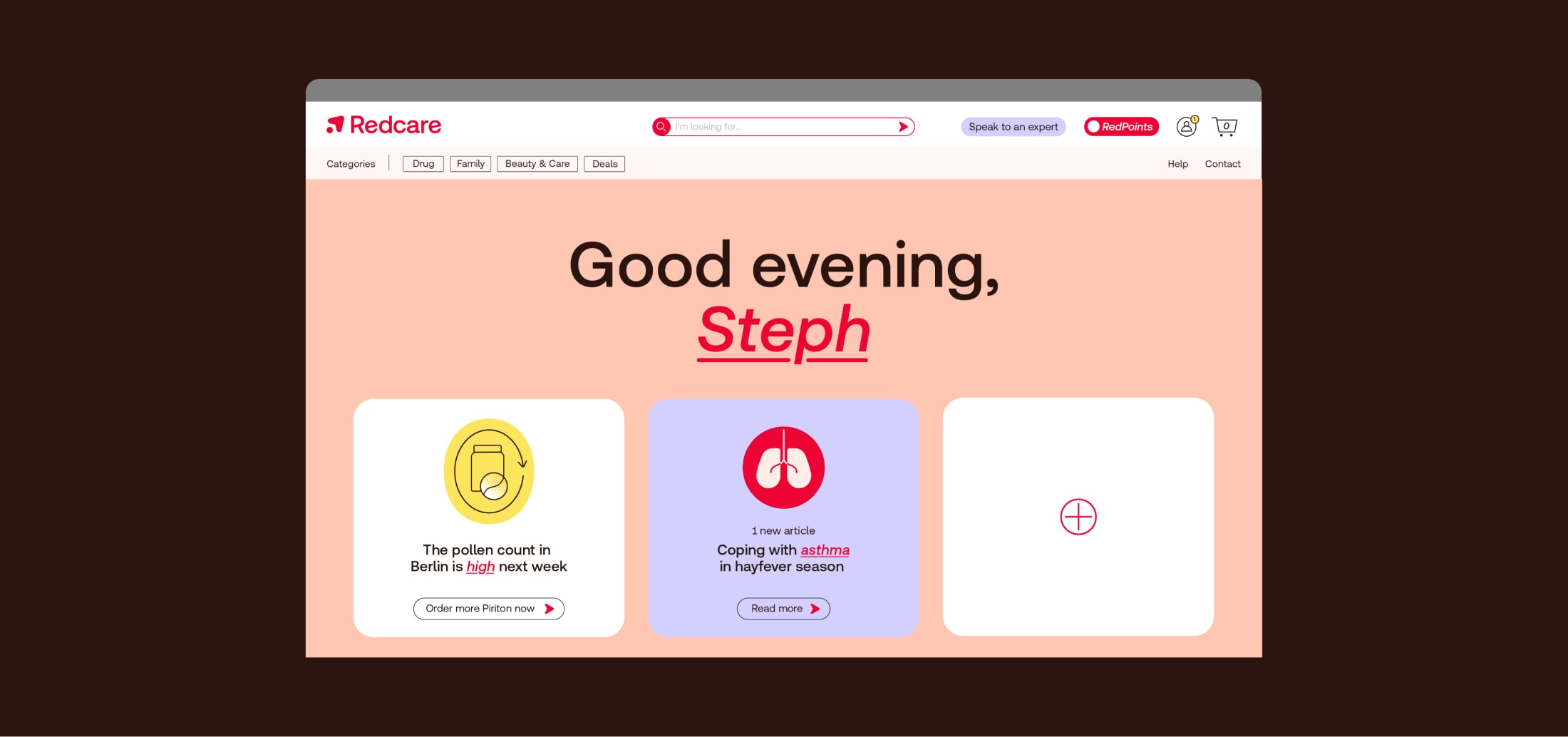
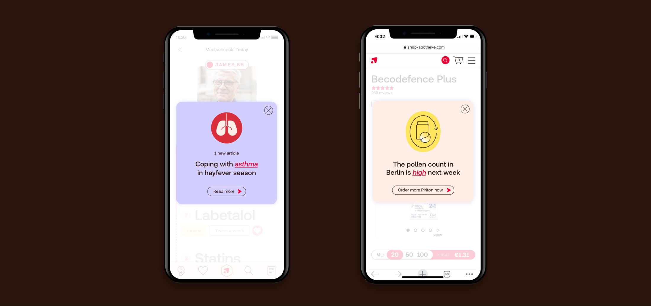
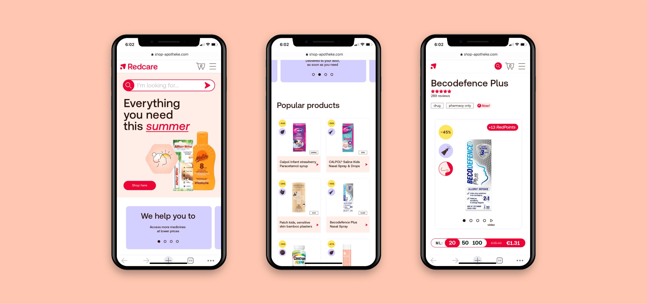
With our app experience, it’s important that people can find information and actions quickly and easily.
So we use our icons and signposting to guide people. We also make sure to carry our caring tone and warmth throughout the experience.
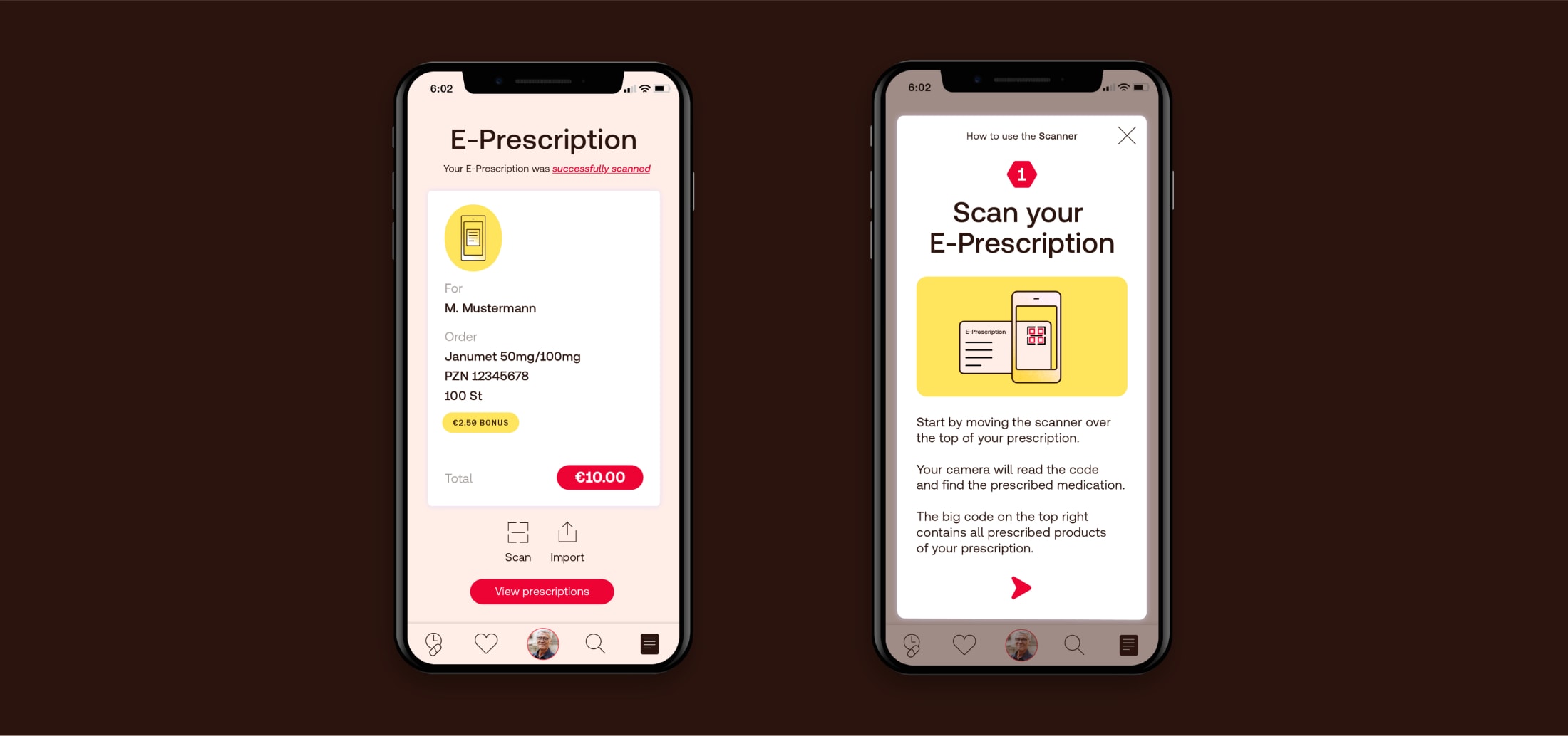
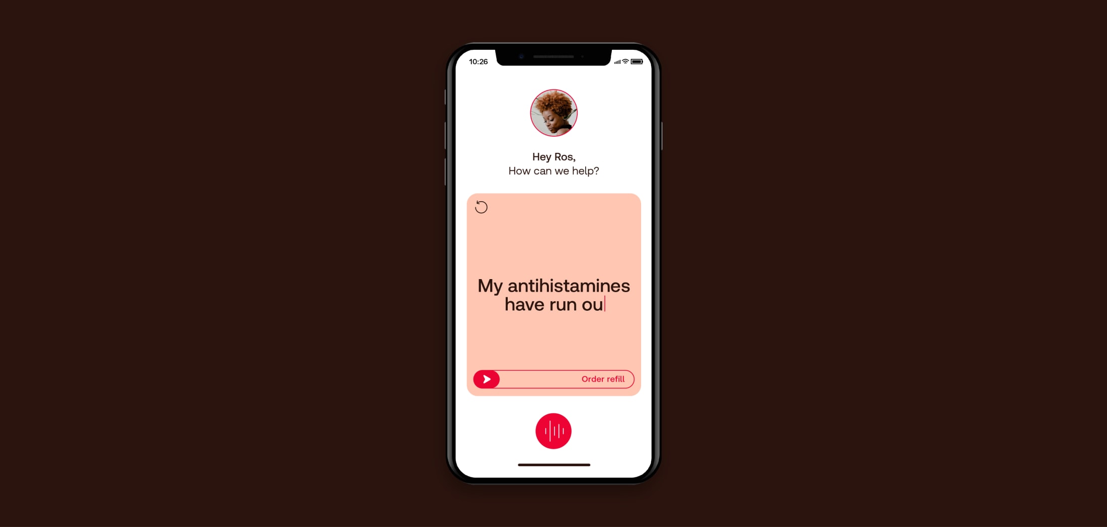
We don’t need a huge amount of text here.
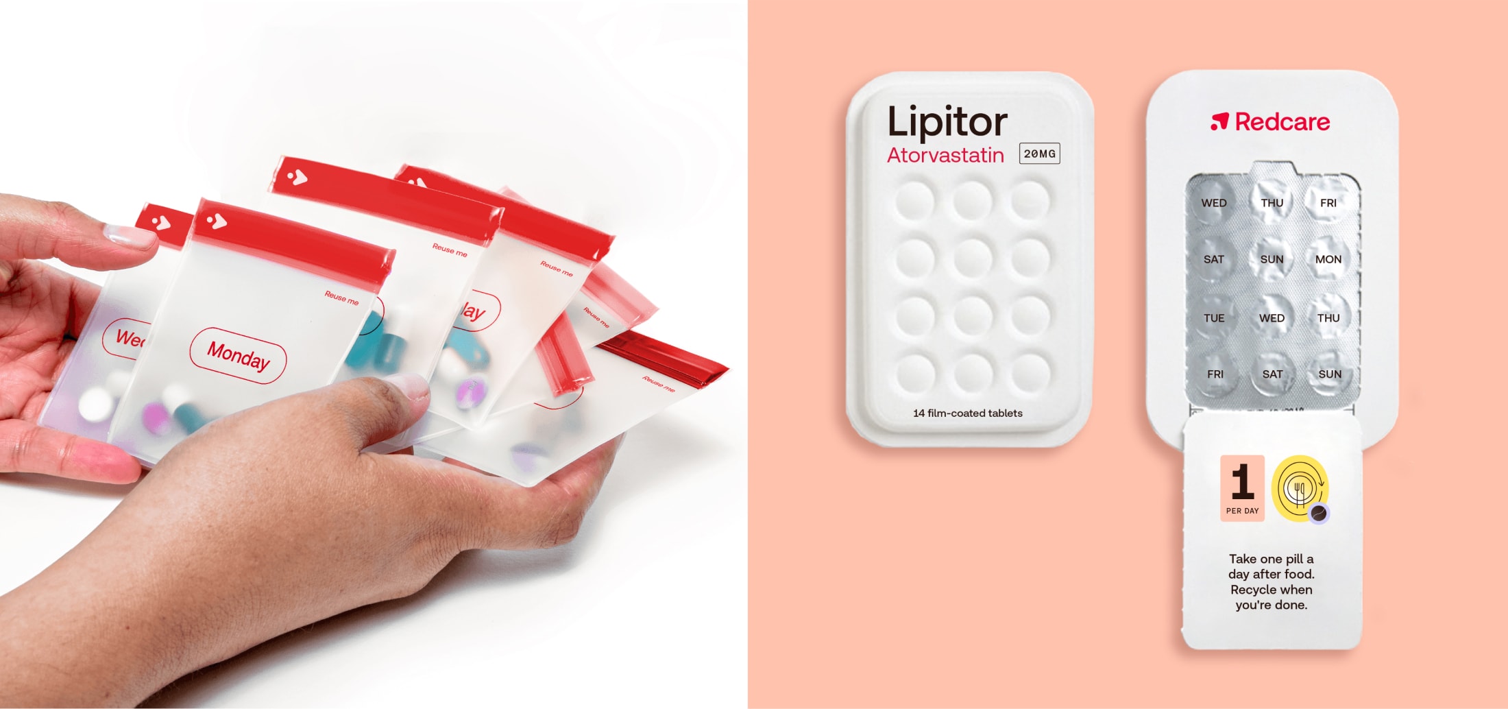
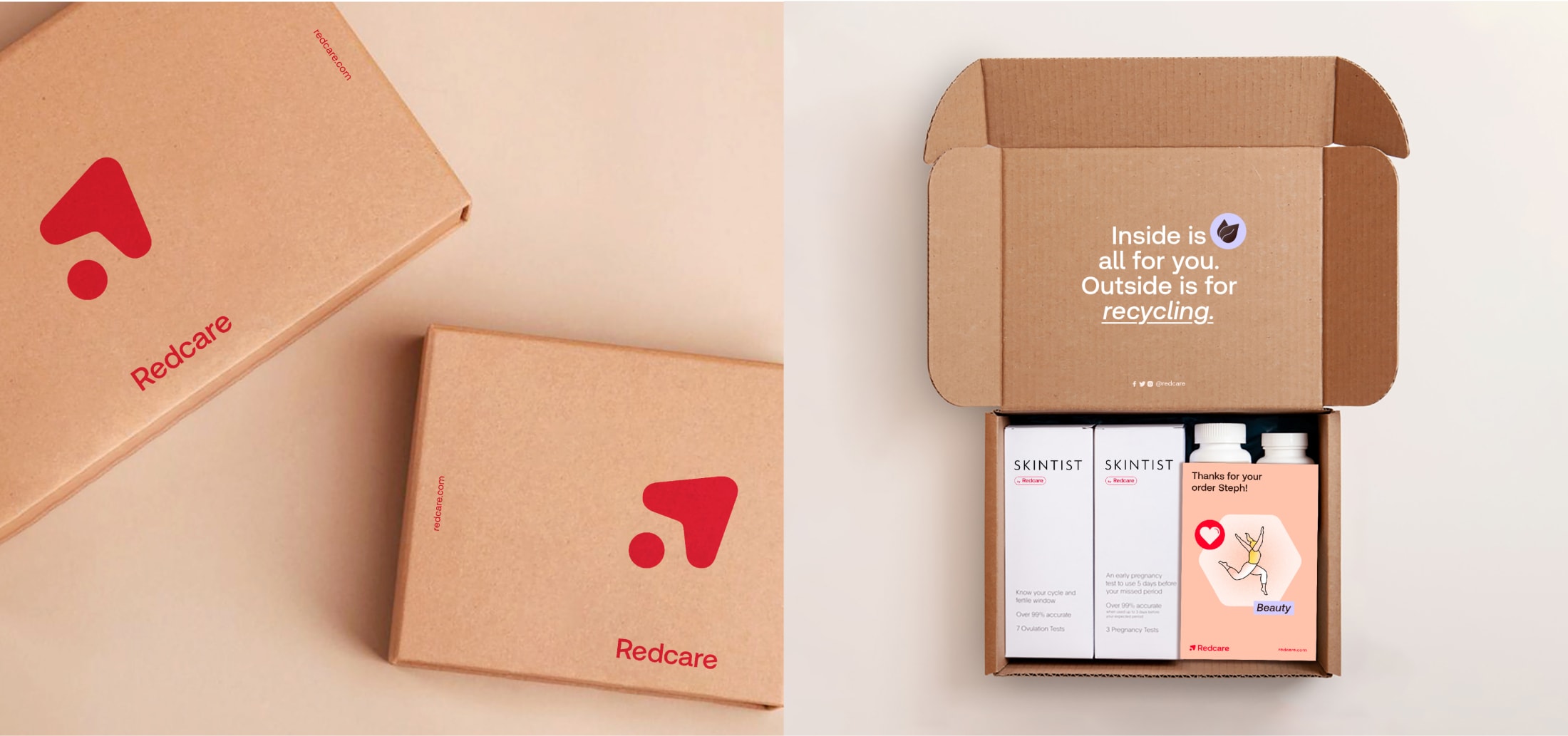
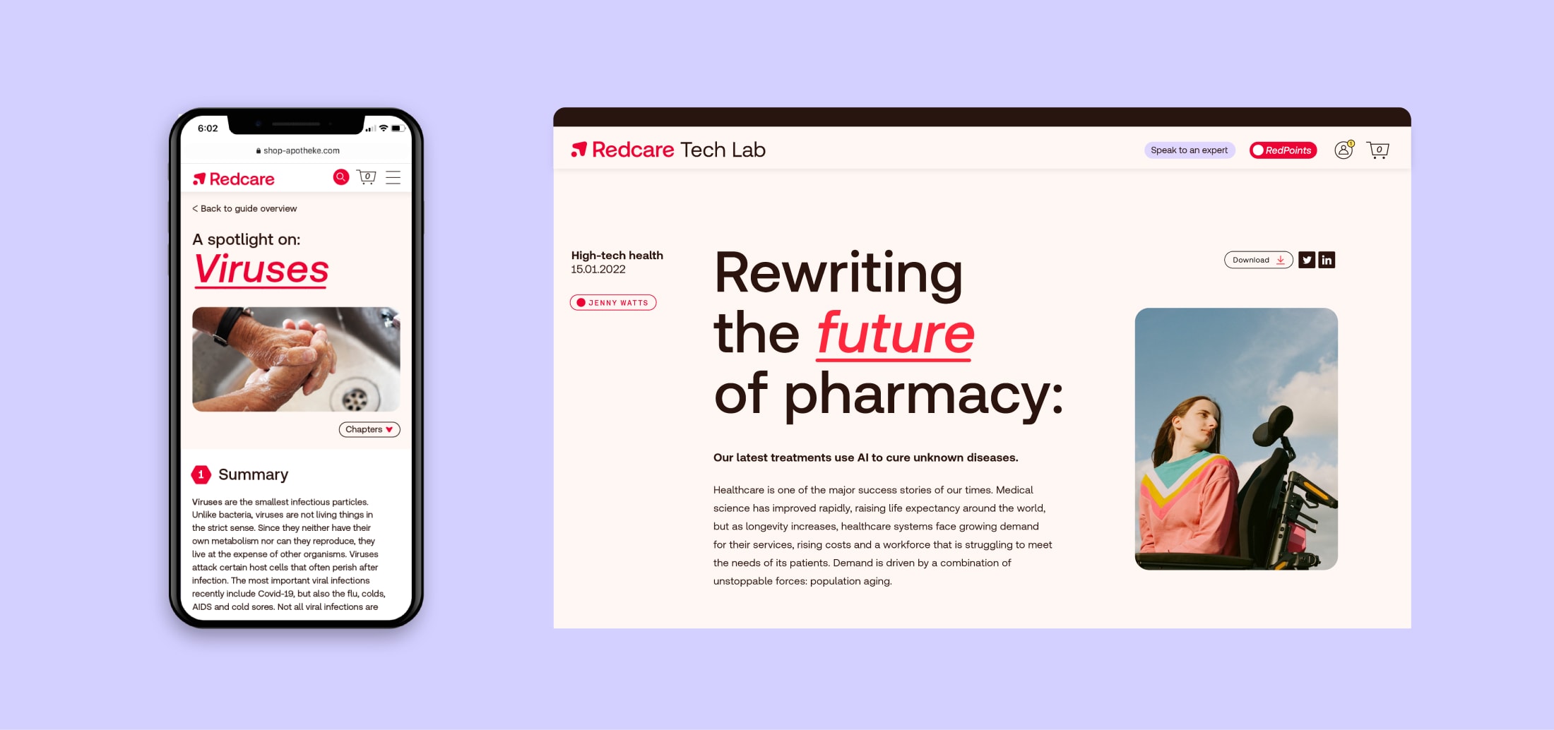
Our physical comms is where our icon language and logo can stand out. We can add some clear, concise copy where appropriate.