Grids, spacing and sizing
Use the following as guidance when setting up grids and placing elements. These rules may need to be adapted for extreme formats.
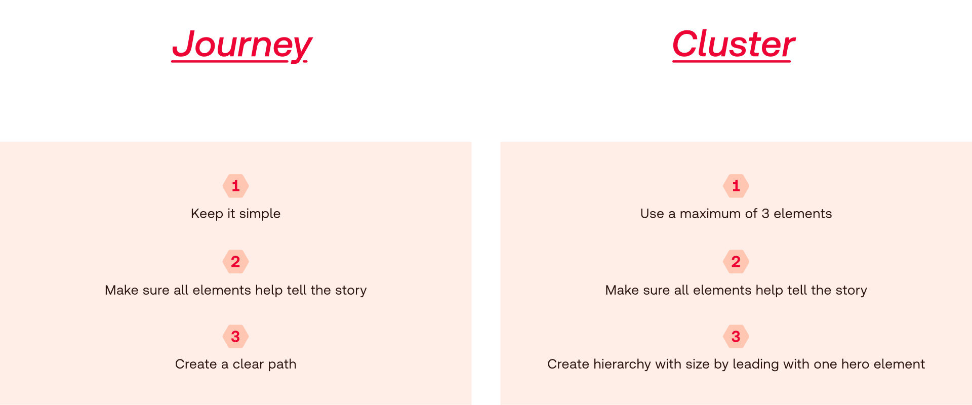
Our design system is all about showing the way forward. Every piece of design should have clear hierarchy and every element should be telling a part of the story.
We can combine our elements in different ways to create rich and engaging content. However, in order to keep the Redcare feel, it’s important to follow our guidelines.


Use the following as guidance when setting up grids and placing elements. These rules may need to be adapted for extreme formats.
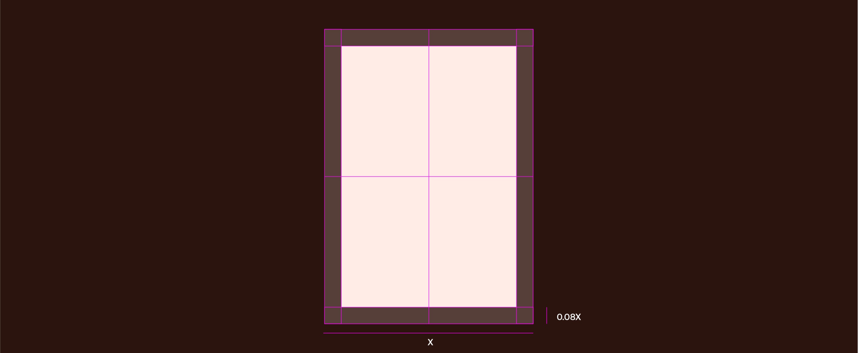
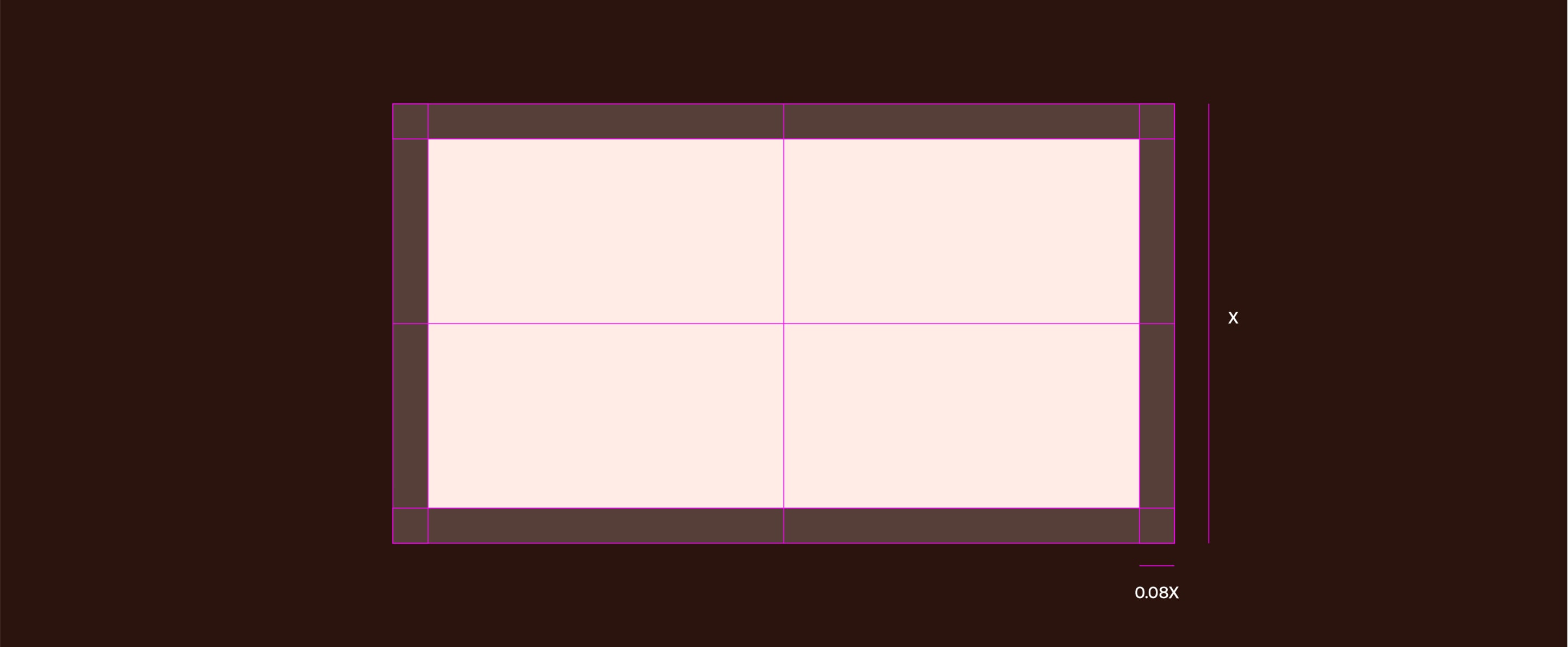
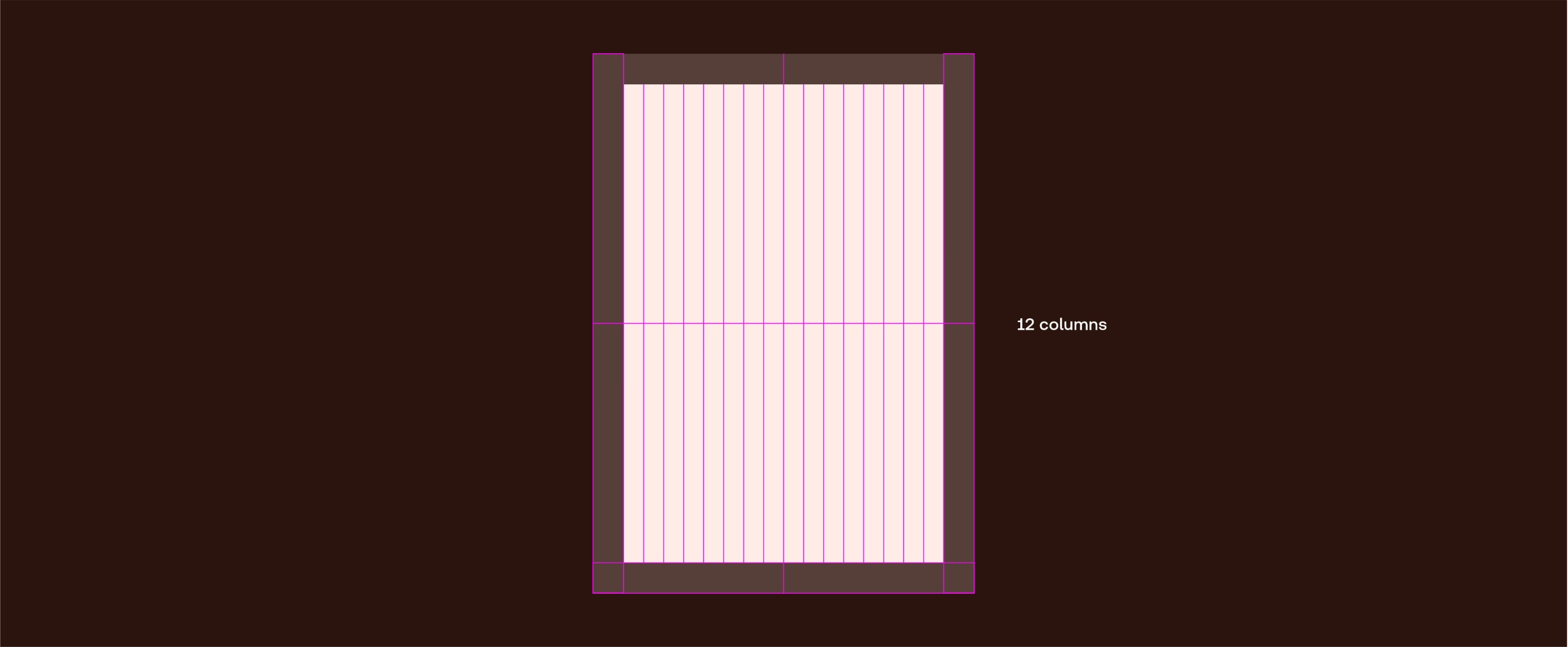
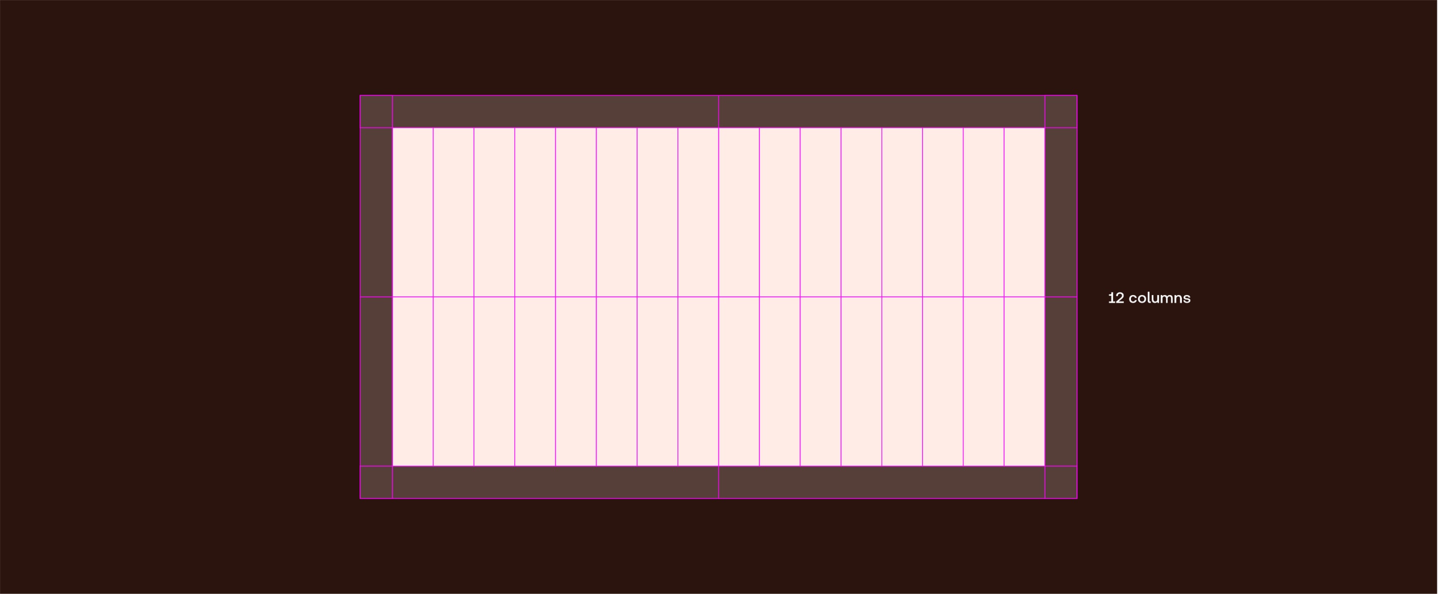
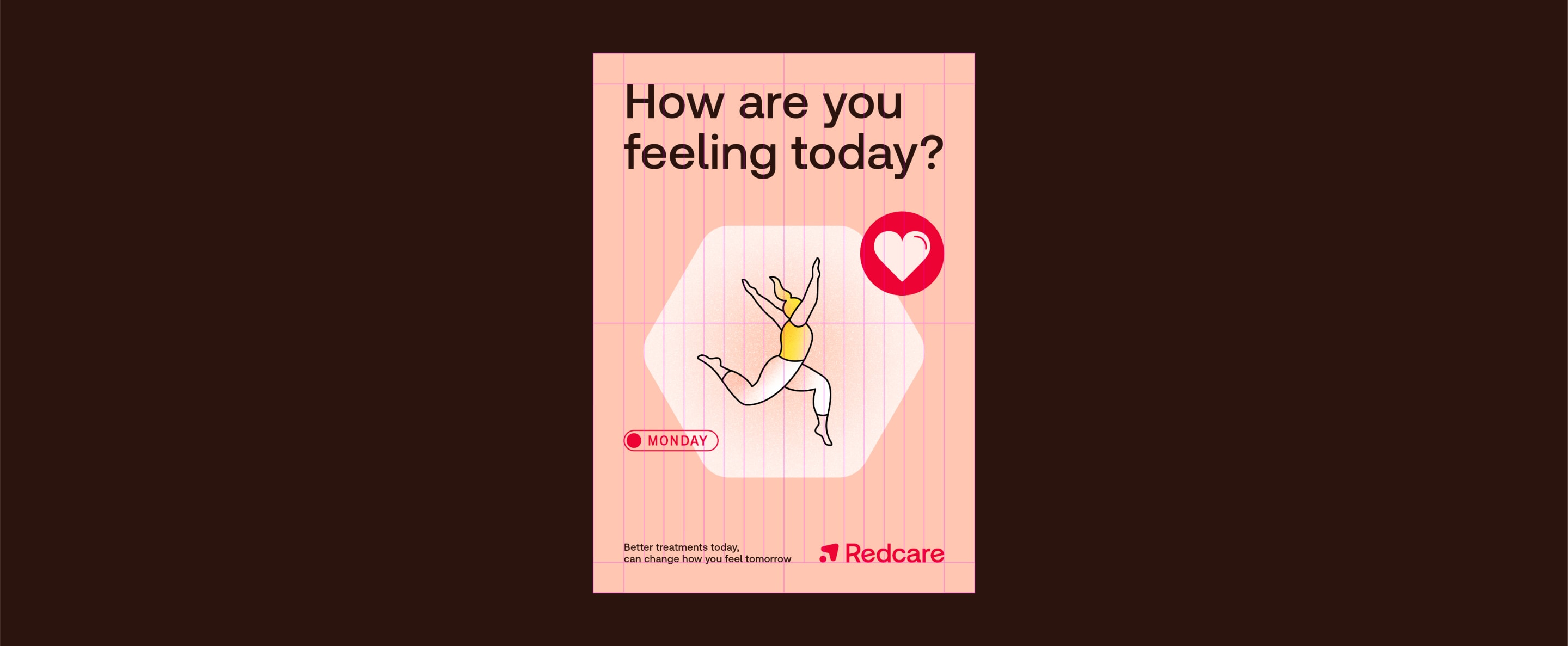
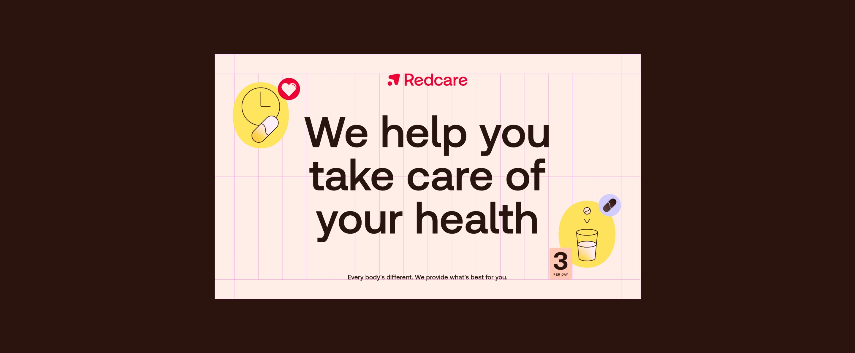
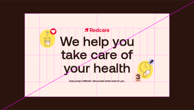
When setting up a layout, begin by setting the margins — these should be 0.8 of the shortest side. Then divide the layout into 16 for alignment of elements.
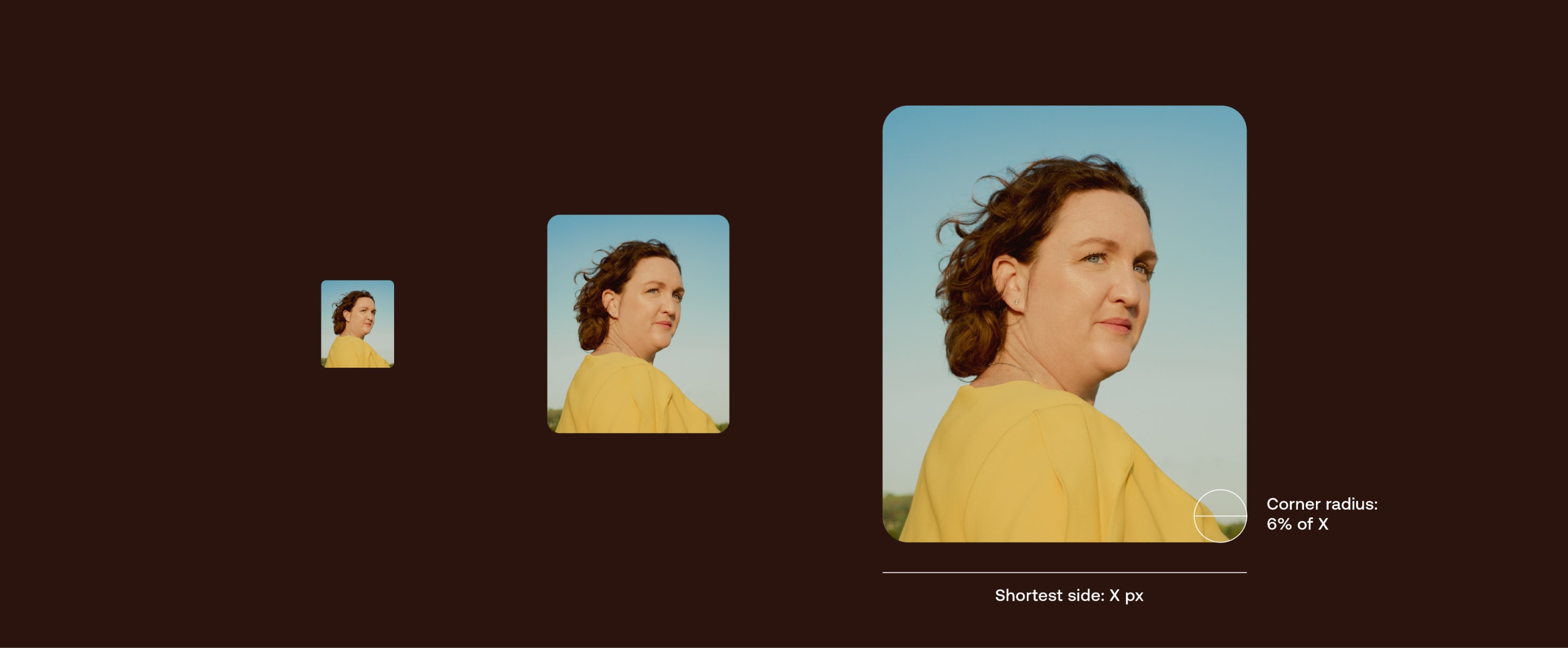
We use rounded corners on our image and text boxes. Use the following as guidance to keep consistency – adjust opticially when scaling.
Note: Keep consistency of corners across a layout by using the radius of the smallest element.
We have two core layout styles; journey and cluster. Scroll down to see when and how to use them.
We have two main ways of laying out information, depending on whether we want to tell a story, or give more of an immediate overview.
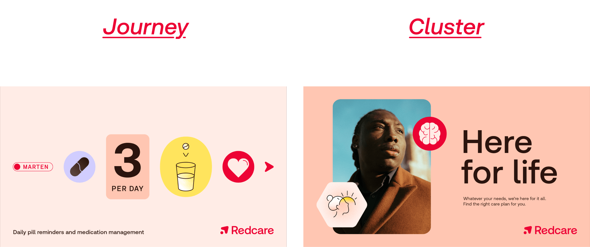
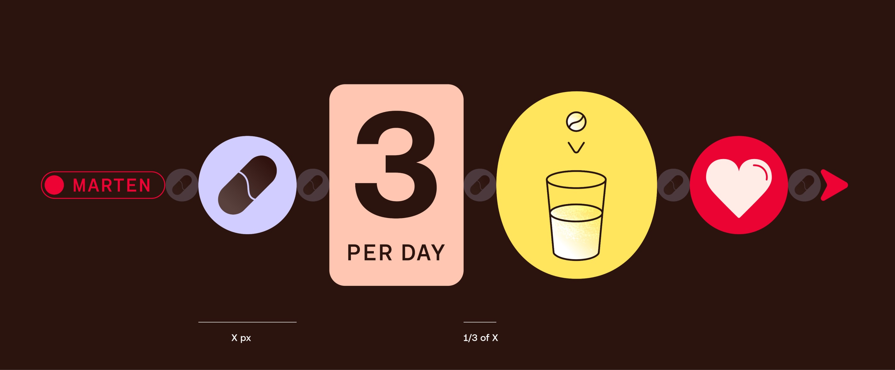
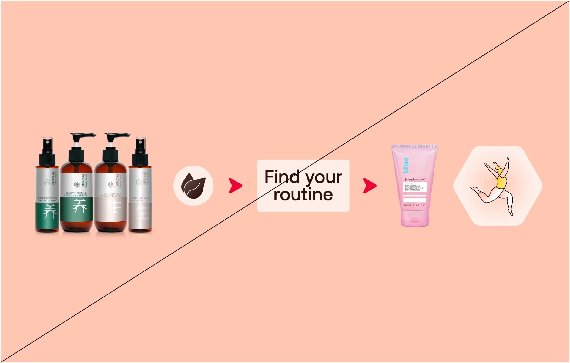
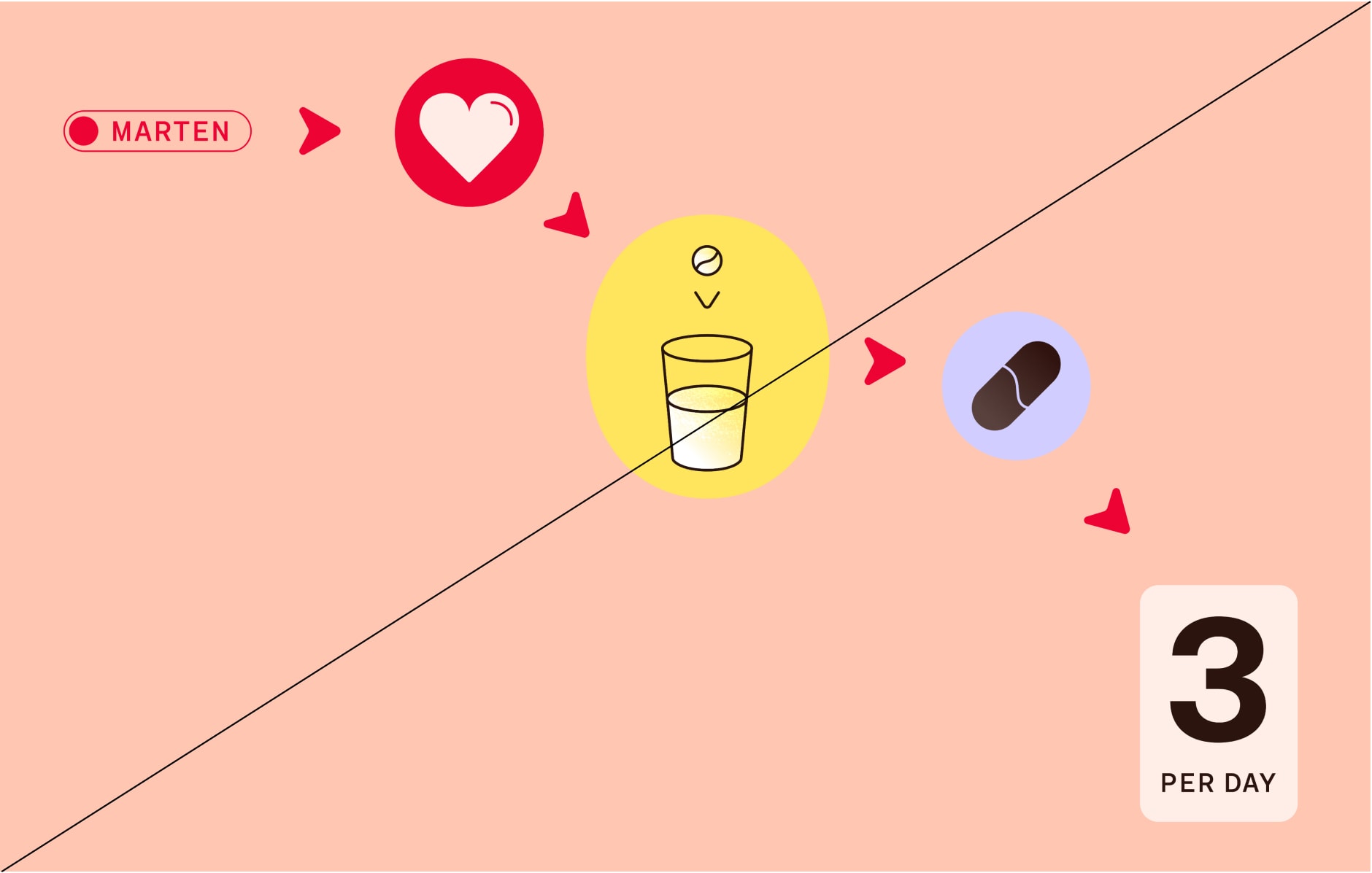
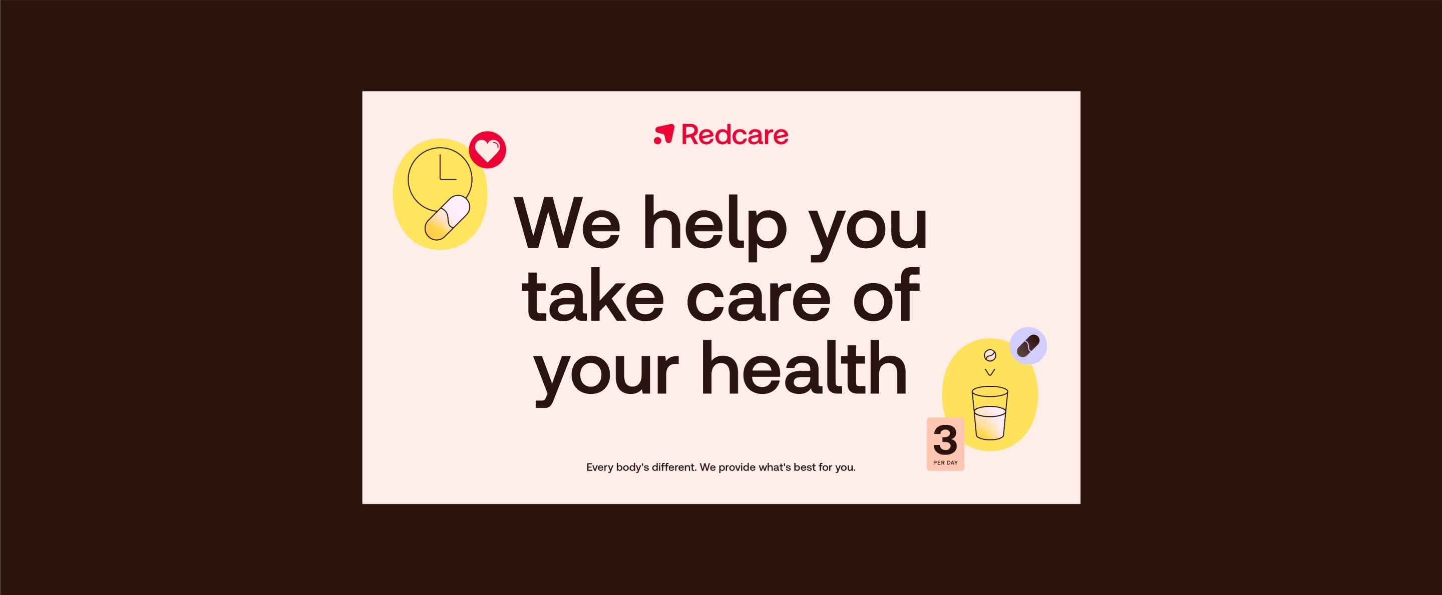
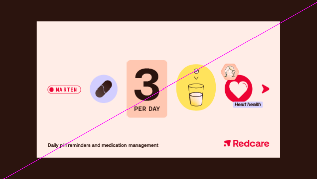
Our sequences of icons can show routines, showcasing how we make taking care of your health easy. Keep the spacing consistent, and follow icon line weight rules.
Our sequences of icons can show routines, showcasing how we make taking care of your health easy. Keep the spacing consistent, and follow icon line weight rules.
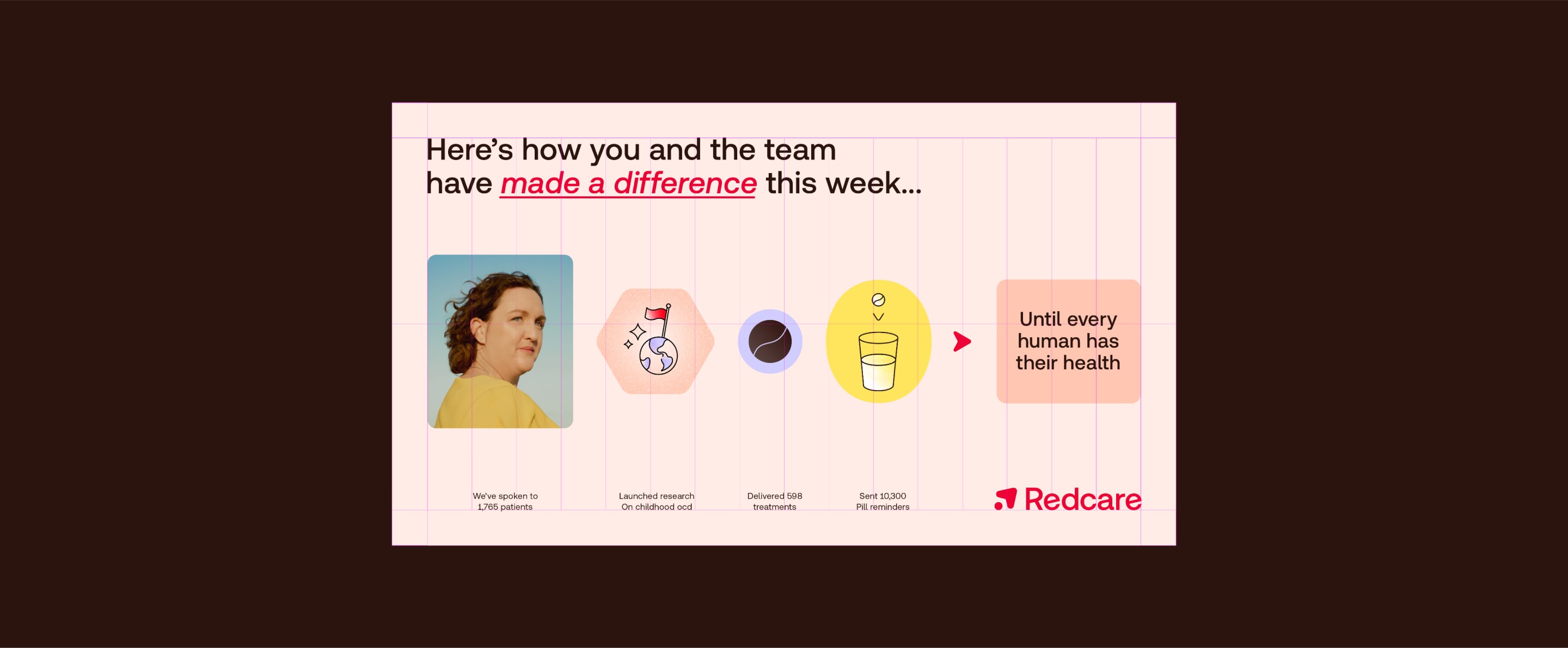
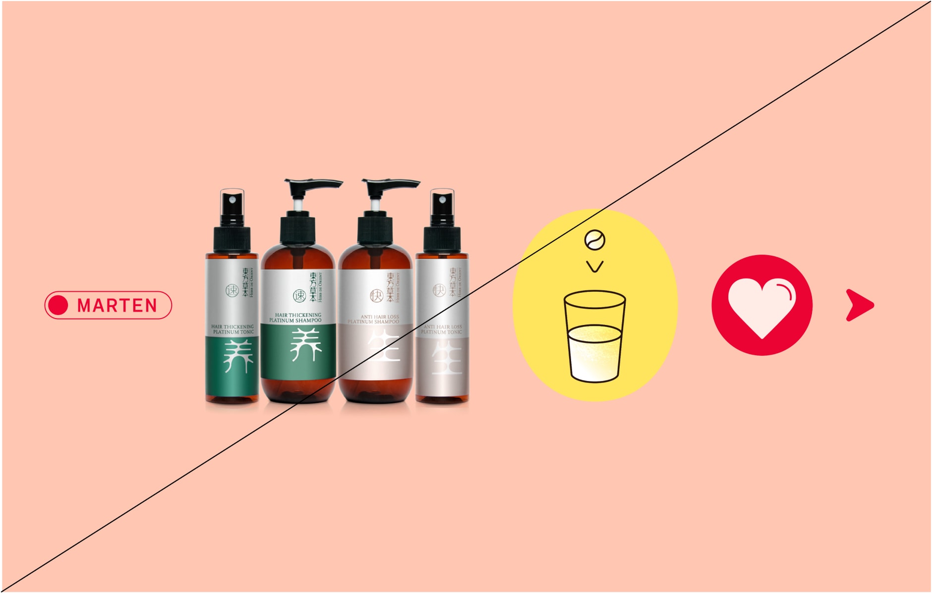
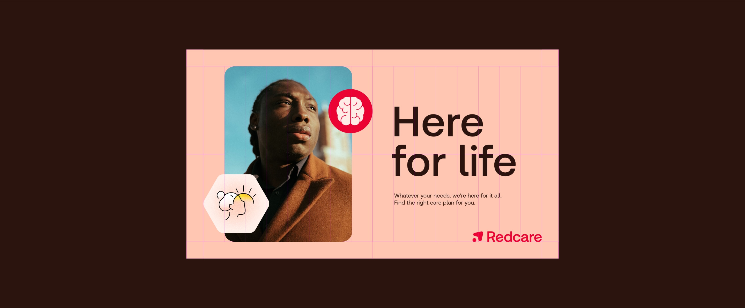
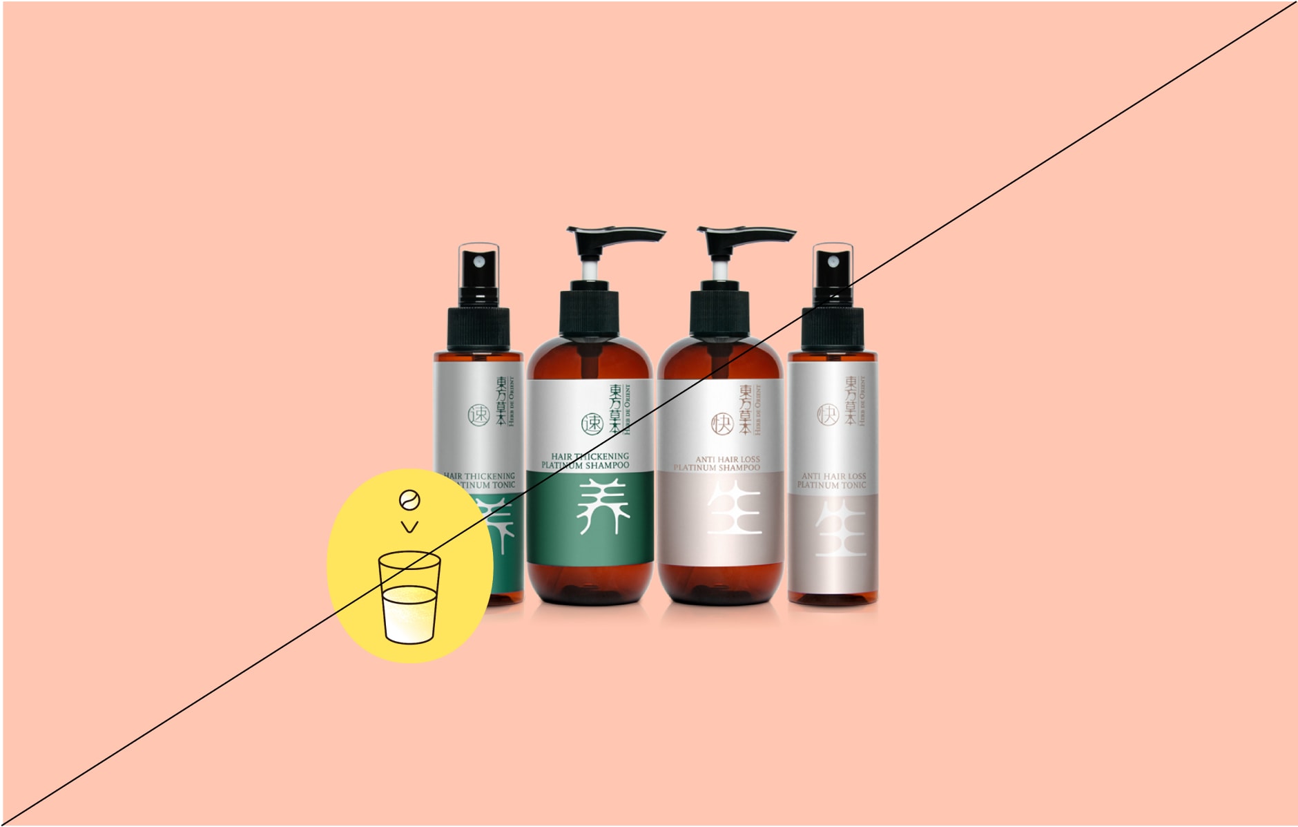
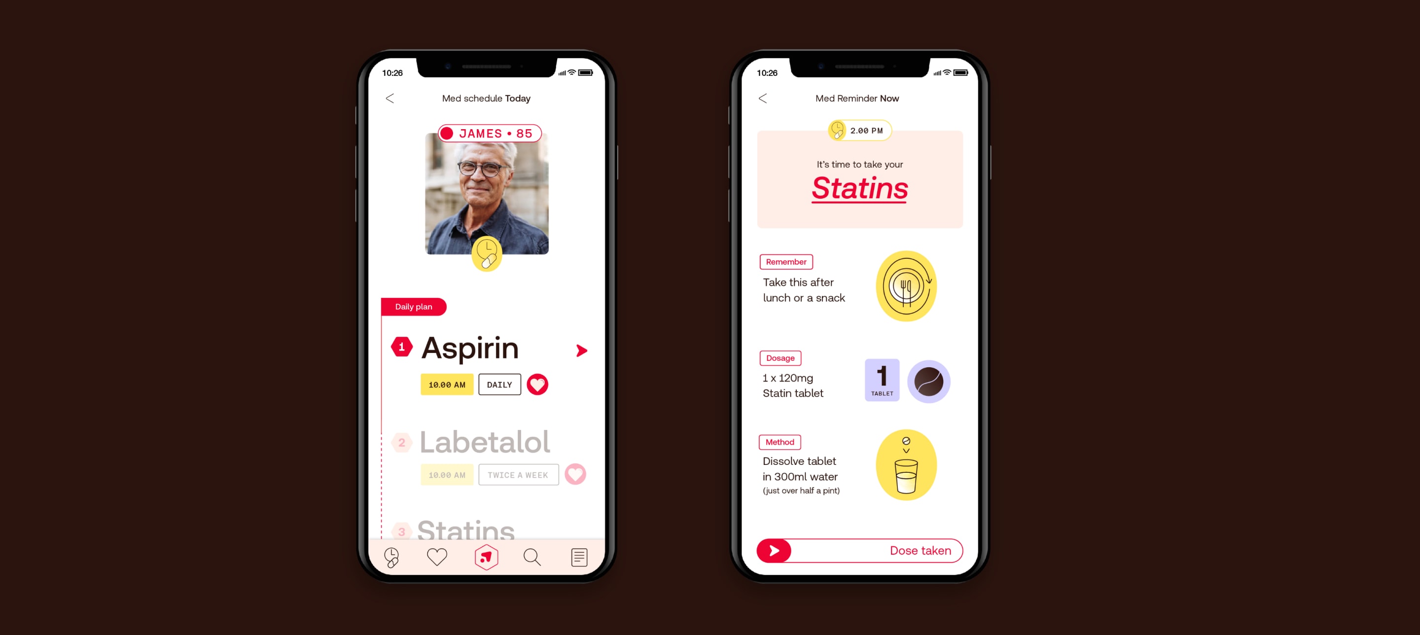
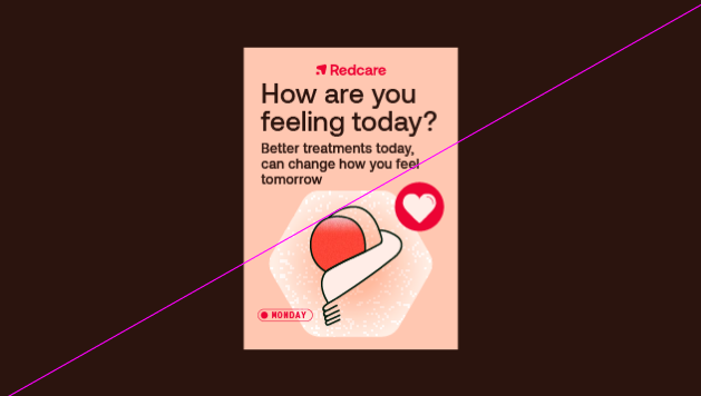
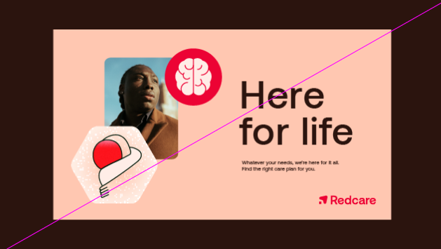
We can combine images and icons in our journey layouts to tell more personal stories. We use the image as another element in the story — keeping spacing consistent.
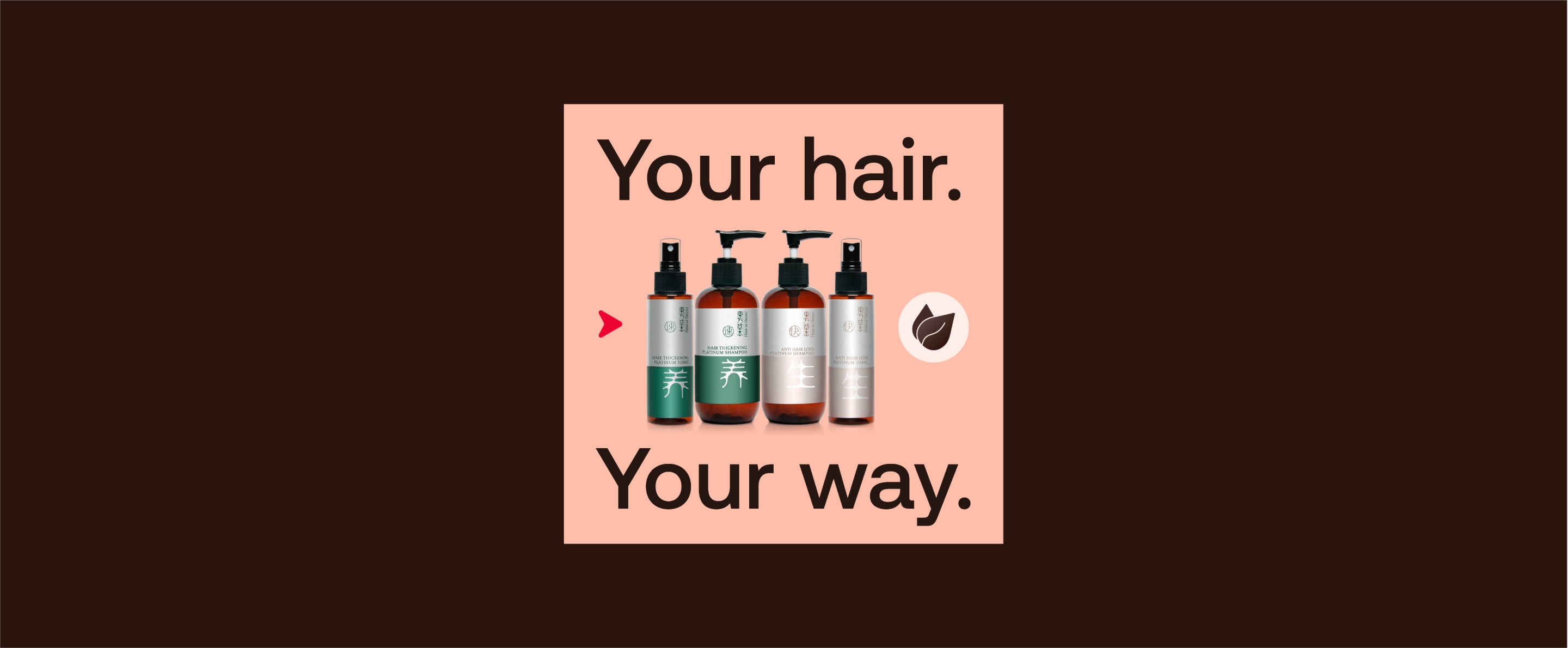
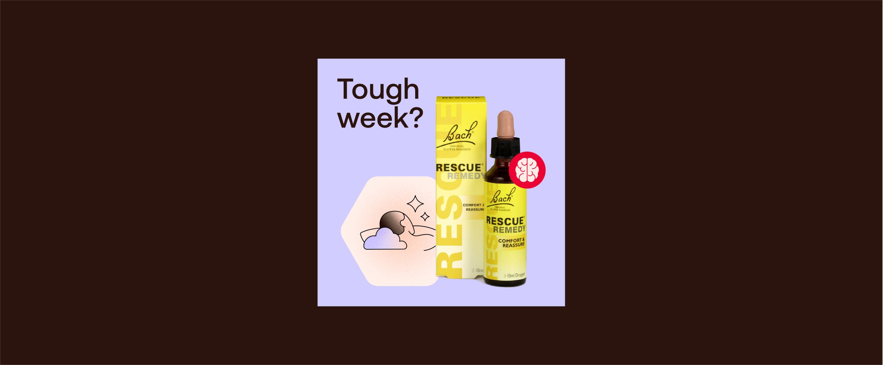
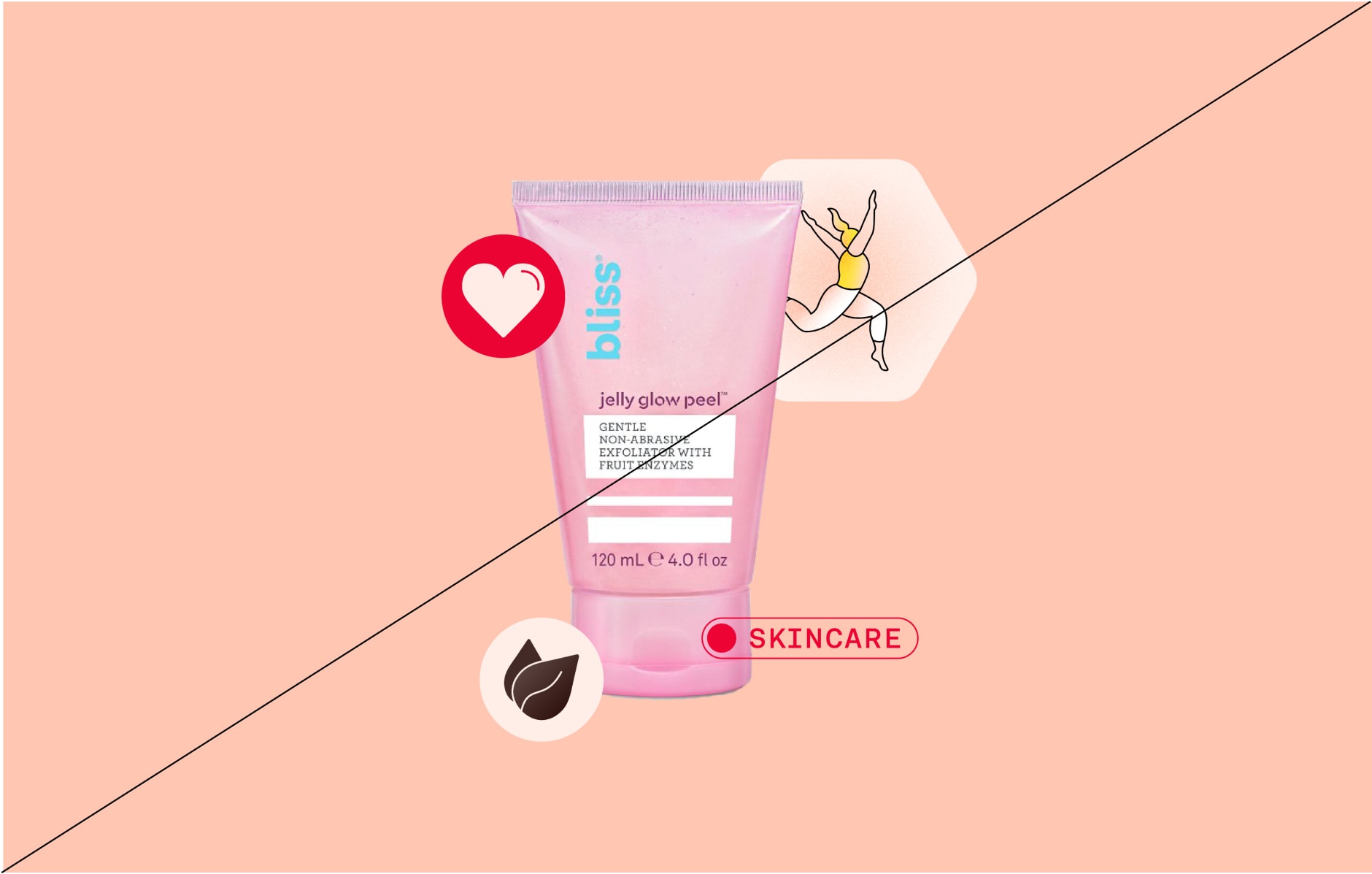
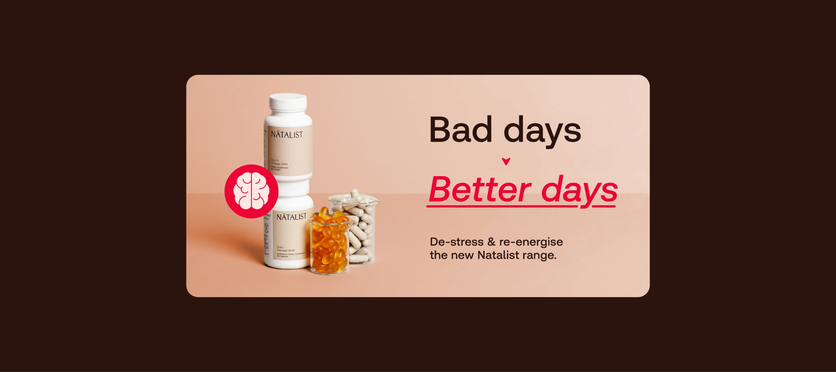
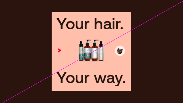
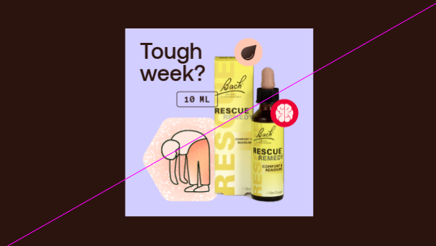
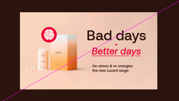
We can hero products as part of a journey, a great way to show off its benefits or how it’s used.
Use simple product cut-outs here to keep it clean and uncluttered.
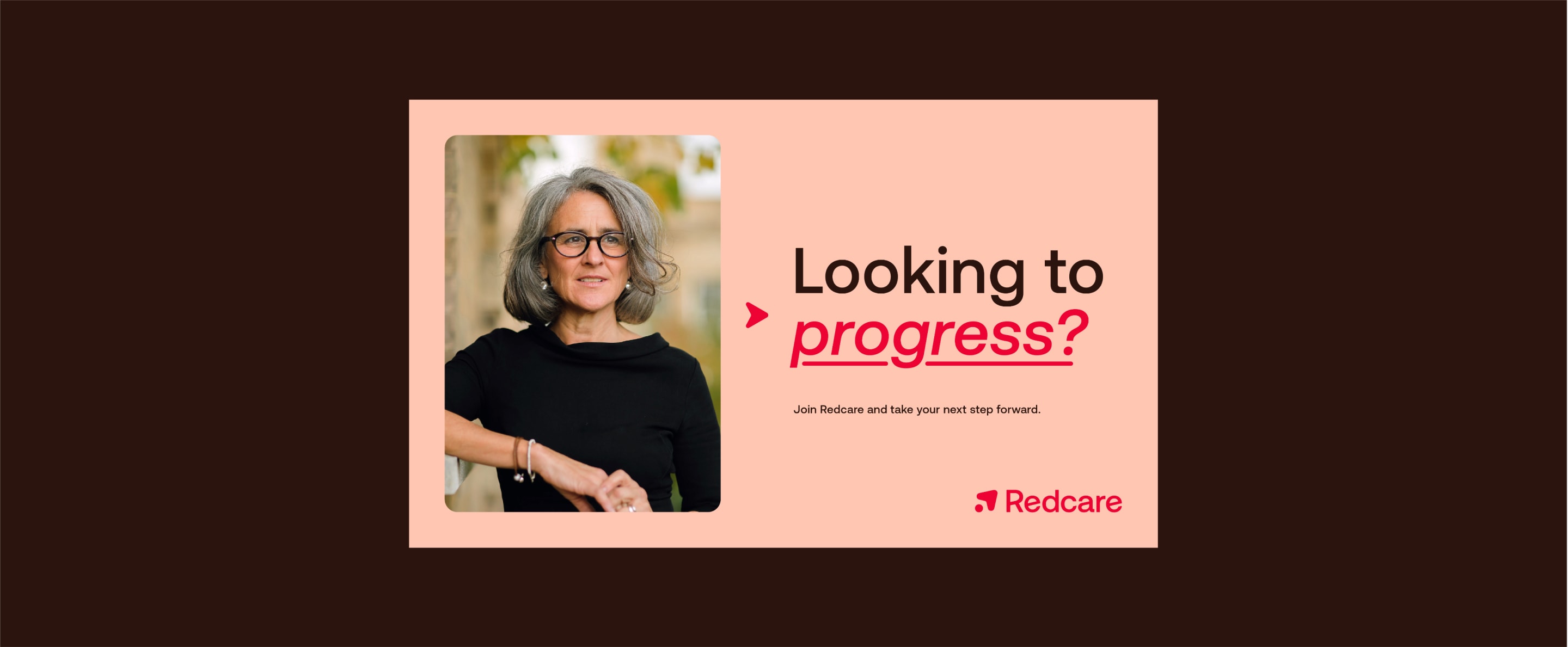
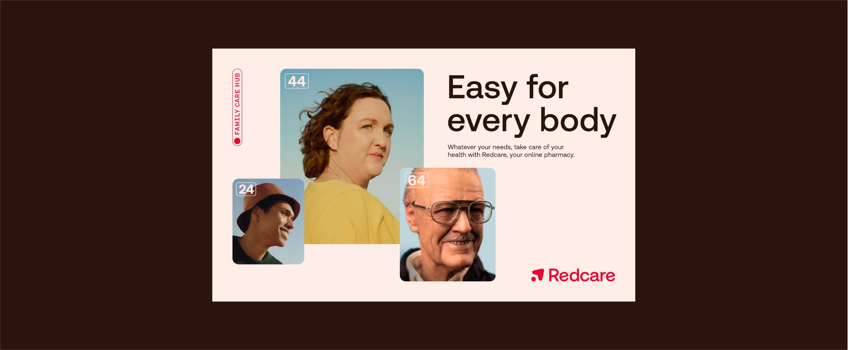
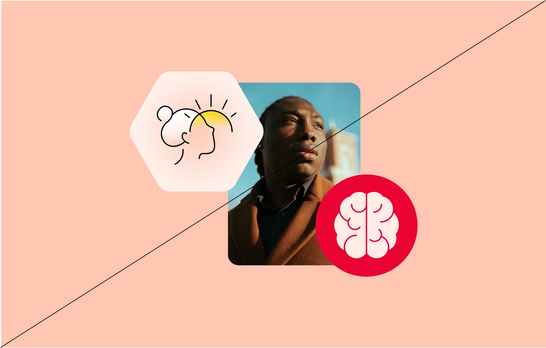
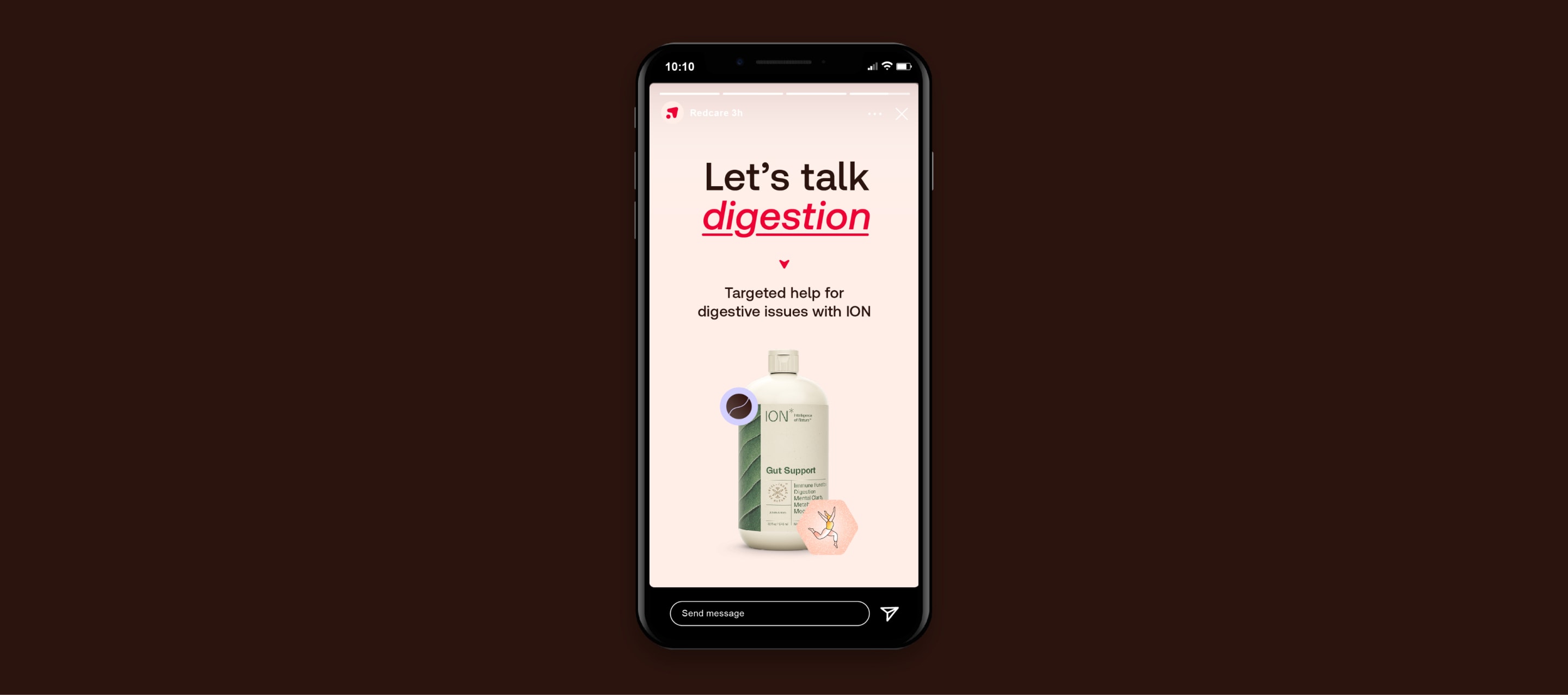
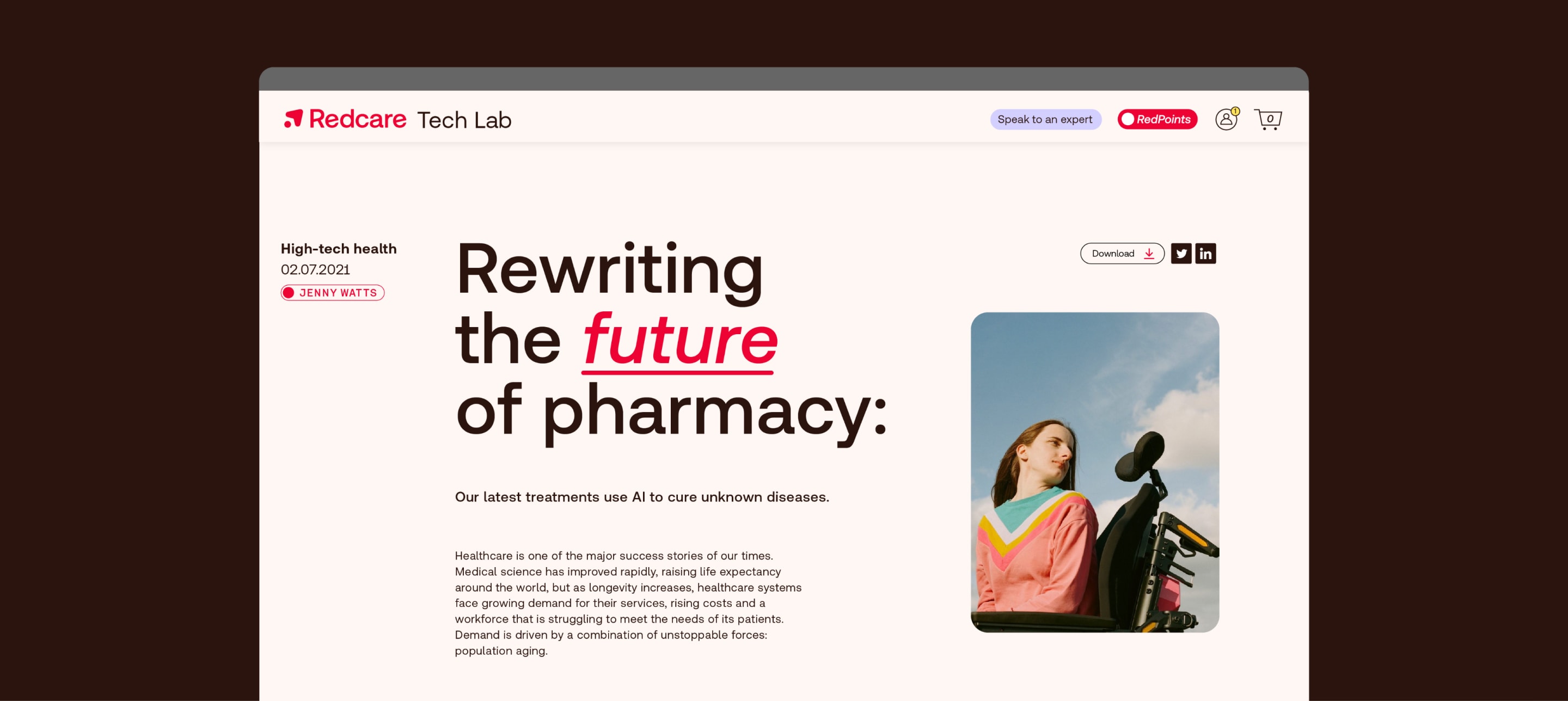
We can use art direction as part of a journey, to tell more personal stories. It’s a great way to show off its benefits or how it’s used with copy.
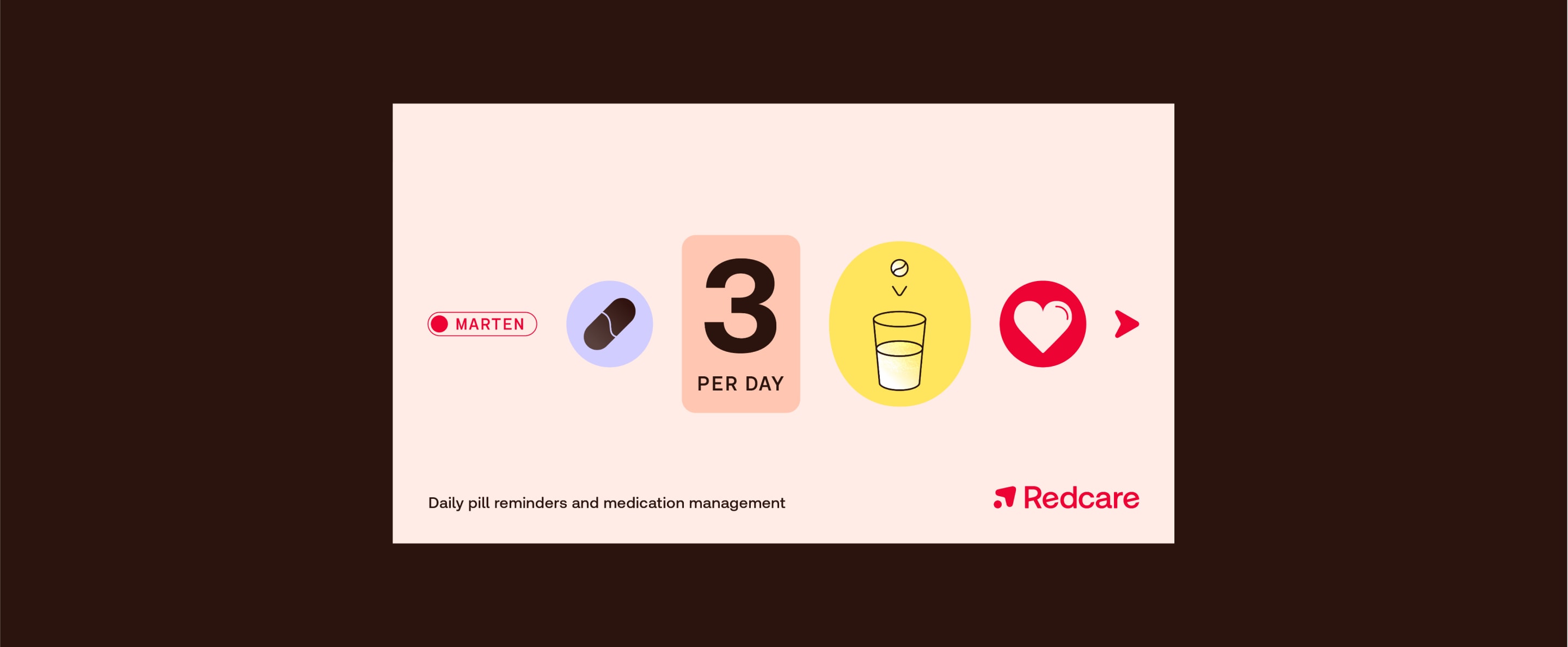
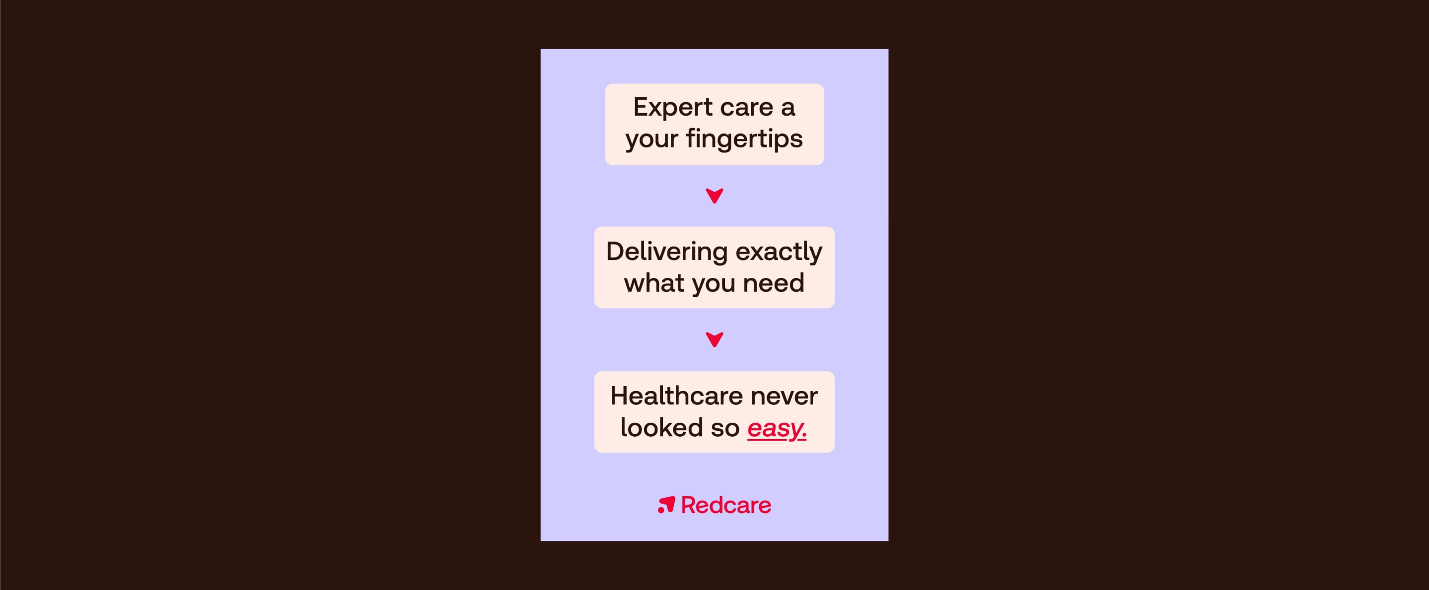
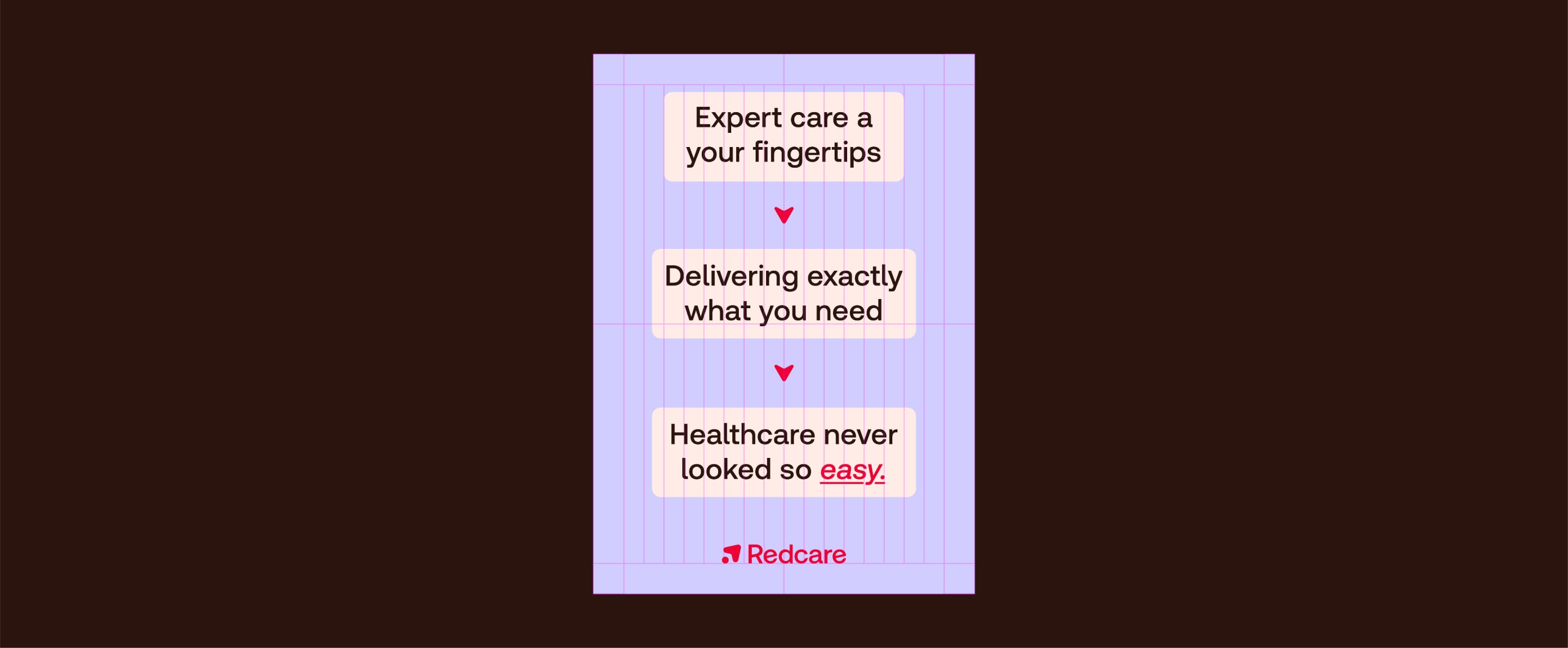
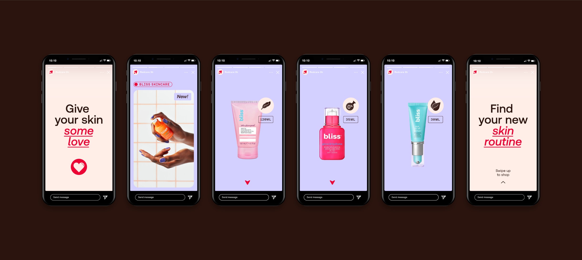
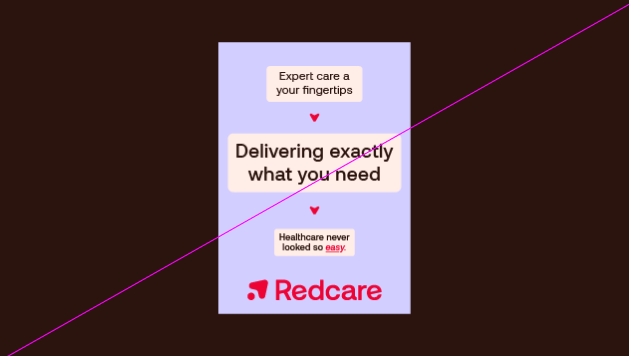
We can take people on a journey with short snappy copy that breaks down into modules. Our navigational arrow guides us through the text.
Things to avoid when creating journey layouts
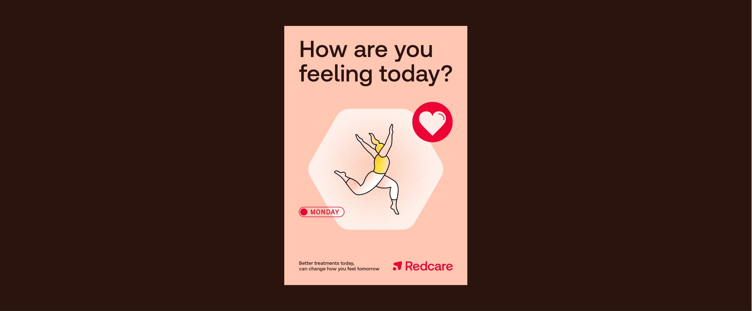
When heroing a cluster of icons, we let one icon take the lead. This layout style is great for more emotive moments when we can be more expressive.
When heroing a cluster of icons, we let one icon take the lead. This layout style is great for more emotive moments when we can be more expressive.
Things to avoid when creating cluster layouts
Click to view example uses
Sometimes we might want to use clusters and journeys side-by-side. We only do this by pairing a typographic journey with one of our other clusters.
Never pair an icon cluster and icon journey.
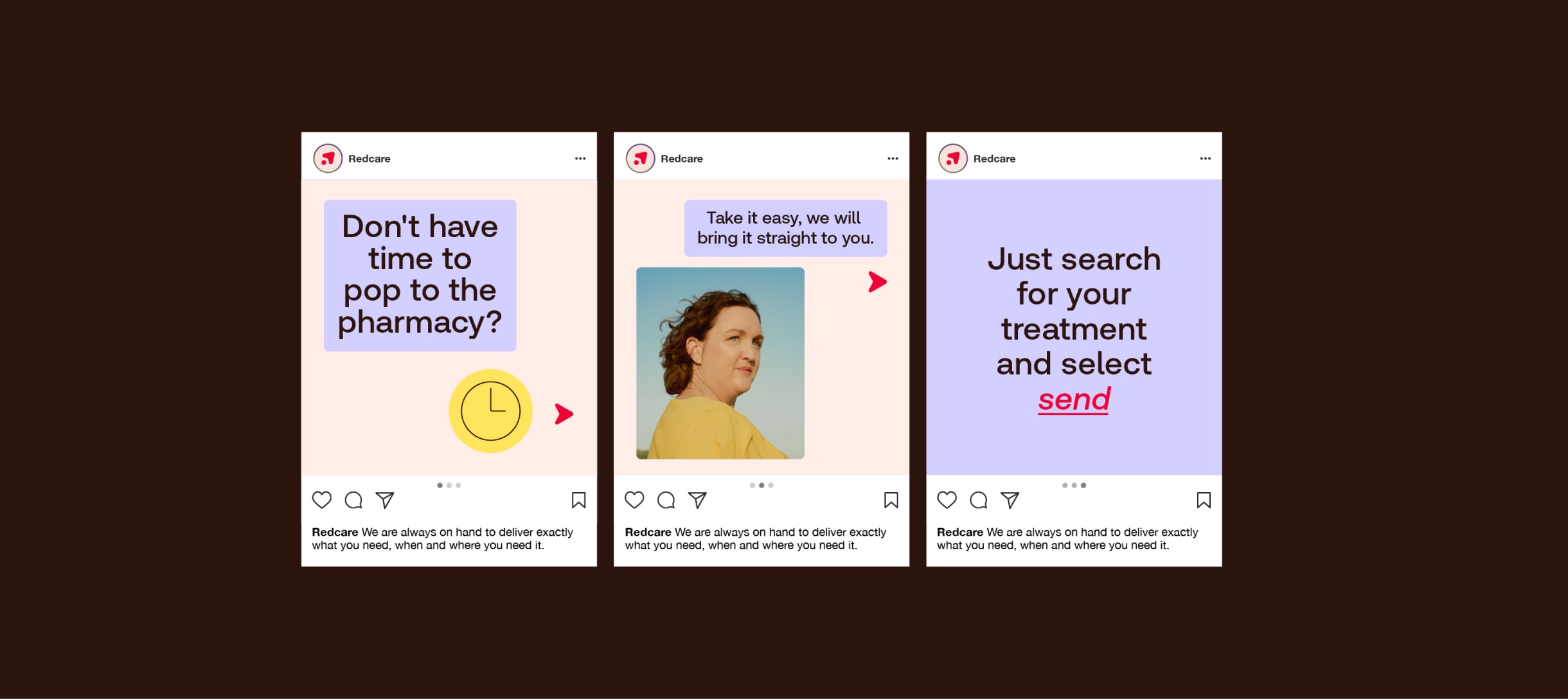
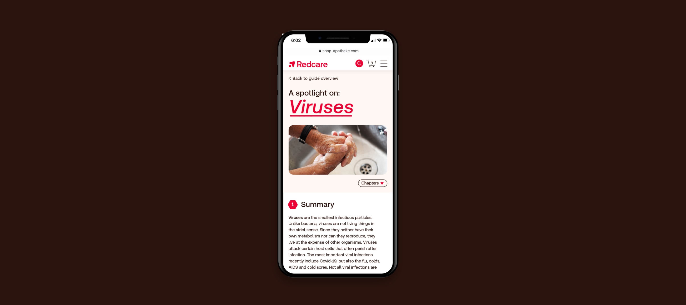
We make the most of multiple page formats and animation to take people on a journey. Keep each frame simple and spread the content over multiple frames.
Within our product and website, we use the concepts of journeys and clusters to break down information and create hierarchy.
Use the following examples as notional guidance.
Things to avoid
So layouts feel consistent, don’t alter the margin or grid rules specified
Make sure layouts feel balanced. Never use huge headlines with tiny icons or images.
Don't use icon clusters within icon journeys
Keep things simple. Avoid using lots of different module and text sizes, and keep logo sign-off small and discrete.
Make sure there is clear hierarchy within layouts and elements are never tightly packed together or cramped
Don’t use icons too big in relation to art direction. They are there to support imagery not over shadow it.
Don’t use more than 3 elements in a cluster layout, or make layout to complex and busy
Don’t make headlines a different type size. Always keep consistent.