Logo
Our logo is the beacon of our brand. The reliable compass showing you the way and the warm caring heart at the centre of Redcare.
Symbol
Our symbol is a caring heart, combined with a compass that shows you the way forward. It also subtly references the ‘A’ of our Apotheke heritage.
To make sure it always looks its best, use the following clear space and minimum size rules.

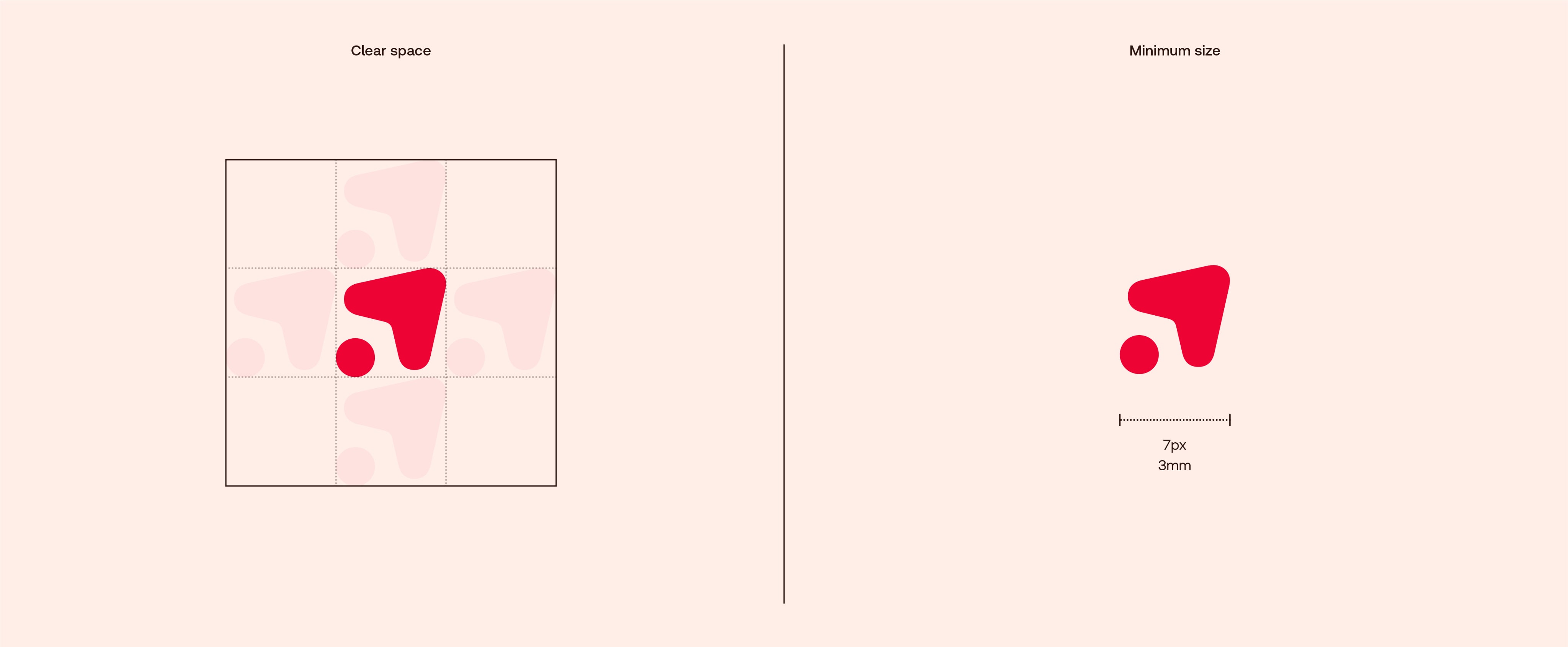
Symbol
Our symbol is a caring heart, combined with a compass that shows you the way forward. It also subtly references the ‘A’ of our Apotheke heritage.
To make sure it always looks its best, use the following clear space and minimum size rules.
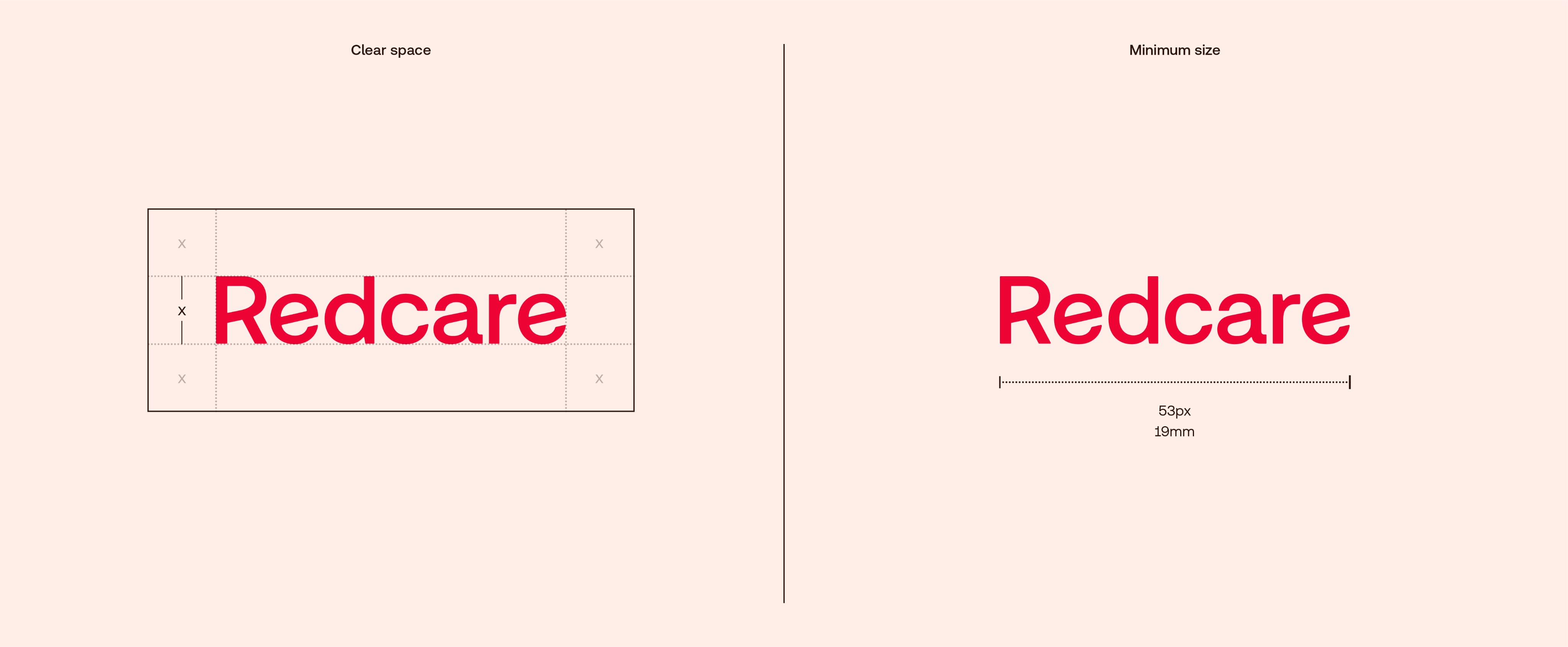
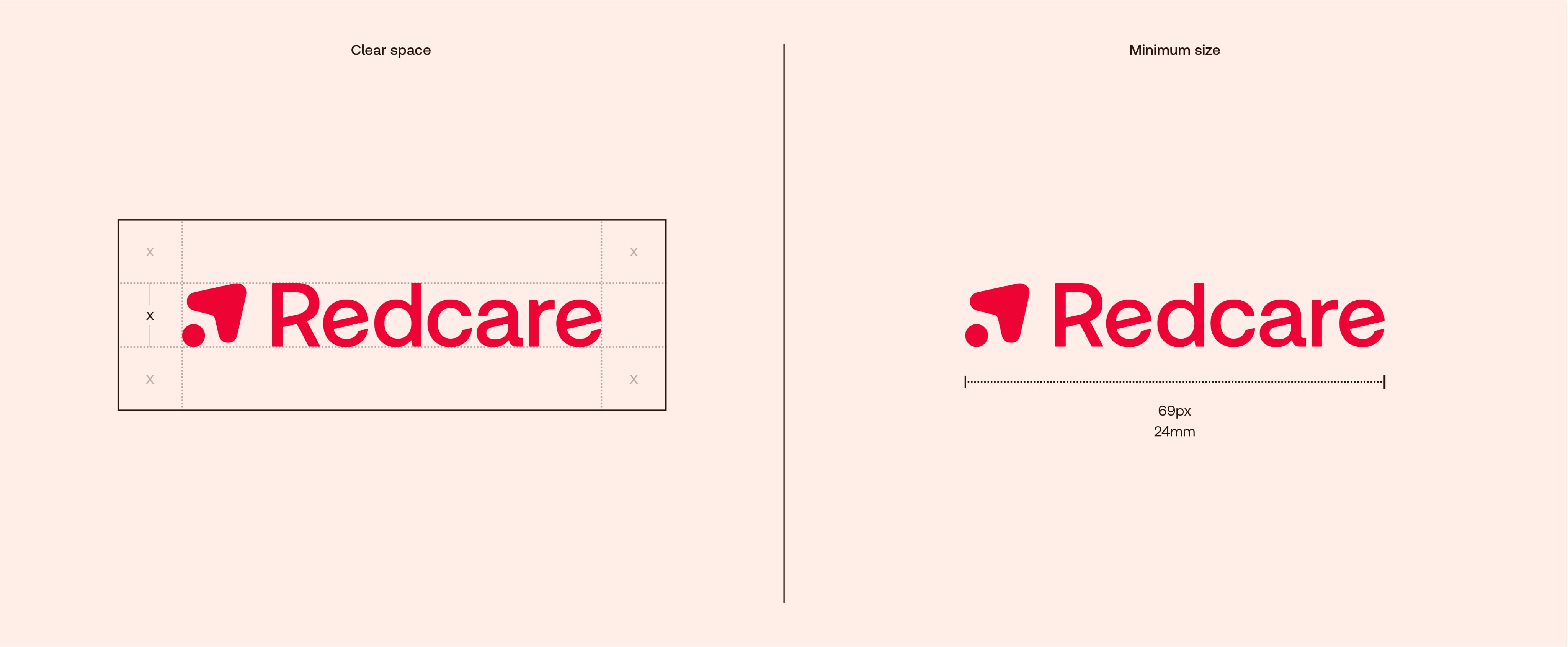
Wordmark
With optimistic angled crossbars, our wordmark emphasizes the Redcare way onward and upwards.
So it always looks its best, use the following clear space and minimum size rules:
Wordmark
With optimistic angled crossbars, our wordmark emphasizes the Redcare way onward and upwards.
So it always looks its best, use the following clear space and minimum size rules:
Logo Lockup
This is our core logo and main signifier of the brand. So it always looks its best, use the following clear space and minimum size rules:
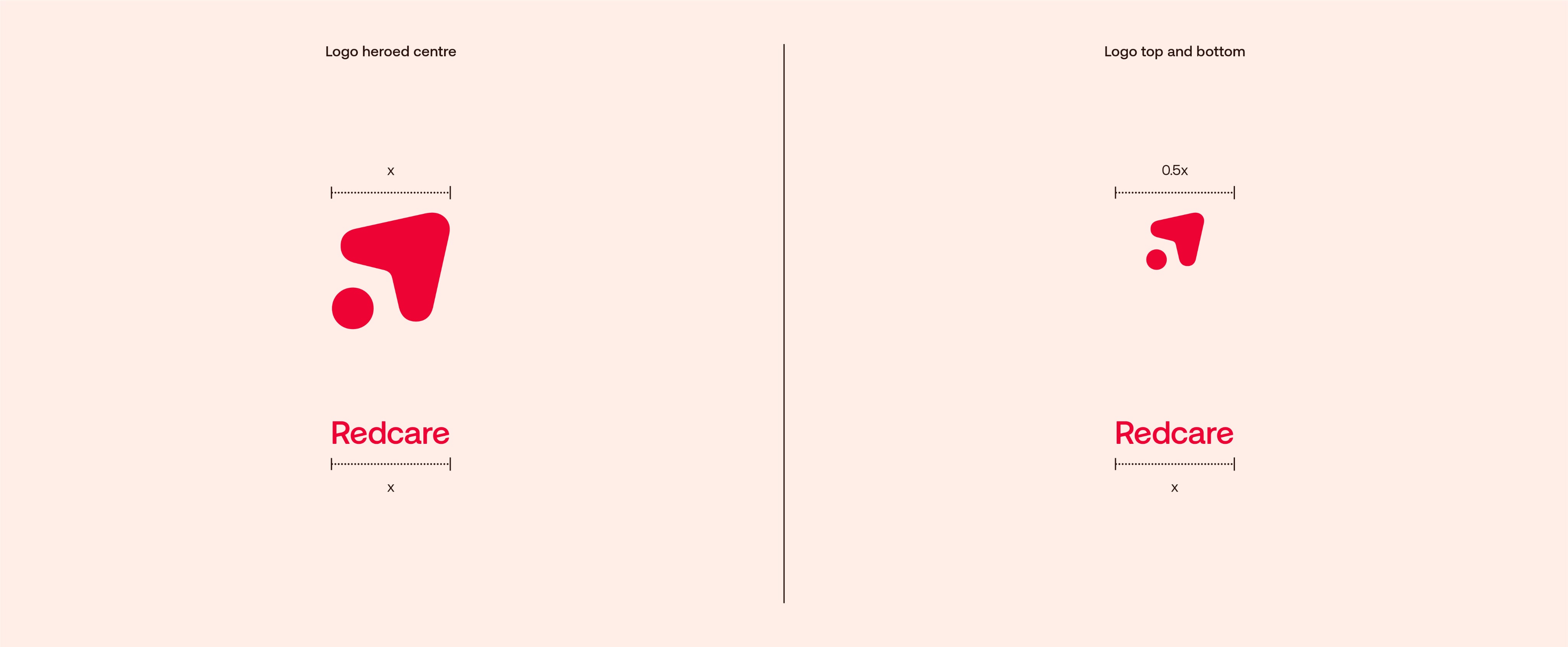
Split Logo Lockup
These are our split logo lockups, for use on square or portrait layouts when we want to be more expressive or really hero our logo.
So they always look their best, use the following construction rules:
Split Logo Lockup
These are our split logo lockups, for use on square or portrait layouts when we want to be more expressive or really hero our logo.
So they always look their best, use the following construction rules:
Logo colour
For all brand communications we use our logo in Red on the following backgrounds.
In rare cases where no colour is allowed (e.g. corporate documents or T&Cs) use black and white.
Logo colour
For all brand communications we use our logo in Red on the following backgrounds.
In rare cases where no colour is allowed (e.g. corporate documents or T&Cs) use black and white.
Symbol colour
For all brand communications we use our logo in Red on the following backgrounds.
In rare cases where no colour is allowed (e.g. corporate documents or T&Cs) use black and white.

Symbol colour
For all brand communications we use our logo in Red on the following backgrounds.
In rare cases where no colour is allowed (e.g. corporate documents or T&Cs) use black and white.

Logo on photography
Our logo can be used over photography in the following colours, ensuring there is enough contrast between background and logo so it always legible and clear.
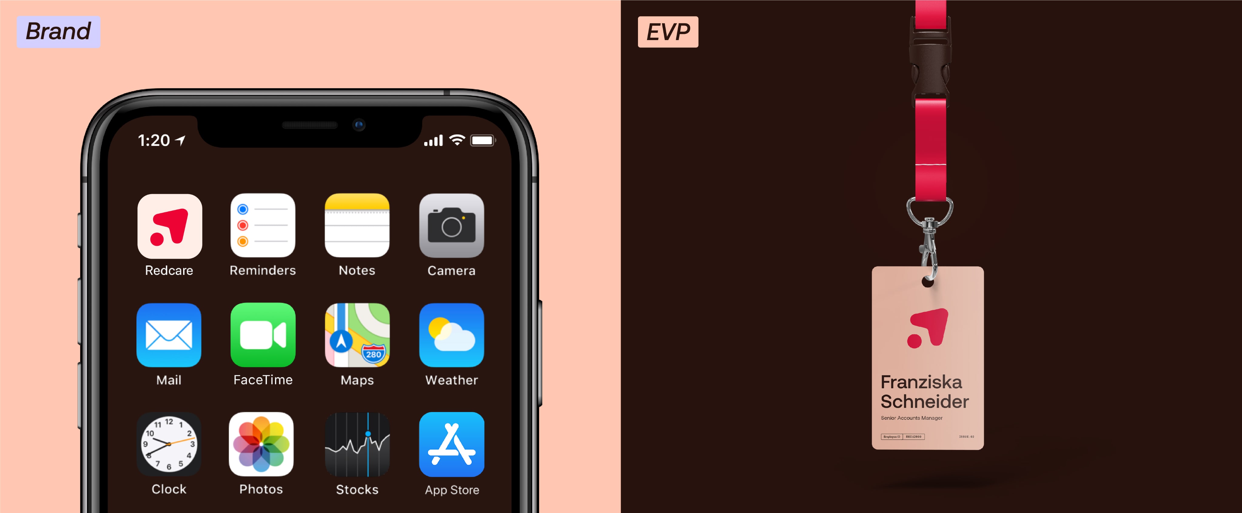
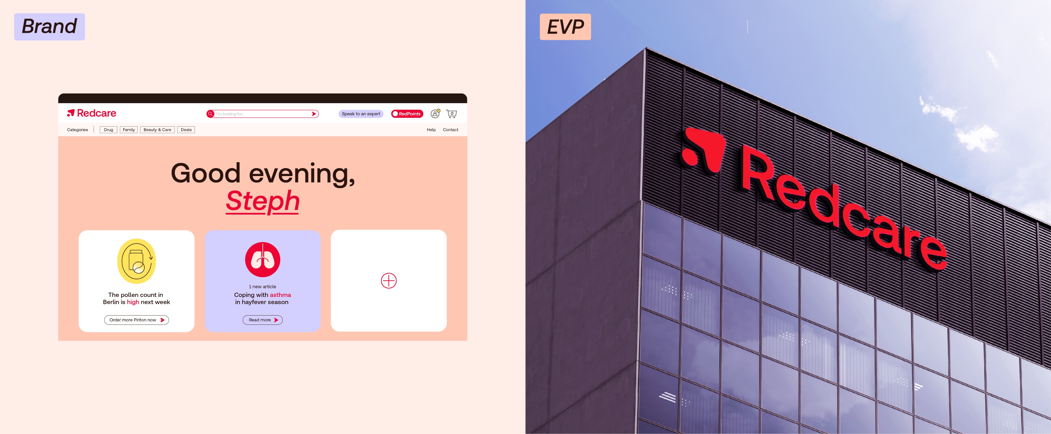
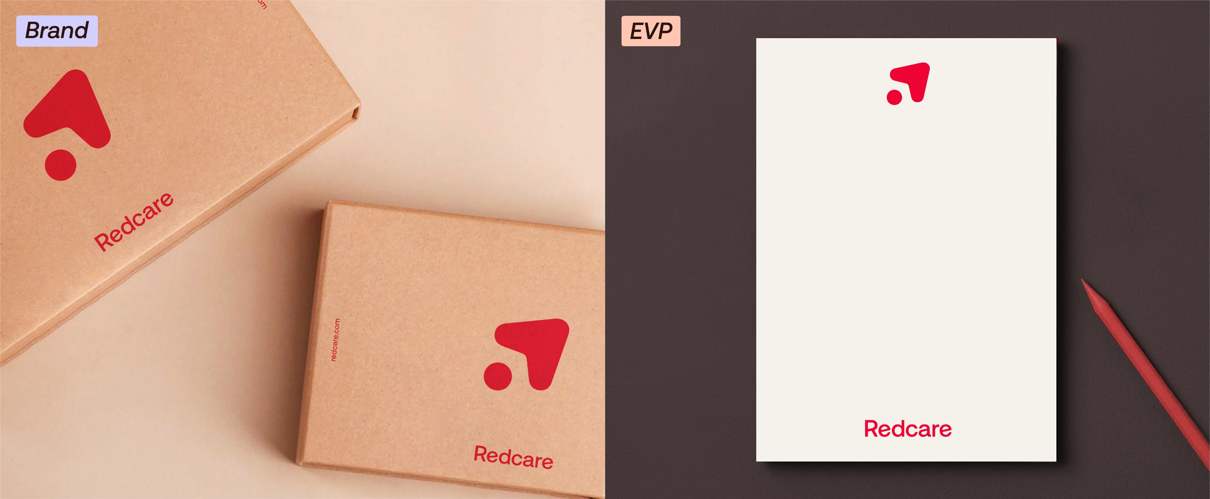
Logo positioning
We can either hero our logo and symbol in the center of our layouts or use them as a smaller sign-off. Use the following positioning:
Logo misuse
Things to avoid
Don’t change the proportions of our logo
Don’t change the layout of our logo
Don’t use two colours in our logo
Don’t add a drop shadow or other effects to our logo
Don’t use in any colourways that aren’t specified in the guidelines
Don’t skew or distort the angle of the logo
Don’t crop the logo
Don’t outline any part of the logo