Motion
From the smallest details to more holistic
layouts, we breathe life into every interaction
through ownable Redcare motion.
Motion
Principles
Our motion principles are the same as our art direction principles, just adapted for animation to make sure every piece of motion feels distinctly Redcare.


Logo
in motion
Our logo animation is simple and rooted in our core idea. It brings to life it’s compass concept, and gives a nod to the beating heart.
Logo
in motion
Our logo animation is simple and rooted in our core idea. It brings to life it’s compass concept, and gives a nod to the beating heart.
Photography
In motion
We bring in images on an optimistic angle, from bottom left to top right. The motion is dynamic but gentle, never moving too suddenly.

Typography
In motion
Here is how we bring our typography to life in motion. We always emphasise our optimistic spirit and highlight what’s important.
We bring in type in an upwards motion with a soft motion curve. Animating the highlights can bring extra attention to important words.
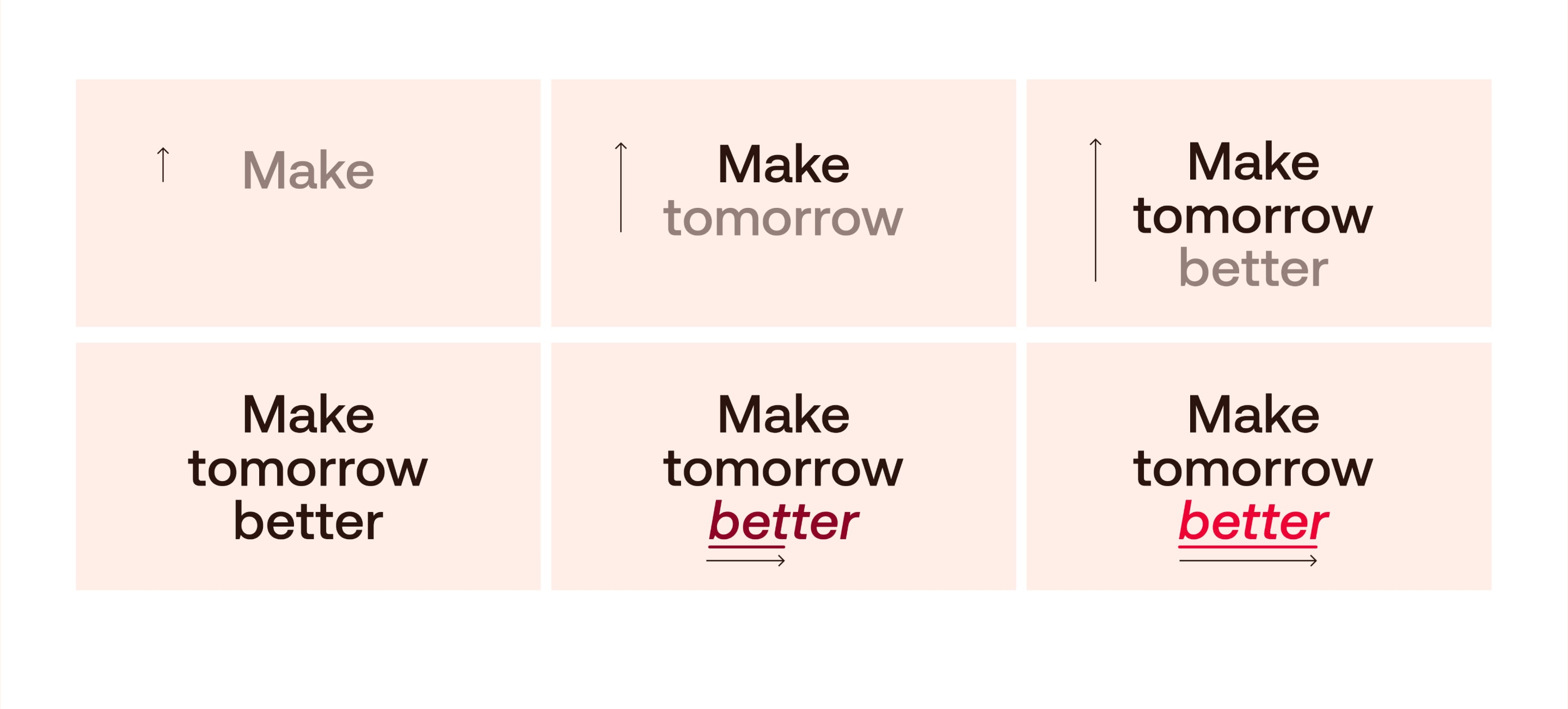
Typography
In motion
Here is how we bring our typography to life in motion. We always emphasise our optimistic spirit and highlight what’s important.
We bring in type in an upwards motion with a soft motion curve. Animating the highlights can bring extra attention to important words.
Iconography
In motion
Our icons are brought to life with subtle motion. The motion should breathe a sense of life into the icons, without becoming distracting.
Illustration
In motion
Our illustrations are brought to life with subtle motion. The motion should breathe a sense of life and character into the illustrations, without becoming distracting
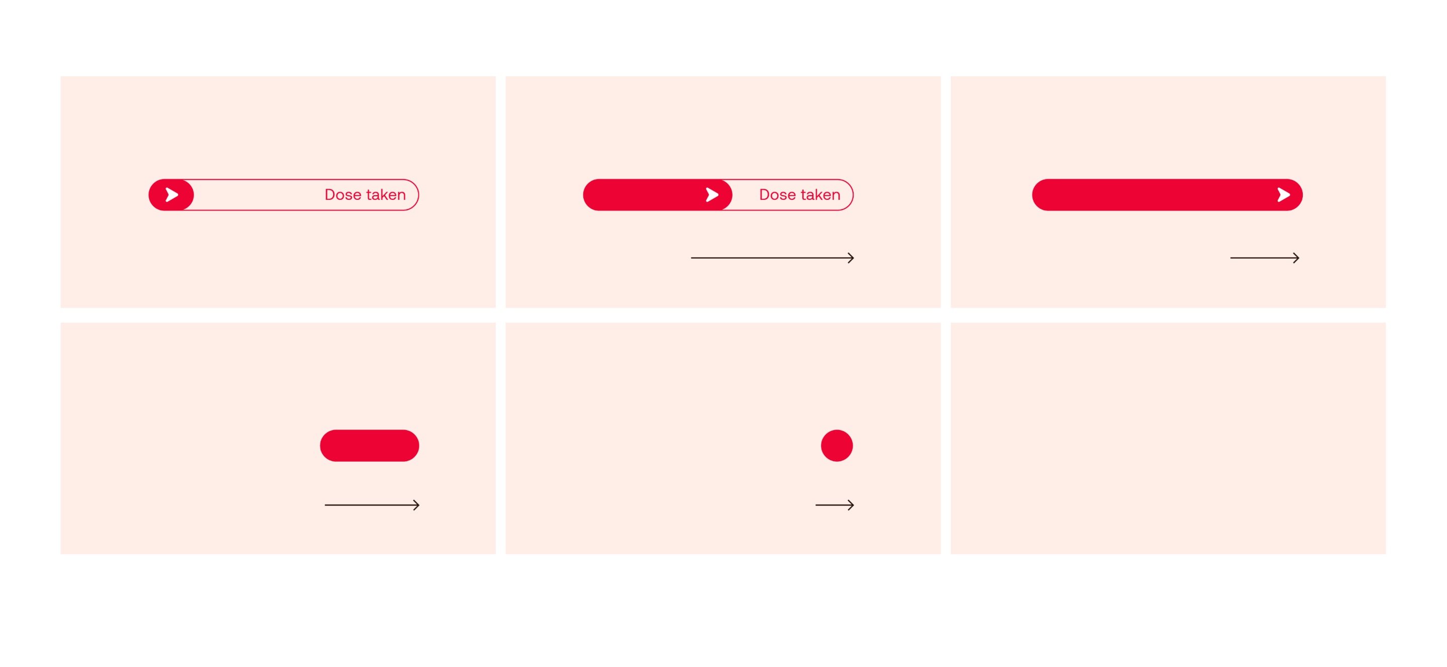
Signposting
In motion
In motion, we emphasise the sense of moving forward, clearly navigating through content and guiding you to the next step.
Modules
In motion
We can bring in modules in the same was as our photography – with an optimistic angle, from bottom left to top right.
The motion is dynamic but gentle, never moving too suddenly. This can add a Redcare feeling to even the simplest product transitions.
