Interactive
Signposting
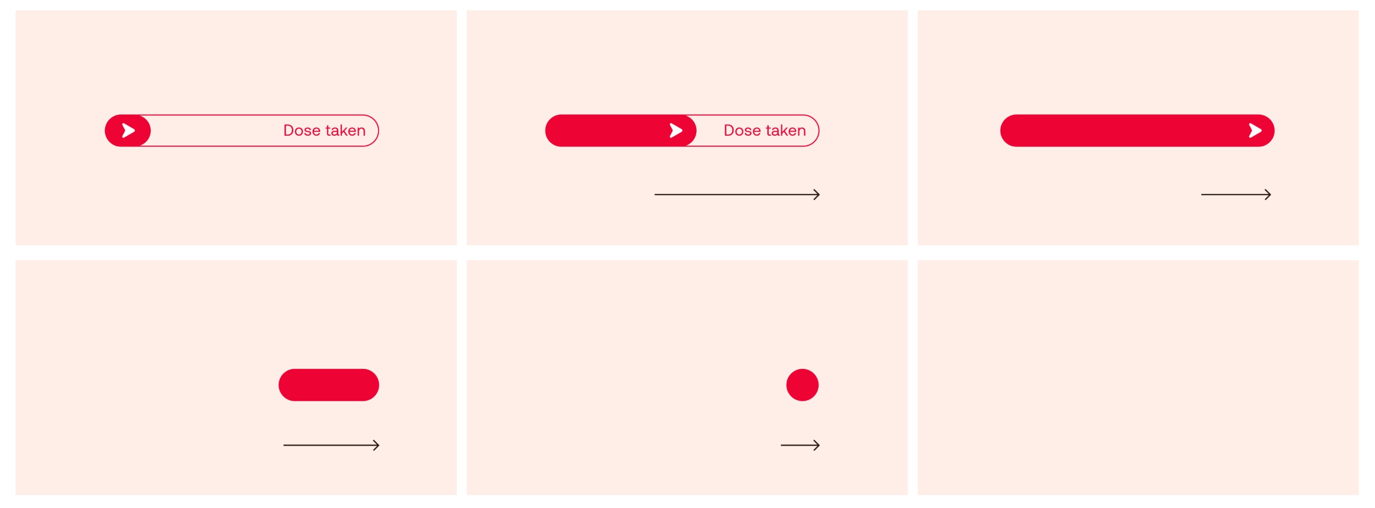
These are notional examples of how we can create interactive signposting elements and buttons for use in digital applications.
These elements support our icon language. They aid navigation, provide clarity to our layouts, and highlight key details and functional information.
There are six different categories of elements, each with their own attributes and role.
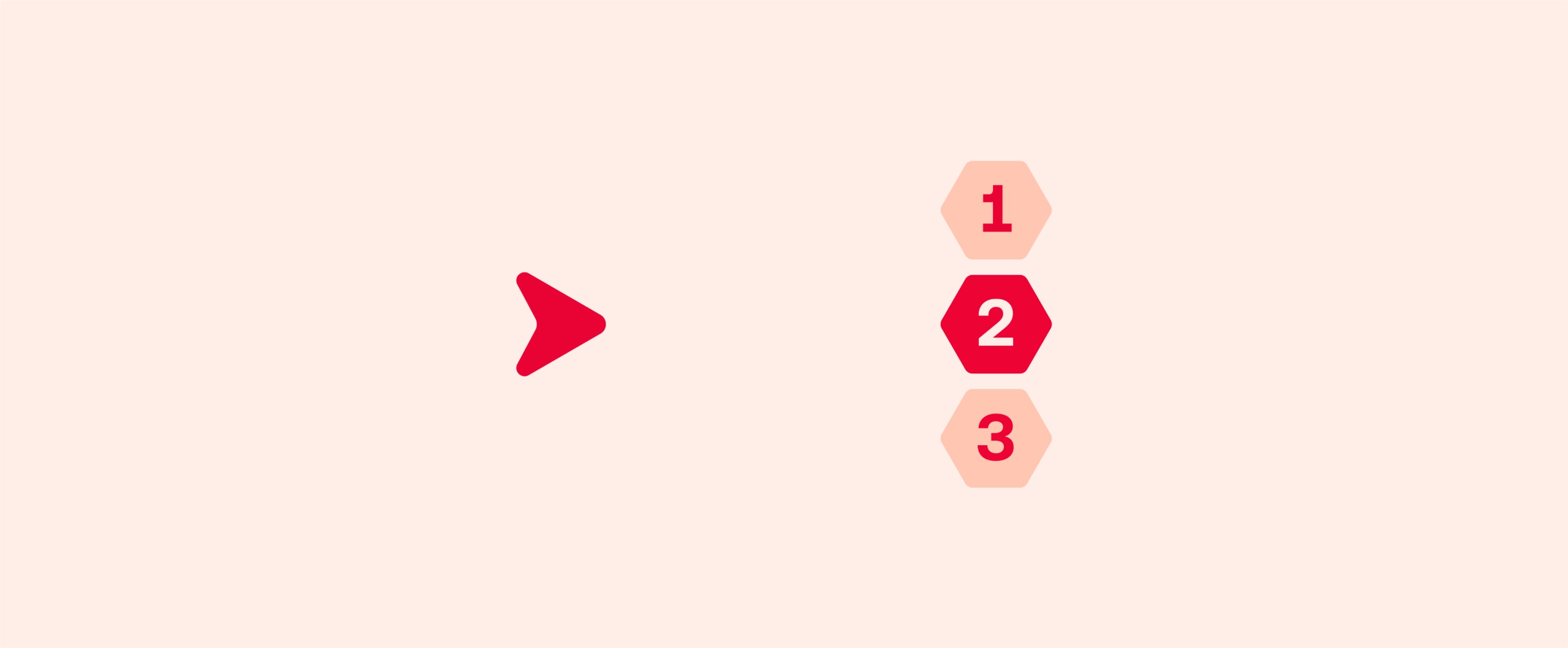
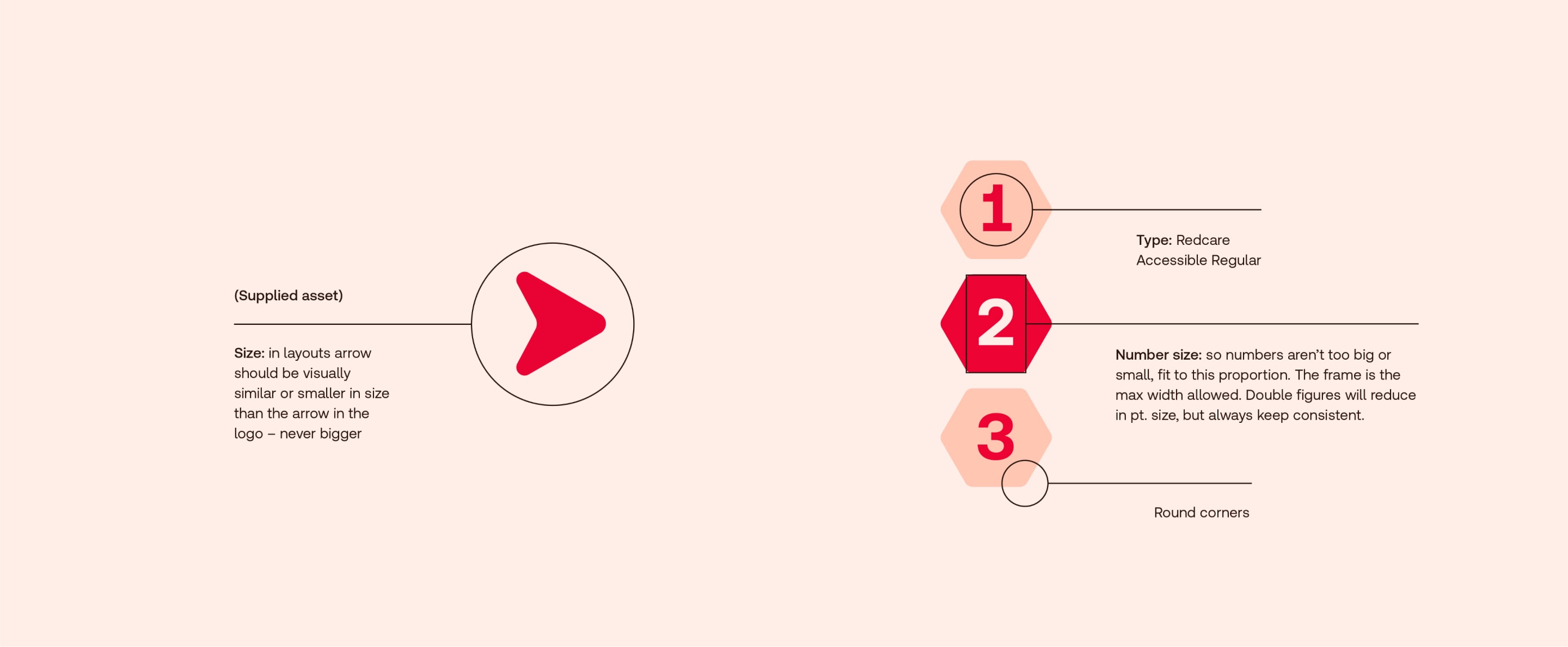
Derived from our symbol, we use a distinctive Redcare arrow in our communications, always helpfully signifying the way forward.
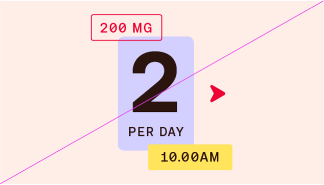
We also use a hexagon numbering system to clearly break down information.
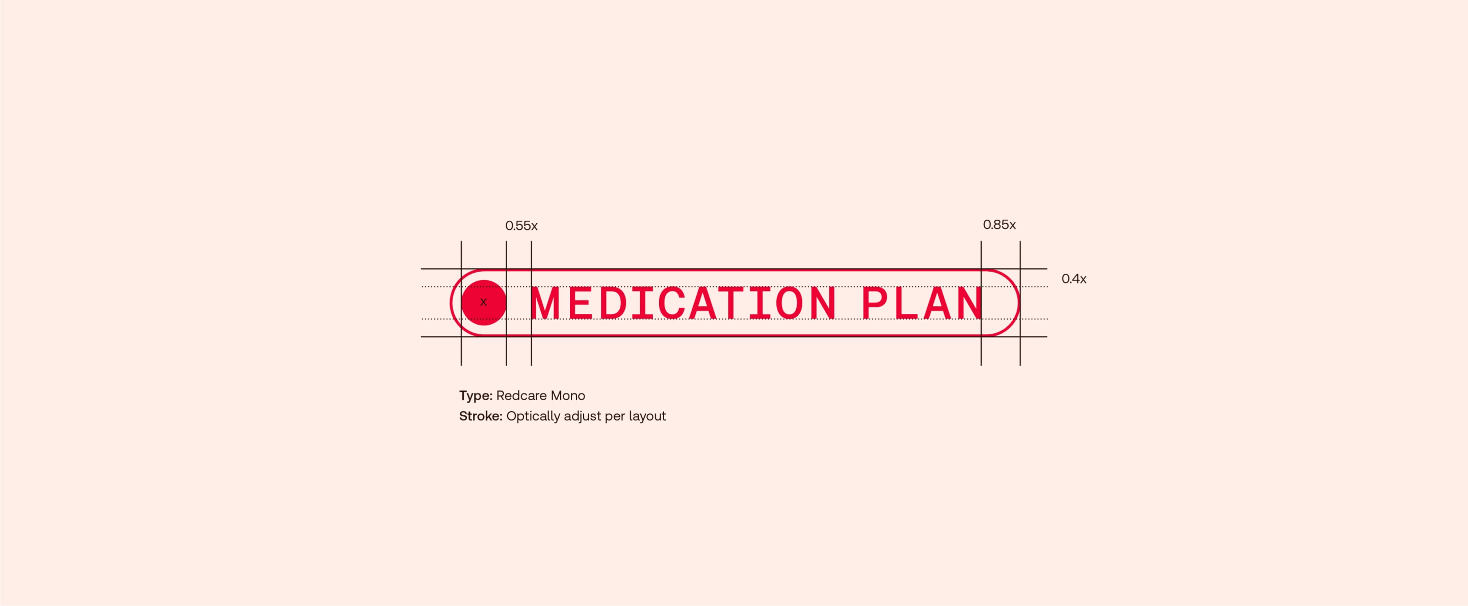
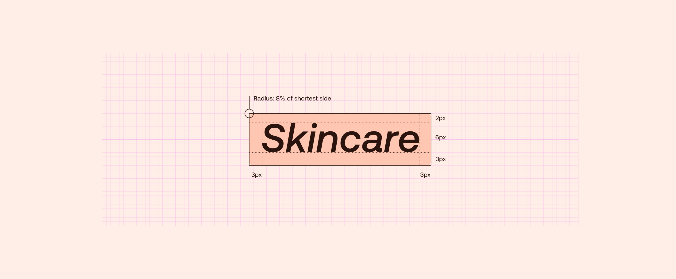
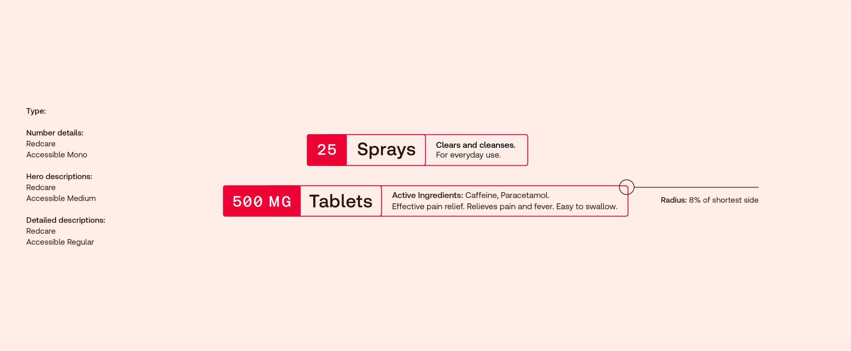
When creating capsules use the following guidance. The stroke thickness flexes per layout dependent on scale – optically adjust so it’s not too thin or thick and feels
balanced in relation to the icon line weight. If used with other signposting details always keep the strokes consistent.
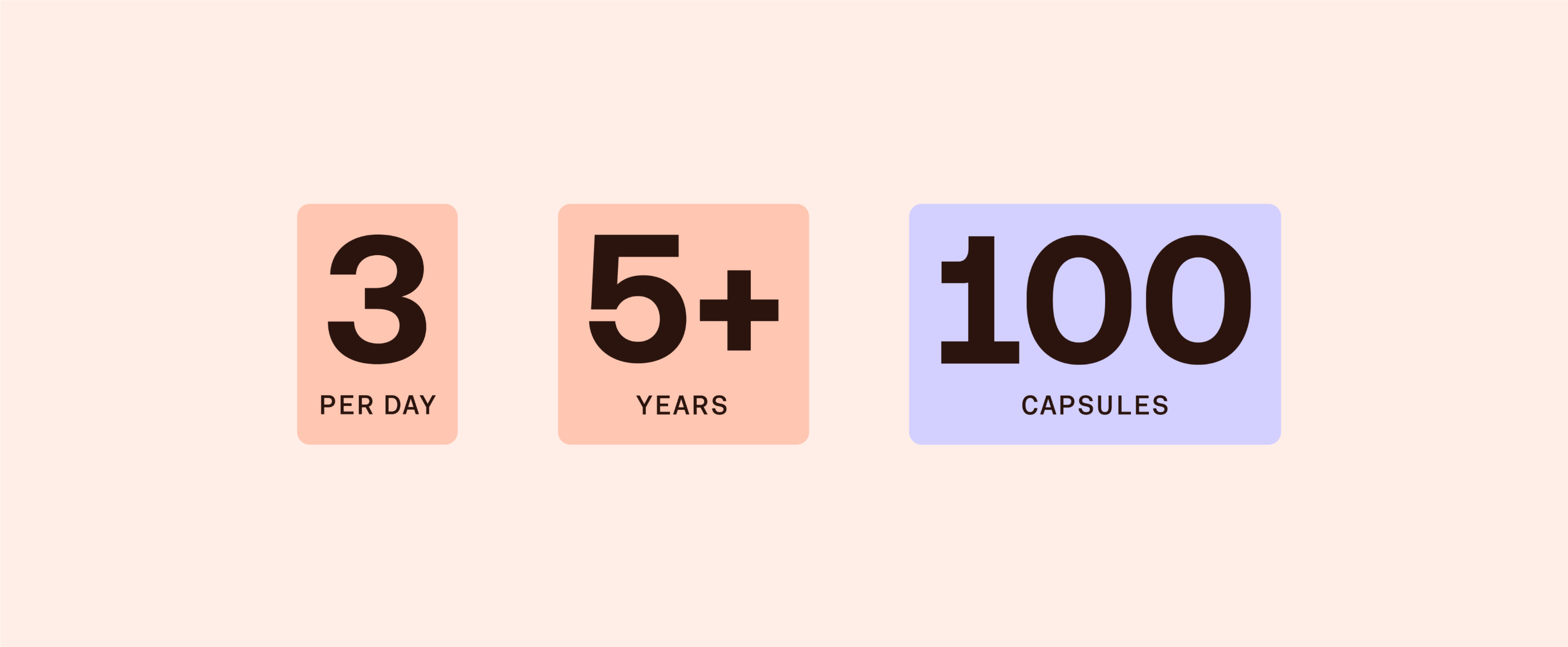
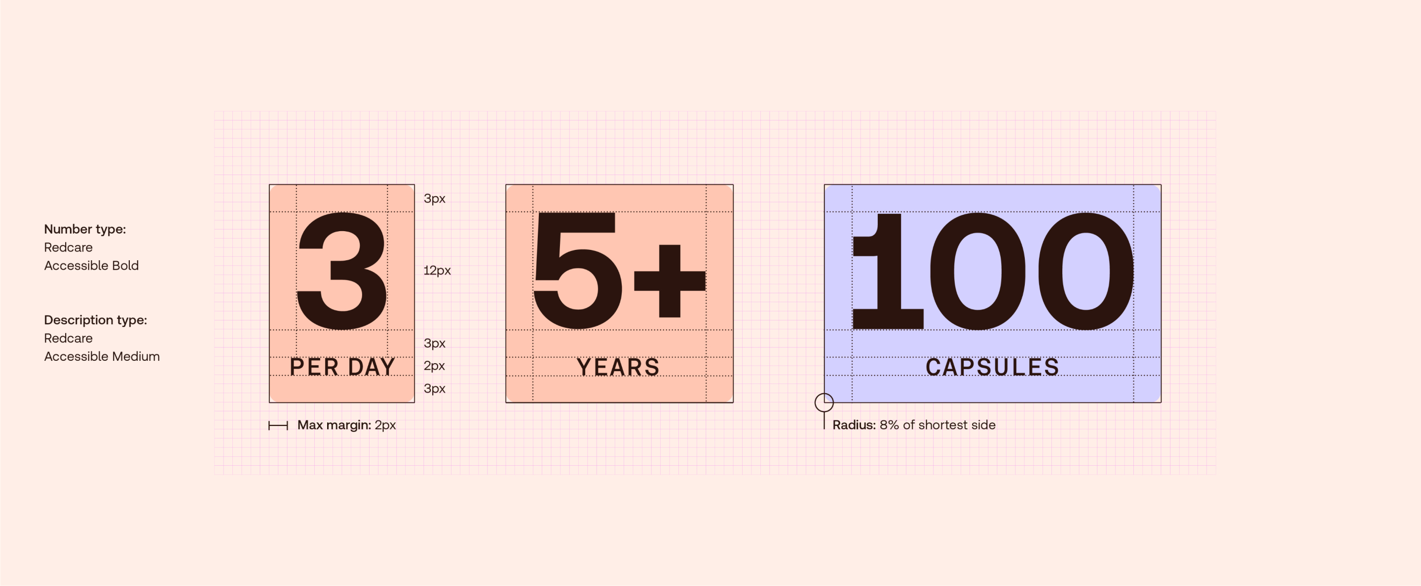
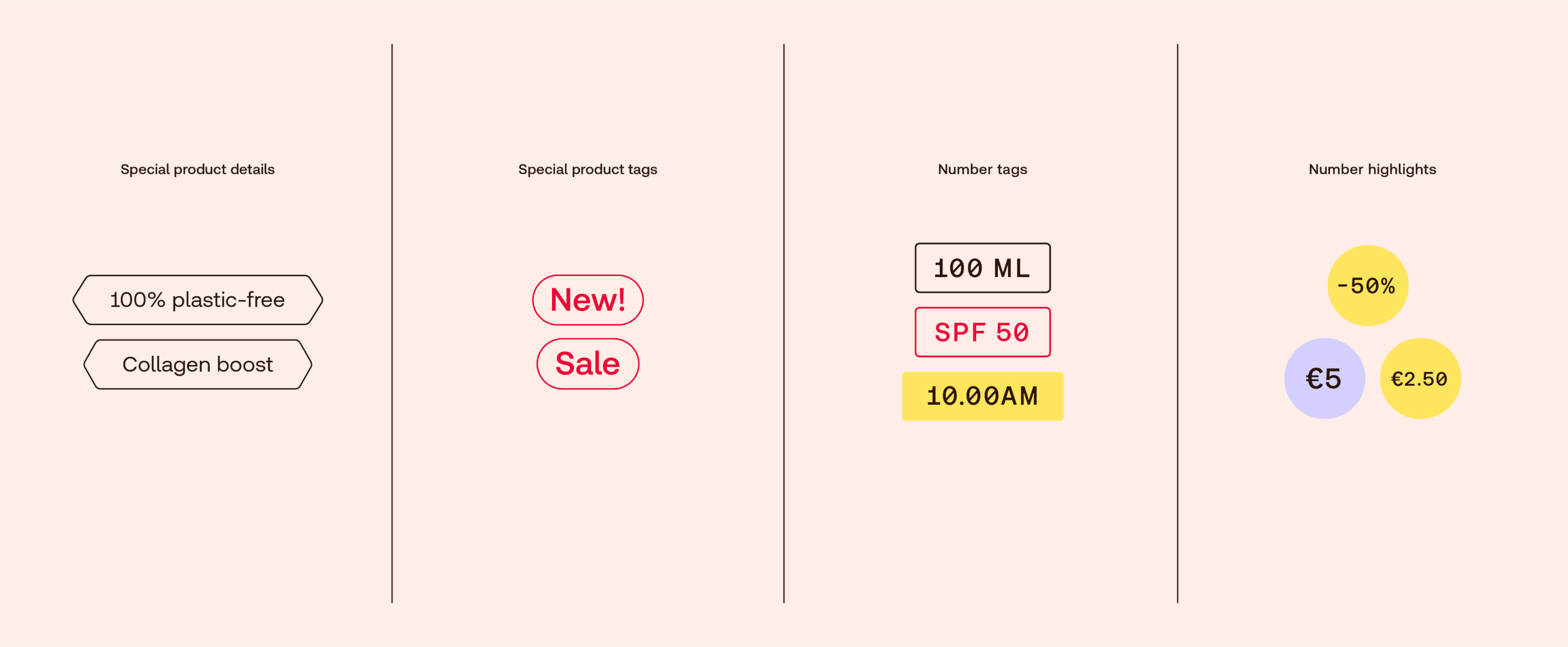
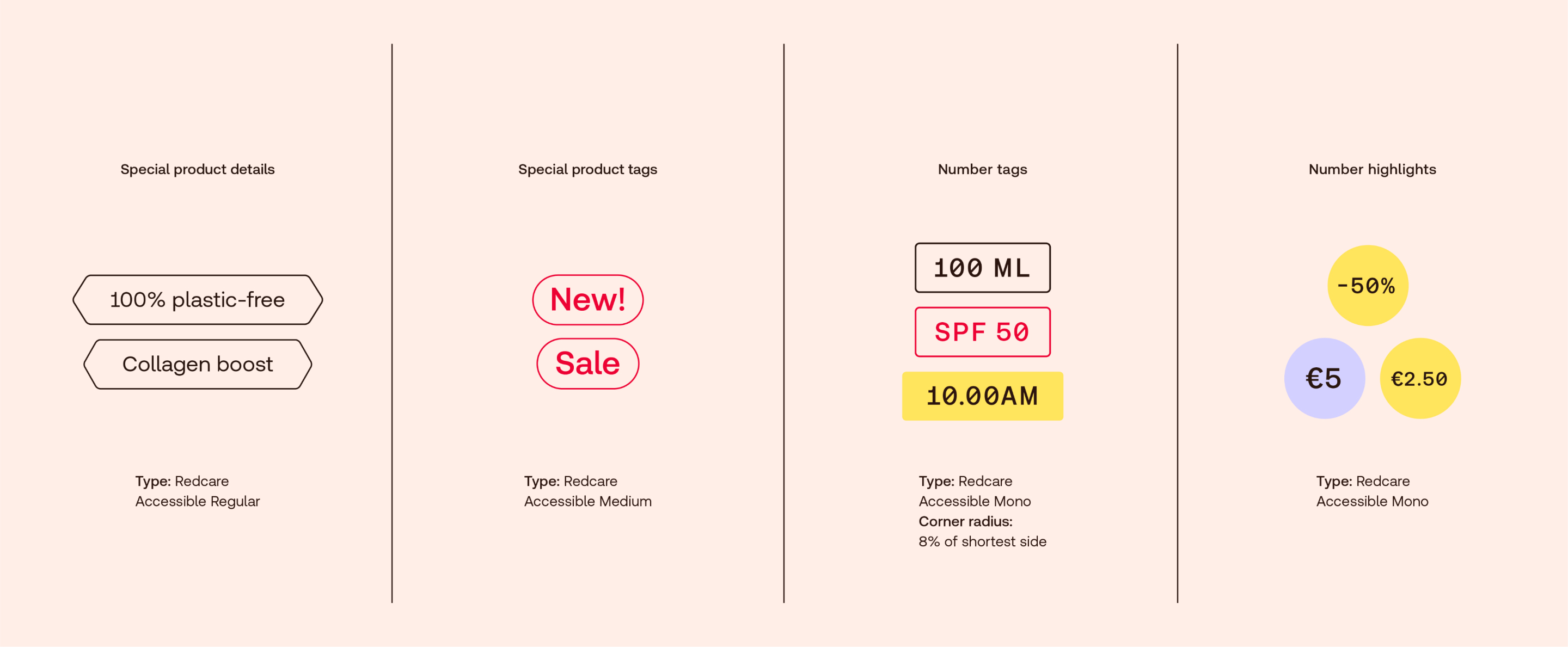
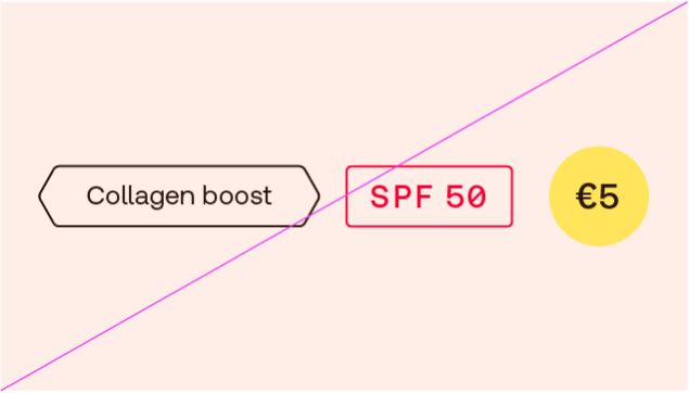
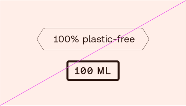
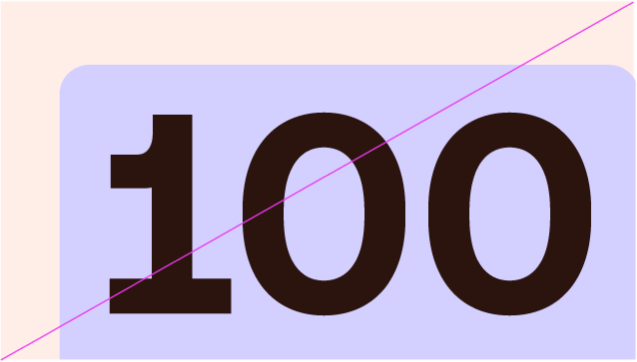
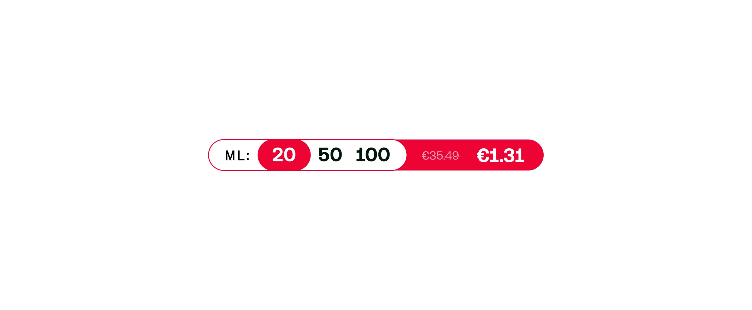
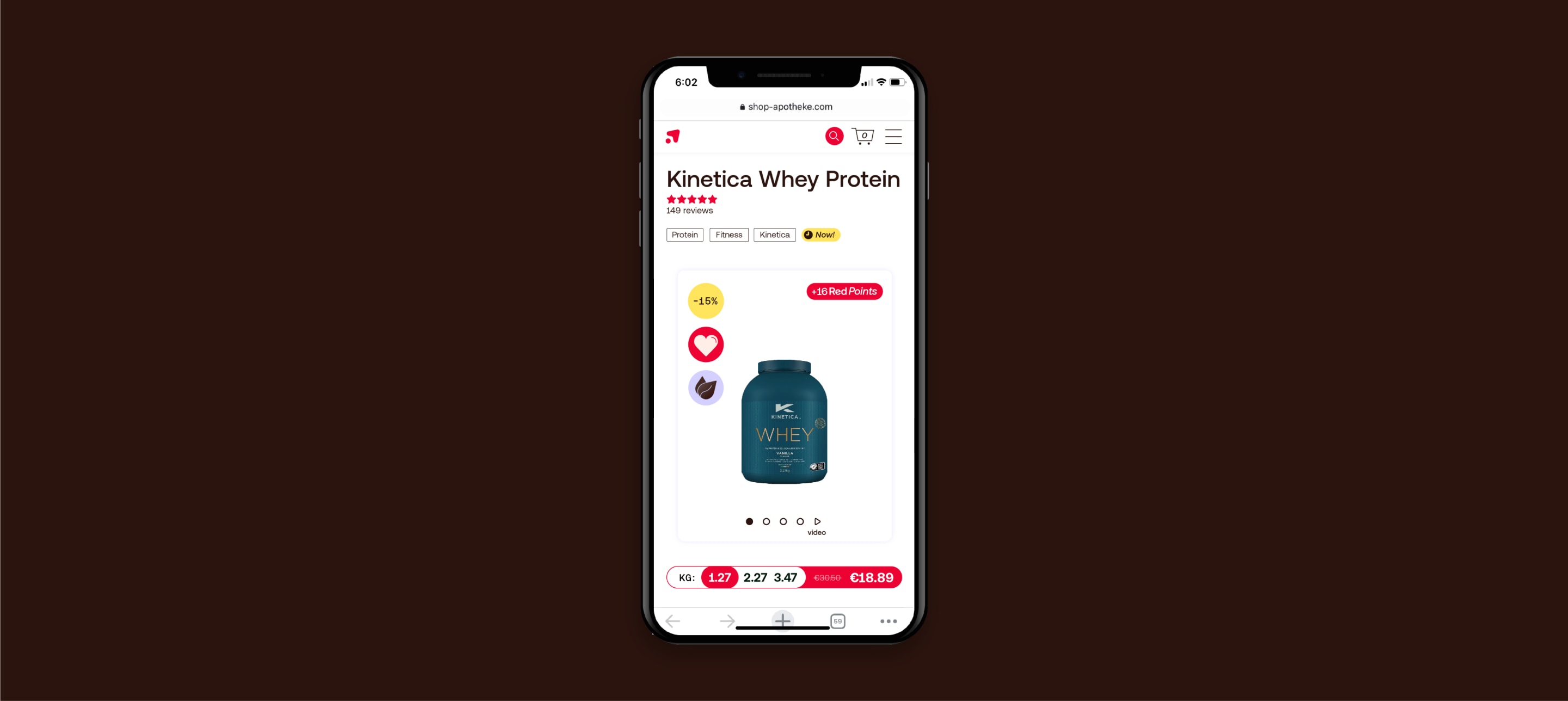
Numeric tabs are used to highlight key numbers (e.g. age, dosage or quantity). Use them alongside icons to tell stories, or in functional settings such as labeling products.
Add an extra level of clarity by using labels to categorise content. These are small scale, adding a level of helpful detail.
These detail elements are used to break down functional information in a clear way. They are always used small, in support of our icons.
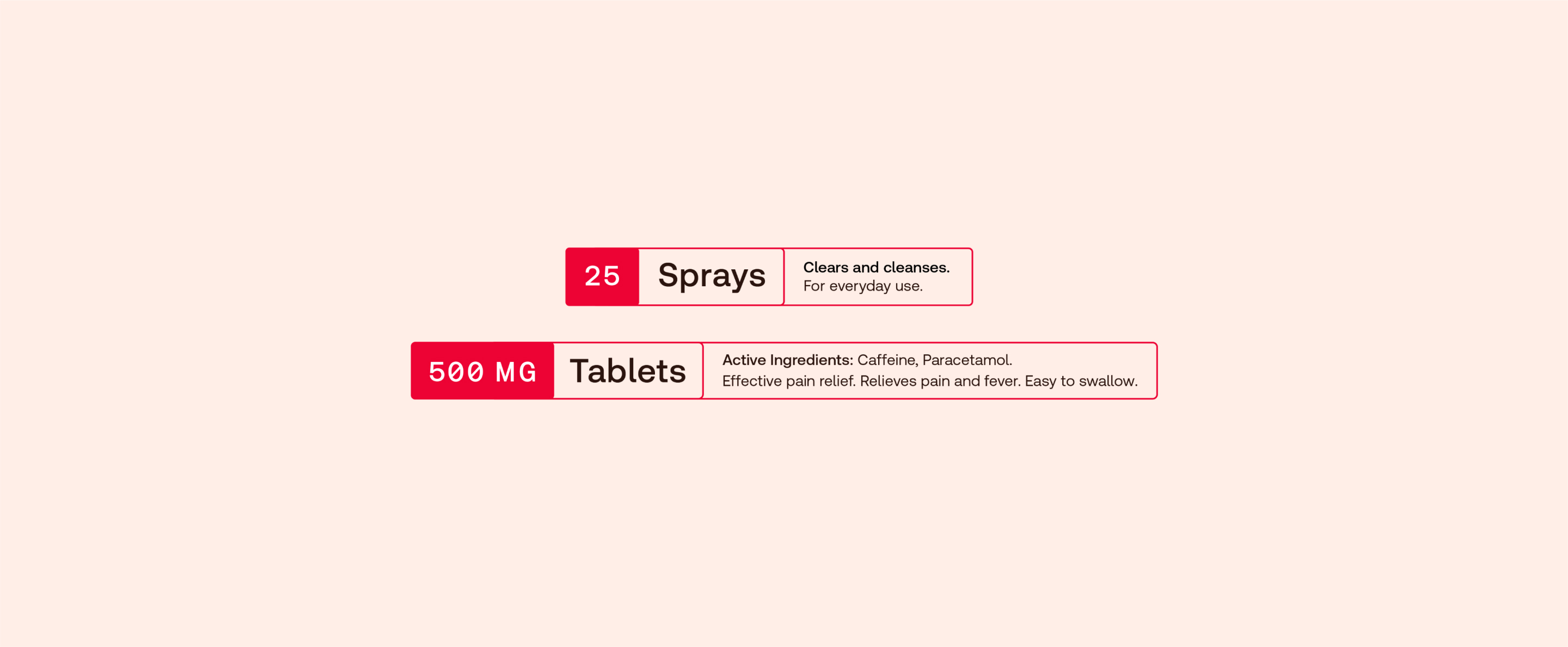
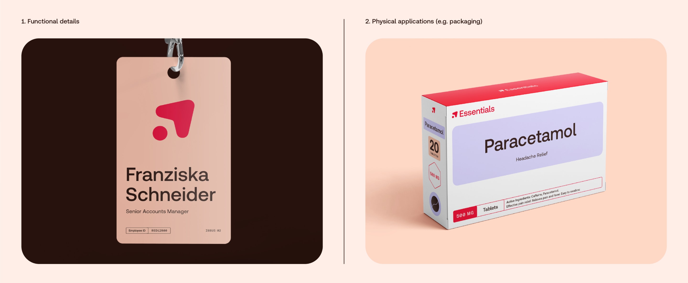
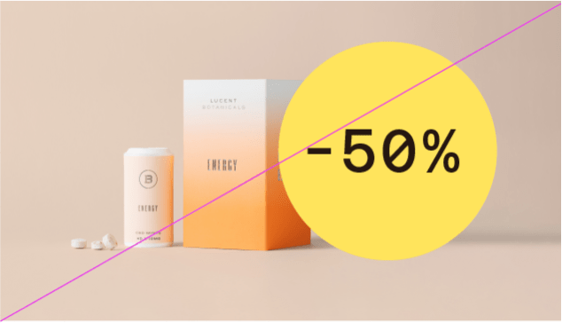
In occasional circumstances (e.g. packaging), when we need to convey a lot of information in a small space, we use this special tab device to pull out key information in a
linear way. Note: Pull out the most important information to highlight. Don’t try to cram everything in.
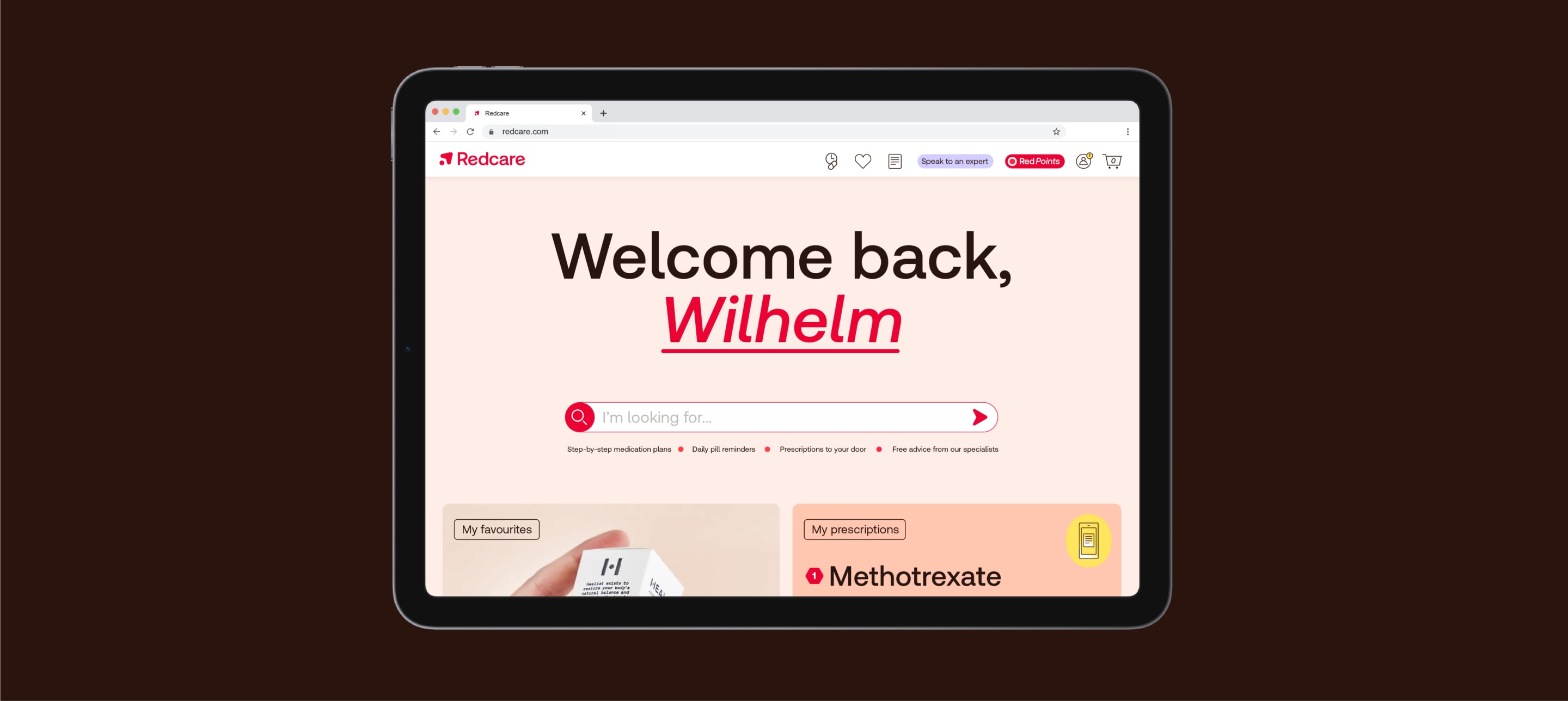
In layouts, our navigation arrow is a key signifier of our brand, and we can use it in the following ways.
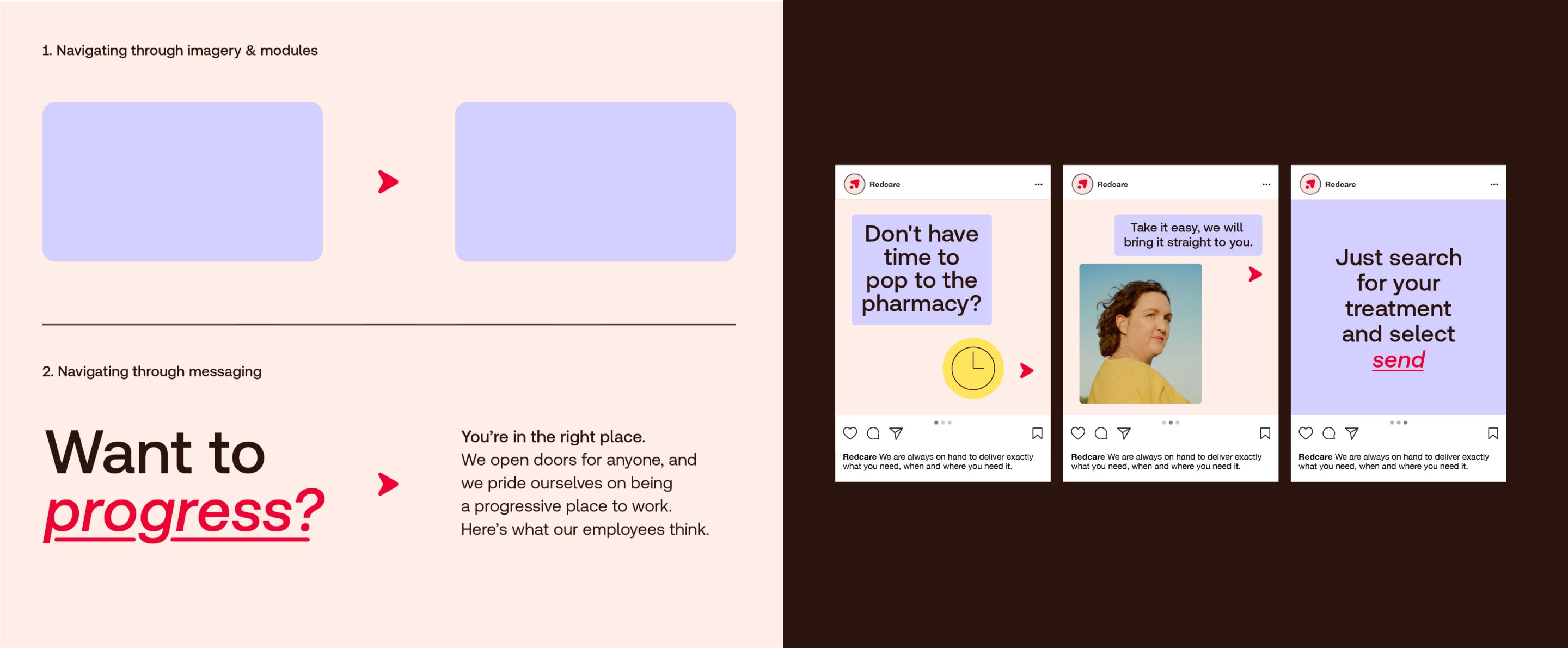
In layouts, our navigation arrow is a key signifier of our brand, and we can use it in the following ways.
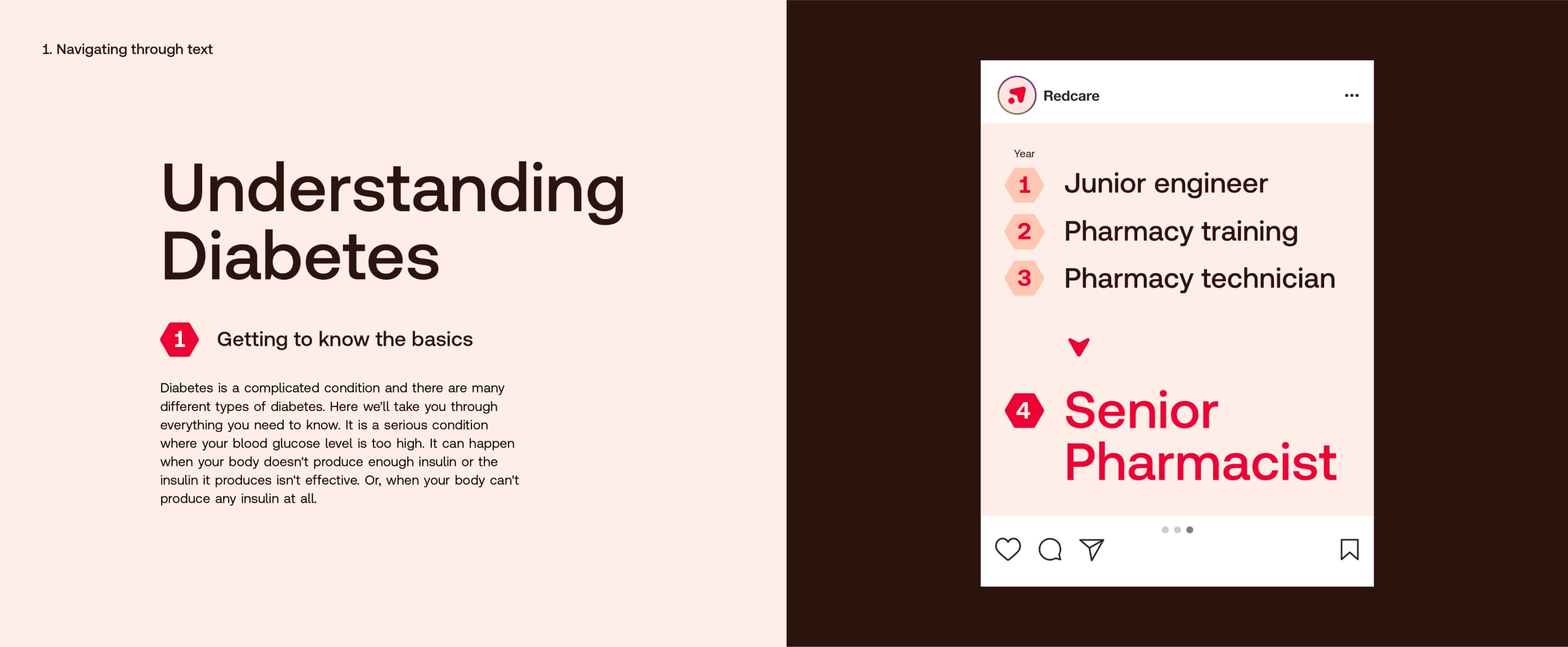
In layouts, we use our navigation numbers to list information in a clear, easy to digest way. The active number is always Red.
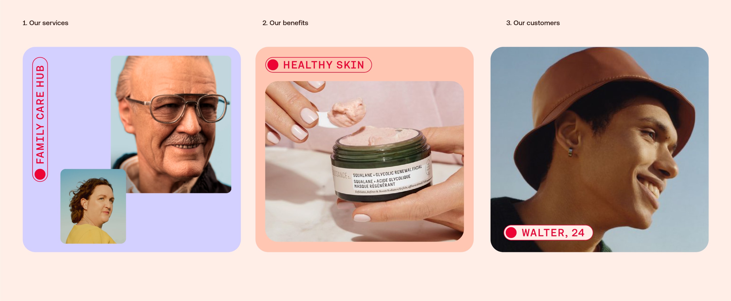
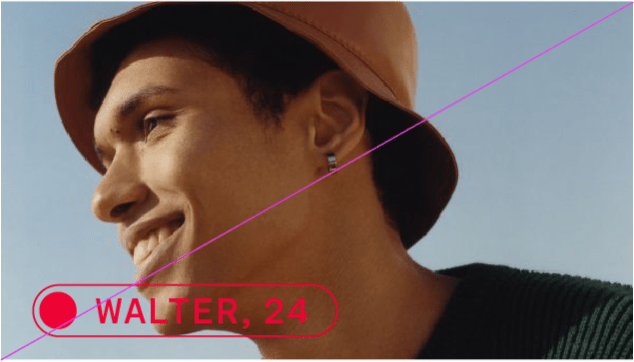
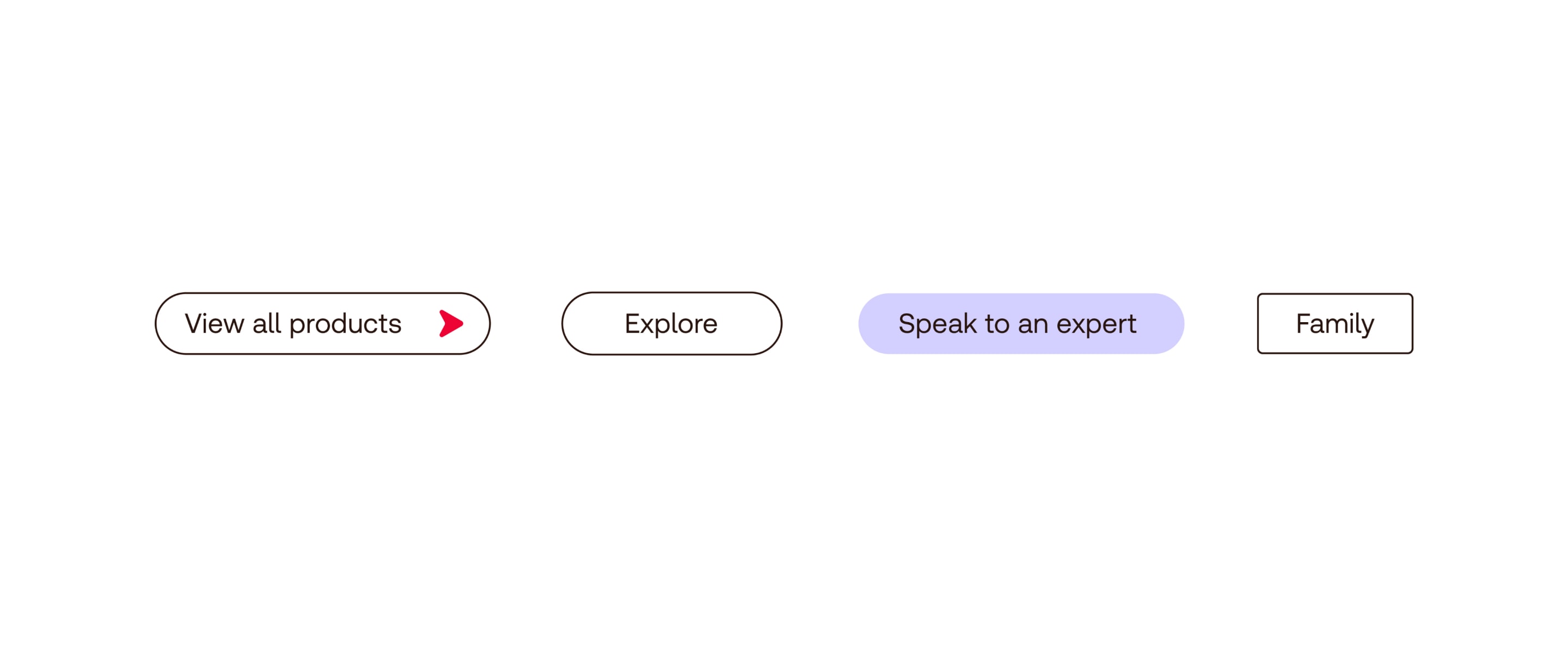
In layouts, capsules are used to signpost the categories shown below. They can be aligned at the top or bottom of layouts, positioned vertically or horizontally.
They can be used over photography with a filled background to ensure they stand out.
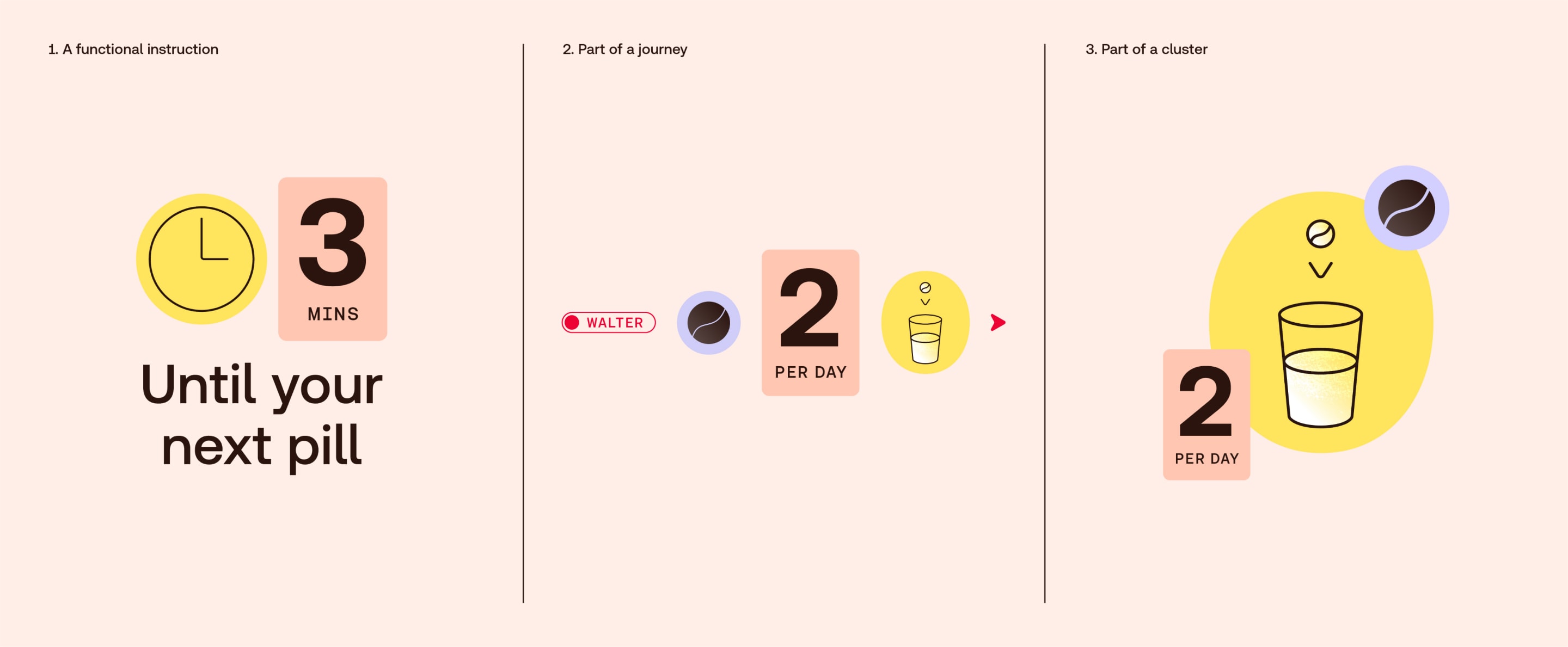
In layouts, we use our numeric tags in the following ways, always supporting our icons and telling different stories.
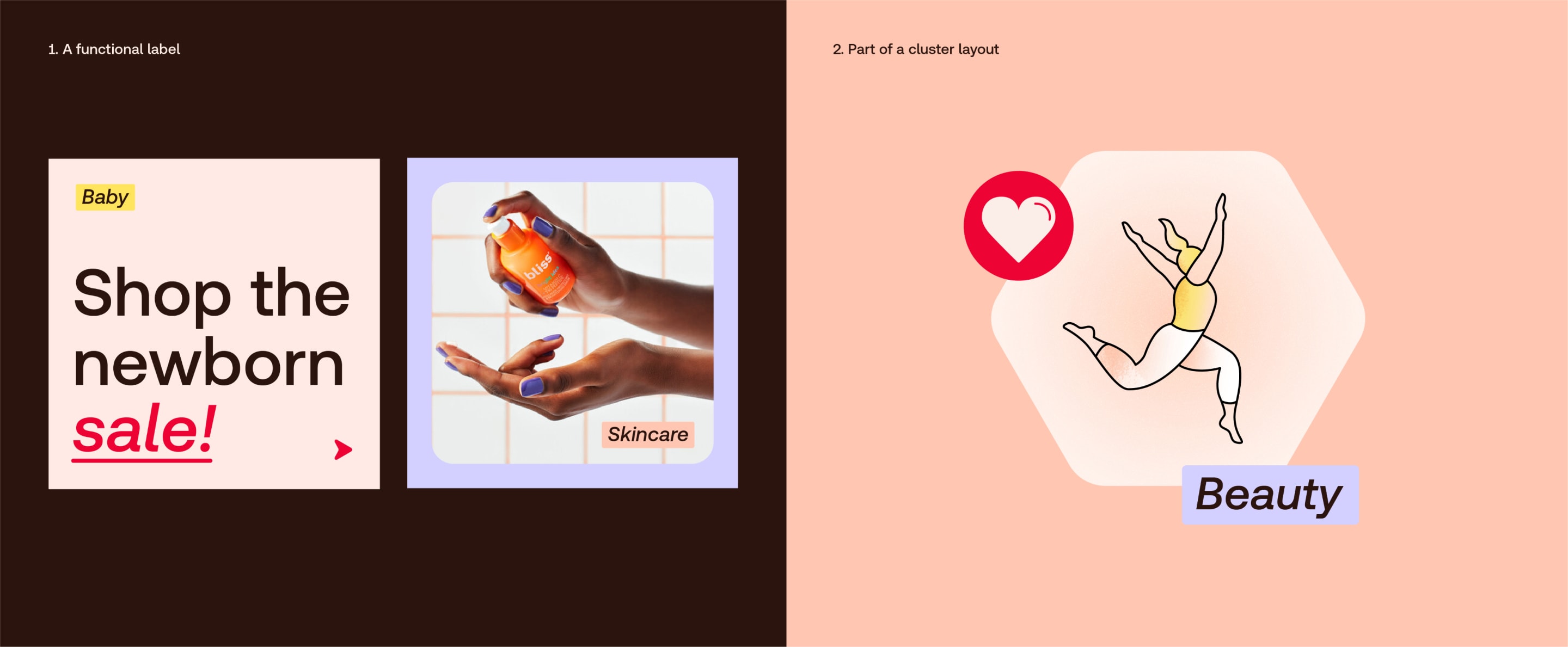
In layouts, we use our labels in the following ways. They highlight the specific category of the content.
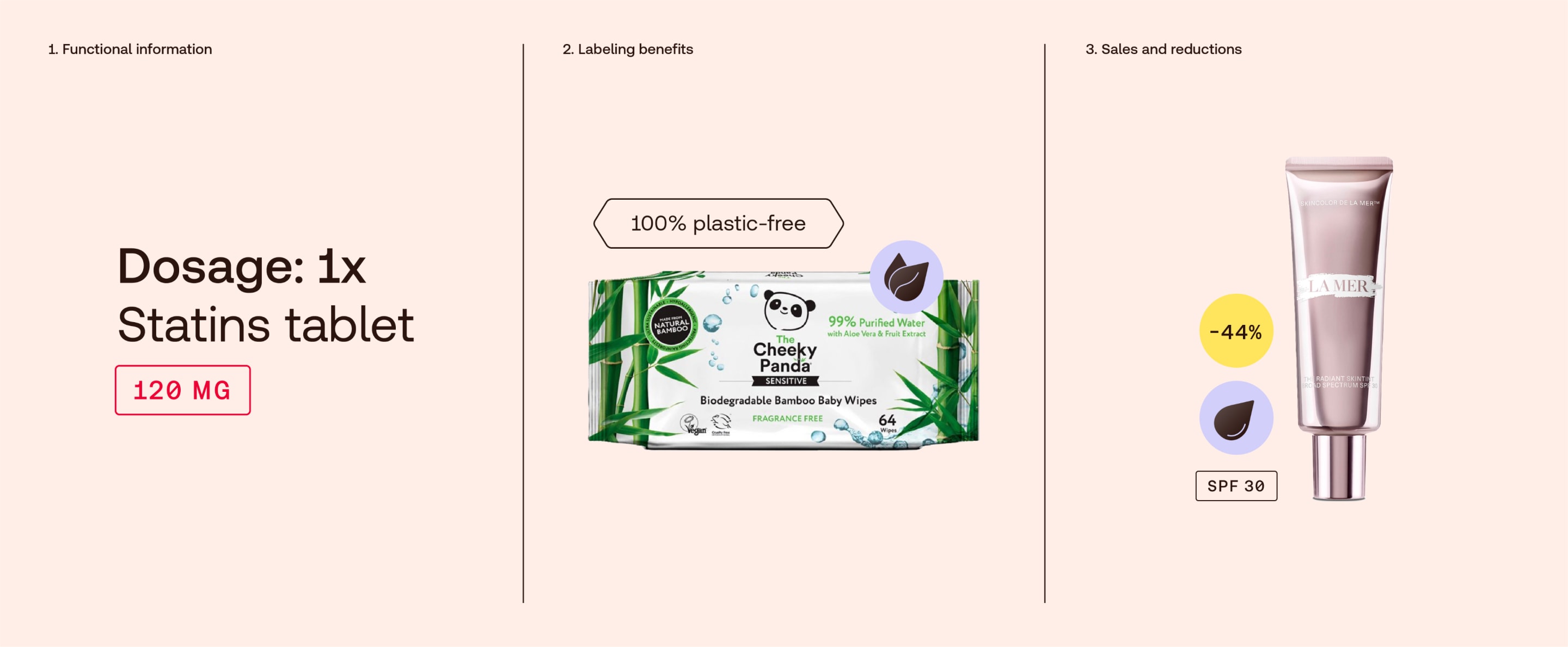
In layouts, we use our details in the following ways. They support our icons by adding extra levels of detail.
In layouts, we use our special tabs in the following ways. They are never heroed or large scale, but give structure to detailed information.
Things to avoid
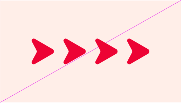
Don’t use more than one arrow in a sequence or as patterns.
Don’t twist or skew elements. Always use horizontally or vertically.
Don’t design clusters out of only signposting elements. Instead, combine them with icons
Don’t design journeys with only signposting elements. Instead, combine them with icons
Don’t use keylines that are too thick or too thin. Always keep your keylines consistent.
Don’t use elements over photography if they aren’t legible enough
Don’t scale too large. They are smaller delicate details that support our icons.
Don’t crop elements
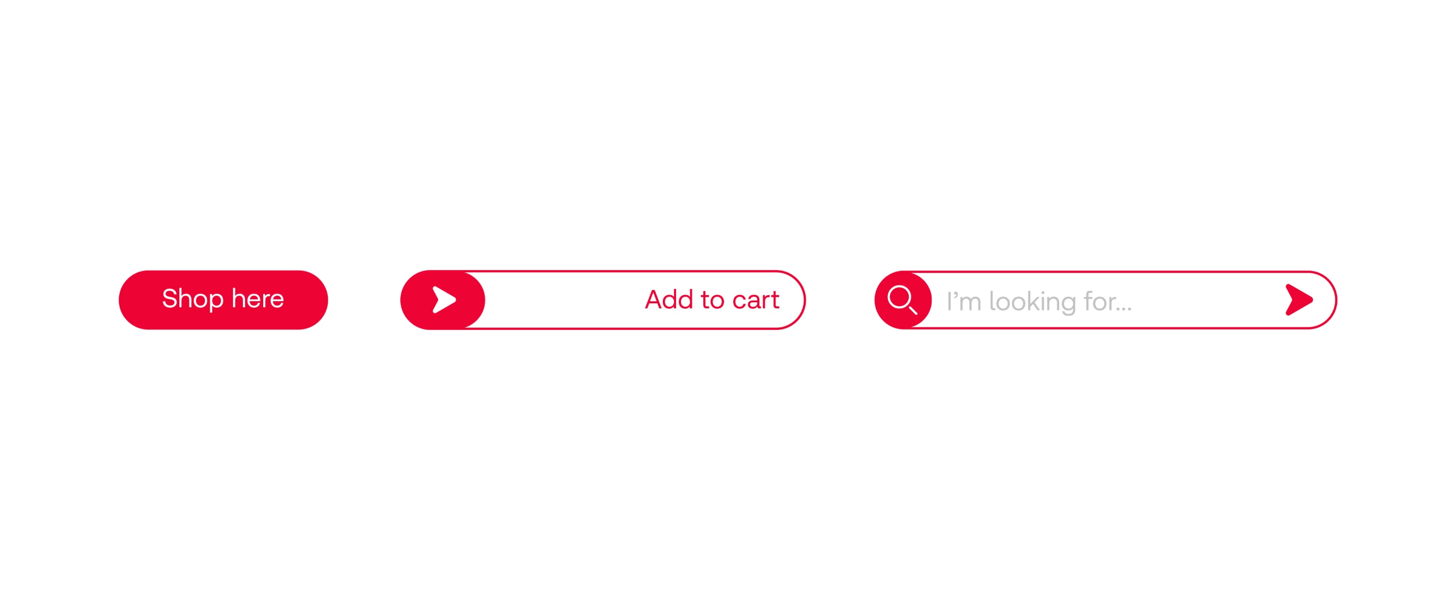
These are notional examples of how we can create interactive signposting elements and buttons for use in digital applications.
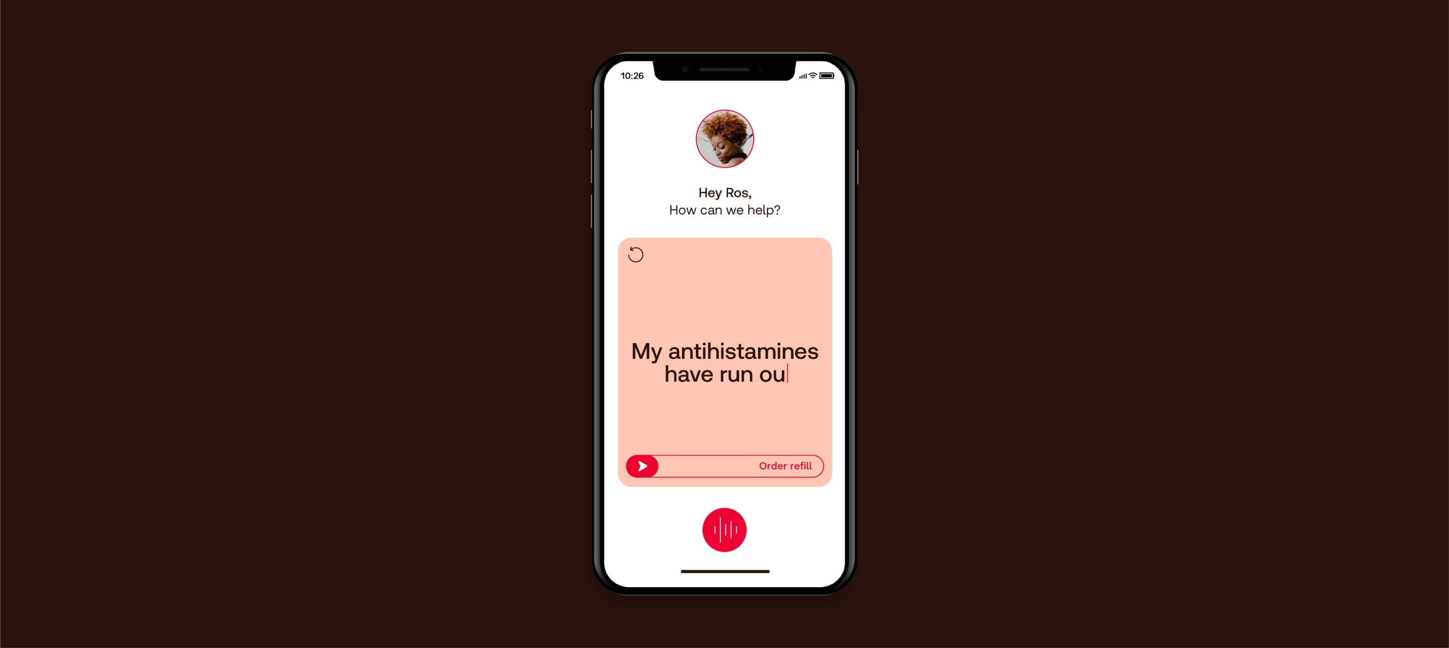
These are notional examples of how buttons might be designed. To make them uniquely Redcare, we can integrate our arrow, Red and container shapes.
On mobile, we could use forward swiping interactions to give you a sense of moving forward to the next step.
These are notional examples of how buttons might be designed. To make them uniquely Redcare, we can integrate our arrow, Red and container shapes.
On mobile, we could use forward swiping interactions to give you a sense of moving forward to the next step.
In motion, we emphasise the sense of moving forward, clearly navigating through content and guiding you to the next step.