- Our typefaces
- Redcare Accessible
- Redcare Accessible - Hierarchy & Typesetting
- Redcare Accessible Colour usage
- Redcare Accessible - Usage
- Redcare Accessible Highlighting treatment
- Redcare Accessible Highlight - How to use
- Redcare Mono
- Redcare Mono Hierarchy & Typesetting
- Redcare Mono Colour usage
- Redcare Mono Usage
- In motion
- Typography Examples
- System fonts - Primary
- System fonts - Secondary
- Typography misuse
Typography
The Redcare type family is unique to our brand.
It combines warmth and functionality along with accessibility adjustments.
Our typefaces
Overview
We have one family of typefaces that we use across all parts of our brand.
The pairing of Redcare Accessible and Redcare Mono let us speak with both warmth and friendliness as well as accessibility and functionality.


Redcare Accessible
Hierarchy & Typesetting
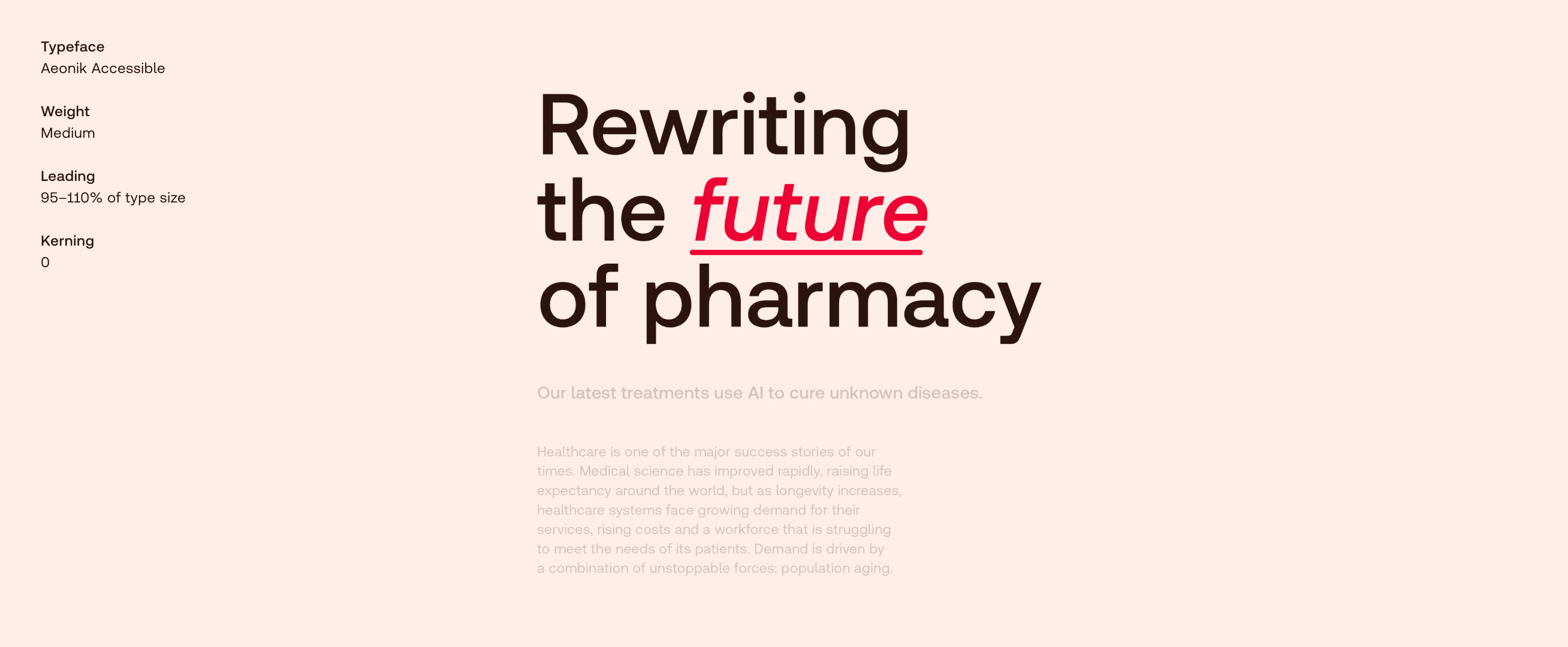
We create hierarchy by using contrasting type sizes and going big with headlines. Use the following as guidance for typesetting in order to ensure maximum legibility.
Redcare Accessible
Hierarchy & Typesetting
We create hierarchy by using contrasting type sizes and going big with headlines. Use the following as guidance for typesetting in order to ensure maximum legibility.
Redcare Accessible
Colour usage
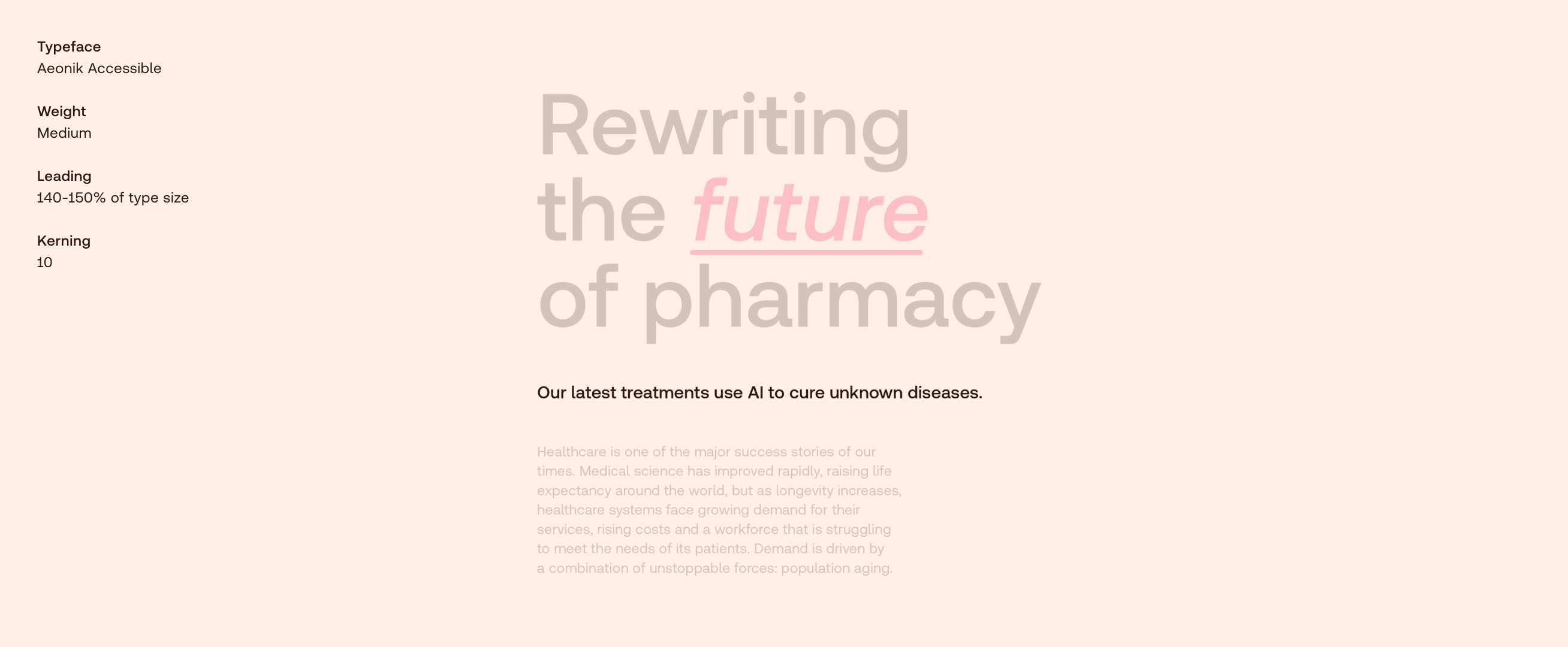
We primarily use Redcare Accessible in brown, or red for highlights, except brown backgrounds where we use off-white.
Type colour
Brown
Aa
Type colour
Red
Aa
Redcare Accessible
Usage
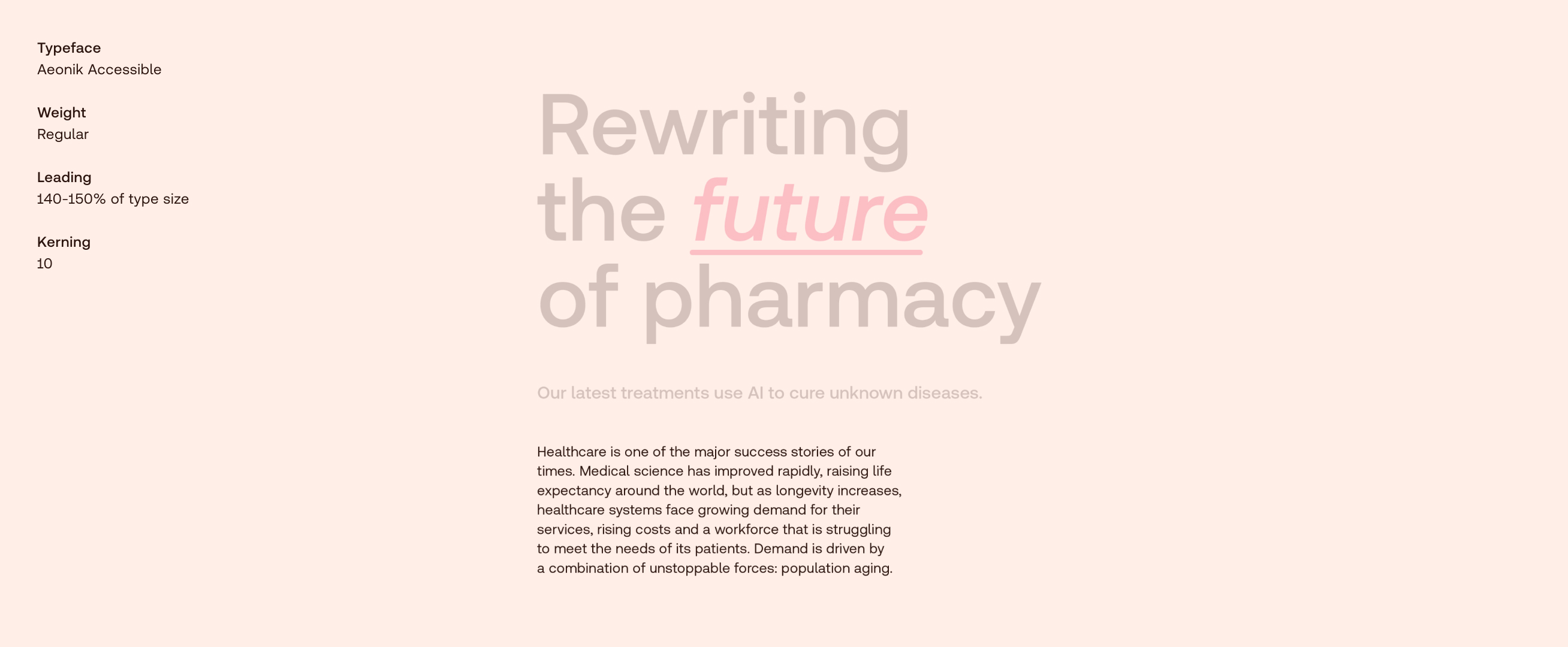
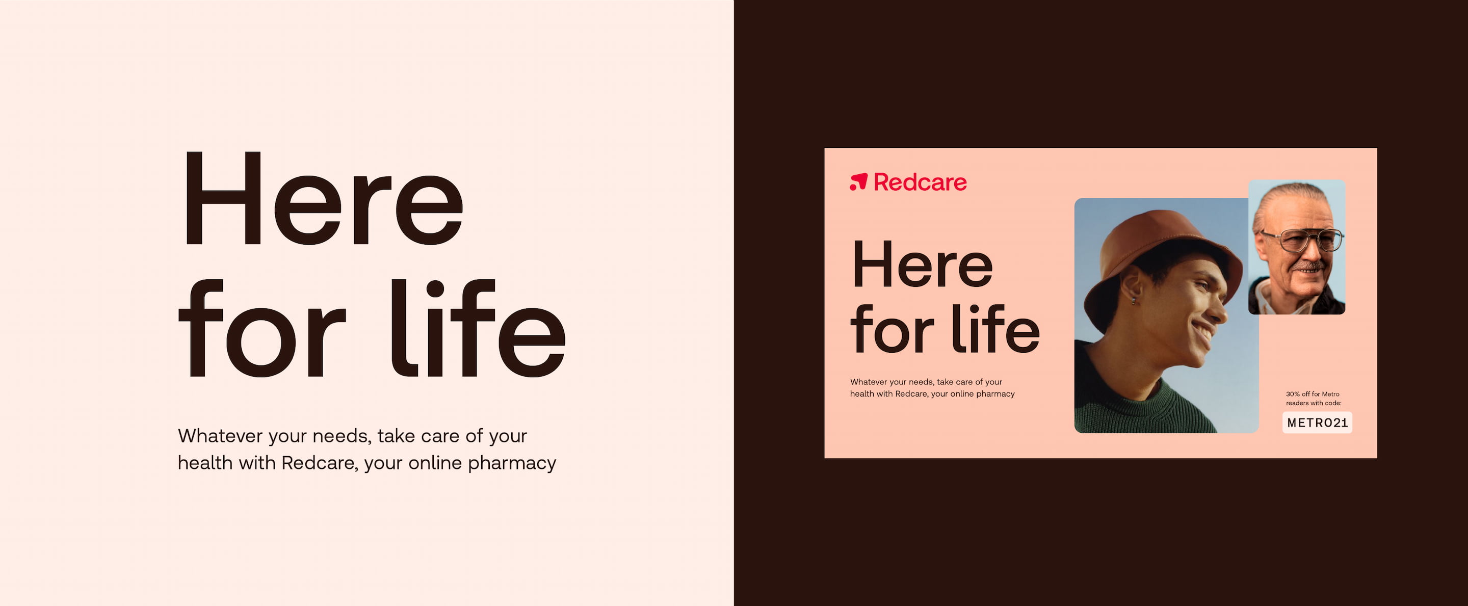
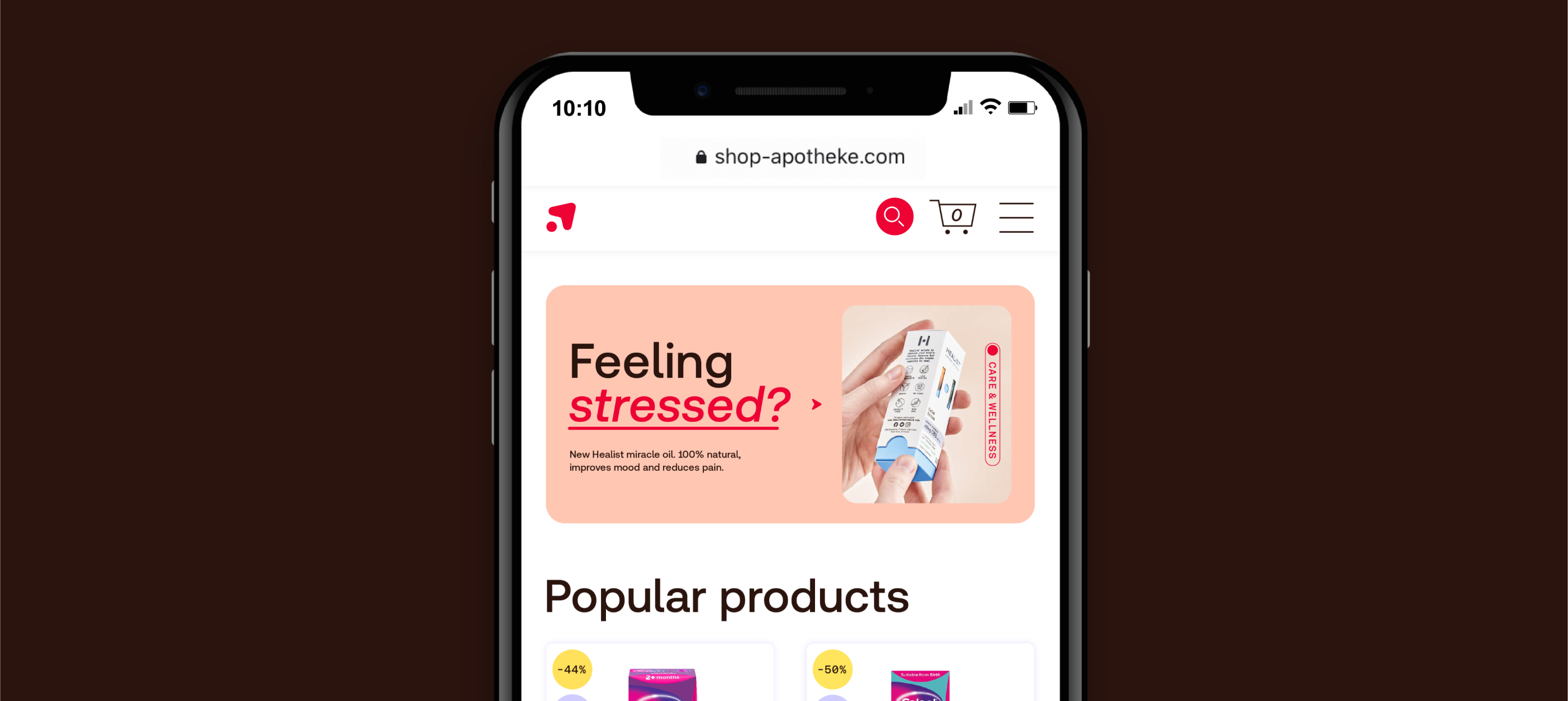
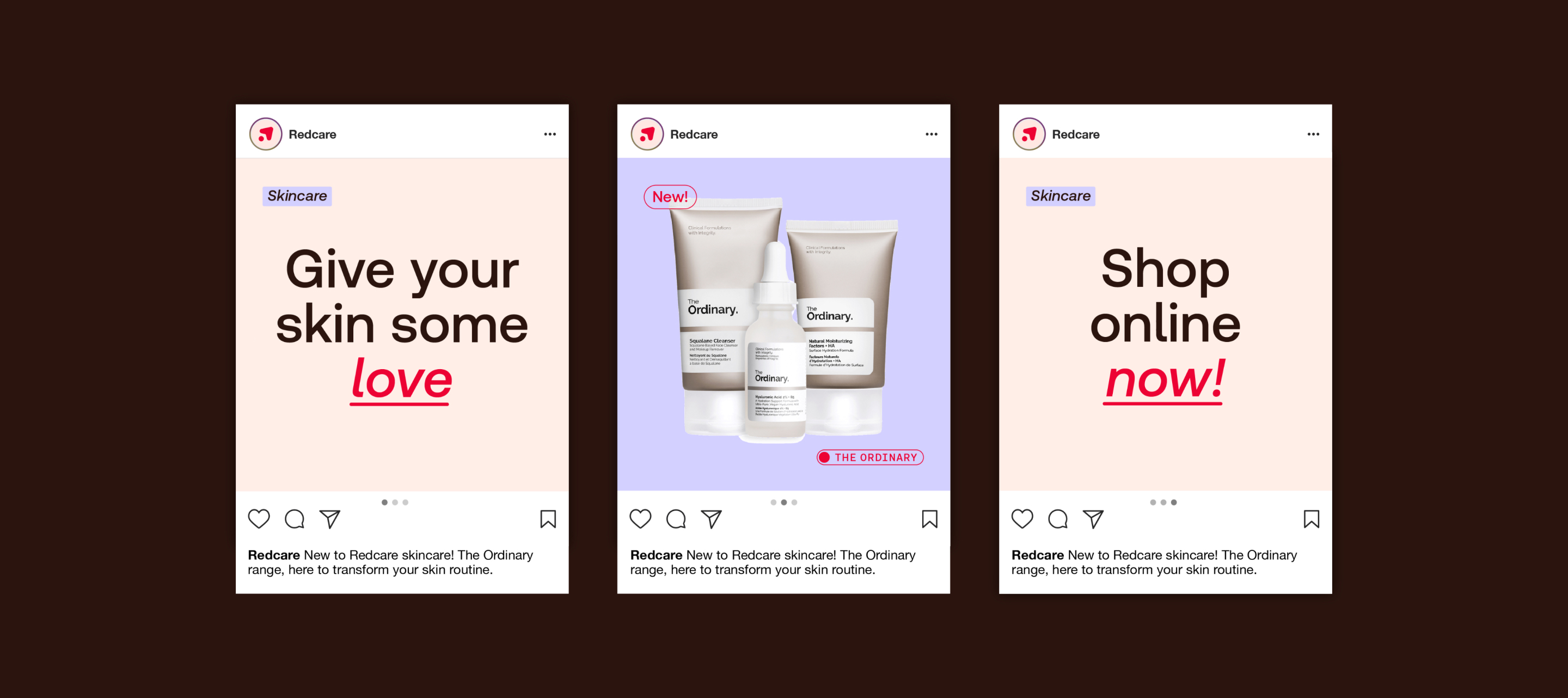
When heroing a headline, we centre-align the type for maximum impact.
Redcare Accessible
Usage
When heroing a headline, we centre-align the type for maximum impact.
Redcare Accessible
Usage
When using a headline alongside more content, or if another element is the hero, we use it left-aligned.
Redcare Accessible
Usage
When using headlines as part of a journey, we use text modules with centre-aligned type.
Redcare Accessible
Usage
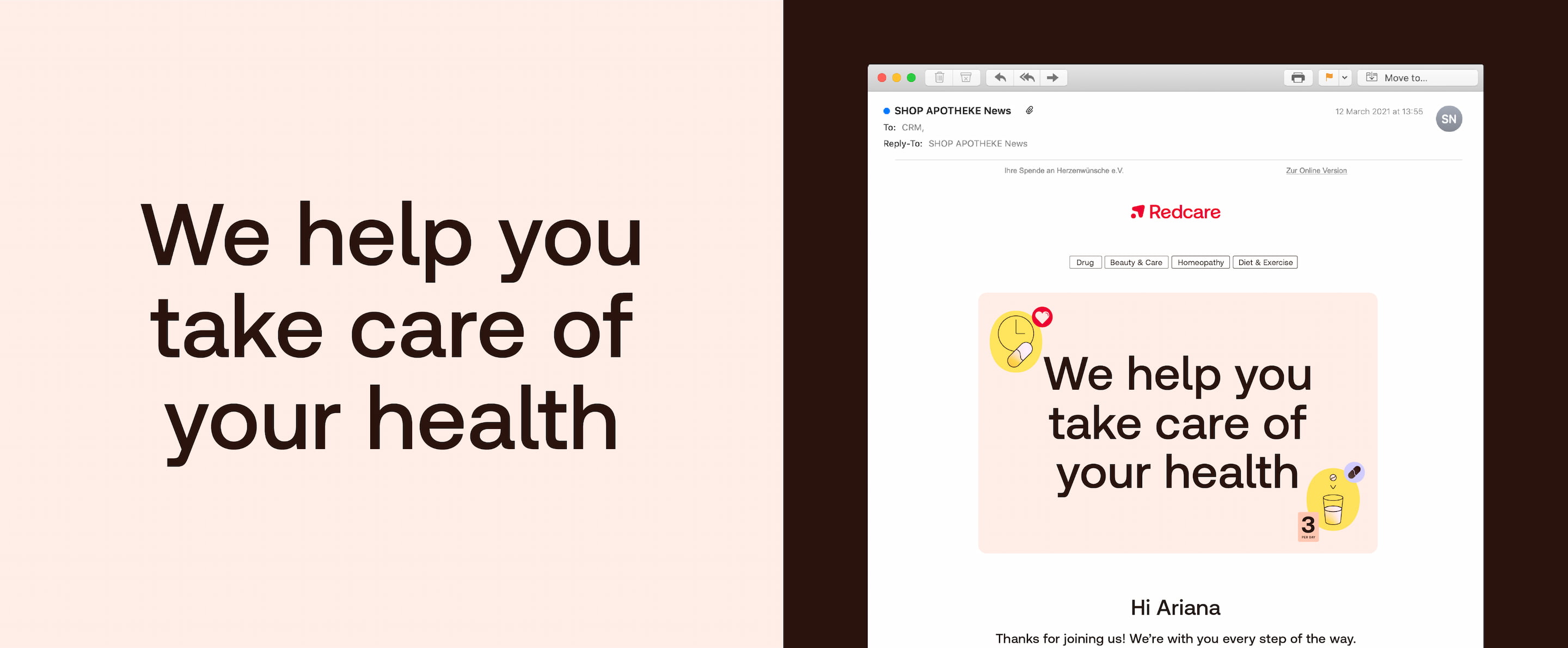
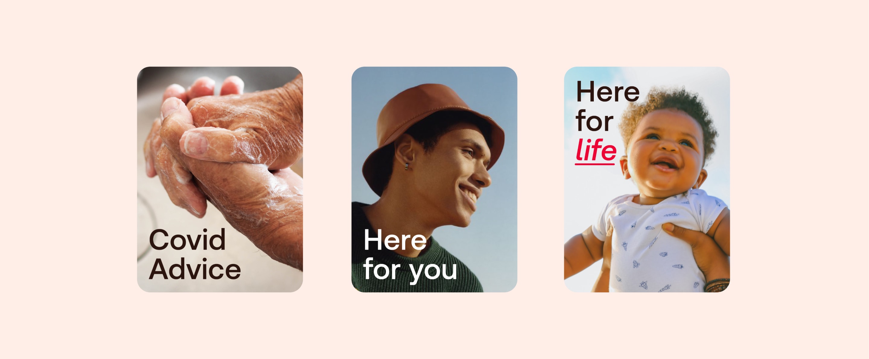
When using a headline on photography, it is important to maximise legibility by placing it over a clean, uncluttered area of the image.
Select the type colour (brown or white) that has the most contrast with the image.
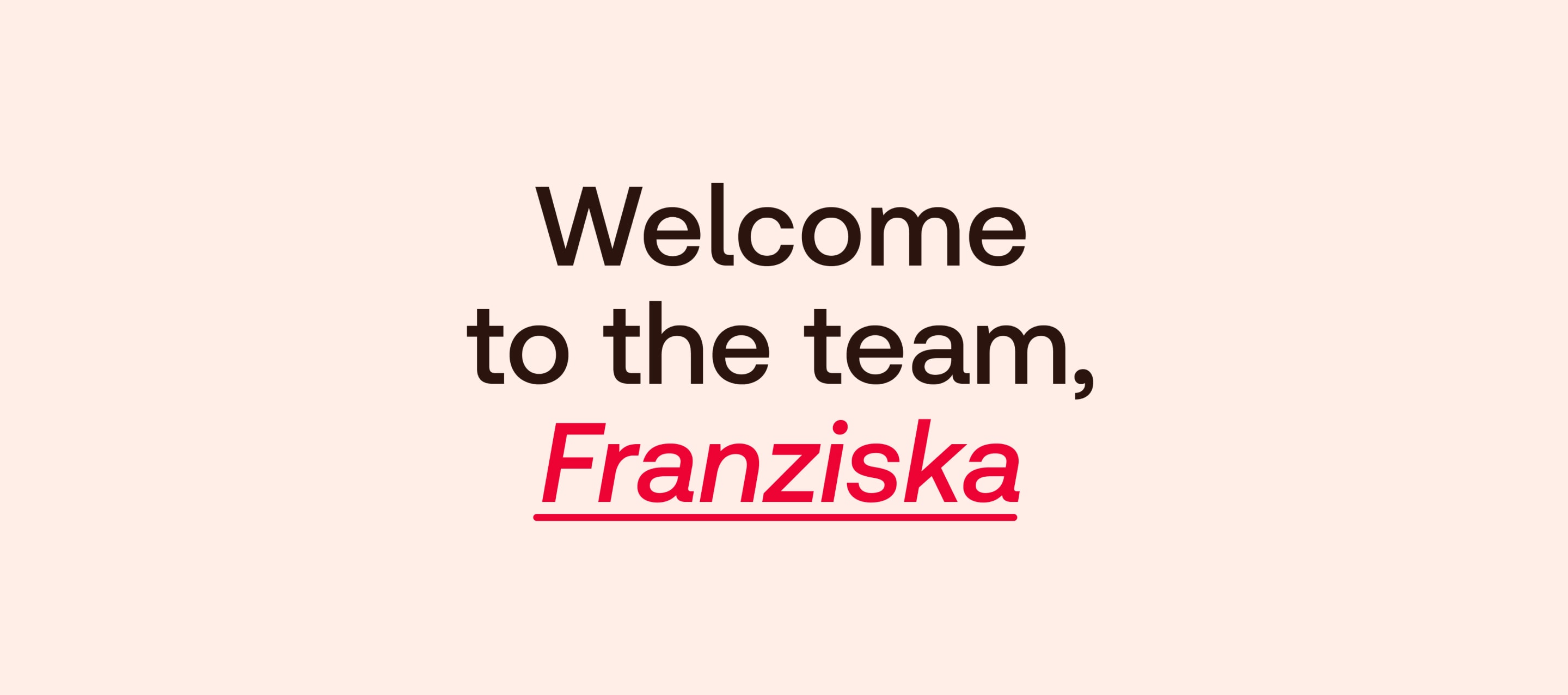
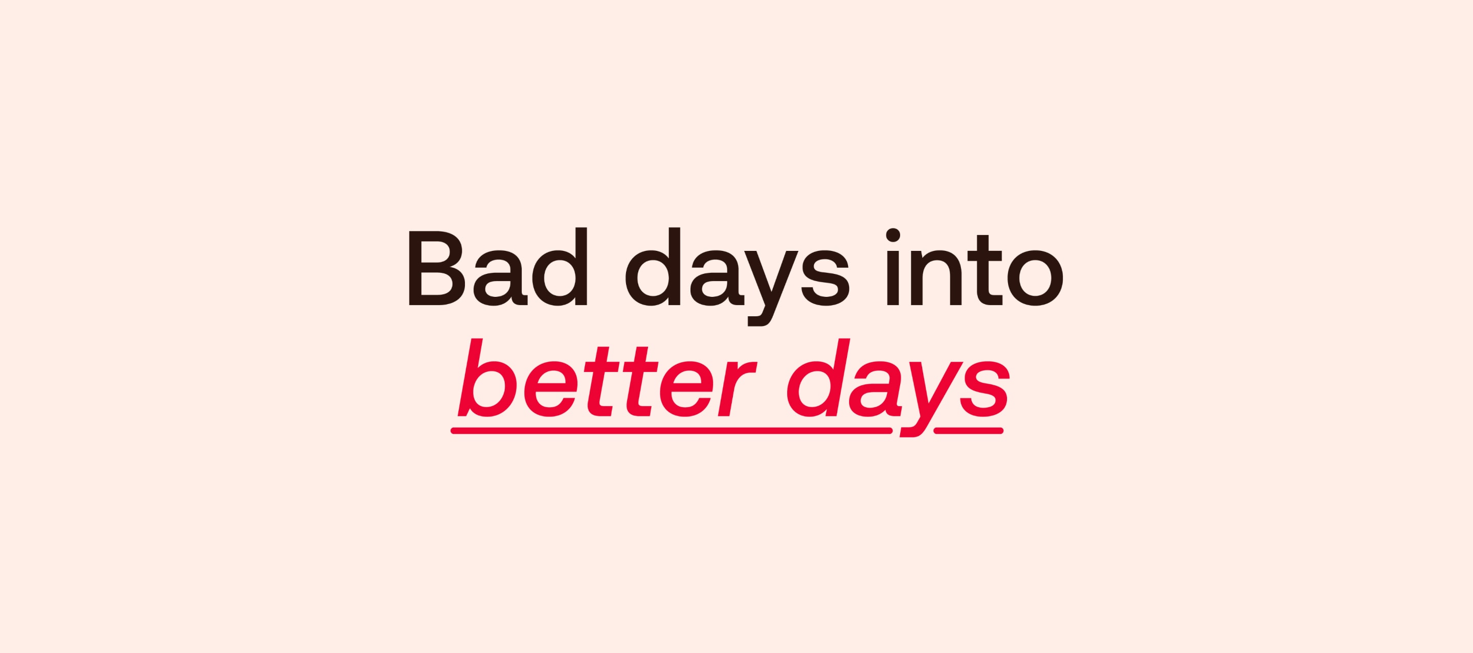
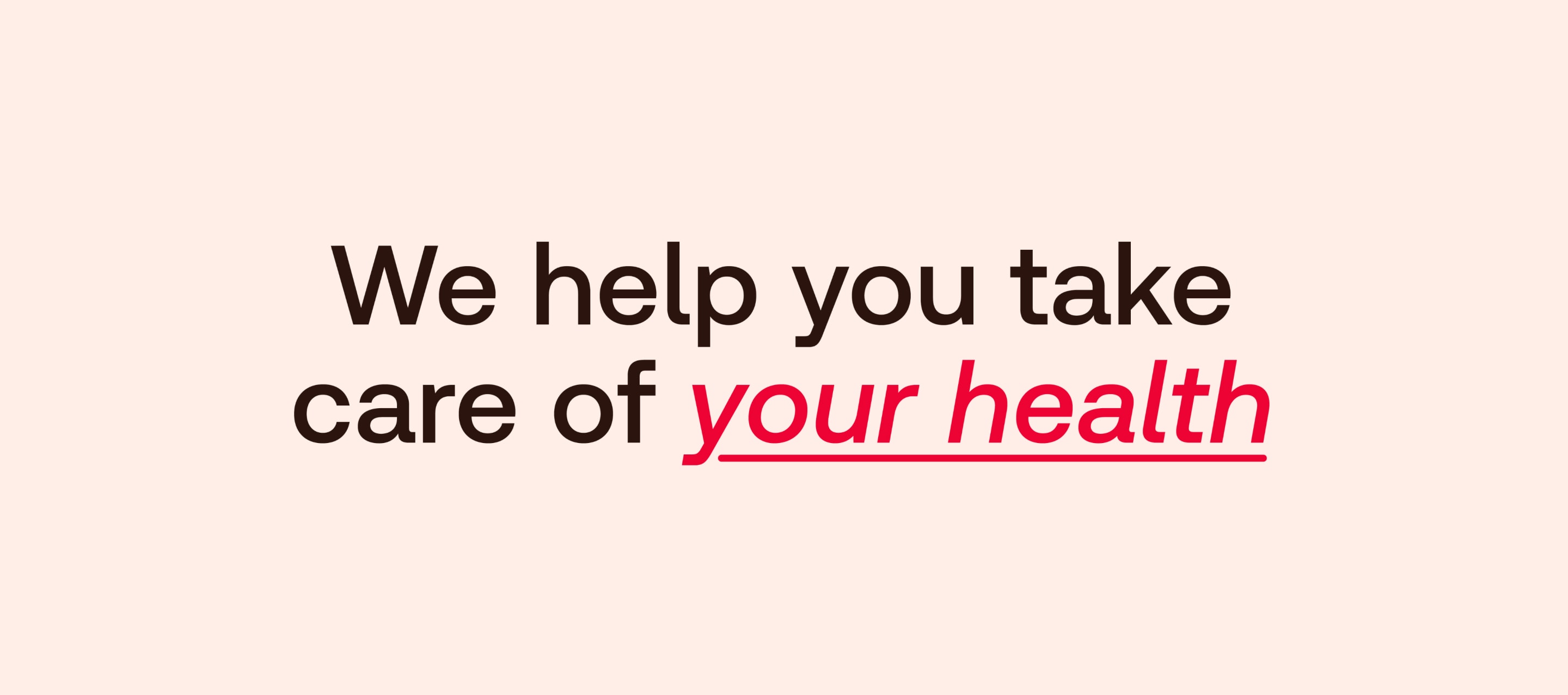
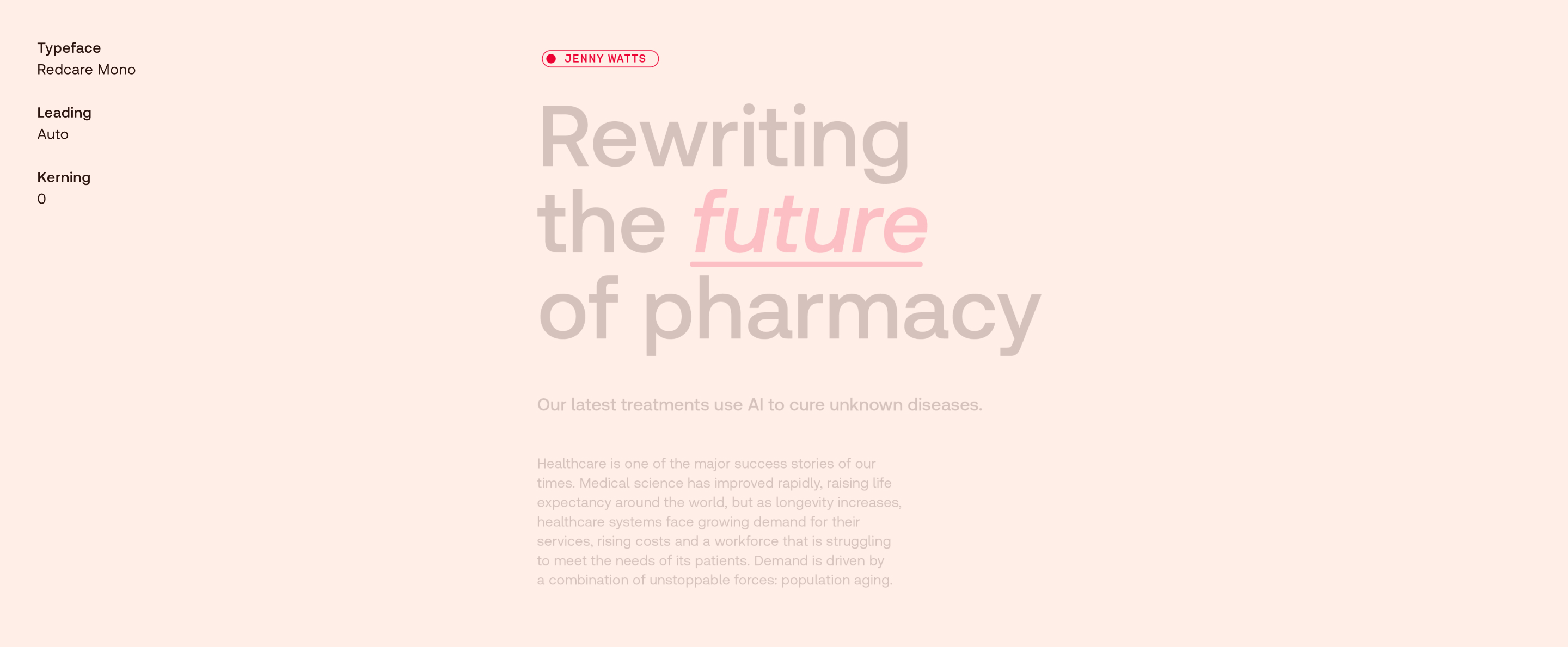
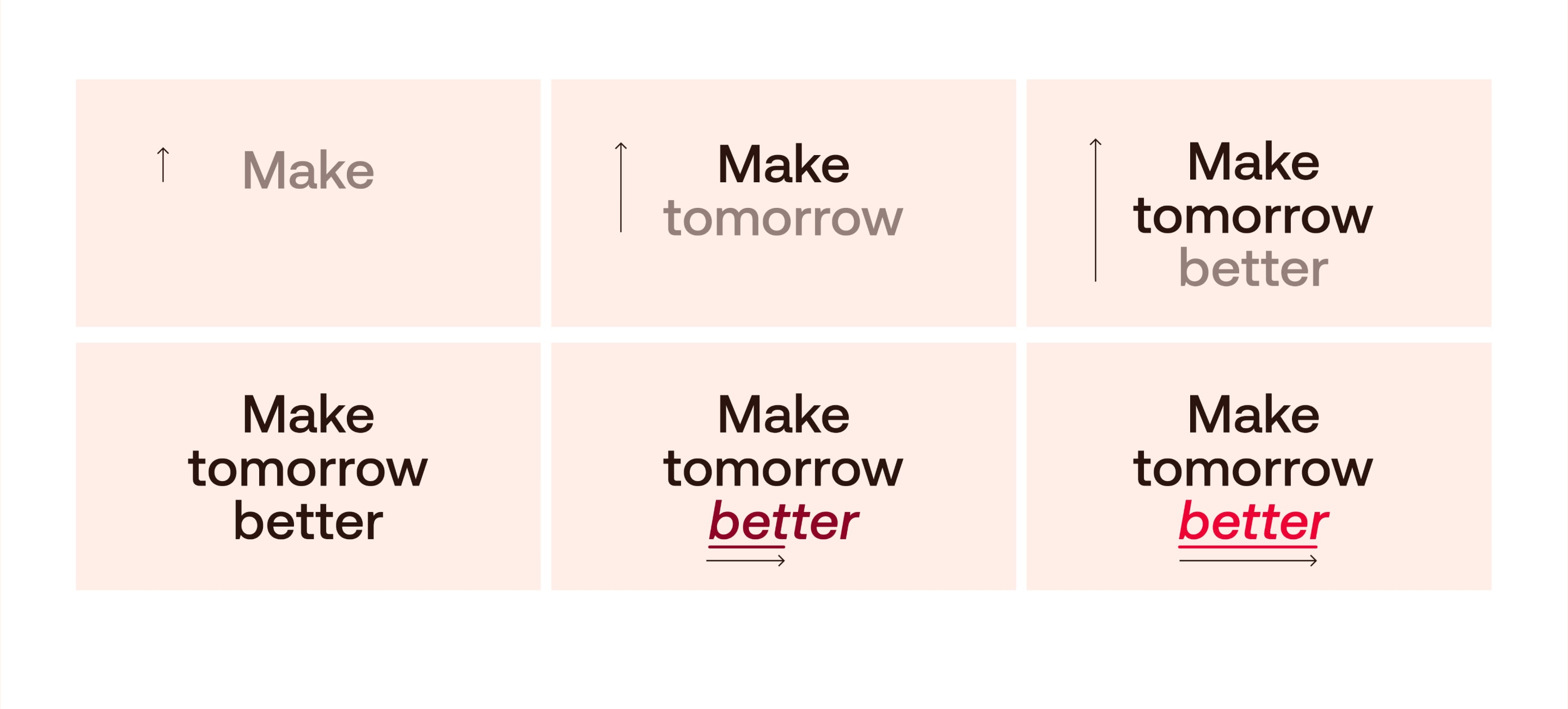
Redcare Accessible Highlight
Highlighting treatment
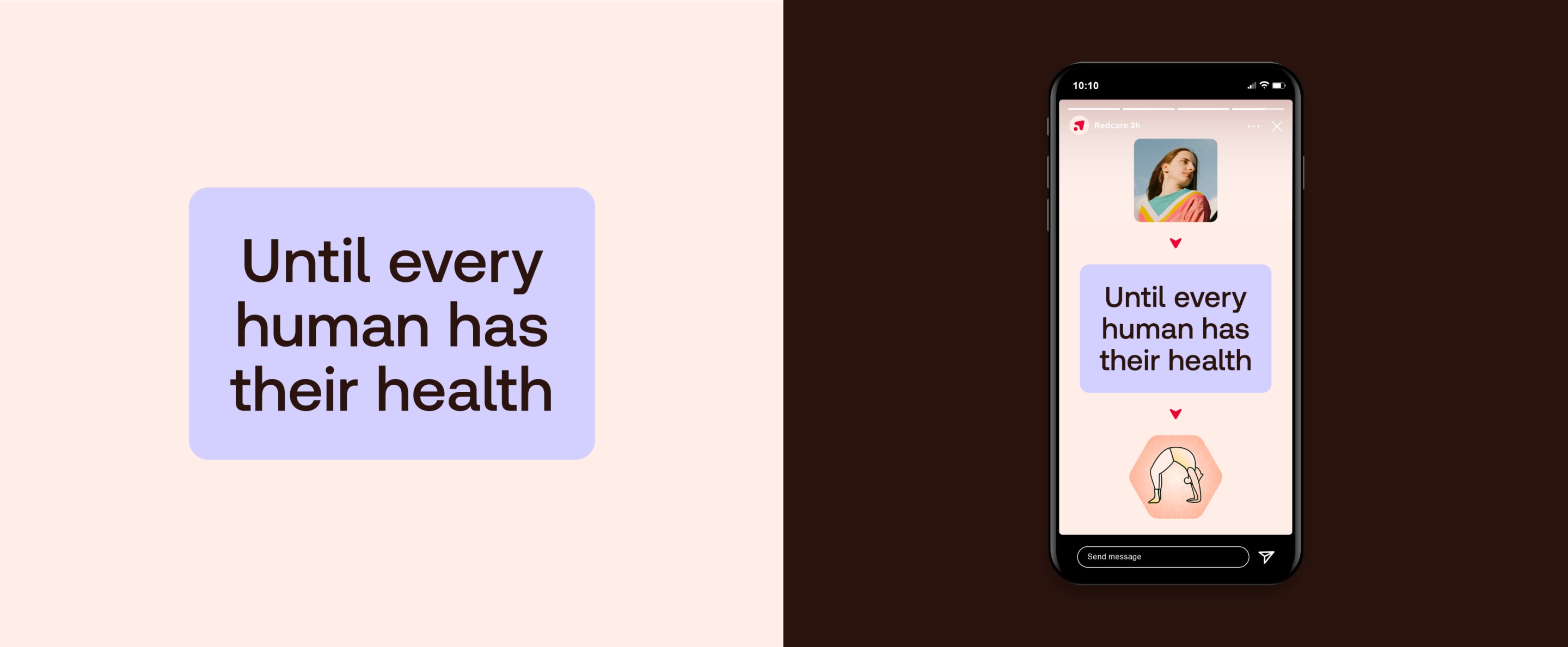
We emphasise the important parts of copy using our Redcare Accessible Highlight weight in red.
Be selective and highlight only the important words – never highlight whole sentences.
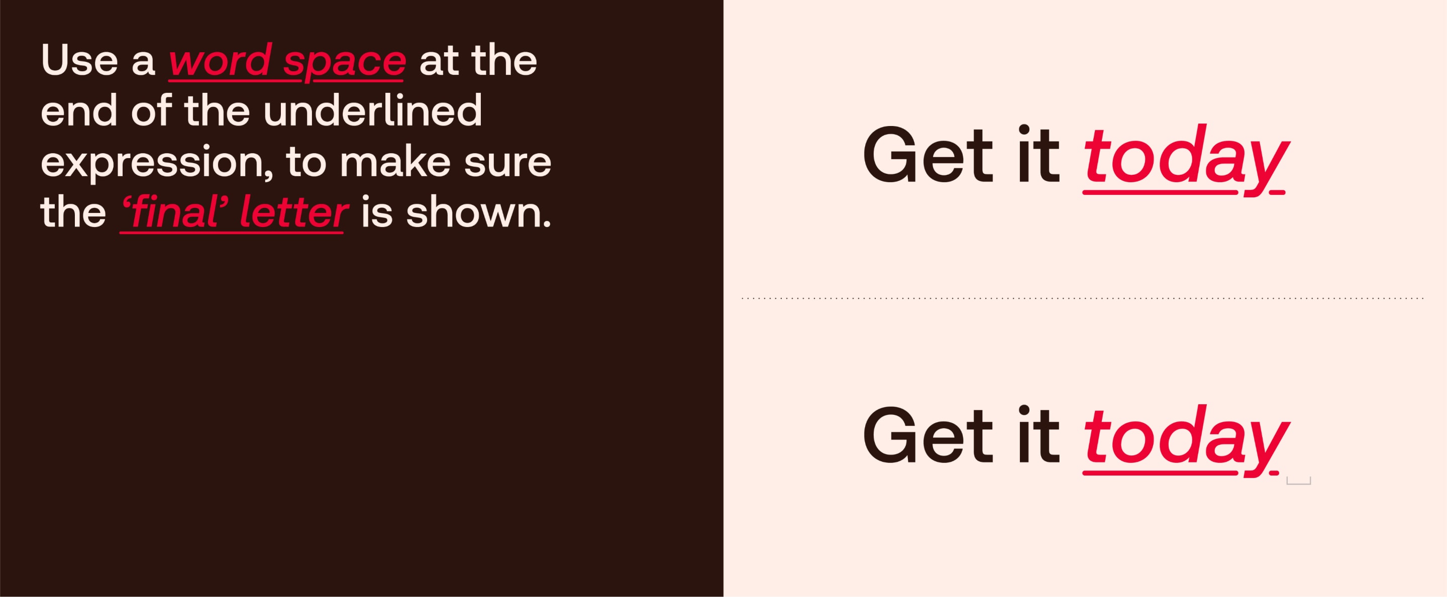
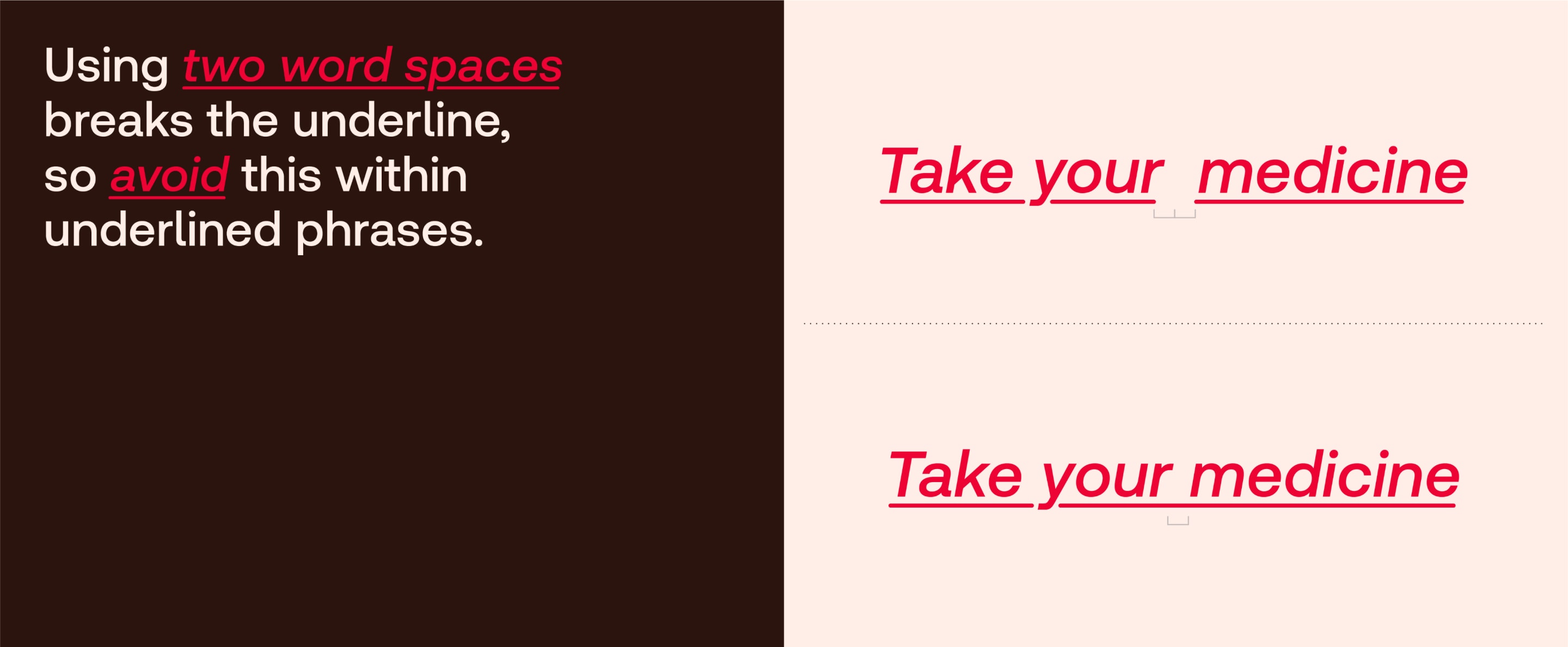
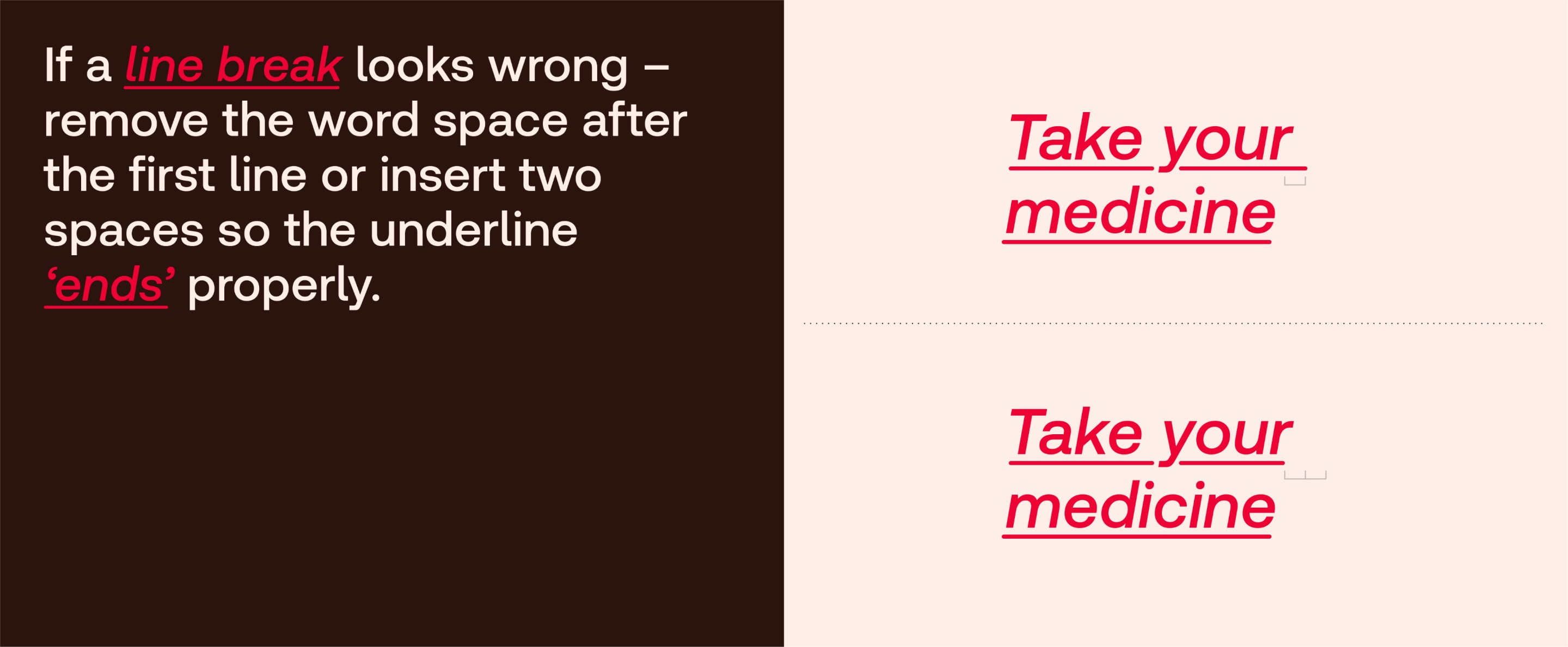
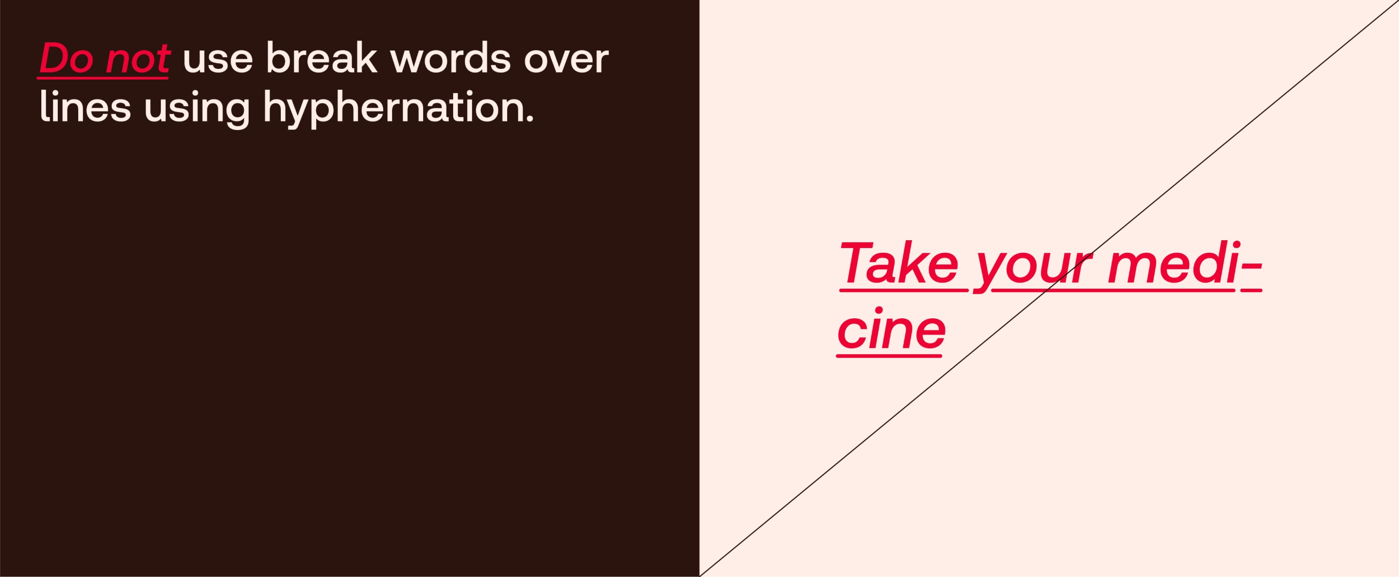
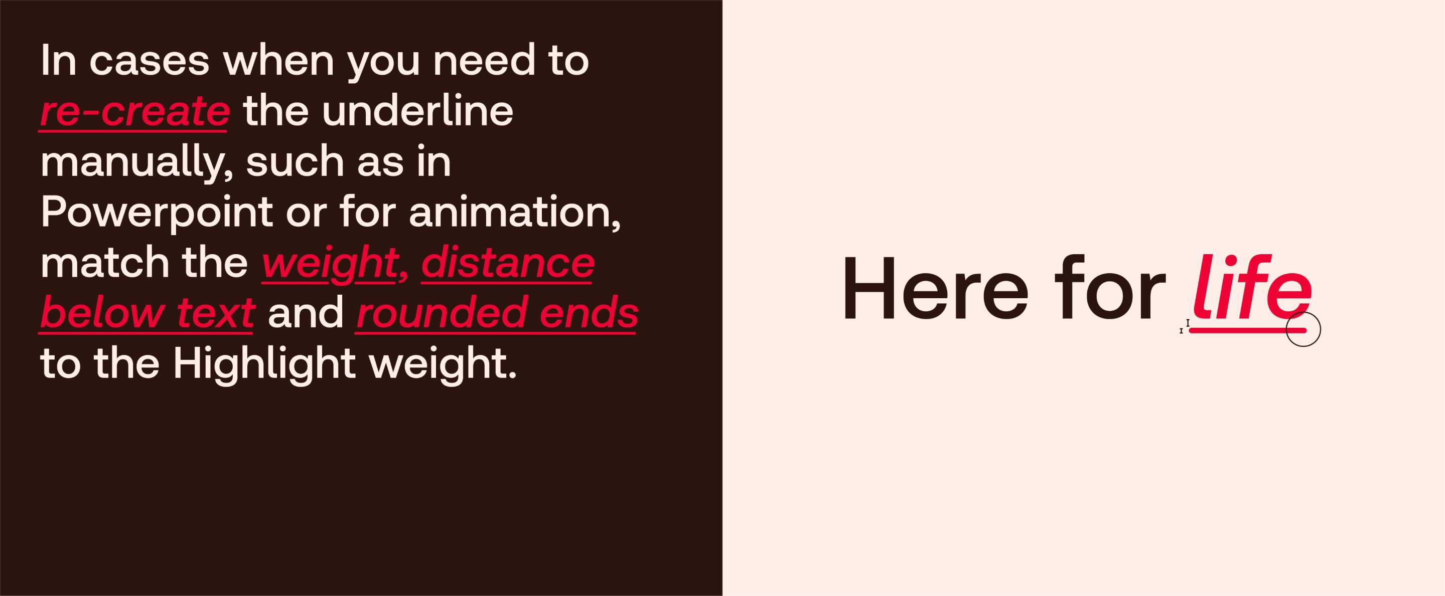
Redcare Accessible Highlight
How to use
The highlight weight is built in to the typeface so it is easier to use. Please use the following guidance to make sure it always looks its best.
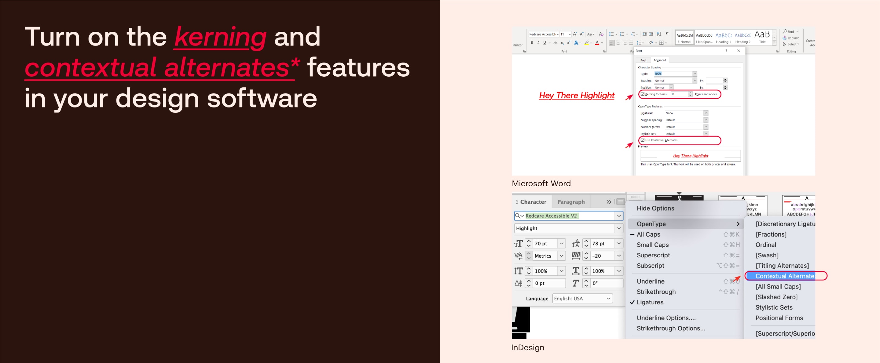
Redcare Accessible Highlight
How to use
The highlight weight is built in to the typeface so it is easier to use. Please use the following guidance to make sure it always looks its best.

Redcare Mono
Hierarchy & Typesetting
Use the following as guidance for typesetting our Mono typeface, ensuring maximum legibility and consistency.
Redcare Mono
Colour usage
Mono is primarily used in Red or Brown depending on the use case.
Type colour
Red
AA
Type colour
Brown
AA
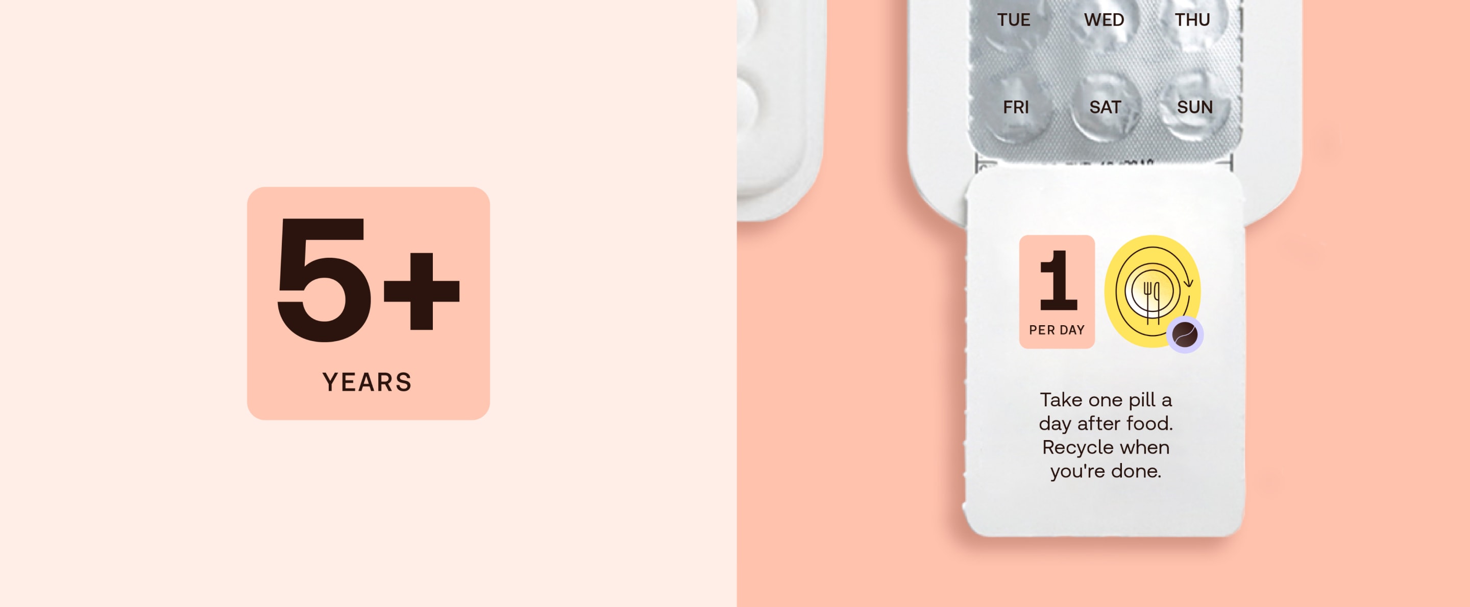
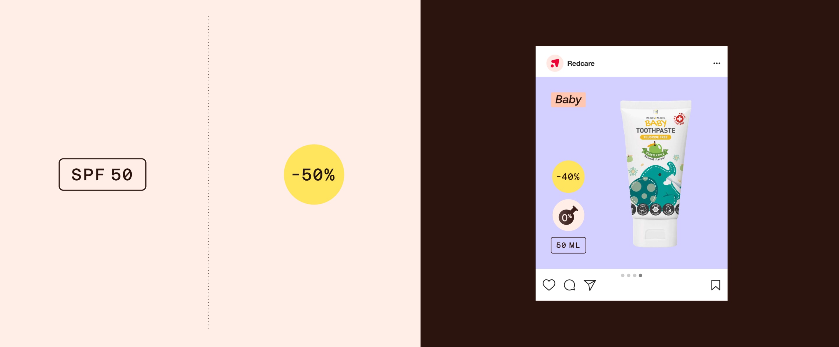
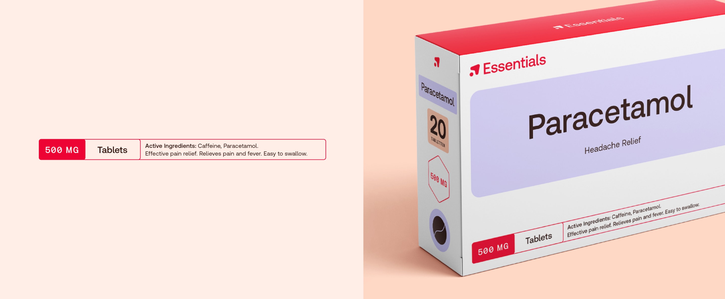
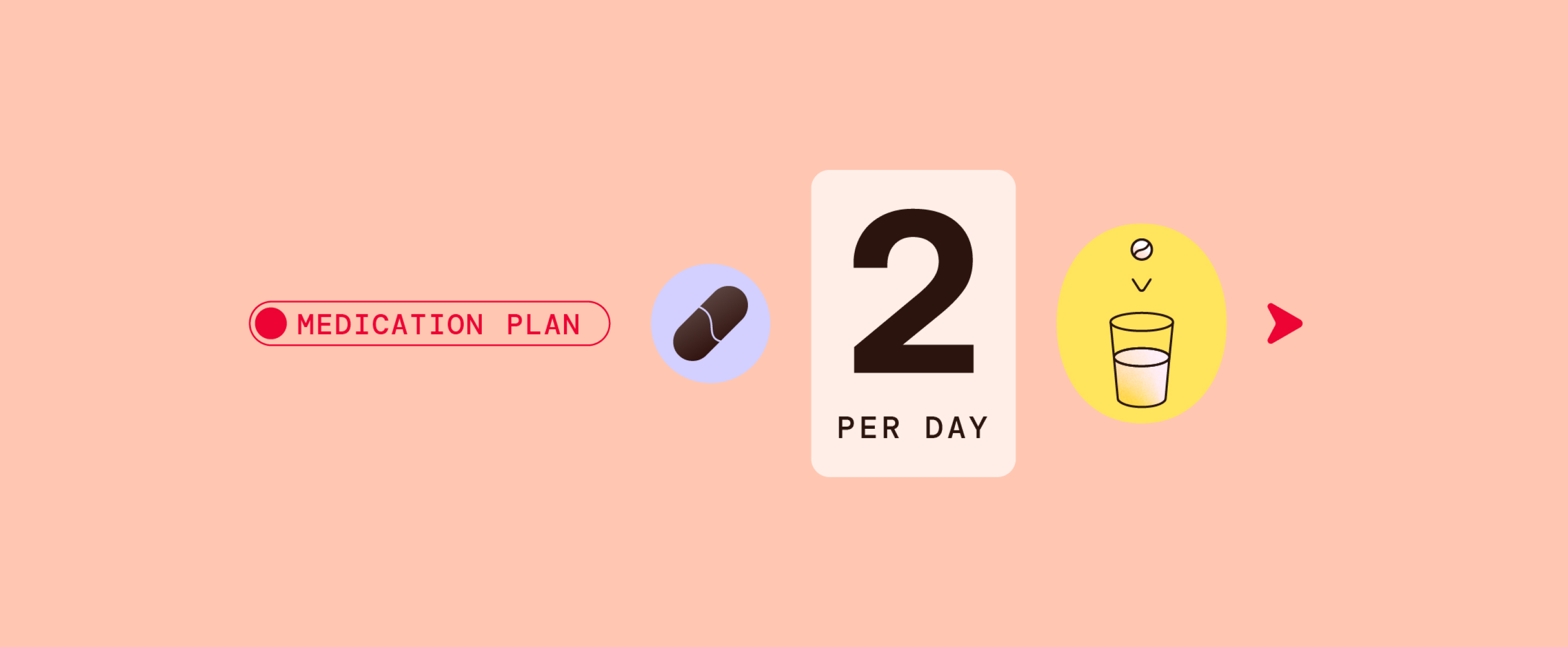
Redcare Mono
Usage
To create hierarchy in layouts, we use Redcare Mono to pull out key details.
Redcare Mono
Usage
To create hierarchy in layouts, we use Redcare Mono to pull out key details.
In motion
Here is how we bring our typography to life in motion. We always emphasise our optimistic spirit and highlight what’s important.
Typography
Examples
System fonts
Primary
Always aim to use our brand font. But when this isn’t possible, we can substitute Redcare Accessible with the following Google font.

System fonts
Primary
Always aim to use our brand font. But when this isn’t possible, we can substitute Redcare Accessible with the following Google font.

System fonts
Secondary
Always aim to use our brand font. But when this isn’t possible, we can substitute our Redcare Mono with the following Google font.

System fonts
Secondary
Always aim to use our brand font. But when this isn’t possible, we can substitute our Redcare Mono with the following Google font.
Typography misuse
Things to avoid

Don’t track or apply leading differently to the guidance

Don’t use Redcare Accessible Regular weight for headlines

Don’t use Mono for headlines, sub-headings or body copy

Don’t italicise whole headlines or any text that isn’t red

Don’t set headlines and body copy with low size contrast

Don’t use Redcare Accessible for signposting number details or number highlights

Don’t use all caps when using Redcare Accessible, only for Aeonik Mono details

Don’t use red type for sub-headings or body copy